When Chairman Ben Bernanke of the Council of Economic Advisors made a statement about the U.S. housing market last week, some analysts jumped all over him. It looks to me like Bernanke had his facts exactly right.
In a speech delivered at the American Enterprise Institute last week, Ben Bernanke made the following statement:
The market for residential housing has been remarkably strong recently, in terms of both new construction and home prices. Homeownership has reached an all-time high during this Administration, as now nearly seven of ten American families own their own homes. The increase in house prices has recently received much attention in the media. While speculative behavior appears to be surfacing in some local markets, strong economic fundamentals are contributing
importantly to the housing boom. These fundamentals include low mortgage rates, rising employment and incomes, a growing population, and limited supply of homes or land in some areas. For example, states exhibiting higher rates of job growth also tend to have experienced greater appreciation in house prices.
Several analysts took issue with the last statement that job growth had something to do with house price increases. Angry Bear referred to Bernanke’s claim as an “alleged correlation,” and Calculated Risk stated flatly that “Bernanke misspoke.” Both attributed their views to fact-checking by MSNBC’s Martin Wolk.
So what did Wolk find objectionable in Bernanke’s statement? Wolk wrote,
For one thing, home sales and prices have been rising steadily for five years, breaking records year after year, even throughout the recession of 2001 and the jobless recovery that followed. If home price gains now are explained by rising employment, how do we explain the gains of 2001 to 2003, when the economy lost more than 2 million jobs and the unemployment rate was rising?
There are two facts about house prices that we’re trying to explain. The first is a
statement about the aggregate time series data– overall, house prices in the U.S. increased rapidly between 2000 and 2005. The second is a statement about cross-section data– house prices went up more in some communities than others. Bernanke provided a long list of factors that were making a contribution to house prices, with the first factor he mentioned being the declining mortgage rate. Since the interest rate varies little across different communities, the declining mortgage rate is obviously something that addresses the time-series question rather than the cross-section question. Bernanke’s answer to Wolk’s time-series question is the answer that any reasonable person should give: the drop in mortgage rates, not an aggregate increase in employment, is the primary reason that house prices overall rose so much in the U.S. over the last five years.
On the cross-section question, Wolk says that he
discovered that yes, many of the states that have seen the strongest home price gains over the past year have also seen some of the best job growth, including Nevada, Florida, Arizona and Virginia.
But then Wolk goes on to catalog a number of exceptions to the pattern:
Take a look at California. Over the 12 months ending March 31, California ranked No. 2 in home price growth….But California added only 250,000 jobs last year– about in line with the 1.7 percent job growth rate seen in the nation as a whole. Even more interesting: From 1999 to 2004, California’s work force only grew by 2.9 percent while home prices rose 103 percent. Compare that to the boom years of 1995-2000, when the work force expanded by 17 percent yet home prices rose only 47 percent.
The last point of course again gets back to Wolk’s confusion about the role of low mortgage rates as the dominant factor in the aggregate time-series trend. But after this diversion Wolk returns to his main theme:
The same disconnect can be seen over and over again. In New Jersey, New York and Connecticut, home prices rose an average of 13 to 16 percent over the 12 months ending March 31, a bit better than the national average of 12.5 percent, a near-record rate. Yet job growth in all three states was well below average last year– New York state added only 80,000 jobs, or 1 percent of its work force.
I suppose it is valid and often useful to be reminded that there are always exceptions to any statistical generalization, but this is the kind of argument that can drive a statistician nuts. The question is not whether some states do fit the pattern and some don’t, but rather whether there is any overall statistical tendency that could be used to summarize the combined inference from all 50 states taken together.
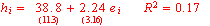
One standard way to do this is with statistical regression analysis. I used the data
(represented by hi) for state i’s change in house prices between 2000 and 2005 from
Office of Federal Housing Enterprise Oversight and calculated the logarithmic growth rate of nonfarm employment (represented by ei) for that state between March 2000 and March 2005. The regression estimates are as follows (t-statistics in parentheses):
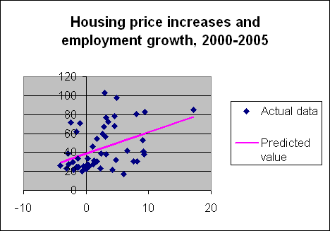
The raw data along with the fitted regression relation are plotted on the right. One
standard method used to assess whether there is a systematic relation between these two
variables is to ask, if there was really no relation at all between these variables, what is the probability of observing a sample with the degree of correlation found in the data? This probability turns out to be 0.003. Most statisticians would summarize such a relation as highly statistically significant.
Another way such a relation is sometimes summarized is with the regression’s R2,
which is the fraction of the variance of house price increases across states that the regression is able to explain. In this case, the R2 of 17% means that more than 80% of the variance in housing appreciation across states would come from something other than employment differences. Or, another way to describe what this means is the way that Wolk in fact does– you can find lots of examples of states that don’t fit the pattern, and even for states that the pattern does describe (for example, Montana and Nevada), the difference is far from the exact number you’d predict from the relation.
How high an R2 should we have expected from Bernanke’s statement? There are
obviously serious problems with trying to summarize community-by-community differences at a state-wide level, and employment differences are just one of five factors he mentioned that would vary across communities, along with home ownership rates, population growth rates, income growth rates, and housing supply. Perhaps Bernanke’s critics want to insist he report his R2 whenever he makes a statement like, “states exhibiting higher rates of job growth also tend to have experienced greater appreciation in house prices”.
In fact, I would argue that the huge differences across communities in the rate of housing appreciation are much more of an embarrassment for Bernanke’s critics than they are for him. Those challenging Bernanke’s interpretation are forced to suggest that there are hundreds of separate little bubblets, expanding in different communities at curiously different rates. And if you claimed that those differences had nothing at all to do with economic fundamentals, the statistical significance of the regression we just analyzed establishes that your story is pretty conclusively rejected by a statistical analysis of the data.
So, if in fact you do acknowledge that the differences in housing appreciation across
communities are at least in part explained by economic fundamentals, how would you articulate your belief? Maybe with a statement such as
While speculative behavior appears to be surfacing in some local markets, strong economic fundamentals are contributing importantly to the housing boom.
I am only a mathematician not a statistician but it seems to me that R^2 of .17 is fairly pathetic. Still it is a correlation so . . . for what it is worth I accept it.
However, I do have to take issue with your regression analysis. It appears you have weighted the data from the most populous (and most houses too) state California as equal with that of a 3 electoral vote smidgeon like Rhode Island . . . tsk tsk! What we are concerned about here is how home prices coincided with regional employment growth. As such we are looking to see how your statistically typical house’s price will correlate with the regional employment growth. By giving the housing markets of Rhode Island, Montana, Alaska and Hawaii collectively 4 times the weight of the housing market of California you distort the regression – the California housing market is an ORDER OF MAGNITUDE L A R G E R than the housing markets of these 4 states taken together. As such you will not have developed a good model of our statistically typical house but a model which works far better for Idaho manors than Big Apple lofts.
This guy Wolk probably had just this in mind when he mentioned that the data in 4 states – California, New York, Connecticut, and New Jersey – suggested that Bernankes assertion that above average rises in home prices correlated positively with above average employment growth was incorrect. The housing markets of those four states together constitute such a large portion of the national housing market that any contrarian trend in those 4 states probably destroys the value of a generalization like Bernankes.
I’d like to see the regression analysis redone with proper weighting according to either housing market size or regional population. It would also be interesting to see the chart redone with some sort of appropiate visual weighting of the dots according to the size of the chunk of data they represent – perhaps area of a data point could be proportional to the corresponding housing market size, or a color scheme.
My apologies if you did weight your regression analysis appropiately.
Another thing to consider is the data mining effect.
I have no idea how many possible variables Bernanke considered to pick the 5 that he says are correlated. But suppose he looked at 50, and picked the 5 with the highest correlation with house price gains.
In that case, you can’t just look at the t-statistic of 3 or whatever and say there is less than 0.3% it is by chance. Of those 50 variables, if they were all uncorrelated, you would still expect to see a few of them show some small correlation just by random variation.
So it is not correct to state the 0.3% figure without knowing how much data mining Bernanke did.
If the question was, “what’s happening to a typical house,” I’d agree with you, Alejandro. But the question I believe we are and should be asking is, “why are house prices going up more quickly in some communities than others?” I don’t think you want to suggest that each individual house constitutes its own unique price bubble. If so, I need to coin a new term besides “bubblet” to talk about such a phenomenon!
Also, measurement error is not independent across observations. For example, problems in measuring the employment of undocumented immigrants could be influencing all of the California observations. Counting the single California data point as if equivalent to 10 other states would not be the best way to deal with that issue.
Can’t the cause and effect be going in the opposite direction of the one that Bernanke suggested? Accelerated housing activity (caused by low interest rates) is causing increased employment in some areas. Other areas have large enough populations and diverse enough employment bases that the effect is less pronounced.
My casual impression is that house prices are going up faster in communities where the initial level of prices was highest — coastal cities in places like California and New York. This disparate pattern across cities can be explained if there’s a common nationwide bubble in land prices, but no corresponding bubble in the price of structures.
This is quite plausible because the price of structures will be constrained by the cost of construction, while it’s pretty hard to make more land. In high-priced areas, land is a bigger portion of house prices, probably a much bigger portion.
You shouldn’t forget that house price data are measuring the price of the combined package of land and structure.
I am neither a mathematician nor an economist, so perhaps it can be explained to me why my intuitive sense that Alejandro has a point is wrong. Suppose that ten states include ninety-five percent of home sales, and in those ten states there is no correlation, or even a small negative correlation, between prices and employment. In the other forty states there is a clear positive correlation. As best as I can make out, the regression curve would show a statistically significant positive correlation, but my intuitive understanding of the facts would be that the relationship is non-existent or trivial.
For those of us who believe that the housing price rise is mostly a bubble at this point, it’s not hard to believe that the degree of frothiness could vary from place to place. If we suppose the price rises began for legitimate economic fundamental reasons a decade or so back, those economic fundamentals would vary from place to place. Bubbles are driven by feedback mechanisms where people hear stories of how their friends made out great, feel left out and jealous, and want part of the action. The past price rises drive future speculative price rises that become increasingly leveraged as the bubble proceeds – people have to borrow more and more riskily to keep the thing going, given that it’s out of line with fundamentals of income. So places that had very strong economic fundamentals at the start of the bubble would build stronger bubbles (the cocktail party stories will be better in California than Ohio and people mostly go to parties in their own city, rather than flying to parties in random parts of the country :-).
I speculate that what continued the house price growth during the Nasdaq crash was to a significant degree people taking money out of the stock markets and putting it into real estate (combined with low interest rates of course – I’m not discounting that factor). That too is a mechanism that would preferentially inflate the housing markets of places where households had a lot of stock market wealth (ie California and New York, not Ohio or Tennessee).
So JDH: what you might do is redo your regression analysis comparing todays house prices rises with employment growth in the late 90s, and see if you get a better R^2 significantly better than 17%. If so, I would argue that’s evidence for the bubble explanation.
Stuart.
Alan, in your (of course hypothetical) example, if you were interested in asking why, among those 40 states that contained 5% of the population, you saw a much higher rate of house price appreciation in some states than in others, then it could not make any sense to throw those 40 states out and base your answer to the question on the data from only 10 states.
I do not agree that, if the 40 states contained only 5% of the population, understanding what goes on in them would be trivial or of no interest. I repeat that what we’re trying to understand here is not the experience of a typical house, but rather the features of different housing markets. If that is the question we’re asking, then the relevant unit of analysis is the market, not the house.
The hypothesis is that some markets are characterized by a bubble and others are not.
The hypothesis is not that some houses are characterized by a bubble and others are not.
It would certainly be better to have data further disaggregated into the separate markets within a state, if such data were available.
bernanke –
“Homeownership has reached an all-time high during this Administration, as now nearly seven of ten American families own their own homes.”
i wonder if he means that up to six point something per cent of american families aspire to own the homes, one day, upon which they have committed themselves to mortgage payments ?
it would be more interesting to calculate what percentage of the value of their homes those seven families have paid off, and what percentage is owed.
or what percentage of current household earnings are committed to mortgage repayments.
Interesting regression – with comments from the crowd over at Angrybear. CalculatedRisk has been taken down temporarily with a cold but promises to address this contribution to the debate.
I have no idea whether there is a bubble or not, and have not been able to get exicted over it, so have no dog in this fight. But looking at the scatterplot, and the estimated regression line, are you sure there is just one population with one joint distribution of housing price and employment growth rates? Looks like it could be a mixture of two: one on the top (the frothy, bubbly bunch) and one below (the market fundamentalists?), unless I have the axes mixed up. A mixture of two populations could drive a statistician just as nuts as anecdotes, I guess. Does Prof. Hamilton have any thoughts on this aspect? How could you test that with a relatively small number of observations? I would be interested in seeing some or all of the individual points on the scatterplot labeled. Would analysis of market broken down into SMSA help? I suppose one could download that data. But I agree that the unit of analysis should be each market, unweighted, and assuming each state is a market, then the regression is strong evidence that there is some kind of relationship between one measure of economic fundamentals and increase in home prices. But does that rule out bubbles, or stat specific bubblets? I think it does rule out a certain kind bubble -a large fraction of each market being froth and foam.
A simple tautological exercise:
The housing boom is a result of lower borrowing costs and strong economic fundamentals.
Lower borrowing costs AND strong economic fundamentals are a result of low interest rates.
Therefore, the housing boom is a result of low interest rates.
Aside: Maybe low interest rates — the long end — will actually “out-last” our strong economic fundamentals.
Hamilton on Bernanke on Bubbles
James Hamilton leaps to defend Ben Bernanke’s skepticism about housing bubbles. As a guy who bought a Northern Virginia home…
Hola.
Many of your blog entries are well written. I take issue with this one.
My objections last to first:
4) Mark Sullivan brought to our attention the fact regression analysis simply gives a correlation. There maybe no direct causal relationship or they may be causal relationships in both directions.
3) ErikR brought up a possible data mining situation. It is certainly possible that Bernanke looked at enough variables that he was guranteed to find at least a few relationships that appeared significantly stronger than in fact they are.
2) Assuming we are looking at trends in housing markets in the US then using states to demarcate distinct markets is somewhat arbirtrary. Although this returns slightly to my orignal point note that while the Pittsburgh and Philadelphia markets are about as distinct as the North and South Dakota markets the latter constitute two data points while the former only one data point.
1) Because we don’t have a team of undergraduates to sit around and break up the data for us accurately breaking regions into nice chunks of market is difficult (disaggregate). So we return to the orginal point.
Weight your regression analysis. The original question at hand was what exactly is governing the national housing market. Wolks comments were clearly intended to show that Bernankes assertion regarding employment growth was false in a large enough section of the national housing market so as to be useless as a generalization and possibly false. Your regression is biased toward rural housing trends and as such does not address the question validly at the national level. You may reply that you want to look at the behavior of particular markets etc etc but that does not address the question that Bernanke and Wolk were considering. Furthermore, I fundamentally do not care what happens in the smaller states – nor do most housing market observers. Frankly the housing markets of Wyoming, Idaho, Alaska, Hawaii, Utah and Vermont could all tank and it would make little difference to the national market . . . but were the California market to slip even moderately it would have tremendous implications. Thus – while you may, in life or regression, consider Montana as significant as New York, most of us do not.
If I had the data I would do the analysis. I don’t – post it or do it . . . let’s see what correlation there is between employment growth and housing price when weighted appropiately.
Referring to the regression coefficients above, in asking whether there’s a housing bubble the question isn’t whether beta is or isn’t zero, it’s why alpha is so much bigger than zero. In my mind, the way to address the housing bubble question is to try to find a set of (reasonable) omitted variables that bring alpha down to (reasonable) levels.
Alejandro, I agree that it would be interesting to look at data for individual housing markets. Feel free to try to assemble such a data set and let us know what you find.
Marc, in my opinion the constant term in the regression, which corresponds to the average rate of housing appreciation across all states for the last five years, is best explained by the drop in interest rates. It doesn’t do any good to put that variable in the regression, however, because the drop in the interest rate between 2000 and 2005 is the same number for all states. A cross-section regression like this one can only tell you about the contribution of variables that are different across different states, and has no information about the contribution of a variable like the interest rate that is the same across different states.
“…The original question at hand was what exactly is governing the national housing market…If I had the data I would do the analysis. I don’t – post it or do it . . . let’s see what correlation there is between employment growth and housing price when weighted appropiately.” — Australia and South Korea are the most advanced economies possessing the data for high grade analysis to occur of the bubble effect. USA economic practioners as evidenced by the above vagaries are blinkered to land location value capture for public revenue to prevent the boom bust cycle. Think about that the next time you read commentators use the capital description of housing, which bears a cost of production. Site values appropriated for public revenue does not burden labour, the value of a site arises from privelege in security of tenure either from leasehold or freehold title. Irrespective of what’s on it or how it’s used. Value is in demand. And a monopoliconomy (speculation on the static factor of production) exists in land the world over. Has any of you reading this considered the genuine economic insight offered of a contour map of site values to highlight the titles carrying the greatest speculation which can be observed in real time with current technology ?
If you guys are going to keep ordering Prof. Hamilton to run your silly analysis (“post it or do it”), don’t you think you ought to offer to pay his usual consulting rate?
And re-weighting the state data is silly — no matter much you give to California, it doesn’t change the fact that it’s only a single observation in the data set. If you want to learn any more, you’ll need more data, not a new weighting scheme.
I’m not a statistician, but I have a little experience with data analysis. My concern with the regression would be with that big honking outlier at about 18 or so on the x-axis. In applied regression terms, we’d say that that point has high leverage, in that its positioning strongly affects the parameters of the regression (as well as their significance.) There are robust regression techniques for handling such situations, but one quick-and-dirty way is just to leave it out, and see how much the regression changes. Does anyone aside from me think that we’d see no predictive relationship in the reduced dataset?
Visual inspection of the data plot shows a clear fanning effect … I would read this to be heteroskedasticity … one way to address is through a transformation … the author employed one method … the weighting approach as suggested by Alejandro COULD reduce the effect … the real question, however, is not weights but a transformation that reduces the fanning effect …
Even without an additional transformation I think that the author’s (and Bernanke’s) contention is still fair … a more interesting question is why the Angry Bear is so ANGRY and looks for gloom and doom in every economic stat … What will transformation or weight will get him to move?
E Greenspan falou
Sua última apresentação no Congresso dos EUA antes do final de seu mandato à frente do FED. As preocupações? Petróleo, salários e o mercado imobiliário. James Hamilton tem algo a dizer sobre a última delas e um outro “boom” imobiliário…
A few comments and caveats: I’m just recovering from a cold (please bear with me), I’ve been a supporter of Bernanke to replace Chairman Greenspan so my criticism of his comments are nothing personal, I am probably biased about housing – I am as confident as I ever get that there is a housing bubble, and finally I hope this is taken as constructive criticism.
Here is Bernanke’s statement in question: “The increase in house prices has recently received much attention in the media. While speculative behavior appears to be surfacing in some local markets, strong economic fundamentals are contributing importantly to the housing boom. These fundamentals include low mortgage rates, rising employment and incomes, a growing population, and limited supply of homes or land in some areas. For example, states exhibiting higher rates of job growth also tend to have experienced greater appreciation in house prices.”
Much of Dr. Hamilton’s post deals with the last sentence. He offers a regression analysis to show that “states exhibiting higher rates of job growth also tend to have experienced greater appreciation in house prices” over the last 5 years. I agree, but ….
I read Bernanke comments as saying that job growth was a “strong economic fundamental” that is contributing to the “housing boom”. I believe this is false.
In his analysis, it appears Dr. Hamilton confuses correlation with causation. I’ve argued for some time that the housing bubble was leading to RE related job creation (not the inverse). Who is correct? If you back out RE related jobs, the correlation between jobs and housing prices (on a per state basis over the last 5 years) appears to disappear.
I only analyzed a few states since this is a big job and the state by state BLS data varies. I looked at the boom states of California and Nevada, and bust states Ohio and Tennessee. In California, 309K of the 361K jobs added since March 2000 were RE related. In Nevada, it is 83K out of 189K. The reverse is true for Ohio and Tennessee; both of these states have lost RE related jobs. Although this isn’t definitive, I would argue that the causation is the housing bubble is creating jobs, not jobs leading to higher housing prices.
Best Regards!
Four fine posts from economics blogs
Tino at Truck and Barter declares that policy on Global Warming should use two types of science: climatology and economics. Professor James Hamilton patiently and clearly explains that causal relationships in cross-sectional data can be different from …
Small Excel experiments shows:
– Generate 5 pairs of random numbers, with 0
50 points, not 5.
Sorry about that.
Richard, you seem to be reporting the results of a Monte Carlo experiment that you performed without describing the details of the experiment to us. What is the precise meaning of your statement “Generate 5 [or, in your correction, 50] pairs of random numbers, with 0
Sir,
What I did is choosing 50 pairs of random data, fit a ling through it and record the R-sq. In excel, that is rather easy. next you do this, say, 100 times. You can also do it 1000 times or any other large number. Next you can compare the R-sq with a treshold value. Now for this experiment, a treshold value of 0.17 is indeed very unlikely.
If you keep 50% of your data in a reduced interval of about half or 0.4 of the original size, then the R-sq is dramatically increased. About 15%-25% of the cases, the R-sq will be higher than 0.17. To get an estimate for this, you have to do deep-thinking math, but just rerunning the experiment a few times will get you a clear picture of the size & shape.
Now the explanation is actually very simple for this: I can increase the R-sq arbitrarely close to 1 (but not to exactly 1) of any data set by adding just 1 point. I just move this point away far enough of the data set. If you look at your data set, you see that there is one point on the right hand side (about (18,80) in coordinates) that more or less acts as such a point. Please have a look at R-sq when you remove that point.
I will send you my excell file at jhamilton@ucsd.edu so you can have a look.
It’s really not a lot of magic, you know.
Last but not least, I apologise for saying indeed rather casually ‘lie with statistics’, if not for any other reason than it is not very nice to say. I work in the industry and here we are a bit more direct than in academics. Sorry about that.
Richard was kind enough to send me his spreadsheet so that I could understand what he was saying. It turns out that what he did was to generate a sample of 50 pairs of observations. Letting U(0,a) denote a uniform distribution between 0 and a, in the first 25 pairs, Richard’s x(i) was drawn from a U(0,0.4) distribution and the y(i) was drawn from a U(0,0.5) distribution. In the last 25 pairs, the x(i) was drawn from a U(0,1) distribution, and the y(i) was drawn from a U(0,1) distribution. These two sets of 25 pairs were then combined into a single sample of 50 pairs and the R^2 was calculated.
Elementary statistical calculations establish that, for a data set generated from that probability law, if you observe an x(i) > 0.4, you know with 100% certainty that y(i) is distributed U(0,1), so the expectation of y(i) given that x(i) > 0.4 is 0.5. On the other hand, if you observe an x(i)
Back in the dark ages, I was taught that data sets must be from an approximately normally distribution to use correlation analysis to tease out relationships. The data are from two non-normal distributions. Have the rules been changed?
As others have noted, we also want each unit to be of equal importance because the data for each state has equal impact upon the correlation.
My conclusion: ditch this result. Ignore it.
Raymond, if you were really taught that X and Y must come from a bivariate Normal distribution in order to estimate a regression, all I can say is, try looking at any graduate text on this topic, like, for example, mine.