Downward revision in the level of nonfarm payroll (NFP) employment; stabilization in employment measures (establishment, household, research series); aggregate weekly hours trend up.
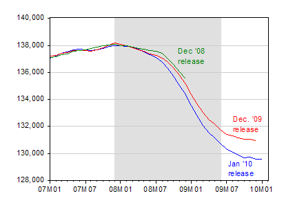
Figure 1: Nonfarm payroll employment, in thousands, seasonally adjusted, from January release (blue), December 2009 release (red) and December 2008 release (green). NBER defined recession dates shaded gray, assumes recession ended 2009M06. Source: BLS January 2010, December 2009 and December 2008 releases via FREDII, and NBER.
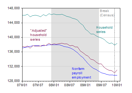
Figure 2: Nonfarm payroll employment, in thousands, seasonally adjusted, from January release (blue), civilian employment (over 16), in thousands, seasonally adjusted (teal) and civilian employment adjusted to conform to NFP concept (dark red). A vertical dashed line shows the break in the household survey based series, reflecting the introduction of new population controls based on Census data. NBER defined recession dates shaded gray, assumes recession ended 2009M06. Source: BLS January 2010, release via FREDII, BLS, and NBER.
As discussed in the Employment Situation release, there are breaks in the population controls. Table B in the release indicate little impact on the unemployment rate. With respect to changes in civilian employment, the Dec to Jan change would have been larger than the one actually published.
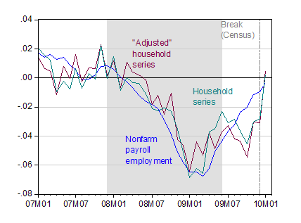
Figure 3: Annualized three month growth rates for nonfarm payroll employment, seasonally adjusted (blue), civilian employment (over 16), seasonally adjusted (teal) and civilian employment adjusted to conform to NFP concept (dark red). Growth rates calculated as log-differences. A vertical dashed line shows the break in the household survey based series, reflecting the introduction of new population controls based on Census data. NBER defined recession dates shaded gray, assumes recession ended 2009M06. Source: BLS January 2010, release via FREDII, BLS, NBER, and author’s calculations.
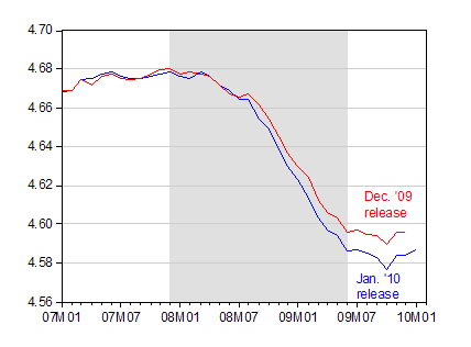
Figure 4: Log aggregate weekly hours in private sector index from Jan. ’10 release (blue), from Dec. ’09 release (red). NBER defined recession dates shaded gray, assumes recession ended 2009M06. Source: BLS January 2010, release via FREDII, and NBER.
Additional coverage: Izzo/WSJ RTE, Reddy/WSJ RTE, CR 1, CR 2, CR 3, Economist’s View, Jeff Frankel.
A large downward revision in the number of people employed — hmmm, wouldn’t have anything to do with the complex averaging that goes on in the birth/death model would it?
Since that has been completely foreseeable for over a year, why doesn’t someone fix it? Why would an economist put up with data that is reliably known to be inaccurate for long periods of time?
Mike Laird, unfortunately many research economists are not willing to throw away the junk data on which they have relied for years to produce papers. A few days ago there was a discussion about census data in Marginal Revolution; read
http://www.marginalrevolution.com/marginalrevolution/2010/02/census-miscounts.html
A question to the professor and readers that are more knowledgeable than me… Isn’t the annually projected 1.8% uptick in total hours equivalent to 200,000 new jobs monthly? If so, how long will the squeeze of the already overworked employees continue before we see either a revolt or a mass hiring in many fronts?
The most positive aspect of this report is that aggregate hours have begun to tick up. I find it to be a much more conceptually appealing indicator of labor force activity than the headline payrolls number. Of course, their movements are very similar as one would expect, though the magnitudes can vary as they did in this recession.