The employment situation report has been well analyzed by a variety of researchers [0], including Jim. Given the noise introduced by weather and new seasonal factors, I thought it would be of interest to see what the experimental series, based on the household survey, indicates.
Figure 1 depicts the establishment based nonfarm payroll employment series, the NFP series ex.-temporary Census workers, and the household survey based research series.
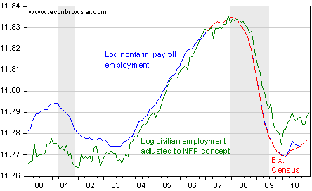
Figure 1: Log nonfarm payroll employment series (blue), the NFP series ex.-temporary Census workers (red), and the civilian employment series adjusted to conform to the NFP concept. NBER defined recession dates shaded gray. Source: BLS via FRED, and BLS, NBER and author’s calculations.
As has been discussed on various occasions, [1] [2] [3] the household series is more volatile. However, if one is concerned primarily with identifying trends, it still might be useful to refer to it. Interestingly, the growth rates (3 mo., annualized) possess similar trends.
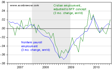
Figure 2: Three month annualized growth rates of nonfarm payroll employment series (blue) and the civilian employment series adjusted to conform to the NFP concept (green). Growth rates calculated as log differences. NBER defined recession dates shaded gray. Source: BLS via FRED, and BLS, NBER and author’s calculations.
Note that this (research) household-survey based series is revised over time, unlike the civilian employment series. Weather could have (and is likely to have) also impacted the household-survey based series, so the purpose of these graphs is not to argue one series is better than the other. Rather, we want to additional series might contain additional information.
Might be interesting to see ADP in there for comparison.
Peak Baby Boomer and Millennial demographics imply that the net growth of the labor force over the next 7-9 to 12-15 years will be no more than 130,000s/month, later 110,000s/month, and eventually less than 100,000/month, as Boomers leave the full-time regular labor market en masse (voluntarily or otherwise), and Millennials increase their labor force participation rate, albeit at just half the level of Boomers during their peak entrance as a share of total population.
Labor force and employment growth will slow from 1.6-2% over the past 50-100 years to less than 1%, and eventually to just 0.5-0.6% by the late ’10s to early to mid-’20s (or no growth, depending upon whether or not the private sector can grow at all due to global structural effects of Peak Oil and population overshoot).
Without a dramatic increase in US immigration, new house sales will track in the 300,000s-400,000s indefinitely hereafter, which is just half the average level from the early ’60s to late ’90s, and less than 30% of the peak level during the unprecedented unreal estate bubble of the ’00s.
The auto-, oil-, debt-, and housing-based growth (and associated private and public infrastructure development) of the peak Oil Age era is over permanently for all practical purposes, owing to the global structural effects of Peak Oil and population overshoot.
Thanks, Menzie. What is unfortunate is that BLS could be benchmarking on a quarterly basis instead of annually. Current estimates are benchmarked to March 2010 could already be updated to June 2010 and produce continuously more accurate preliminary estimates.
A graph of total civilian non-institutional population minus total employed and minus total unemployed helps explain why the unemployment rate is probably going to be restrained from going to much higher for some time. This formula takes out the effect of unemployment rate on the dropout rate (which is highly correlated). Note the surges and then plateaus from 2000 and then from 2008. Not sure what account for 2000 surge but the 2008 surge surely is related to the “Baby Boomers” taking early Social Security Retirement.