Markups, Competitiveness, and the Bush Tax Cuts and Deficits
The Administration released the annual Economic Report of the President on Friday. Many topics were covered, but here I’ll remark upon a few issues, motivated by several graphs.
First is price markup over unit labor cost. The interesting trend since 2001 has been the rise in this variable.
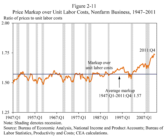
Source: Economic Report of the President, 2012.
From this graph, one would be hard pressed to find American business in terrible shape. Productivity has increased, labor compensation growth has been modest, so that it’s obvious where profits have come from. This also means (to me) that there is substantial space for rising wages to be absorbed without a commensurate wage-price spiral.
As I noted in this recent post, rapid productivity growth combined with slow compensation growth has improved American competitiveness. Nominal dollar depreciation over that period emphasized that improvement.
The next graph decomposes the budget deficit into its constituent components, going forward. The graph highlights the impact of the 2001 and 2003 tax cuts on the Nation’s fiscal prospects. In a word, disastrous.
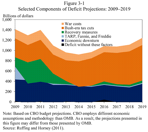
Source: Economic Report of the President, 2012.
Figure 3-1 demonstrates that the much maligned ARRA and other stimulus measures are of minor importance going forward. Rather the sheer magnitude of the economic downturn that started at the end of the Bush Administration combined with the operation of automatic stabilizers was important. But not as important as the exploding costs associated with EGTRRA and JGTRRA and AMT patches.
As I said back in 2006, we would rue the day we engaged on this bout of fiscal profligacy, as the boom became a bust, and the deficits that benefitted primarily the wealthiest constrained our range of fiscal policy. It’s a prediction I think has proven much more right than wrong.
That being said, I believe that policymakers did respond as best they could, given these constraints, under the conditions they inherited from the Bush Administration. To remind readers, CEA notes:
When President Obama took office on January 20, 2009, the U.S. economy was contracting at an alarming rate, and employment was falling by more than 700,000 jobs a month. The plunge in economic activity was even deeper than the Bureau of Economic Analysis initially reported: revised estimates show that the economy contracted at an 8.9 percent annualized rate in the last quarter of 2008, from the initial advanced estimate of 3.8 percent. This was the largest quarterly downward revision ever reported.
Upon taking office, the Obama Administration immediately took bold steps to turn around an economy in free fall. It worked to stem the economic and financial collapse and put people back to work through the American Recovery and Reinvestment Act of 2009 (the Recovery Act), and it shored up the banking system and stabilized the financial sector through a series of measures including stress tests for banks and rigorous requirements for banks to raise private capital and repay the government for funds from the Troubled Asset Relief Program, and it rescued the American auto industry.
Soon after the Recovery Act was passed, the contraction of GDP slowed markedly to -0.7 percent in the second quarter of 2009 from -6.7 percent in the preceding quarter. Economic growth turned positive in the third quarter of 2009, and the economy has grown at an annualized growth rate of 2.4 percent over the past 10 quarters. Private sector employment has grown for 23 straight months, and employers have added a total of 3.7 million jobs in that period.
It bears repeating that ARRA was passed only five months after Don Luskin declared:
in the final analysis let’s just stick to facts. We are not in a recession
It amazes me that so many of the people who denied the likelihood of a long, deep and persistent recession were the same ones who thought no action was necessary (aside from getting rid of regulations), and continue to argue that all we need is a little more deregulation. (For more on the intellectual backing for that view, see this critique.
The entire document is here; the CEA blogpost is here. And for some hysterically funny attacks on the ERP and spirited (and predictable) defense of “job creators” (aka those with lots of unearned income), see here.
Update, 2/26, 2pm Pacific: Readers Rich Berger and hv ask how Figure 2-11 from the Economic Report of the President was generated. Since this seems to be a common question, I decided to actually do the calculation. It took me five minutes to go to the proper section of FRED, download the nonfarm business sector unit labor cost and the implicit price deflator, in excel spreadsheet, enter into my statistical package and generate the below graph.
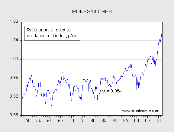
Figure 1: Replication of CEA (2012) Figure 2-11, ratio of price to unit labor cost. Source: BLS data on productivity and costs, downloaded from FRED; series IPDNBS for price and series ULCNBS for unit labor costs. Data downloaded on 26 February 2012.
Since these are indices, then one cannot actually get the actual price to ULC ratio. I have plotted p/ulc, where p and ulc denote indices of P and ULC, specifically (P/Pbase) = p, and (ULC/ULCbase) = ulc. CEA plots (P/ULC). Note (p/ulc)× (Pbase/ULCbase) = P/ULC . I can approximate (Pbase/ULCbase) by setting the share of income going to labor to 60%. The implied price to cost ratio is 1.66. So multiply p/ulc by 1.66 to obtain the following series:
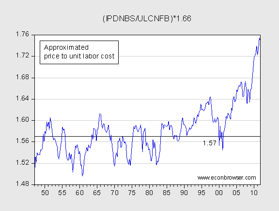
Figure 2: Approximation of CEA (2012) Figure 2-11. Source: BLS data on productivity and costs, downloaded from FRED; series IPDNBS for price and series ULCNBS for unit labor costs; see text for adjustment. Data downloaded on 26 February 2012.
This seems reasonably close to Figure 2-11 in the ERP.
Still, every time Federal tax receipts have picked a recession followed (Please read Econbrowser and comments, Graph 1″ Data: Spending and Tax Receipts, 1967-2011″)
Still the ongoing taxable base is enshrined as an heritage of previous government,designed to be more friendly to capital gains and more neutral to real business development.
Still it takes a lot of GDP and large decreasing wages to create little employment,when reading an industrial base that has regained a large share of its optimal production capacity.The traction is shouldered by increasing government expenditures.
International Economic Trends United States P 42 (International Economic Trends February 2012 Fed St Louis)
When reading this interesting paper from Fed St Louis,one may notice,these last three years capture well,the nations economic sensitivity and industrial efficient suppliers credit.
France is a laggard in every inflexion point of this lost decade (P 3 International Economic Trends February 2012 Fed St Louis)
Labor compensation data does not include payments in the form of stock options.
Since stock options have been the major source of the explosion in the compensation of top executives I wonder how much of this increased markup is really an unrecorded growth in the compensation of top executives rather than an increase in profit margins.
Has anyone seen a good estimate of the size of the increase in stock options and how much it’s omissions distorts the compensation data ??
Figure 3.1 is on page 84 and this comment follows on page 85 –
While demographic trends and rising health care costs pose serious challenges on the spending side of the ledger…
Ah yes, the spending side of the deficit. Let’s just focus on raising taxes and ignore Table 7.1 p 207 in which 4 spending lines related to Medicare, UI and Social Security rack up nearly $1.4 trillion of spending in 2010.
The problem with Fig 3.1 and Menzie’s commentary is that it puts ALL the emphasis on raising taxes. Does anyone not see the lessons of the EU?
Government cannot push spending level/growth to an unsustainable level and then try to justify it by claiming a segment, the rich, do not pay enough in tax. Maybe the rich do, maybe they don’t, but the point is that we have to get control of the spending side of the equation before we can tackle the tax side. Otherwise, we will be raising taxes again in a few years to cover even higher spending.
It’s like rewarding illegal aliens with amnesty but never trying to slow the inflow of illegals. You simply perpetuate the problem and align incentives with behavior that makes the problem worse in the long run.
“Government cannot push spending level/growth to an unsustainable level and then try to justify it by claiming a segment, the rich, do not pay enough in tax. Maybe the rich do, maybe they don’t, ”
The don’t.
billj,
Thanks for making my point. You focus on the tax side and ignore the spending side.
Take at look at this FRED chart – http://research.stlouisfed.org/fredgraph.png?g=590
It compares (federal expenditures)/gdp to (federal revenues)/gdp. Notice that after EGTRRA and JGTRRA in the early 2000’s that the gap between revenue and speding as a share of gdp was rapidly closing because revenue was rising faster than spending, until we approach the start of the great recession. From that point on spending grew at a much faster pace than revenues.
The point is that to retrace our steps back to in the mid 2000’s where tax revenue was growing at an historically rapid rate,we need to reduce spending more than we increase taxes.
In fact, if you look at the chart, you will see that there are few time periods since WWII where tax revenue as a share of gdp was growing at a more rapid rate than it was in the years following EGTRRA and JGTRRA.
-tj,
Federal taxation as a fraction of GDP is the lowest it has been since 1950. As of 2010, the feds collected 14.9% of GDP in taxes. The post-WWII average is 17.7%. Only 1949 and ’50 had lower tax rates. (source: taxpolicycenter.org)
Spending is a problem, but taxation is a bigger one. If we were at average taxation rates for the last 60 years, we’d be bringing in an additional 400 billion dollars a year in taxes. That would cover an additional stimulus bill every other year.
ppcm, I think you are confusing cause and effect. When a recession occurs, it reduces government tax revenue, so it’s mathematically necessary that the prior period was a peak for tax revenue. Tax peaks don’t cause recessions; they appear as peaks because the following period is a recession.
tj: Spending is equivalent to allowing in illegal aliens. Hmm. I should be thankful Hitler didn’t make it into the simile.
Can someone explain how we can have such a dramatic markup in prices without a dramatic jump in inflation?
Nice Menzie. I was noting the similarity between 2 areas where government policy has failed. Both because government is failing to solve the underlying problem.
Maybe you misunderstood so I will clarify. Do nothing about spending and promote tax increases. That doesn’t mean I think all spending is bad for society. Do nothing about the inflow of illegals and promote amnesty. That doesn’t mean I think all illegals are bad for society. Immigration is not the point. If you want to focus on that part of my post then that tells me you can’t refute the main point.
The point is that to retrace our steps back to in the mid 2000’s where tax revenue was growing at an historically rapid rate,we need to reduce spending more than we increase taxes.
In fact, if you look at the chart, you will see that there are few time periods since WWII where tax revenue as a share of gdp was growing at a more rapid rate than it was in the years following EGTRRA and JGTRRA.
Your attempt to associate Hitler with my post is vulgar, insulting and very revealing. You can’t refute the main points in my post, so you try to link my post to Hitler.
I think your readers expect more from you. You could start with an apology to those whose relatives were tortured and slaughtered because they didn’t fit Hitler’s vision of the future.
I can’t believe Figure 2-11 didn’t merit it’s own blog post in and of itself. It is a fascinating graph.
There was obviously a shift to a higher mean in 1980, and a stable one at that.
Then a shift to a rising mean in 1990, but then a shift downward in ’97.
And then a relentless rise starting in 2000 or so.
Explanations?
tj: Thank you for your comments. I gave you credit for not making the allusion, so no apology is necessary. However, you clearly were going down that path — of all the government failures one could look at (ethanol subsidies, ag subsidies, tax expenditures) you pick a highly emotionally charged one. Well, I think I can read between the lines pretty well.
With regard to your argument about tax increases inducing spending increases, well, it barely constitutes an argument, the empirical bases of it being so lacking. I’ll outsource the rebuttal to Jeffrey Frankel, who has repeatedly debunked the starve the beast hypothesis.
By the way, let me return to the issue of inflammatory comments. Guess who wrote this comment about unions:
Perhaps I misunderstand the significance of the price markup over unit labor costs.
The implication seems to be that there is “price gouging” going on. But if the chart is simply measuring the cost of labor as a percentage of selling price, that implication may be quite fallacious.
The presumption is that because the price markup was roughly 1.5 times labor costs for 50 years that it should remain that way into the future. Why?
The movement of labor to lower cost areas and general efficiency improvements should have made labor less significant. The change in the relationship of labor costs to total seems coincidental with massive outsourcing of labor. Two things that are currently happening… the increasing cost of labor in China and the renegotiation of labor contracts in the U.S. … are making manufacturing in the U.S. more attractive than it has been for a decade.
Again, I may not understand the significance of the graphic, but it seems to be indicating that other costs may be replacing labor costs and that doesn’t necessarily mean stock options.
Furthermore, if labor costs dramatically dropped over the past decade, it doesn’t follow that markups have been excessive. It just means that there may be room for some profits rather than taking a loss. A good example would be the U.S. automotive industry that couldn’t make a profit on a small car ever. Now those small Chevys and Fords are profitable. That doesn’t mean that Ford and Chevy are doing something wrong or are defying the dynamics of the marketplace by overpricing their products. It may mean nothing more than the labor portion of the price equation is finally making sense on a global scale. Small Fords and Chevys are priced competitively with Korean brands and returning a profit on investment. That insures future products and jobs. I guess the solution is to raise costs out of line again.
Help me understand if I’m way out of line here.
Menzie, if you included corporate profits, that would further reveal as nonsense the idea that lowering corporate taxes would stimulate employment.
tj This isn’t one of your better days.
Medicare, UI and Social Security rack up nearly $1.4 trillion of spending in 2010.
UI is up because we’re working our way through a severe recession. Social Security does not add to the debt. Medicare is increasing, but not as fast as private health insurance. We need to control Medicare spending, but you do that by controlling healthcare costs in general. And that’s why Obamacare was a small but important step in the right direction. Obamacare reduces the cost of healthcare, albeit not nearly enough.
Notice that after EGTRRA and JGTRRA in the early 2000’s that the gap between revenue and speding as a share of gdp was rapidly closing because revenue was rising faster than spending
The economy was operating near potential GDP. We should have been running a surplus.
In fact, if you look at the chart, you will see that there are few time periods since WWII where tax revenue as a share of gdp was growing at a more rapid rate
Your chart shows no such thing. Revenue growth was fairly typical for a recovery. But revenue is more than just income taxes. FICA and other taxes are what grew:
http://en.wikipedia.org/wiki/File:U.S.-income-taxes-out-of-total-taxes.JPG
Menzie Chinn: When you looked at Figure 3-1 from the 2012 ERP, didn’t it strike you as odd that there is ZERO impact either recent or future deficits from spending increases?
And didn’t you find it odd that the amount of future deficits “caused” by the 2001 and 2003 tax cuts INCREASES even after the budget assumes the tax cuts for ‘the rich’ are reversed?
Put your glasses on and take another look.
tj gibbers: Ah yes, the spending side of the deficit. Let’s just focus on raising taxes and ignore Table 7.1 p 207 in which 4 spending lines related to Medicare, UI and Social Security rack up nearly $1.4 trillion of spending in 2010.
America’s current pisses away more than 1.4 trillion per year on endless pointless unwinnable wars. Don’t like the deficit? Slash military spending. End the endless pointless unwinnable foreign wars.
Problem solved.
tj,
Don’t you know it is easy to reduce the debt? All we have to do is raise taxes to 101% of GDP.
Kenneth Gould: Thank you for your comments. Since I have read the underlying document, I think I understand why the graph looks the way it does. I suggest you do some reading yourself. My discussion (with hyperlinks) is in this post.
The data is the data. You can dice it how you like, but in the end the chart shows exactly what I said it did and the Table I cited shows exactly what I said it did. If it doesn’t fit your narrative then tell the CBO and BLS/Commerce.
The budget was headed toward balance before the recession. It is beginning to move back in that direction now. But then, why waste a good economic crisis? Let’s take the data out of context and use it to promote tax increases.
One thing that is misleading about 3.1 is that if you returned rates to pre EGTRRA and JGTRRA levels, but kept AMT patches (the most recent being last year’s), the gold band would be about half as broad as it is now. Maybe it will narrow considerably as the economy continues to pick up speed, even with further AMT patches (in lieu of indexing it), I don’t know. But since no one is proposing to do away with those patches, the baseline seems a bit skewed to me.
tj How you concluded that the budget was headed towards being balanced before the recession is absolutely beyond me. In 2007 the economy was at potential GDP and we still ran a unified deficit of 1.2% of GDP. Did you think that the economy was going to somehow operate indefinitely above potential GDP??? But look at the data a little closer and your argument looks even crazier. First, when the economy is operating at potential GDP we should be running a surplus, not a deficit. When the economy is at capacity and still generating deficits, then those deficits are structural. That’s what Bush gave us…structural deficit. Second, look at the on-budget deficit, because that’s the part that the President controls. The on-budget deficit in 2007 (Bush’s best year) never got below 2.5% of GDP. By way of comparison, that’s more than the hapless Jimmy Carter’s average deficit over his four year term. Carter’s worst year was 2.7% and that was during a recession year (1980). And you guys are always going on about how Carter ran out of control deficits.
Menzie-
Can you tell me how the numbers behind the chart 2-11 were calculated? Not just in words, but specifically so that I can find the series and check the calculations? The chart list sources, but is unclear which one since it seems to be based on data from BEA and BLS and “CEA calculations”.
“First is price markup over unit labor cost. The interesting trend since 2001 has been the rise in this variable.”
It seems to me that the breakout of the range took place after the recession in 2007. Prior to that it was returning to the level it reached during the Clinton administration. I am told by reliable sources that the Clinton era was a golden age of higher taxes and surpluses.
One of the most disappointing trends in academia is that with the introduction of “macroeconomics” economists are no longer conversant in accounting and usually totally ignore it. Accounting is important because it drives decisions that macroeconomists try to manipulate in aggregate. Below is an excellent analysis a friend gave me yesterday.
If you look at today’s WSJ OP-Ed about Obama’s dividend tax proposal you will see that he plans to raise the tax to 39.6%…then you tack on phased out deductions to get a top bracket effective rates of 41%…and then you add the Obama Care tax and you move up to 44.8%…on dividends…and if you remember that the corporate earnings would already be taxed at Obama’s new low rate of 28%…you would seem to get an effective rate of distributed C-Corp earnings of 72.8%! (Somehow the WSJ adds up the present 35% corporate rate with the 44.8% dividend rate projection and gets 64.1%; I don’t know how they do that or what assumption they are making without revealing). In any case you can see that Obama’s corporate tax structure is schizophrenic with regard to the purpose of competitiveness or job formation.
Rich Berger: I certainly don’t have the time to figure this out (and I don’t use research assistants to help me out on the blog), so here’s a guess, based on how I would approach this: I would go to FRED database, see go to the productivity and costs subsection, pull up the unit labor costs and the price deflator for the appropriate sector, and do the division and normalization. I am interested if you can replicate broadly what is there. Of course, to do this right, one would probably need to know some institutional details regarding the coverage, nature of the surveys that are used to generate the series, etc.
Menzie-
Thanks. I notice that this chart is being publicized in various places, and I wanted to know how it was created. Maybe I should ask the President – it comes from his report. Do you have his cell phone #?
2slugs,
Can you cite all the cases, excepting the late 90’s when we were at potential GDP and we ran a budget surplus? Again, your theory is spot on, but your arguement lacks pragmatism.
Tax receipts began growing at a rapid rate shortly after the ~2000/1 recession. How do we jump from recession to potential GDP in a year or 2?
Menzie & Rich,
A bit jury-rigged, but labor’s share (available on FRED) is seen as the inverse of markup over unit labor cost (also available on FRED). So in Excel:
(Labor’s Share)^(-1)*(Unit Labor Costs)=Markup (as a %).
(Markup * 100)/ULC = Ratio
Not on the same scale, but eyeballing the results says its the same pattern as the EPR. Add a constant or something to raise the damn thing up.
And Menzie, what good are grad students if they’re not helping you with this stuff? You’re just too damn nice (now how many times do you get to hear that on this blog?) 🙂
For TJ and 2Slugs:
https://research.stlouisfed.org/fred2/graph/?graph_id=66982&category_id=3901
By my quick count (didn’t bother figuring out if I was matching correct fiscal year to calendar year) we have had 8 to 9 times we’ve been above potential GDP AND had a surplus (annually). Two of those were in the ‘late 90s’ so we’ll go with 6 to 7.
In the sample there were 30 times GDP was above potential; again, we’ll drop the late 90s. So we’ve run a surplus at the ‘correct’ time 20 to 23% of the sample.
When we didn’t run a surplus, the deficit averaged 17% of GDP (note: surplus & deficit data is nominal so I used nominal GDP for the denominator; NGDP is not included in the linked chart).
The average of all deficits is ~23% (and no, I didn’t include deficits since 2008 since I figured that would cause someone to cry wolf), so it would appear while we don’t always adhere to the idea of when to run a surplus or not (and this is all rather quick and dirty) we have done so in the past and have at least cut back on the spending relative to when we are below potential.
Two final points:
1) When the economy was running above potential under GWB (govt. fiscal year 2004 to 2007) the deficit average 22.5% of GDP. 2007’s was 11.5%. I’m not sure if this is what TJ means by being close; it is number 16 in listing all deficits from smallest to largest (does not include surpluses).
2) Not sure I agree with TJ’s assertion regarding tax receipets growing rapidly either. Y-o-Y growth in the 00s did see 2005 and 2006 in the ‘top’ years (#13 & #18 respectively) but 2007 was #41. To put this in some perspective here’s Average Y-o-Y receipt growth:
50s 9.3%
60s 8.4%
70s 9.9%
80s 7.9%
90s 6.2%
00s 4.5%
And the 00s have had 2000, 2001, 2008, 2009 removed (talk about cherry-picking).
Damn. I suppose I shouldn’t make fun of Menzie for not using grad assistants; instead can I be a grad assistant so I’m not pulling data?
tj I always take the opportunity to brag about the family history. Uncle Lyndon ran a budget surplus in 1969…remember, back then FY1969 ran from 1 July 1968 thru 30 June 1969, so the FY1969 budget is considered LBJ’s budget rather than Nixon’s.
Over the 2001Q2-2003Q1 timeframe the output gap average ~0.6% of potential GDP. Today’s output gap is roughly 10 times that size. In other words, the 2001 recession was very mild and very short-lived. That’s how we “jump” from recession to potential GDP quickly…not really much of a jump. Maybe an old lady jump.
As to my argument lacking pragmatism, why is it impractical to recommend a fiscally responsible policy? Hey, it was only a dozen years ago when we not only ran surpluses, but Greenspan’s big worry was that by the end of the decade there might not be any publicly held debt, which he feared might hamper Fed operations.
I’m all for running a very large cyclical deficit over the short run. As Menzie’s chart makes clear, cyclical deficits are transitory problems. But over the longer run we will have to at least run significant primary surpluses if not absolute surpluses. That means allowing the Bush tax cuts to expire. Of course, we’ll need a lot more than that, but killing off the Bush tax cuts would be a good start.
“Figure 3-1 demonstrates that the much maligned ARRA and other stimulus measures are of minor importance going forward.”
I’m not sure what figure 3-1 demonstrates “going forward,” or even for the present or recent past. For one thing, who knows what government programs would have been undertaken if the “Bush era tax cuts” had not been undertaken. The graph appears to assume that the extra government collections would have been saved (the deficit would have been smaller). I respectfully question this assumption. And if Bernanke’s shortsighted policies bring Europe to the brink again, the future may look very different from that portrayed in the figure. (For those who would attribute greater perspicacity to him than to Greenspan, I would remind that Ben voted with Alan on every single vote when Alan was Chair.)
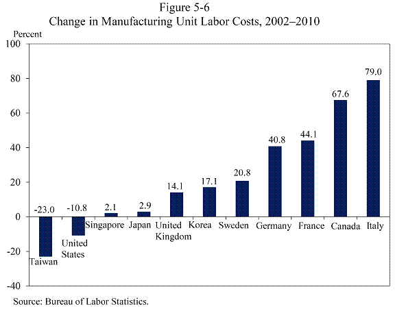
As for figure 5-6. I’m not sure it demonstrates anything other than a change in the composition of manufactures. This cannot be measured with standard output statistics, because important changes have occurred within industry categories, as parts of various production processes are outsourced.
Ricardo:
“Somehow the WSJ adds up the present 35% corporate rate with the 44.8% dividend rate projection and gets 64.1%; I don’t know how they do that or what assumption they are making without revealing.”
Take $100 of corporate profits taxed at 35%. Add $65 in dividends taxed at 44.8%. That is, add $35 + $29.12 (= $65 X .0448). The result is $66.12.
Ricardo
“44.8%…on dividends…and if you remember that the corporate earnings would already be taxed at Obama’s new low rate of 28%…you would seem to get an effective rate of distributed C-Corp earnings of 72.8%! (Somehow the WSJ adds up the present 35% corporate rate with the 44.8% dividend rate projection and gets 64.1%; I don’t know how they do that or what assumption they are making without revealing).”
It’s the magic of compounding. Using the WSJ’s numbers … start with one dollar of C-corp earnings and you pay 35 cents in corporate taxes leaving you with 65 cents. You then pay 44.8 percent of 65 cents NOT of the original dollar in individual taxes leaving you with 35.88 cents thus the combined effective rate is 64.12 percent. Lower the corporate tax to the 28 percent mentioned above and you get 60.26 percent.
It doesn’t seem to me that anyone has explained where the data in Table 2-11 is sourced.
Great graph but where oh were did those numbers come from?
The closest I can come is Table 13 of the BEA’s GDP report.
A simple and logical definition to me would be
Markup = (Price/Unit)/ (Unit Labor Cost)
Lookiing at the Q3 2001 GDP Report issued in Dec. 2011 the following #’s are reported in Table 13.
Price/Unit =1.12
ULC = 0.686
Markup = 1.63
This table appears to be in nominal $’s
So maybe the Table 2-11 is chained to 2005 $’s or some other conversion to real $’s.
Table 13 makes it appear that Price per Unit is growing faster the ULC… so in Real $’s the Markup may be impacted in the direction indicated in the Graph 2-11.
However since 2007 about 30% of corporate profits increases are derived from lowering their cost of capital… So if I have my facts right there should be two graphs.
Table 2-11 which describes the relationship between workers and corporations.
And a second graph which shows the relationship between corporations and investors who fund their debt. The government is the enabler of these activities with their ZIRP (zero interest rate policy).
So if we try to link this to cause and effect.
In Act I: We have those corporations hoarding profits at the expense of their workers.
In Act II: We have the government stepping in to “fix things” by penalizing those who fund the corporations.
To say more would be an exercise in commenting on values and this is not the venue.
Look forward to some comment on the “Markup Calculation”
To hv,
I tried your method but the pattern does not look all that close to Figure 2-11.
Additionally:
*Since this is a ratio it doesn’t need to be adjusted for inflation (assuming both the price of goods and labor moved similarly in the past).
*The Price/Unit variable you reference refers to real gross value added so it’s not the same as price/unit.
*I personally have enjoyed Karl Smith’s analysis on this chart(http://modeledbehavior.com/2012/02/21/beyond-industrialization/). I point it out because I don’t think the point of the chart is to discuss that capital costs have recently decreased (I would add that the ratio has been rising since 2004 but I don’t think your real point is the 2007 timeline) so much as the value of labor is shifting. As we move to a point where innoviation is valued more than butt-on-the-line(industrialization) we will see a change in labor compensation.
*And if you can innovate, why do it for someone else? Do it for yourself and pay yourself more. The ratio will get bigger.
*I can’t claim to have perfectly figured out Figure 2-11, but I think my method (explained in the comments above) was darn close. The y-axis is off, but the pattern is the same (so the story is also the same).
As for the rest, I can’t say I agree, but let’s save it for a different post.
Rich Berger and hv and finn0123: See the update at the end of the post.
Thanks Menzie; appears the 60% was the part I was missing. Is the 60% (1.66) taken from the standard Cobb-Douglas assumption of labor’s share or somewhere else?
Menzie-
Thanks for your explanation – I will try to replicate your results.
Your citing of Don Luskin’s predictions reminded me of another, even more famous prediction – Hope and Change
finn0123: I was going off memory. As of 2006, the labor share of income was about 64%, and it’s been decreasing over time, so 60% is a rough guess. 66% used to be the rule of thumb, based on a Cobb-Douglass production function.
Thanks for kind comments to my post.
Let me try to restate my point.
If profits rise due to falling capital costs and labor costs are constant, then a graph like the one in Table 2-11 must show that profits or markups rise relative to labor costs.
The implication (but unproven fact) is that there is a causal relationship between the two (markups and the cost of labor).
Now that Menzie (and others) have confirmed the data, it seems the question should be:
Is there a causal relationship… is the Y-axis related to the X-axis?
If, Y is not a function of X, then is Table 2-11 appropriate?
Thanks for your patience with my interest.
Thanks Menzie; I think I was able to nail down the source. The chart sources the BEA, NIPA and Table 1.15 gives us a price to cost ratio round 1.63 in 3Q 11.