Updated, includes summary of an econometric analysis of impact of austerity in the UK
Prime Minister Chancellor of the Exchequer Osborne has lauded the recent UK growth numbers as validation for the policy of austerity [1] (recently relaxed, although he doesn’t mention that).
Paul Krugman refers to the the Three Stooges in explaining the deficiencies of this logic. And Richard Portes (head of CEPR) states:
“The current policies have been disastrous…My view is pretty much the view I had a little over three years ago when I said the austerity program would be a disaster. And it has been. It has been responsible for the painfully slow recovery.”
So who is right? Well, I think it useful to compare the US and the UK. The former embarked upon a policy of fiscal stimulus, and then retrenchment, but nothing compared to the retrenchment implemented in the latter. And in the US, per capita GDP growth was much more rapid than in the UK.
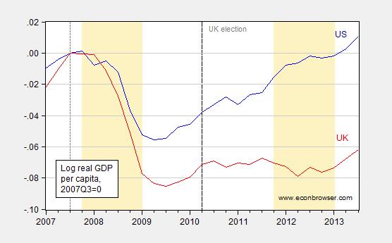
Figure 1: Log per capita US GDP, in Ch.09$ (blue) and per capita UK GDP, in Ch.2010£ (red), all 2007Q3=0 (short dashed line). Long dashed line at 2010Q2, election of Osborne. UK population is annual midyear data from IMF WEO, interpolated using quadratic match. OECD defined UK recession dates shaded light tan. Source: BEA, ONS, IMF WEO database (October), OECD via FRED, and author’s calculations.
The gap between the US and UK per capita income series is 7.3% as of 2013Q3. So, the current growth in the UK is merely digging that economy out of the big hole dug for itself in the vain search of expansionary fiscal contraction. [2].
For a longer perspective on UK per capita GDP — and how big a break the current trend is — see this Simon Wren-Lewis post (actually, Mainly Macro is the best blog on UK macro, so always good to refer to).
Update, 12/28, 7AM Pacific: Oscar Jordà reminds me of his work with Alan Taylor. From VoxEU:
In a new paper we exploit a treatment-control design using statistical techniques designed for situations, experimental or otherwise, where underlying allocation bias may prevail (Jordà and Taylor 2013). This turns out to be a serious problem here, as in many other macroeconomic contexts where endogenous policy actions epitomise the “insufficient randomisation” problem.
…
To provide illustration, we apply our estimates to make an (out-of-sample) counterfactual forecast of the post-2007 path of the UK economy without the fiscal austerity policies imposed by the coalition government after the 2010 election.
Two assumptions may be needed to make this exercise relevant. First, we assume that the UK had fiscal space and was not forced to do austerity; this may be defended in that real GDP is now worse than was expected in 2010, and debt to GDP higher than expected, yet gilt yields remain ultra-low in real terms (and at their lowest nominal level in their 280 years of recorded history). Second, we assume that policymakers care about timing fiscal adjustments so as to mitigate damage to the real GDP path of the economy; this is, at least, an oft-stated goal of most policymakers.
The results are presented in Figure 1, where we show actual and forecast paths for UK real GDP from 2007 (the business cycle peak) through 2013. How much of the poorer outturn can be attributed to the fiscal policy choice of instigating austerity during a bad slump? The answer, using our model as described above, is about 60%. Without austerity, UK real output would now be steadily climbing above its 2007 peak, rather than being stuck 2% below.
Figure 1. UK actual path and counterfactual path without austerity
The residual relative to the forecast could be accounted for by various omitted factors, as has been noted (Davies 2012), such as export patterns in the Eurozone and idiosyncratic UK sector shocks. There could also have been over-optimism in the 2010 forecast. However, a major caveat suggests that we likely have a biased underestimate of the effects of current UK austerity. This caveat is the zero lower bound, when fiscal multipliers are known to be much larger in both theory and evidence. Our UK out-of-sample counterfactual does correspond to a ‘liquidity trap’ environment, but our in-sample data overwhelmingly do not.5 Thus our estimate of austerity’s effects in the UK is probably conservative.

Update, 12/29, 11:15AM Pacific: Steven Kopits still asserts the fiscal austerity story doesn’t work, and cites the cyclically adjusted balance figures. I don’t understand his argument; let me present two graphs to show why I don’t understand his argument. One is the level of the primary (ex.-interest payments) cyclically adjusted budget balance to potential GDP ratio, from the IMF Fiscal Monitor, and the other the first difference, for the US and UK.
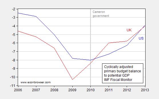
Figure 2: Cyclically adjusted primary budget balance as a share of potential GDP, in percentage points, for US (blue) and for UK (red). Source: IMF Fiscal Monitor (October 2013), Statistical Table 2.
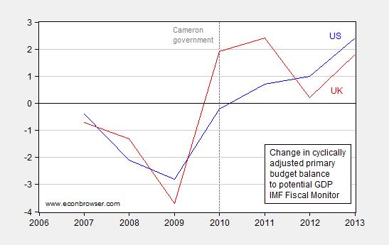
Figure 3: Change in cyclically adjusted primary budget balance as a share of potential GDP, in percentage points, for US (blue) and for UK (red). Source: IMF Fiscal Monitor (October 2013), Statistical Table 2, and author’s calculations.
The UK moves from a bigger structural deficit to rough equality by 2010; given the Cameron government is elected in the middle of 2010, this is a pretty remarkable pace of consolidation. Then in 2011 it moves to more than entire percentage point’s worth of GDP smaller deficit. The changes in 2011 and 2012, shown in Figure 3, are pretty remarkable. In 2012, in accord with IMF suggestions (I’m not claiming the Cameron government took the IMF advice; they relented for their own reasons), the UK moved toward a more expansionary fiscal policy toward the end of the year. So I am not surprised that from the middle of 2013, growth resumed — it’s a pretty standard neoclassical synthesis story.
I missed the moment when Osborne become prime minister.
Running budget deficit at 6.8% (up from 5.6% for FY2012/13) can hardly be called austerity. Also not sure they can increase it much further given the debt level at 79% and state sector worth of 65% GDP. There are implications for productivity and debt sustainability.
Funny Ivars 🙂 Correct that part please, MC.
Mainly Macro is indeed a very informative blog though!
The UK has nearly double the total debt to GDP that the US has.
http://www.gfmag.com/tools/global-database/economic-data/11855-total-debt-to-gdp.html#axzz2oaohNUAE
It’s laughable to expect them to grow out of that. It’s also laughable to expect them to compete with the US given our numerous advantages over them. I do find it amusing that your solution would be to increase their debt to gdp higher on the hilarious notion that you get an economic return from political spending.
You may want to plot the employment-population ratio of the UK vs the US for another perspective.
Also: the UK economy has seen a large fall in productivity. The fact that this productivity drop has been sustained for five years suggests this is not just labour hoarding. So it looks like the UK economy has “aggregate supply problems” (e.g. from a still-broken banking sector) rather than “aggregate demand” problems that fiscal policy could fix.
“Prime Minister Osborne” so Cameron resigned as PM!!
Funny Arthur:-)
If austerity has a hard time performing as promised then lets redefine the word “austerity”. How about we define it to something that has a tight correlation with economic growth. Then how could anybody be against austerity and how could it fail to be popular?
As long as you do it on a blog for 5’th graders how could that strategy (for improving performance and popularity of austerity) fail?
Because the austerian here cannot refute the substance of MC’s Post, they focus on mislabeling!
arthur,
“Also not sure they can increase it much further given the debt level at 79% and state sector worth of 65% GDP. There are implications for productivity and debt sustainability.”
Exactly what are these implications and at what level of debt? Or do you not know the numbers, but your gut is sure that a problem exists? We have alot of people out their touting these “dangerous levels” with no proof of the danger and implications.
my argument is not against possible debt problems. my argument is against people who state as fact these debt problems without any model or proof to show this is the case. simply back these numbers up with something beyond a statement with arrogance!
Lets just cover the basics and point out that when a country can borrow at negative real interest rates, then the “models” for the “catastrophy of increased debt” falls apart.
However, the models for permanent loss of the wealth that an unemployed person would have produced had he been employed (rather than sitting idle) – they remain strong and valid regardless of interest and debt rates.
The UK budget also shows a big problem with the idea of “austerity” when you are committed to social expenditures. While they’ve cut many programs, the actual level of social spending has risen. What has been cut – and I think the disaster in that shows – is public investment.
My take is the cuts to public investment spending reduce future productive capacity while also signaling the business community now that this will be the case. That induces business to spend less now. Indeed, if you look at current numbers, if not for the forcing of money into housing, things would look much worse.
Hans and Ivars: Indeed! Error corrected (and unlike some, I admit it!).
Austerity was never implemented for fiscal correction. It was implemented as a way of creating the largest ever transfer of wealth from the poorest in society to the richest in society.
A while back, the Brits cut excise taxes on petrol and diesel to consumers while increasing taxes on producers. In the background North Sea oil production continued to decline. That move struck me as highly incompetent, and a signal to what extent the Brits remain wedded to myopic special-interest politics.
Can expansionary fiscal policy compensate bad policy? Can expansionary monetary policy paper over bad security policy such as the Vietnam War or US support for Israeli nuclear weapons and the on-going settlement of the remaining bits of the Palestinian mandate taken by military force in 1967?
Shakespeare,
You have austerity confused with socialism. The socialist Lords always have plenty to eat as they distribute what remains to others based on political loyality. Austerity is a consequence of the inability of government to service excessive government spending. Have you ever heard the term austerity applied to businesses in the free market?
from Ricardo:
“Have you ever heard the term austerity applied to businesses in the free market?”
When applied to businesses it’s called restructuring.
It’s much the same thing though: Fire lots of employees, sell off or dismantle poorly performing branches, decrease wages etc.
Menzie Chinn:
“…Well, I think it useful to compare the US and the UK. The former embarked upon a policy of fiscal stimulus, and then retrenchment, but nothing compared to the retrenchment implemented in the latter. And in the US, per capita GDP growth was much more rapid than in the UK.
[Graph]
The gap between the US and UK per capita income series is 7.3% as of 2013Q3. So, the current growth in the UK is merely digging that economy out of the big hole dug for itself in the vain search of expansionary fiscal contraction…”
The UK has suffered a negative labor productivity shock since 2007. This is an aggregate supply (AS) problem that neither fiscal nor monetary policy can do much to remedy.
According to The Conference Board:
http://www.conference-board.org/data/economydatabase/
Real GDP per hour worked declined by 2.5% between 2007 and 2009 in the UK, and in 2012 it was still 2.2% below its peak in 2007. In contrast US real GDP per hour worked has increased every year since 2007, and as of 2012 was up by 5.6%. In log terms the gap between US and UK labor productivity since 2007 reached 7.8% as of 2012. This more than accounts for the 7.3% difference in real GDP per capita growth between 2007Q3 and 2013Q3.
This underscores the fact that the appropriate way of comparing the effectiveness of policies meant to affect aggregate demand (AD) is in fact to compare AD, that is nominal GDP (NGDP), not real output or real GDP (RGDP), since shifts in short run aggregate supply (SRAS) can change RGDP just as easily as shifts in AD can.
The following is the graph of logged NGDP per capita for the US and the UK indexed to zero in 2007Q3:
http://research.stlouisfed.org/fred2/graph/?graph_id=152889&category_id=0
It should be clear from looking at the graph that US and UK NGDP per capita performance was very similar until between 2011Q3 to 2012Q2 when a noticable gap opened up. Could fiscal policy have played a role?
In my opinion the most objective way of measuring fiscal policy stance is the change in the general government cyclically adjusted balance, particularly the cyclically adjusted primary balance (CAPB). The cyclically adjusted balance takes into account any changes in the general government budget balance due to the business cycle. Thus changes in the cyclically adjusted balance are mostly due to discretionary fiscal policy, and consequently may be taken as a proxy for the degree of fiscal stimulus. The CAPB goes a step further, factoring out changes in net interest on government debt and thus ensuring that practically all of the changes in fiscal balance are discretionary in nature. The best place to find CAPB data is the IMF Fiscal Monitor. You can find the CAPB on the bottom half of Table 2 on page 70:
http://www.imf.org/external/pubs/ft/fm/2013/02/pdf/fm1302.pdf
Between calendar years 2007 and 2009 the UK’s CAPB decreased by 5.1% of potential GDP, or exactly the same amount as the US’. This in part reflects the UK’s own fiscal stimulus, which although at 1.9% of GDP according to the OECD:
http://www.oecd-ilibrary.org/docserver/download/3010061ec106.pdf?expires=1388087636&id=id&accname=guest&checksum=267D0ED56AE10D561847FB270C62E357
was approximately the third the size of the US’s fiscal stimulus, was nevertheless still significant, with over three quarters of its fiscal effect due to the reduction in the VAT from 17.5% to 15.0% during calendar year 2009.
In 2010 and 2011 the UK’s CAPB increased by 1.9% and 2.6% of potential GDP respectively. This partly reflected the increase of the VAT from 15.0% to 17.5% in 2010 and to 20.0% in 2011. (Note that the change in government took place in early 2010.) In contrast the US CAPB decreased by 0.2% of potential GDP in 2010 and then increased by 1.0% of potential GDP in 2011 as fiscal consolidation got underway there as well, largely as a result of the unwinding of the US fiscal stimulus.
The UK’s CAPB decreased by 0.2% of GDP in 2012 as fiscal consolidation was paused. In contrast the US CAPB increased by 1.1% of potential GDP in 2012. Thus it is somewhat ironic that the gap in NGDP per capita growth mostly opened up the very year the UK’s fiscal policy stopped being more contractionary than the US’.
Perhaps policy lags can explain this. Typically the major models assume that something like 80% of the level effect of government spending changes occurs in the first year of impact rising to near 100% the following year, and 40-50% of the level effect of tax changes occurs in the first year of impact rising to near 90% the following year. Since most of the fiscal tightening involved VAT increases, this might explain why the tax increases in 2010 and 2011 did not have much effect until 2011Q4 through 2012Q2. But I also suspect that monetary policy may be playing a role, as both the UK and the US have had large QE programs and each has been done in fits and starts since November 2008.
Finally, in 2013 the UK’s CAPB increased by 0.9% of potential GDP. By way of comparison the US CAPB increased by 2.3% of potential GDP. It’s perhaps too early to judge the effects of these most recent fiscal consolidations, but as the mystery of the unusually long lagged effects of UK fiscal consolidation suggests, perhaps the effects of monetary policy need also to be considered here.
Mark A. Sadowski: Well, I’m all for using cyclically adjusted budget balances. See the discussion in this post. I think it validates my view that the UK tried austerity before relenting (see discussion here).
Ivars, beats me by four hours – a lot in the nuclear age…
Professor Chinn, you are most graceful and a honorable and righteous man.
Hans, I just happen to live in the right time zone:)
Thanks Professor.
Uncle George’s book:
Restoring Public Debt Sustainability
George, as readers will know, instituted the first fiscal policy council, in Hungary. He had the singular pleasure of being evicted from the country for his efforts, but now sits on the fiscal policy boards of Peru and Portugal, if I understand correctly.
For those interested in such institutions, this would be the book to read.
Available at Barnes & Noble:
http://www.barnesandnoble.com/w/restoring-public-debt-sustainability-george-kopits/1114902358?ean=9780199644476
@Mark Sadowski, the supply side shock came about due to a AD shock. Once you restore the AD deficiency problem, the supply side should take care of itself.
There is no reason to believe that the UK just magically suffered a supply-side shock.
Lets entertain these supply sideres, what policy prescription do they subscribe to that is choking off the AS of the British economy.
I love how supply siders magically claim that the UK economy is suffering from supply side problem, but fail to point out these problems.
Yves Smith has an interesting essay about some monetary basics :
http://www.nakedcapitalism.com/2013/12/essays-monetary-theory-policy-nature-money-continued.html
for humble people like Menzie and me.
Antiderivative,
“Mark Sadowski, the supply side shock came about due to a AD shock. Once you restore the AD deficiency problem, the supply side should take care of itself.
There is no reason to believe that the UK just magically suffered a supply-side shock…”
A near 8% relative decline in labour productivity is “no reason”?!? What planet do you live on?
There is little reason to believe that shifts in AD necessarily cause huge shifts in AS. That’s some very funky macroeconomics that you’re peddling there.
And who is a “supply sider”?!?
Apparently *you* are, since evidently it is *you* who thinks aggregate supply can easily and substantially changed by mere changes in public policy.
I’m merely pointing out the most one can expect from demand side policies is to regulate demand. And by that measure the UK was doing relatively well compared to the US, at least through 2011Q3.
Now go listen to the voices in your head. Evidently Laffer, Mundell, Wanniski, Reagan and Thatcher are calling.
Regarding Figure 1,
the graph police ask, how many of your readers are more comfortable with log change, and how many are more comfortable with % change
TGP also ask why you did not show a longer time series, with one series offset so peaks conincide; it may sound clunkier, but when you show timeseries with selected endpoints and one point as 100%, the reader doesn’t know if you have selected out choice data
TGP also think your sources are insufficiently preciese; “http://www.imf.org/external/pubs/ft/weo/2013/02/weodata/index.aspx” is not exactly a source
TGP encourage bloggers to find a format that allows precise sourcing, perhaps a cached form of the exact webpage from which the data were taken
So, there are three theories of why the UK did comparatively poorly compared to the US:
The UK had too much austerity
Government net borrowing in the US decreased more than that of the UK by i) 2% of GDP from 2009-2013; ii) 1.2% from 2010-2013; iii) 2.3% from 2011-2013, and iv) 0.8% from 2012 to 2013. For any period you would care to measure, government borrowing fell faster in the US than the UK. Austerity, as measured by actual government borrowing, was greater in the US through the entire period.
We can also look at the general government structural balance. Compared to 2013, government structural balance in the UK decreased more than that of the US by i) 2.4% of GDP from 2009-2013; ii) by 0.3% from 2010-2013; but the US structural balanced decreased by more thereafter iii) by 1.3% from 2011-2013, and iv) 0.6% from 2012 to 2013.
Thus, arguing based on structural balance would suggest that the 2009 period was decisive for 2013 outcomes. In the last three years, however, there’s not much to differentiate the US from the UK in this regard, and in the last two years, the US tightened more. Thus, criticizing UK policy based on structural balances hinges on the 2009 differential in policy. I think this is a thin reed.
Nor can the British be criticized on the basis of employment. In 2008, the US and UK unemployment rates were virtually the same. Subsequently, the US unemployment rate grew faster, but UK and US unemployment rates are virtually identical today again. If you want to criticize, it would be US policy in 2009 and 2010, not British policy today.
Nor can we credit the output gap. The US output gap was higher in every year since 2009, and it’s still higher than the UK output gap. Now, I personally believe the output gap as a statistic is garbage, but if I believed it, the UK has done a better job of managing it than the US.
Thus, the IMF WEO suggests that UK policy was not more contractionary than the US. Indeed, by most measures, it supports the opposite conclusion.
As Mark Sadowski points out, it just ain’t there in the data, unless you are willing to ascribe singular importance to events more than three years ago.
Monetary Policy
But things aren’t much better for market monetarists either. In principle, a looser monetary policy should lead to higher inflation, implying higher NGDP, which it turn should foster higher RGDP. (But maybe I don’t understand the theory correctly; no doubt Scott Sumner or someone else will excoriate me for my ignorance.)
As it turns out, UK inflation has been much higher than that of the US. Since 2009, the UK CPI is up 14%; the US is up 8%. But GDP at constant prices is up only 4.4% in the UK, 9.0% in the US. Thus, higher inflation is paired with lower RGDP growth–a problem for the Scott Sumners of the world.
If the difference is monetary policy, it’s not the monetary policy associated with inflation.
The Oil Theory
This leaves us with the Oil Theory. The Oil Theory states that, if oil is a binding constraint, then those who produce more of it will be better off.
So let’s take a look at oil production:
UK oil production averaged 1.42 mbpd in 2009, falling by 7% in 2010, 18% in 2011, 15% in 2012, and a further 14% in 2013. Today, UK oil production is 840 kbpd, down 580 kbpd, or 42%, from the 2009 average. This represents a loss of about $60 million per day, or $23 bn, or 1.5% of GDP, on an annual basis. UK oil industry wages are about twice that of the rest of the economy, and thus the loss of this output has proved a material drag on UK productivity growth.
US oil production (Q3) is up 3.5 mbpd (38%) compared to the average of 2009. Growth really accelerated in Q4 2011, when annual growth increased to 750+ kbpd / year. It has accelerated even more since then, and is expected at 1,150 kbpd / year for Q4 2013.
Thus, both the US and UK are the respective poster boys for peak oil. For the UK, the lessons revolve around the loss of productivity and adverse effects on the current account from declining oil production. By contrast, the US innovated and has seen a dramatic increase in oil production, with a big surge starting around the Q3 2011 date Mark Sadowski identifies as the point at which the US begins to diverge from the UK.
Thus, the only real data set which is consistent with the relative paths of the US and UK revolves around oil production data.
Steven Kopits: I regret I do not understand your argument about the cyclically adjusted budget balance. I have added Figures 2 and 3, for the primary cyclically adjusted budget balance to GDP ratios for the US and UK. Consolidation in 2010, and particularly 2011, and into 2012, was more rapid than that in the US. Given lags in the implementation and multiplier process, I am not surprised at the timing of the resumption of growth.
Steven Kopits,
“But maybe I don’t understand the theory correctly; no doubt Scott Sumner or someone else will excoriate me for my ignorance.”
Steve, I’ve been through this at least twice before. The problem has less to do with a specific Market Monetarist theory than with your stubborn refusal to learn elementary macroeconomics.
The following link is to a dynamic AD-AS diagram, and which can be found in “Modern Principles: Macroeconomics” by Tyler Cowen and Alex Tabarrok. You’ll note that the rate of change in the AD curve is equal to the sum of the inflation rate and the rate of change in RGDP, and so is precisely equal to the rate of change in NGDP:
http://1.bp.blogspot.com/_JqNx8yXnFE8/SxlWoq_PI8I/AAAAAAAABCg/7y9VXIleCrs/s1600-h/Tabarrok-Cowen+ADAS.JPG
Note also the short run AS (SRAS) curve and the Solow growth curve, which is essentially the long run AS curve. In the short run wages and prices are sticky causing the SRAS curve to be upwardly sloped. In the long run money is neutral and wages and prices are flexible so the Solow growth curve is vertical. Thus shifts in AD influence the rate of growth of RGDP in the short run, but not in the long run.
Shifts in AD are caused by monetary policy and fiscal policy. Shifts in the SRAS curve are caused by anything that affects the costs of production (e.g. the price of energy).
A short run shift in only the AD curve will result in the rate of change in RGDP and the inflation rate both increasing, or both decreasing. A shift in only the SRAS curve will result in the rate of change in RGDP increasing and the inflation rate decreasing, or the rate of change in RGDP decreasing and the inflation rate increasing.
Shifts in both may make it harder to determine the nature of the shifts in the curves. Fortunately AD = NGDP which greatly simplifies the task. As I’ve shown in the FRED graph above, NGDP per capita growth in the UK closely tracked US growth through 2011Q3. The gap that opened up between the UK and the US between then and 2012Q2 is due purely to monetary and fiscal policy. It has absolutely nothing to do with oil.
The slower rate of growth in RGDP per capita, and the higher rate of inflation in the UK than in the US is symptomatic of a leftward shift in the SRAS curve. As I explained above, this is readily apparent when one consults labour productivity data, which show a 7.8% gap opening up between UK and the US RGDP per hour worked growth between 2007 and 2012.
Now it’s possible that this enormous gap in labor productivity has something to do with oil, but based on everything I’ve read oil can only explain a small fraction of the difference, and even when one throws in other potential culprits such as the financial sector, there is still something of a mystery.
But in any case, the bottom line is that if you took the time to learn elementary macroeconomics before lecturing macroeconomists, you’d know that higher inflation paired with lower RGDP growth is precisely what you would expect if the SRAS curve shifted to the left.
Mark –
I believe I am arguing your point. If we refer to oil, then it’s a shift in the AS curve, yes?
But isn’t the whole point of NGDP targeting based on the notion that higher inflation will lead to a higher RGDP growth rate, all other things equal? Otherwise, what’s the use of NGDP targeting?
If I understand Menzie’s argument, he’s saying the differing performance in UK and US growth rates are a function of aggregate demand policies, ie, fiscal stimulus. You’re saying that’s not true, if I understand correctly, and I agree.
But if we turn to Scott Sumner, all his remedies focus on NGDP targeting with scant consideration of real economy (ie, supply) considerations. If that were true, and assuming supply didn’t matter, then higher inflation in the UK should have led to higher GDP growth, and it didn’t. Or am I putting words into Scott’s mouth?
In any event, here’s a year-old article on UK productivity. The interesting thing here is that the US, not the UK, is the outlier.
http://www.forbes.com/sites/modeledbehavior/2013/02/05/thoughts-on-the-uk-productivity-puzzle/
And the article fingers the culprits: “Mining, which I assume is North Sea Oil, fell off a cliff. And, Finance through which London serves as banker to much of the world, also fell off a cliff.”
So, where does that leave us? I think we are agreed that AD policies are not the cause of the difference. I think the comparative inflation rates suggest, at least indirectly, that monetary policy is not the reason. Therefore, we–you and I–appear to agree that some aggregate supply factor must be the reason.
So what aspect of supply is it? The difference between us is that I have a suspect–oil production (not consumption). Neither of us has a convincing causal mechanism at this point. I suspect Jim is on to something in his work on the current account. I suspect, but do not know, that the transmission mechanism will be found there, but I don’t know how the mechanics work.
“I believe I am arguing your point. If we refer to oil, then it’s a shift in the AS curve, yes?”
Not when you say things like this:
“By contrast, the US innovated and has seen a dramatic increase in oil production, with a big surge starting around the Q3 2011 date Mark Sadowski identifies as the point at which the US begins to diverge from the UK.”
The divergence in performance I was refering to was in AD, not AS. There is simply no way oil production can explain a divergence in NGDP.
“But isn’t the whole point of NGDP targeting based on the notion that higher inflation will lead to a higher RGDP growth rate, all other things equal? Otherwise, what’s the use of NGDP targeting?”
First of all if you had even a minimum understanding of the AD-AS Model you would realize that inflation is an effect and not a cause of AD policies. Your failure to grasp even this simple point indicates to me that you have exerted zero mental effort in understanding my previous comment, something which I have said at least two time previously almost word for word.
The whole point of NGDP Level Targeting is to stabilize AD. This should result in less volatility in RGDP growth. It will not change the long run RGDP growth which is determined entirely by the vertical Solow growth curve.
“If I understand Menzie’s argument, he’s saying the differing performance in UK and US growth rates are a function of aggregate demand policies, ie, fiscal stimulus. You’re saying that’s not true, if I understand correctly, and I agree.”
I’m arguing a clearer picture of the effects of the policies meant to impact AD is obtained by focusing on AD (NGDP) rather than RGDP growth. A gap opened up in NGDP growth between 2011Q2 and 2012Q3 which can only be attributed to monetary and/or fiscal policy, not oil.
“But if we turn to Scott Sumner, all his remedies focus on NGDP targeting with scant consideration of real economy (ie, supply) considerations. If that were true, and assuming supply didn’t matter, then higher inflation in the UK should have led to higher GDP growth, and it didn’t. Or am I putting words into Scott’s mouth?”
You’re horribly misrepresenting Scott Sumner’s views. Sumner believes demand side problems should be addressed by demand side policies and supply side problems should be addressed by supply side policies. This seems to be a trivial enough point, but I’m continually astonished at how many people are determined to solve demand side problems with supply side policies.
And, in order to figure out what kind of problems an economy is suffering from, it is imperative that one go to the trouble of doing the kind of elementary AD-AS analysis which you steadfastly refuse to even consider.
“In any event, here’s a year-old article on UK productivity. The interesting thing here is that the US, not the UK, is the outlier.”
That’s not my reading of the article at all. Yes, France, Germany and Italy are also suffering from lackluster productivity growth, but given that they are tightly geographically clustered members of the very same currency area, they are hardly representative of the entire advanced world.
Here’s the percent change in GDP per hour worked between 2007 and 2012 as estimated by The Conference Board for members of the OECD:
1.Korea 15.9
2.Ireland 13.7
3.Poland 13.5
4.Spain 9.3
5.Slovak Republic 8.6
6.Japan 6.4
7.Estonia 6.3
8.United States 5.6
9.Israel 5.4
10.Mexico 5.4
11.Iceland 5.0
12.Australia 4.3
13.Portugal 3.8
14.Canada 3.4
15.Austria 3.4
16.Sweden 2.0
17.New Zealand 1.9
18.Denmark 1.3
19.Germany 1.1
20.France 0.9
21.Hungary 0.8
22.Turkey 0.6
23.Czech Republic 0.2
24.Italy (-0.4)
25.Switzerland (-0.6)
26.Netherlands (-0.6)
27.Belgium (-0.8)
28.Norway (-0.8)
29.Slovenia (-1.7)
30.Finland (-1.9)
31.United Kingdom (-2.2)
32.Greece (-9.0)
33.Luxembourg (-9.0)
Of those countries, Australia, Canada, Denmark, Italy, Mexico, Norway, the UK and the US are significant producers of oil. Note that one of the top seven nations ranked by productivity growth are significant producers of oil.
The average increase in productivity for the OECD is 2.8%. The average for the eight oil producers is 2.1%. Excluding the UK raises this to 2.7%. The average productivity increase for the 25 non-oil producers is 3.0%. Thus there is no significant difference in productivity growth between oil producers and non-oil producers. Moreover the UK’s productivity performance is worse than all of the OECD with the exception of only Greece and Luxembourg.
“And the article fingers the culprits: “Mining, which I assume is North Sea Oil, fell off a cliff. And, Finance through which London serves as banker to much of the world, also fell off a cliff.””
If confirming your biases is all you hope to achieve then it is a very simple matter by only consulting those articles or posts that agree with them. If you are interesting in challenging those biases may I suggest you read a broader range of articles on the UK productivity puzzle?
I would start here:
http://www.bruegel.org/nc/blog/detail/article/906-blogs-review-the-uks-output-employment-and-productivity-puzzle/
Mark –
Let’s start with the oil stuff. First, I did not make any comment about the level of production. Since it is change in GDP in question, I was looking at the change in oil production.
Here are the stats for the countries you mentioned.
US, production up 38% since 2005, major oil importer, major oil producer. Productivity up 5.6% 2007-2012 (your numbers).
UK, oil production down 47% since 2005, moderate oil producer (1 mbpd), now a net importer. Productivity down 2.2%
Denmark, production down 45% since 2005. Minor oil producer. For example, Denmark’s 5.6 m pop produces 200 kbpd vs Norway 5 m pop producing 1,900 kbpd. Denmark productivity up 1.3%
Norway, major oil producer, production down 35% since 2005. Still a major oil exporter. Productivity down 0.8%.
Italy, not a material oil producer, 100 kbpd, major oil importer. Oil production down 12% since 2005. Productivity: -0.4%
Australia, relatively modest oil producer, 450 kbpd, down 17% since 2005. Australia is a multi-faceted producer, as it is primarily associated with coal, iron ore and natural gas production, rather than oil. Productivity up 4.3%
Canada, major oil producer, 3,700 kbpd. Major oil exporter. Oil production is up 23% since 2005. Productivity up 3.4%.
Mexico, major oil producer, 2,900 kbpd, down 23% from 2005. Historically a major oil exporter, but will become net importer this decade, most likely. Emerging economy. Productivity up 5.4%.
In terms of comps, we can speak of the US, Canada, Norway, UK and maybe Denmark. Mexico is an emerging economy, and disqualified on that basis. Production in Italy is insignificant. Australia is a heavy commodity exporter, and not primarily of oil, thus disqualified on that front.
In both Canada and the US, where oil production has grown rapidly, productivity is up substantially. In the UK and Norway, where oil production has been declining, productivity has also declined. In Denmark, where oil production is declining but a relatively small portion of the economy, productivity has lagged. So all of these countries are consistent with the oil production and productivity thesis.
I appreciate the link to Bruegel, but there are a lot of articles listed there, and it’s not clear that they are in agreement.
Notwithstanding, are you stating that the data in
Forbes article is wrong? Specifically, are you arguing that the sector decompositions in Fig. 3.5, which inform my quote above, are wrong?
http://www.forbes.com/sites/modeledbehavior/2013/02/05/thoughts-on-the-uk-productivity-puzzle/
If you’re going to argue oil stats, here are the sources you should know:
BP Statistical Review. The Review is published annually and provides annual data on oil, coal, gas, nuclear, renewables and CO2 emissions. An essential resource. Find the excel table under the tab “Historical Data Workbook” at this link:
http://www.bp.com/en/global/corporate/about-bp/energy-economics/statistical-review-of-world-energy-2013.html
The other major source of data is the EIA. They have any number of different publications, and notwithstanding the abuse we occasionally heap on them, are one of the seven wonders of the world. Monthly, quarterly and annual data can be found there. Their Short Term Energy Outlook (STEO) is my bible.
For the STEO, issued monthly, see the “Tables” link on this web page: http://www.eia.gov/forecasts/steo/
Also, the Custom Table Builder on the STEO site is terrific if you want to set your own parameters: http://www.eia.gov/forecasts/steo/query/
Now, Mark, when we consider the countries you mentioned, you’ll note that all but the US and Canada are suffering oil production declines, some of them very substantial. Production in Denmark, the UK, Norway, Italy, Australia and Mexico are all lower than they were in 2005, notwithstanding historically high oil prices and simply phenomenal upstream spend.
If you want to be conversant on oil supply issues, here’s my recommendation. Take the “Oil Production – Barrels” tab of the BP Statistical Review and make your own supply projection. It’s not hard. The data goes back to 1965, by year by country. Take a look and see what you think might be a reasonable supply forecast based on what you see there. I think you’ll find the exercise illuminating.
Steven Kopits,
If you’re going to exclude Mexico because its an emerging economy then let’s make it complete and exclude the Czech Republic, Estonia, Hungary, Poland, Slovenia and Turkey. And while we’re at it let’s exclude Iceland and Luxembourg for being ultra-small, one of which is an outlier in terms of the change in productivity. Then we’re down to just 24 advanced economies.
The average increase in productivity for these countries is 2.9%. The average increase among the 17 non-oil producers is 3.5% which is higher than Canada, and five of these countries, or nearly 30%, had an increase in productivity that exceeded both Canada and the US.
“Specifically, are you arguing that the sector decompositions in Fig. 3.5, which inform my quote above, are wrong?”
Figure 3.5 comes from this IFS study:
http://www.ifs.org.uk/docs/34598THZZ12.pdf
If you bring it up to date (2013Q3) taking the gross value added data from “GDP(O) low level aggregates at constant and current prices” which can be found here:
http://www.ons.gov.uk/ons/about-ons/business-transparency/freedom-of-information/what-can-i-request/published-ad-hoc-data/econ/december-2013/index.html
And hours worked data from “Productivity jobs and hours (whole economy), market sector workers and hours – 2013 Q3” which can be found by searching for it here:
http://www.ons.gov.uk/ons/datasets-and-tables/index.html
And taking care to exclude the real estate sector (SIC 2007 Section I) because output of this sector includes the imputed rent of owner-occupiers, which requires no labour input (the IFS did the same) what you’ll find is the following.
Labour productivity fell 5.9% from 2008Q1 to 2013Q3 using ONS data. Of the 15 sectors considered by the IFS, labor productivity has fallen in 12 which accounted for 84.7% of non-real estate gross value added in 2008Q1. The only sectors where productivity increased are: 1) administrative and support service activities, 2) arts, entertainment, recreation and other services, and 3) information and communication.
Within the 12 sectors in which labour productivity declined, labour productivity declined by 7.9%. The decline weighted by the size of the 12 sectors relative to the whole economy in 2008Q1 yields a value of 6.6 points. Doing the same thing for financial and insurance activities, and mining and quarrying, yields a value of 2.2 points and 1.4 points respectively. Thus within the portion of the economy experiencing declining productivity, finance and insurance contributed about a third of the decline by weight, and mining and quarrying about a fifth, with nearly half of the decline caused by the ten other declining sectors.
In short, declining productivity is a very widespread problem in the UK involving 80% of the sectors contributing 85% of output. Furthermore no sector accounts for more than a third of the size of the decline within the declining portion, and the sector of which oil is a subset accounts for only a fifth of this decline and it is not even the leading contributor.
More briefly still, your interpretation of the facts is wrong.
Steven Kopits,
“If you’re going to argue oil stats, here are the sources you should know:…”
Thanks, but I’m very familiar with both the BP Statistical Review (it’s precisely how I know that Italy is considered a significant producer of oil) and the EIA, including STEO.
May I suggest that you familiarize yourself with the fact that the mining and quarrying sector contributes only 1.7% and 1.9% of gross value added in the US and the UK respectively? Thus to expect this single tiny sector to explain the entire enormous difference in productivity growth between the US and the UK since 2007 is absolutely ludicrous.
“Thanks, but I’m very familiar with both the BP Statistical Review (it’s precisely how I know that Italy is considered a significant producer of oil) and the EIA, including STEO.”
MAS, your significant producer did not even make David Lettermen top ten list…
http://www.mining.com/top-10-oil-and-gas-producing-countries-in-2012-24585/
I do thank you for your significant abstract thinking…
Hans,
“MAS, your significant producer did not even make David Lettermen top ten list…”
No doubt. There are 49 countries listed as significant producers of oil by the BP Statistical Review accounting for over 98% of world oil production.
Italy is a significant producer of oil? Italy produced 125 kbpd in 2005, 112 kbpd in 2012. That’s 0.1% of global oil production. That’s a material producer?
Meanwhile, the point I was making related to the change in oil production related to the change in productivity (or GDP, if you prefer).
A decline of 15,000 barrels per day over seven years is 2,000 barrels per day / year. That’s a change of 0.004% of GDP attributable to the decline of oil production. How is that material?
But let’s take all of Italy’s oil production, worth about $4.5 bn per year, on GDP of about $2 trn. All of Italy’s oil production is only 0.2% of GDP. Is that material?
So, please define “material” for me in this context.
“First of all if you had even a minimum understanding of the AD-AS Model you would realize that inflation is an effect and not a cause of AD policies. Your failure to grasp even this simple point indicates to me that you have exerted zero mental effort in understanding my previous comment, something which I have said at least two time previously almost word for word.”
Did I say that inflation is a cause of AD policies?
Here’s what I said:
“But things aren’t much better for market monetarists either. In principle, a looser monetary policy should lead to higher inflation, implying higher NGDP, which it turn should foster higher RGDP. (But maybe I don’t understand the theory correctly; no doubt Scott Sumner or someone else will excoriate me for my ignorance.)
As it turns out, UK inflation has been much higher than that of the US. Since 2009, the UK CPI is up 14%; the US is up 8%. But GDP at constant prices is up only 4.4% in the UK, 9.0% in the US. Thus, higher inflation is paired with lower RGDP growth–a problem for the Scott Sumners of the world.
If the difference is monetary policy, it’s not the monetary policy associated with inflation.”
I explicitly wanted to avoid a discussion of the specific monetary policies, therefore I discussed the effect of those policies, ie, that a higher inflation rate, all other things equal, would tend to suggest a looser monetary policy, and therefore, that those who attributed lower NGDP UK growth to UK monetary policies would have to address the issue of why the inflation rate was higher there.
I did not say, nor did I imply, that inflation causes AD policies.
If you’re going to beat me up, at least beat me up for what I said.
@Sadowski
I am a basic macroeconomic Keynesian. What on Earth gave you the impression that I was a neoliberal or a supply-sider? In fact, I asked you to defend yourself from ridiculous supply-side claims. Quite, frankly you failed to do so.
I simply offered the idea that England’s “supply side” problem was a result of AD deficiency. You became hostile to this idea and even tried to call me a Lafferite. (I did get a good laugh out of that).
Perhaps I am wrong or I misunderstood you and other posters on this board, but I see no supply side issue that has magically erupted due to the GFC.
Supply side issues are structural problems. Yes, they do exist. But they are not the cause nor the solution to our cyclical AD problems.
“Italy is a significant producer of oil? Italy produced 125 kbpd in 2005, 112 kbpd in 2012. That’s 0.1% of global oil production. That’s a material producer?”
Well Italy is certainly important enough to be listed as a significant producer of oil by the BP Statistical Review.
And the UK’s oil production is only 1.1% of global oil production in 2012. The GDP of the UK and Italy is only 2.8% and 2.2% of world GDP in 2012 respectively. Anything measured as a percent of the entire world is bound to be small.
“But let’s take all of Italy’s oil production, worth about $4.5 bn per year, on GDP of about $2 trn. All of Italy’s oil production is only 0.2% of GDP. Is that material?”
That’s at best an educated guess. According to Eurostat, mining and quarrying is 0.38% of Italy’s total gross value added in 2012. That’s not even a magnitude’s worth of a difference with respect to the UK, where mining and quarrying was 1.74% of total gross value added in 2012 according to the ONS. By this standard, if mining and quarrying is not an important industry in Italy, then it’s questionable whether it should be considered an important industry in the UK.
Steven Kopits,
“I explicitly wanted to avoid a discussion of the specific monetary policies, therefore I discussed the effect of those policies, ie, that a higher inflation rate, all other things equal, would tend to suggest a looser monetary policy, and therefore, that those who attributed lower NGDP UK growth to UK monetary policies would have to address the issue of why the inflation rate was higher there.”
It’s precisely because the rate of inflation can also be changed by a shift in SRAS that inflation is such an absolutely terrible indicator of monetary policy stance. In fact “inflation” is one of the dreaded “i” words (e.g. interest, income etc.) that Scott Sumner is eternally railing against.
Those who attribute lower NGDP growth to monetary policy wouldn’t really have to address inflation at all, if it weren’t for that fact that so many people who don’t seem to understand the simple AD-AS Model nevertheless think they are the fount of wisdom on such matters. The best way to measure aggregate demand is by actually looking at aggregate demand (NGDP).
Mark –
If we’re seeing falling UK productivity across the board, why would that be?
Does the UK have a hidden unemployment issue? Is there some labor policy which has internalized unemployment (ie, less work for existing employees)? Would it stand to reason that slower growing productivity is the result of some labor markets policy?
Antiderivative,
“I am a basic macroeconomic Keynesian. What on Earth gave you the impression that I was a neoliberal or a supply-sider? In fact, I asked you to defend yourself from ridiculous supply-side claims. Quite, frankly you failed to do so.”
You claimed I was a “supply sider”, which is completely absurd given the common definition of the term and the analysis I offered in my initial comment. The point of the comment that I addressed to you was to make you see the absurdity of the claim, and apparently it went right over your head.
“I simply offered the idea that England’s “supply side” problem was a result of AD deficiency. You became hostile to this idea and even tried to call me a Lafferite. (I did get a good laugh out of that).”
If you truly are a Keynesian then you should be familiar with Chapter 3 of the General Theory where Keynes introduces the AD-AS Model. Given Keynes’ discussion of the model I think its very unlikely he would have thought an AD deficiency could cause a leftward shift in AS.
“Perhaps I am wrong or I misunderstood you and other posters on this board, but I see no supply side issue that has magically erupted due to the GFC.”
The amount of ink that has been spilled on the UK’s “productivity puzzle” could fill a supertanker. Anyone who doesn’t think that the UK has suffered a leftward shift in SRAS really needs to justify why they think so rather than ridicule those who apparently have given a lot of thought to the issue than you have.
“Supply side issues are structural problems. Yes, they do exist. But they are not the cause nor the solution to our cyclical AD problems.”
Thus it is all the more imperative that we are able to distinguish between AD and AS problems. It’s clear that in terms of NGDP (AD) per capita growth the UK did no worse than the US, at least through 2011Q3. The RGDP per capita growth gap that opened up in 2007-09, and has only widened over time, is entirely explained by declining labour productivity, and consequently has all the hallmarks of a leftward shift in SRAS.
Steven Kopits,
“Is there some labor policy which has internalized unemployment (ie, less work for existing employees)?”
None that I am aware of, although labor hoarding is one hypothesis. See this paper for example:
http://www.cbr.cam.ac.uk/pdf/BM_Report3.pdf
Essentially under this hypothesis firms are hoarding labor in order to save on the sunk costs of recruiting and training.
One big problem with this theory is that it does not explain why employment has expanded to record levels. UK employment is now 1.4% higher than it was at its pre-recession peak. This is the strongest employment growth in the EU apart from Luxembourg, Malta and Germany, and it is of course much better than in the US.
“Well Italy is certainly important enough to be listed as a significant producer of oil by the BP Statistical Review.”
MAS, then Syria with it’s 160,ooo bpd is a significant producer as well…
Please, just admit you made an error and then over played your hand…
Hans,
“MAS, then Syria with it’s 160,ooo bpd is a significant producer as well…”
Well, according to the UN, mining and quarrying was over 25% of Syria’s total gross value added in 2009:
http://unstats.un.org/unsd/environment/Contribution_of_mining.htm
So in a word, yep.
Moreover, that was more than any of the seven advanced countries classified by the BP Statistical Review as significant producers of oil, and over twelve times greater than the UK.
If someone wants to argue that the decline in oil production is the single most important economic factor holding back Syria’s RGDP per capita growth since 2010, then that at least has the ring of plausibility.
Syria is a notable, although not major, producer of oil.
Its production has been declining at a 4.4% pace since 2005, and its expected production in 2012, absent the war, would have been about 312,000 bpd, representing approximately 17% of GDP. This is very material in domestic terms.
With the war, production in 2012 was only 164,000 bpd, representing about 9% of GDP.
Thus, the war had the effect of reducing Syria’s GDP by 8% if oil production is considered alone.