A few graphs I found interesting.
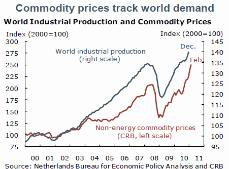
Via Mark Thoma, this graph shows that commodity prices have closely tracked world industrial production.
Source:Reuven Glick.
And this graphic makes clear that energy and food are the principal factors behind the increase in the CPI over the last 12 months.
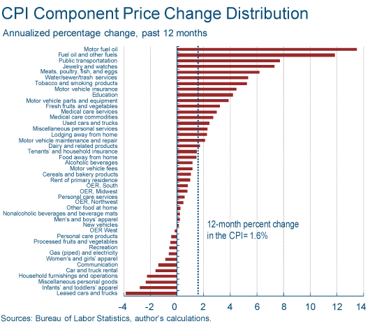
Source:Brent Meyer.
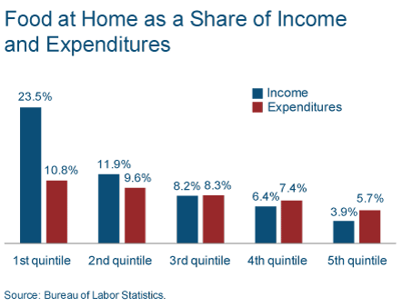
Thoma also reminds us that although the richest 20% of Americans spend about 4% of their income on energy and another 4% on food, the poorest quintile spend 20.6% on energy and 23.5% on food.
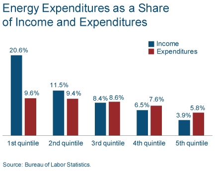
Source: Daniel Carroll.
I’ve also figured out how to use active GasBuddy widgets to display some of their useful graphs. These should update automatically, so if you come back to this site at some later date, you’ll see the current figures as of that date. You can also click on the images below to adjust the parameters.
| New Jersey Historical Gas Price Charts Provided by GasBuddy.com |
| New Jersey Gas Prices provided by GasBuddy.com |
| Click here to add this map to your website. |
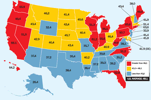
Since the question always comes up, the biggest single reason why average retail gas prices differ across states is differences in gasoline taxes.
 |
Thanks for this post. The share of income going to food and energy in the bottom quintile is astounding. If one cares about the welfare of the poor in this country we need to stop looking at just the “core” inflation measures.
Fascinating charts.
The New York Times recently had a story about how the US is better prepared for higher oil prices now, versus 2008. My take on this issue is that it will now take a higher oil price to balance demand against the supply of global net oil exports.
This is basically the pattern that we have been seeing, i.e., higher highs and higher lows.
If the 1997 to 2009 pattern holds, the next year over year decline in annual oil prices will bring us down to an annual average price of $120 per barrel, in the context of an average double digit rate of increase in oil prices.
The colors! Wow, the colors man.
I like the BLS showing how much of income energy is for the lower 3 quints. Also, how expenses are obviously greater than income, especially for the bottom two.
Jeff, looking at the BAEs income and expenditures data, we were in about as bad shape as 08 before Jan. Incomes aren’t quite as solid, medical cost have offset declines in financial services and housing. It shouldn’t take such high prices in gas to have a real bad effect now.
Also, I don’t trust the FHWA data as of late. After 08, there have been quick dollar influxes for roads that would certainly bias the data. Normally the TVT estimates are within 1% of the final numbers. Revisions for the 2010 report were closer to 3% higher. I don’t think our fleet has made the fuel efficiency gains we think it has.
Of course the real consumption story is the developing countries. Here is a chart showing normalized oil consumption (1998 = 100, EIA) for the US plus four developing countries from 1998 to 2009:
http://i1095.photobucket.com/albums/i475/westexas/Slide3.jpg
And this is a fascinating chart showing the (gross) exports of refined petroleum products from the US:
http://www.eia.gov/dnav/pet/hist/LeafHandler.ashx?n=pet&s=wrpexus2&f=4
Methinks we are being outbid by developing countries.
Is anyone else curious when they see charts such as the food and energy expenditures such as above? Enough so, to question its accuracy or reality? Call me curious, or a questioner, or even a skeptic.
BLS income statistics are known to not include welfare and other subsidies given to low income households in the income statistics. And reading the article which generated these charts, I note that the expenditure statistics came from its Survey. I would like to know what the questions of the survey were? Was it something like, “How much did you spend on food excluding dining out last month?” Or was the the question or follow up question, “How much of the expenditure was paid with food stamps or other assistance?”
As for energy, most energy cost is associated with the home. For that matter, so is food. A more informative statistic would be the total expenditure for rent (mortgage and taxes) plus energy plus food. I suspect the total would be much closer across the quintiles. That is because, for instance, an answer to a question such as, “How much do you pay in rent where you live?” would more likely be answered with the sum actually paid out and not include the government housing subsidy that went to the landlord (or bank).
There have been other studies from just as reliable sources that document that a family of 4 earning $14,000 a year has as much disposable income as a family of 4 making about $60,000 a year due to such matters as higher housing cost, greater transportation costs, as well as the forementioned lack of including welfare and subsidy additions to income. That study too calls for curious questioning.
I believe that food and energy do not count as disposable income, so these studies seem to conflict.
Can anyone here clear up my misgivings? The original short article by Daniel Carroll from which Thoma got his post did not.
Jeff, good graphs.
The first one, it looks like we’re seeing the change of each country’s consumption relative to their 98 consumption. It’d be better to see their consumption relative to total 98 consumption.
Anonymous,
Here are some graphs of expenses I consider not-so-discretionary verses disposable income from the BEAs expenditures and income tables. Data is linked.
http://www.google.com/m/url?client=ms-android-sprint-us&ei=IK-KTdiAEoqz8QbvsLXmAQ&gl=us&hl=en&q=http://cumulativemodel.blogspot.com/2011/03/expenses-rising-as-percentage-of.html&source=android-browser-type&ved=0CAsQFjAB&usg=AFQjCNFgWn6bFlmT7aq5tBOsSuSJbRp4Uw
Anonymous,
The bls has quite a lot of data grouped how you like, from income level to expense type. The reports just take a couple years.
J Kemp (Reuters) is providing for a comprehensive outlook of the consequences of sequential monetary policies from 1920 1952.
“A distant mirror :Credit contraction,monetary policy and commodity prices during the great depression”
The Federal reserve bank was restrictive with the money supply in 1932,calling for a retroactive frustration from the contemporary economists.The Federal act of 1913 stipulated, the federal reserves banks had to cover with gold reserve 35% of the amounts of deposits in their books,with
40% gold reserve as a collateral for their notes issued.The great depression was called a prosperity crash,when the last decade may be qualified as a crash of non prosperity.
The effects of a restrictive monetary policy,may be read in the farm prices (P 19) remaining subdued,so did the energy prices (P20)
A jump in prices driven by a relaxation of the monetary policy as of 1942 and the switch from higher interest rates to higher banks reserves.Inflation became quickly a reality.
Many of the above prices patterns can be confirmed “business and booms and depressions since 1775”
http://fraser.stlouisfed.org/publications/bb/issue/5069/download/85250/1943chart_busibooms.pdf
At the outset of the actual economic state of contraction, the IMF (State of public finance 2008) estimated the loss of fiscal revenues drawn from commodities prices falls to be up to 1.8% of emerging countries GDP.
There has been recently very strange behaviour of stocks despite bad news all around, and USD despite instability and wars all around. That leads me to think that we might see a short spike in stocks, silver, ( up to 45 USD in first weak of April) gold, and USD ( USD value drops ) within few next weeks.
However, I think that this spike will be corrected, i.e. stocks will turn down, USD up, silver will have almost 40% correction and so will gold. May be the first profit reports for Q1 will be disappointing on top of growing oil prices and global instability.
Why , I do not know, but things are getting too strange for them to continue ( of course, we may be unleashing USD inflation in big numbers, but something tells me that is not going to happen).
What event would cause a sharp correction in silver and gold prices? Demand drop, or heavy increase in instability leading to expectations that USD will remain safe heaven, and inflation will not happen? Increase in FED interest rates before ECB?
What do You think- for Gold and silver to undergo major correction, what has to happen?
If we looked at industrial production and commodity prices in the 1990s, would we see that clear relationship? I think there must be another ingredient in the soup…
Inflation expectation in Europe looks like more than expected.One has to appreciate the finesse between short term expectation and long term expectation.
Econ Grapher supplies a comprehensive empirical data of inflation by main countries.
http://econgraphergraphs.blogspot.com/
The Fed is transferring wealth from the poor (food and energy consumers) to the rich (asset owners).
It’s particularly pronounced now of course, but this has always been the case over the Fed’s long and steady history of dollar debasement.
Which is why it is puzzling that leftist academics are among the Fed’s biggest fans (after the banker beneficiaries, of course).
Can anyone here explain this paradox?
The first chart is really odd: why put a plot of a quantity series and a plot of a price series in the same chart? The scales of the two are very different too: one from 75-300, and another from 95-200… come to think of it, the CRB spot Commodity Price Index also track Cazakhstan’s population pretty closely in the past 15 years … in fact, Haver says the two have a correlation coefficient of 0.91
Anonymous:
I believe the expenditure shares come from the BLS Spending and Time Use data base, which is compiled from their Consumer Expenditure Survey. At least, I can find the expenditure share and income data there needed to make the tables.
Money income is broken down into components and includes several kinds of transfer payments, including unemployment, food stamps, and other government and private transfers.
So, you need to clarify. What do you mean by ‘BLS’ data? Is there another source of BLS data for the tables in the post?
What ‘other studies’ are you talking about?
Anonymous, some friends of mine were in the BLS expenditure survey. They had to keep very detailed diaries of their expenditures. So it’s not a ‘how much do you think you spent last month’ kind of survey.
J and ScottB
Although the data is out, I did not find a 2009 report, but did find a 2008 report, which had one chart with quintiles and it reinforces my questions.
From the 2008 report table 1, food at home had for the lowest quintile expenditures was $2,369 at an income of $10,263. This is quite compatible with the above charts of 2009 given in the main post. However, it is the statistic on total expenditures for that lowest quintile that is the root for my questioning. Total expenditures are $22,304 for that same quintile with an income of $10,263. To me, that indicates that income as stated does not include cash equivalent welfare and subsidy received. It also indicates considerable disposable income.
If total expenditures is used as the base for food expenditure the percentage drops to about 10.6%, a more realistic figure, also similar to the the above charts. And showing little year to year change.
So I conclude that things are not changing that much. Also, using income as the base does not realistically account for real income of the lowest quintile. And it is reasonably obvious that although the BLS does collect welfare and subsidy data is is not included in the income statistic as used to calculate that very high percent of food and energy expenditure.
Unfortunately, there is a bigger meaning to the statistics. Simply put, the lowest quintile face a daunting and perhaps impossible task of building the the job skills and experience to rise in wealth. That being an effective marginal tax rate on their next dollar earned as they approach the maximum eligibility of welfare and subsidy. I suspect they find they lose much more than a dollar for each dollar they earn. A marginal tax rate of greater than 100%.
So, I guess my complaint is that such charts as posted by JH to not tell a real story, and more importantly, may mislead from the most important story.
I’ve read the US cattle heard is at a very low level. This does not suggest increased demand for grain. Also our ethanol program sucks a large amount of grain off of the dining room table. I think 1/3 of US production.
I suspect there may be some manipulation and possibly problems with production that account for the food inflation.
Food inflation has been much greater in developing countries, to the point that there are riots, and China I believe has started giving out the equivalent of food stamps. Hard to believe demand is increasing.
Dear JDH,
Is there a disconnection in the messages from the Treasuries markets and the equity markets? The yield of 5 year TIPS is negative for more than a month now. The breakevens of 5, 10 and 30 years are all in the range of 2.5 to 3. So the Treasury markets seem expecting a stagflation with moderately inflation.
The equity markets have been able to get higher and higher valuation while lately shrugging off negative news.
Is the equity market expecting higher inflation? Or is it anticipating more helicopters in the sky? Or is it counting on a seismic change in the currency markets? But none of these appears to be consistent to the assessment of the bond market. What is your take? Thank you!
Very interesting chart at the top, but it begs for a question: what happened in 2003? Within a year or so, commodity prices fell way behind industrial production, leaving them about a third too low. What happened?
John Kemp also noticed the funny chart from SF Fed and did an excellent job dismantling it (through alphaville):
http://ftalphaville.ft.com/blog/2011/03/25/527616/john-kemp-dismantles-the-commodities-vs-global-demand-chart/
FedViews presents a graph entitled “Commodity prices track world demand”. …
Unfortunately, the chart is profoundly misleading. Its use of different scales on the vertical axes and decision to show changes only since 2000 gives a grossly distorted view of co-movements in commodity prices and industrial output.
…
In the Fed’s illustration, commodity prices appear to move closely in line with world industrial production. Both vary by about the same amount. If anything non-energy commodity prices have risen slightly less than would be expected given the big increase in industrial production between 2000 and H1 2008, and then again since 2009.
But that is an illusion produced by the choice of different scales for the two series, which produces a pleasing graph but grossly distorts reality. If the graph is corrected to show both series on the same scale it is immediately apparent commodity prices have been far more volatile than industrial production and consumption (Chart 2).
World production rose 18.5 percent between January 2009 and January 2011, according to the CPB measure. But non-energy commodity prices soared 72 percent over the same period, according to the CRB total return index.
FedViews is taking a short-term view of commodity prices and production that fails to account for longer-term trends. If the graph is corrected to show longer time series for both production and prices it becomes apparent there is no close correlation. Between January 1994 and July 2008, world industrial production rose 72 percent but commodity prices increased 176 percent (Chart 3).
…
There is a relationship between industrial production, but it is not linear, and industrial production is not the only or even the predominant influence on prices.
Researchers at the European Central Bank and International Monetary Fund have shown co-movements among commodity prices, as well as with industrial production, and measures of global liquidity (monetary policy). Supply-side variables such as investment, spare capacity and inventories are crucially important in explaining non-linearity.
Strong demand in emerging markets is clearly playing a central role in pushing up prices for a whole range of fuel and non-fuel commodities. But in its rush to downplay the inflation threat and exculpate the Federal Reserve from charges it is responsible for rising raw material prices, the SF Fed and other policymakers, including Bernanke, are presenting an oversimplified and potentially misleading view of how commodity prices behave. …
In contrast to FedViews, there are strong and credible arguments linking rising commodity prices in part to cheap money policies favoured by the Fed (through a combination of excess liquidity, impact on expectations, and the export of excessively loose monetary policy to emerging markets via the system of fixed exchange rates).
Global commodity inflation may or may not feed through into consumer prices (the degree of pass through has surprised Britain’s central bank but seems modest in the United States, at least so far). Some degree of commodity-driven inflation may be beneficial, according to those who worry more about deflation and unemployment.
There are legitimate discussions to be held about pass-through rates and the nature of output gaps. But the question of commodity prices and monetary policy needs to be discussed with much more frankness than the Fed has managed so far. Charts with misleading scales do not help.
I can only say, I am very disappointed with some of the stuff coming out of SF Fed nowadays …
Oh forgot to say in my first post, “Cazakhstan” should be Kazakhstan.