Some quick remarks on the unevenness of the U.S. economic recovery.
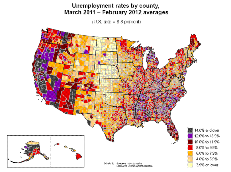
Here’s a map showing the average unemployment rate over the last year by U.S. county. Things are back to normal along a swath through the middle of the country, but still fairly bleak elsewhere, particularly for example here in California.
 |
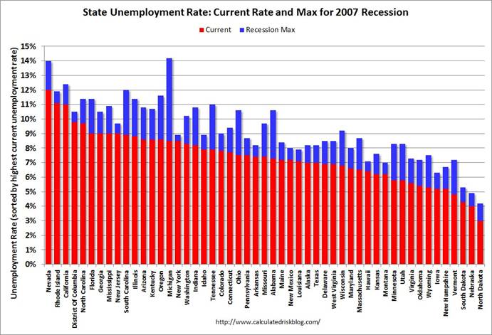
Calculated Risk also prepared this interesting graphic comparing current unemployment rates by state (in red) with the maximum achieved during the recession (in blue). Karl Smith comments on some related graphs.
 |
The states which had experienced the biggest run-up in real-estate prices between 2000 and 2005– California, Rhode Island, Nevada, and Florida– were among those hit hardest by the recession and today are the places having the most difficult time recovering. That observation is consistent with the claim that the recession was fundamentally a spending shock, with the ongoing deleveraging in affected regions a main factor holding back spending. I would emphasize another point, however, which is that it is not easy for unemployed Californians to take the jobs currently available in North Dakota, just as it’s hard for a skilled former construction worker in California to find something else to do where that person could be nearly as productive as he or she used to be. The ongoing housing slump is not just a drag on aggregate demand, but also a key part of why life remains tough for a number of real people with real histories and particular jobs they may still be hoping to get back to.
A far more useful view would not be the unemployment rate, but the # unemployed per county. In some of those counties, the difference between 20 and 30 people being uneployed will move the rate noticeably.
This would put paid to the arrant nonsense about “Well everyone form nevada who’s out of work can just move to North Dakota to get work!”
The observation about home prices inflation and present unemployment might be generally true, but Michigan was in the clutches of a recession [okay, not a technical recession, but high unemployment and falling housing prices] well before the rest of the nation.
Home prices in Michigan barely kept up with general inflation from 1980 onward. The big hit for the lower peninsula was the gradual disintegration of the domestic auto industry and the collapse of mining and lumber in the upper peninsula resulting from Federal regulations. The coal-powered electricity generating plants in the upper peninsula are also threatened that area’s future.
http://epw.senate.gov/public/index.cfm?FuseAction=Issues.View&Issue_id=87c1303a-7e9c-9af9-7d81-37771c380b87
http://www.jsonline.com/business/clean-air-rules-cloud-future-of-up-power-plant-5c340j8-134219868.html
The EPA is continuing to exert a suppressing influence on Michigan’s lumber industry with new regulations:
http://bridgemi.com/2012/02/ruling-bogs-loggers-in-paperwork/#.T5RAf6ZYtAU
Definitely more bailouts for Michigan’s future.
In the color coded map at the top of this post area on the screen is proportional (roughly) to area on the ground; one square inch of screen is equal to the same number of square miles on the ground, whether those miles are in N Dak or NYC.
The trouble is, in terms of unemployment, the number of people per square mile on the ground varys a lot; yet this graph gives the area on the screen to LA and NY as it does to a single county in N Dak.
Does this make sense ?
This type of graph is widely used, and when presenting political data it is strongly misleading, as our brains process information nonrationally, so that when we see a map with a lot of red (ND, WY, MT, etc) and not a lot of blue (LA, NYC, Philly) we don’t mentally make the population adjustment.
I find it a bit astonishing in 2012, we still need to remind the Economics Mandarinate to make these sort of basic sophomore level corrections; thats my personal view.
So dear econbrowser readers, I ask you, if you were a professor, would you take off points ?
The dryness of the area west of the 100th Meridian just jumps out at the eye as the county size expands. Large counties few people per sq. It is noticeable that in the states with moderate unemployment how the counties with Indian Reservations stand out. In California it is mostly the empty quarters that have high unemployment. Just as the old farmers used to think the rain followed the plow, now unemployment follows the plow.
As a person who did actually leave California for the oil boom in North Dakota, I feel compelled to add that the boom is a bust for an increasing number of people. There are currently countless trucks sitting idle in the Williston area, and… jobs are not all that many (that are worth having). Things are certainly better than they are in California, but… in keeping with what BruceJ and ezra have said, it took only a short time for the labor markets to get saturated in ND.
For all of the optimists out there, maybe I should also add, that there have been load restrictions in play due to the instability caused by the Spring thaw. So, there is something of a lull right now that some folks see as temporary.
It is very likely too that many of the people here who came from other states, are not being counted as unemployed here. This part of North Dakota is overwhelmed with transients. There are in fact more travel-trailers and motorhomes than there are houses.
ray
Price movements for cereal grains and livestock since the recovery started (June 2009) have also helped midwestern states. $15/bushel soybeans, $6.75/bushel corn and $7.00/bushel wheat does wonders for the economy in the upper midwest…unless of course the upper midwestern state is unfortunate enough to have Scott Walker as governor.
http://www.indexmundi.com/commodities/?commodity=soybeans&months=33
http://www.indexmundi.com/commodities/?commodity=corn&months=33
http://www.indexmundi.com/commodities/?commodity=wheat&months=33
ezra,
Is it not general knowledge that larger a county is, the smaller the population will be? But it should hold that counties of approximately the same geographic area should be comparable to one another in population.
The chart is clearly labelled at the top ‘by county’. So to anyone they should know that populations in large counties are going to be sparse. Of course it should be explained if this was an example in introductory material.
BruceJ and Ezra Adams: Yes, weighting by population also produces some interesting and informative maps, as I discussed here.
Not exactly what ezra abrams wants, but it does a somewhat better job of comparing apples to apples… it just doesn’t attempt to identify which species of apple.
http://hallofrecord.blogspot.com/2012/04/unemployment-rates-do-not-just-happen.html
Professor,
It would be interesting to lay a political map of red and blue states over the bls map.
“BruceJ and Ezra Adams: Yes, weighting by population also produces some interesting and informative maps, as I discussed here.”
The 100th Meridian just jumps in that map too. Geography is destiny. Just shows how productive that Midwest farm land is.
Regarding California, I suppose there is no need to point out that unemployment is highest in the central valley, where politics is most conservative (not to say reactionary).
At the last election the issue of maps being misleading because of population density also
came up and there were some very good maps produced that scaled by population that made a lot more sense than these maps.
you can find a good example of this type of map here:
http://www-personal.umich.edu/~mejn/election/2008/
I would also add:
1. There are more unemployed people in California than there are people in North Dakota. Even if it were easy for people from CA to go take jobs in ND, it would hardly make a dent in CA unemployment.
2. The entire swath of low unemployment counties between ND and western OK corresponds to low population rural areas. These places were mostly already losing people during the boom. With notable exceptions, e.g. ND, unemployment is low because unemployed people have been leaving.
3. The southern Central Valley – the “empty quarters” of California, as one commenter referred to it – is home to over 3.7 million people, not even counting the Sacramento area. California – yes, we really are that big. 🙂
FRauncher, it is not the politics of the central valley residents that have caused the unemployment.
This from ABC Fresno:
http://abclocal.go.com/kfsn/story?section=news/local&id=6734504
Once again, those falling on their left sides have screwed the pooch.
“It would be interesting to lay a political map of red and blue states over the bls map.”
Funny, I was thinking the same thing (but obviously reaching starkly different conclusions).
Particularliy if one looks at the Eastern half of the nation (where the population is nearly universally dense) note the axis of the dark unemployed states running from the all Republican controlled industrial wastelands of Michigan and Indiana through the impoverished Red state zone of homelessness and despair in the Deep South culminating finally in the giant Floridian peninsula of broken dreams. In contrast the largely Blue states of the even more densly populated BosWash zone look pretty pale and prosperous by comparison. 🙂
I take from the responses that there is widespread un ease about the standard chart defaults; this problem is particularly evident when people use charts with default settings from Excel.
Scout – the problem is, if you are talking about the US, then what happens in ND is (roughly, as PK has pointed out more eloquently then I) irrelvant – there simply arenn’t enough jobs in ND for it to be important on a national policy sort of plain.
Yet in the graph, as shown, LA+NYC+Houston+Seattle+silicon valley get less space then ND !!! how on earth can you talk about the countries economic policys if silicon valley and NYC are given less importance then one country in ND ????
The other point is that although we all try and be rational, our brains process info for us (system I per Kahneman) so when we see large swathes of color, we react, and our rational brain has a very hard time keeping up
I’ve looked into the chart literature, and somewhat to my surprise, I have not found any examples where people do the obvious experiment – you take some data that has a clear point, graph or chart it in various ways, and then ask people to explain it.
We have a lotof people (like me) asserting stuff, eg if you read Tufte carefully, most of what he says seems to be assertion, rather then data driven.
For instance, Tufte, and many others, assert that a pie chart is a bad idea.
Yet graphics designers – people who earn a paycheck communicating – continue to use them.
The most effective book I’ve ever seen is http://www.amazon.com/exec/obidos/ASIN/047127402X/7210-20
Mark A. Sadowski
“note the axis of the dark unemployed states running from the all Republican controlled industrial wastelands of Michigan and Indiana through the impoverished Red state zone of homelessness….”
*********
Funny thing Mark, it was only after 8 years of Democratic Governor Jennifer Granholm that the situation in Michigan has improved. But that’s a detail. Even the Democratic Mayor of Detroit is now working with the Republican Governor trying to salvage 40-years of union/socialist abuses. But that’s a detail.
other than the fact that no one wants to live there, life is good in the parts of the country where no one lives.