The Bureau of Economic Analysis announced today that U.S. real GDP grew at a 4.0% annual rate in the second quarter. Hopefully that’s the start of something good; but so far, it’s only a start.
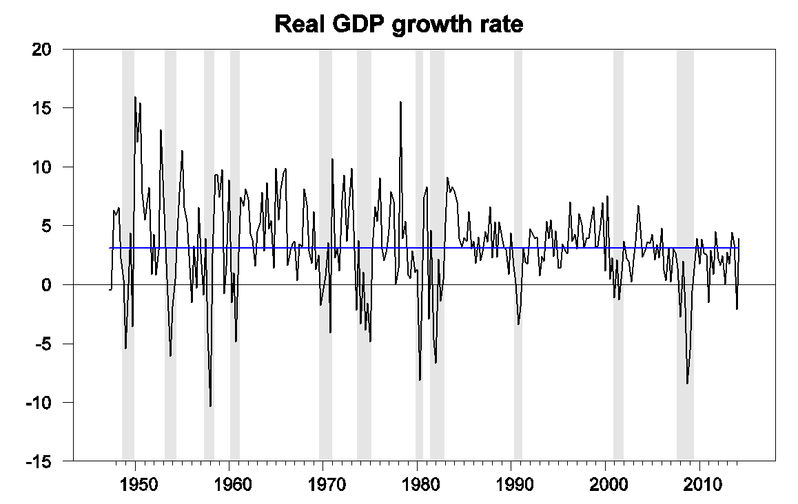
U.S. real GDP growth at an annual rate, 1947:Q2-2014:Q2. Blue horizontal line is drawn at the historical average (3.1%).
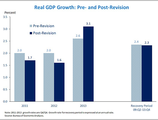
In part, the growth from Q1 to Q2 looked good because the level for Q1 was so bad. True, the BEA’s new estimate of Q1 growth (a 2.1% drop at an annual rate) was a little improvement over the -2.9% figure the BEA announced last month. But the revised estimates still imply a pathetic annual growth rate below 1% for the first half of the year. And true also, the BEA revised up the estimates for 2013, so that the last 4 quarters clocked a more respectable average growth rate of 2.5%. But upward revisions to 2013 came at the expense of downward revisions to 2011 and 2012– we seem to be always borrowing from Peter to pay Paul.
Source: Council of Economic Advisers.
Our Econbrowser Recession Indicator Index, which uses today’s data release to form a picture of where the economy stood as of the end of 2014:Q1, jumped up to 24.1%, reflecting the sharp drop in GDP in the first quarter. Our policy of always waiting one quarter for data revisions and trend recognition before calculating the index is looking particularly wise given the roller coaster ride the BEA has put us through in their different versions of the 2014:Q1 estimates. And our index, unlike the BEA figures, is never revised. According to our gauge, the Q1 drop and slow first half growth were disturbing, but not the start of a recession– our indicator would have to rise to 67% before we would declare that a new recession had begun.
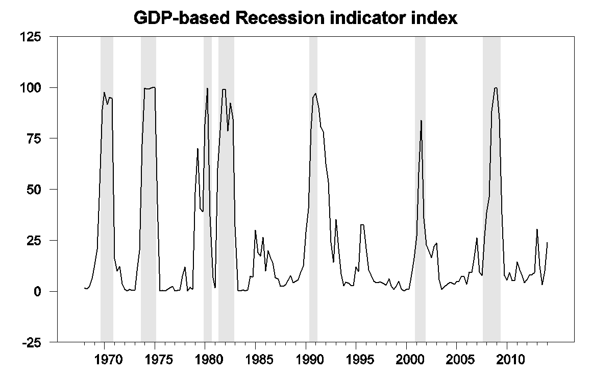
GDP-based recession indicator index. The plotted value for each date is based solely on information as it would have been publicly available and reported as of one quarter after the indicated date, with 2014:Q1 the last date shown on the graph. Shaded regions represent the NBER’s dates for recessions, which dates were not used in any way in constructing the index, and which were sometimes not reported until two years after the date.
In terms of the individual components behind the Q2 GDP growth, the positive contributions of investment and exports are certainly encouraging. But 1.7 percentage points of the 4.0% growth came from inventory build-up, representing goods that need to find buyers in the future– perhaps borrowing more from Peter again.
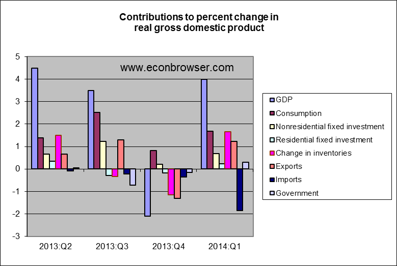
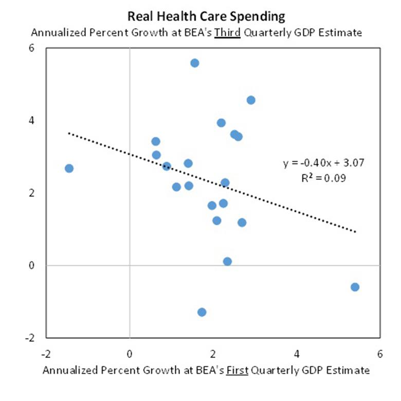
And the White House was unusually candid in warning us that BEA has essentially no idea based on data available so far about what happened to real health care services (which account for about a sixth of total consumption spending) during the second quarter. Indeed, the BEA’s estimates of real health care services in their first announcement for a given quarter (like the one we just received) turn out to be negatively correlated with the estimate for the same quarter that they will announce two months later.
Source: Council of Economic Advisers.
Notwithstanding, this could finally be the start of a string of encouraging GDP numbers that many of us have been expecting for some time. The always-to-be-trusted Bill McBride notes that state-and-local government spending, which had put a persistent drag on the economy over 2010-2012, has finally turned around. And certainly there is potential for a bigger contribution from residential fixed investment.
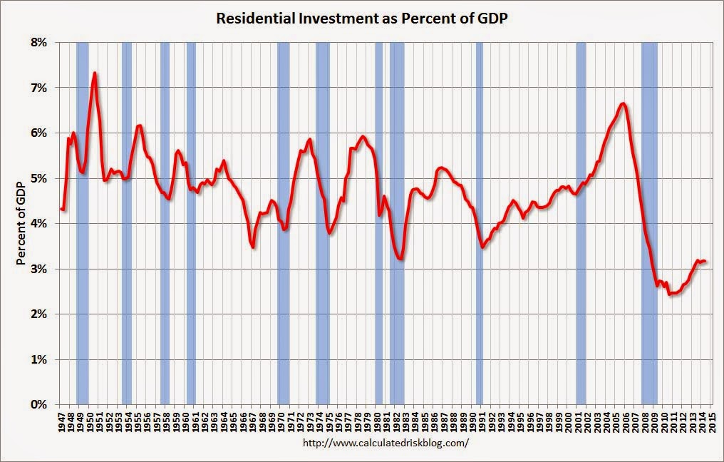
Source: Calculated Risk.
So maybe we’re in for a string of good news. But like I say, so far, it’s only a start.
The year over year change in nominal GDP is now 4.1% compared to an average of 3.8% since 2011.
I still not ready to say that the last several years standard consensus forecast of growth accelerating in the next half year is at hand
Professor Hamilton,
Do you recommend any “simple” time series forecasting models to forecast GDP? I notice that some time series texts use GDP and PCE as a cointegration example with an error correction model( ECM) used to forecast GDP. Is this just a teaching example for such models or is there any reasonable accuracy to such GDP forecasts from such a simple model?
AS:
Since the universe operates on the margin not on the average, there is no good “simple” time series forecasting model to predict GDP. That’s the core answer to your question. The estimated coefficients of such models are averages of quarter-to-quarter changes without regard to the context of a given quarter. The estimated coefficients might be thought of as homogenizations, as each observation in the time series plays a role in the calculation of a given coefficient.
The proper way to forecast GDP is bottom up. You must look at all the little parts and from there get a view of the whole. This takes work. Also open-mindedness, an eclectic view of theory and practice, a not inconsiderable dash of art, and experience.
I would say a forecaster with an average absolute error of 0.7 of a percentage point (or less) on the four-quarter ahead growth rate is in an elite circle. Less than half of the consensus got this close on the just released Q2 number with their latest forecast. And that was a one-quarter ahead forecast with data on two of the three months already in!
There is a further problem with simple time series models. They are wrong at exactly the worse time. That is, at the turning points of the cycle. Q4-to-Q4 2008 GDP fell 2.8%. In December 2007, the most accurate of the consensus had a forecast of 0.5% — an error of 3.3 percentage points. There were some – not members of the consensus – who did a far better job. They did so because they thought outside the mainstream and had a grasp of what was going on with the credit cycle. In other words, they were thinking on the margin, which subsumes context into it.
Jim:
Since its creation almost 8 years ago, your “Econbrowser Emoticon” index has been “happy” for less than 6 months (and that only at its inception.) That leads me to ask two questions
1) Personally, what do you think is the probability that your underlying model is now seriously miscalibrated?
2) Professionally, how long do you think it would take to get statistically significant evidence of its miscalibration?
N.B. I apologise in advance for singling out the Econobrowser model: I understand that these kinds of questions currently apply to many related models proposed by many other researchers. But my questions are topical and I suspect many readers would be interested to hear how you approach these issues.
This is almost entirely the aberrations of the q-on-q SAAR method. Q-on-q SAAR greatly accentuates blips, including real blips (1q dip in auto sales), and technical blips, (mismeasurement, misestimation, seasonal misadjustment).
Take a look at y-o-y data (table 8) from the various releases since last year and you’ll see far less fluctuation. Not only is the real blip from weak 1q auto sales given its true weight, the technical blips are hardly visible.
Real final sales per capita annualized YTD is 0% to slightly negative, which is the trend rate since 2007-08. The 3- to 4-qtr. annualized real final sales per capita rate is 1-1.3%, which is the trend rate since 2009-10, i.e., the secular “new normal”.
constuction spending for June down 1.8% released today implies the first downward revision: http://www.census.gov/construction/c30/pdf/release.pdf
residential investment and government outlays will take the hit…
I am sorry but I do not buy the reporting as accurate. I think that John Williams is much closer to the truth than the government.
http://www.shadowstats.com/imgs/sgs-gdp.gif?hl=ad&t=
http://www.shadowstats.com/alternate_data/gross-domestic-product-charts
Hey Clown, do you use logical fallacies this often when you have nothing else to say ?
That was meant for baffling
vangel, don’t forget to put on your tin foil antennae hat while looking over your shoulder for the men in black…
@ baffling You = Obvious Logical fallacies anon clown that had nothing else to say on his data.
hedge, you have reason to believe shadowstats is more accurate than cpi or the mit index-both of which report about the same results? or you are more confident with the shadow data, which simply uses the bls data and adds to it a constant-hence the shadow curve mimics the cpi data. so when you can explain to me why shadow data is more accurate please come back and give us your insight. otherwise, you simply have nothing intelligent to say.
Professor,
I always appreciate your posts because even when I disagree your analysis is balanced and reasonable.
We will have ups and downs in our stagnation just as Japan has.
I do not agree with your assessment of this sentence: “The always-to-be-trusted Bill McBride notes that state-and-local government spending, which had put a persistent drag on the economy over 2010-2012, has finally turned around.” Economic decline forced the state and local governments into austerity because unlike the federal government they cannot print money to cover their excesses. The increase in employment in the state and local governments is a horrible sign. It means that the federal policies that are strangling recovery are being tightened by state and local governments to fund nepotism and politics as usual in state and local governments and all at the expense of a real productive recovery.
It seems that the government investment strategy is to cap the up-side while leaving the losses open ended. This is an awful investment strategy and it is worse when it is imposed on an entire economy by bureaucrats and politicians.