A close-up picture
At a recent presentation to the National Association of Business Economics, CEA Chair Ed Lazear presented a picture of productivity and real compensation to buttress his case that compensation will follow productivity.
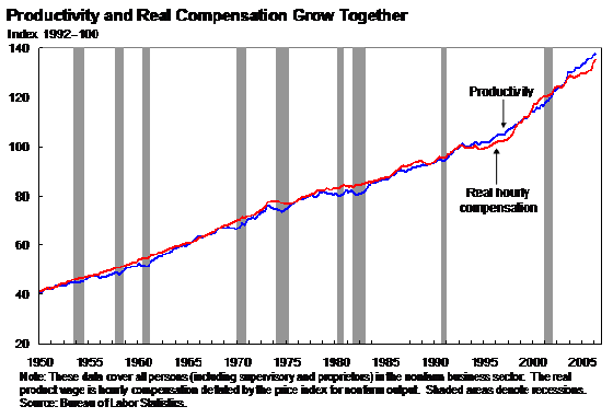
Figure 4 from Lazear
I thought it would be useful to present a similar picture (but using the BEA BLS reported data, rather than the product wage calculated by the CEA), with a closer focus on the last decade and half (in log terms).
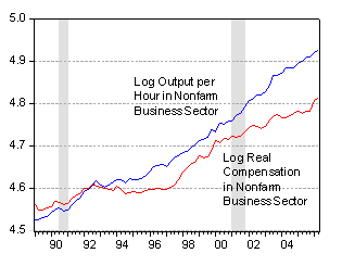
Figure 1: Log output per hour in the nonfarm business sector (blue) and real compensation per hour in the nonfarm business sector (red), 1992=100. Source:
Since the series are plotted in log terms, this means since 1992 output per hour has risen 10 percent higher than real compensation per hour; and since 2001q4, productivity has risen about 5.4 percent higher than compensation, despite the recent surge in real compensation. (5.9 percent using the employment cost index, deflated using the CPI-urban.)
Late addition: 19 September, 6:10pm Pacific
Spencer has provided the data on CPI-RS. I’ve plotted the productivity [blue] and several compensation series that results from using the CEA’s preferred deflator (the implicit price deflator for nonfarm business) [red], using the CPI-U CPI-RS [green] as reported by BLS, and using CPI-U [black]. (Changed graph 20 Sept, 1:30pm Pacific, to reflect fact that the BLS series uses CPI-RS)
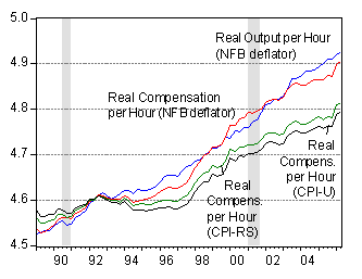
Figure 2: Log output per hour in the nonfarm business sector (blue) and real compensation per hour in the nonfarm business sector deflated using NFB deflator (red), using CPI-U-RS to end-2005, and CPI-U thereafter, as reported by BLS (green), and using CPI-U (black), 1992=100; . Source: BLS via FRED, personal communication from Spencer England, and author’s calculations.
Technorati Tags: productivity,
compensation
Menzie,
Good chart. This is a great demonstration of the validity of capitalism. Compensation should never keep up with productivity because it is productivity through the use of capital improvements and techniques that drive progress, but compensation will increase per man hour because one man will be able to accomplish more.
This is just another reason free markets create prosperity and wealth over and above command economies, the free and innovative use of capital.
when I try to reproduce his chart I get a very different picture.
For example if you index productivity and real compensation at 1957.1 = 100 the current readings are 287.1 for productivity and 204.8 for real compensation.
Something is wrong here.
The productivity increase follows the energy increase. You get only 1/20 horsepower from the human employee but leverage that with hundreds of horsepower from fossil fuel. As the cost of fuel increases, or even just becomes more volatile, the value of the leverage drops and the productivity will drop.
So that little detail “These data cover all persons (supervisory and proprietores)…” in the Lazear graph is ignored…and frankly why I dismiss Lazear.
I leave it for you to decide if that title “productivity and compensation grow together” is an honest assessment of this shabby scholar or the despicable assessment of a marketing agent.
Could be that Lazear is a competent economist and this piece the only one he writes in the service of his master. But the field is full of writers whose integrity is intact.
Why should we bother with prostitutes?
Menzie: I’d be very careful about using these series. Real compensation per hour appears to be calculated using a different deflator from nonfarm business output. Doing a strictly nominal-to-nominal comparison (comparing COMPNFB versus OPHNFB*IPDNBS/100 or obtaining the data directly from the BLS website), the series track each other just about 1-for-1, as they would using any kind of consistent deflator. Using COMPNFB/IPDNBS/100, furthermore, yields a different real compensation number than that given by COMPRNFB. In fact, COMPRNFB is calculated using the CPI-urban, while output per hour is calculated using the other deflator.
Using the nonfarm business output deflator, things again look very much like the top picture. Using a CPI or something similar, the slopes would be flatter, but the time series would still hang together remarkably well. Either way, this pretty much destroys the story that has hourly compensation diverging from productivity, at least in a mean sense. It would be interesting to see if median compensation / hr looks anything like mean compensation / hr; to my knowledge, such data are not available.
Of course, I could be looking at the wrong series–they are labelled pretty ambiguously over at the Fed’s website. If it isn’t too much trouble, would you please be willing to elaborate on which series you used in order to make the second chart? Thanks.
Chris R: Yes, good observations. I used OPHNFB (output per hour non-farm business sector) and COMPRNFB (real compensation in non-farm business sector), as recorded by the St. Louis Fed FRED. In an email exchange earlier today with Spencer, he informed me that BLS calculates real compensation using the CPI. This spurred my observation: “They [the CEA] have calculated the product wage from the perspective of the firms. The real wage from the perspective of the worker is one deflated by a measure of consumer prices. Which one is the relevant depends on the question being asked. Whether firms are optimizing so that marginal productivity of labor equals labor costs is answered by their [CEA’s reported] measure. Whether the benefits from higher productivity are accruing to workers is answered more directly by the BLS measure.” (I’ll let Spencer speak for himself on which deflator he favors).
What about Greg Ip’s speculation that stock options are distorting the compensation data?
link
Given that the CPI-U is widely believed to overstate inflation it most likely causes the real compensation growth to be understated.
The deflator for nonfarm business shows inflation of about 0.5% annually less then
the CPI-u. I’ve just been looking at the CPI-rs.
The CPI-U-RS is a price index of inflation that incorporates most of the improvements in methodology made to the current CPI-U since 1978 into a single, uniform series.
The CPI-rs also shows that the cpi-u seems to overstate inflation about 0.5% annually so
using the nonfarm deflator seems to be a valid adjustment that presents a more realistic picture then using the CPI-u.
So when I first saw the adjusment I was suspicious of data manipulation. But the more I find out about the data I am changing my opinion.
Menzie and Spencer: I agree with both of you that if we’re trying to make statements about the welfare of workers, some flavor of the CPI or PCE deflator is probably appropriate, at least in principle. Furthermore, I agree with Menzie that if we’re talking about marginal products, using the product deflator is the right thing to do.
My point is that the second graph compares nonfarm business productivity (measured in how many apples the firm can produce per hour worked) with the hourly compensation of its workers (measured in how many oranges the workers can consume). We’re comparing the time trends between log apples and log oranges, and we see that they’re diverging. My claim is that this doesn’t tell us very much about who’s been capturing the gains from increased productivity–we need to know the relative prices of apples and oranges before we can say much more.
In fact, the difference between the two series comes almost entirely from the change in the relative prices of apples and oranges–if we measured output in “orange units” or consumption in “apple units” the difference would completely go away, and the graph will, at worst, look like a flatter version of the top graph.
If we’re going to ask about who reaps the welfare benefits of higher productivity, it’s either workers (who consume oranges) or the owners of firms (who also consume oranges) or maybe a particular subset of managers (who consume very, very nice imported oranges). If we’re going to ask about firms equating marginal products with marginal costs, then real revenues and costs both come in the form of apples. How much product are you giving up in order to pay your workers? It’s just a choice of numeraire, so long as we’re consistently using that numeraire to make comparisons.
Looking at the data, then, applying consistent numeraires, leads me to the following interpretation of what’s going on:
1. Looking at things purely in terms of oranges, workers (on the whole, including managers) have approximately kept up with productivity growth in terms of their compensation.
2. Looking at things purely in terms of apples, marginal cost has appeared to approximately keep up with marginal productivity.
3. Issues of CPI bias aside, the price of apples has declined relative to that of oranges, over the past fifteen years. In particular, investment goods have become cheaper relative to consumption goods. This makes real productivity in apples grow more quickly than real compensation in oranges, without meaning very much in relation to (1) and (2). This is what the second graph captures, no more, no less.
4. You will get slightly different results if you stick to hourly earnings for nonfarm, nonsupervisory production workers. These data have a bit of a mystery meat quality about them, but this does coincide with what we know about what’s been happening to wage inequality.
If you want, I’ll slap these things into a spreadsheet and send them over. Thanks for your patience–it’s an interesting discussion.
-Chris R
News of the World #4
Elsewhere… TNR on Outsourcing, Prof. Mankiw is like Sisyphus, doomed for eternity to point out to people that they—including the state—face trade-offs. More microdata please, New Economist publishes a link to papers from the Internati…
Joseph: Yes, stock options are up for discussion. That’s why I included the ECI comparison.
Spencer and Chris R: I’ve added a graph (Figure 2) that shows compensation per hour deflated by CEA’s preferred figure, the real compensation series produced by BLS (using primarily CPI-U-RS), and for comparison compensation per hour deflated by CPI-U. I think the CEA comparison is valid for answering the question of whether the workers are being paid their marginal product denominated in NFB sector output (although how stock options are imputed needs to be sorted out, so I’m a little leery on the upsurge in the last quarters), while deflation by the consumer basket (PCE would be okay with me as well) makes sense if one wants to compare productivity trends against the welfare of workers (given that workers do not consume the basket of goods produced by the NFB sector).
Cool. This is a lot more informative and easier to interpret.