This week’s GDP and employment numbers were a pleasant surprise. Should this cause the Fed to change its warning in Wednesday’s FOMC minutes that
the pace of economic expansion will likely slow in the near term.
The Bureau of Labor Statistics’ survey of establishments showed a net gain of 166,000 more workers on nonfarm payrolls (on a seasonally adjusted basis) during October compared with September. A separate estimate based on the 23 million payrolls processed by Automatic Data Processing suggested 106,000 new private-sector jobs, which, if you add in the 36,000 gain in government employees reported by BLS, implies a value of 142,000 for net jobs growth, slightly more moderate than the BLS estimate.
And then we have a third indicator from the BLS survey of households which reckoned that we experienced a 250,000 net drop in employment in October. Which supposedly followed a 463,000 gain in September. Which supposedly followed a 316,000 drop in August. Umm, right.
The only way I can see doing anything with household numbers like these is to look at the 12-month change in the seasonally unadjusted data, and here one gets a pretty clear indication that employment growth has slowed considerably:
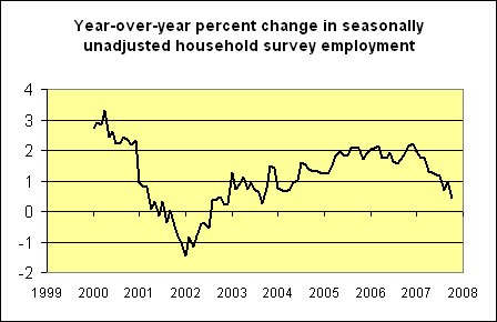 |
If you look at the establishment data on the same year-over-year seasonally unadjusted basis, you reach a similar conclusion:
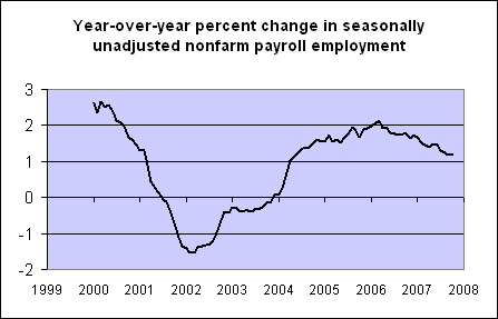 |
So I’m inclined to conclude that things are unlikely to be as rosy as the single observation on nonfarm payrolls might lead you to think. The weighted average of the three monthly indicators (nfp, ADP, and household) that we’ve been using here would give you a number of
(0.7)(166) + (0.1)(106 + 36) – (0.2)(250) = 80.4
or net job creation of 80,400 jobs, though that seems too pessimistic given the clearly suspicious recent household numbers.
All of this leaves me with the impression of an economy in which employment continues to grow, though not quickly enough to prevent the unemployment rate from rising,
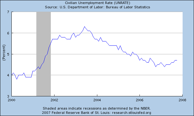 |
or the employment-to-population ratio from falling:
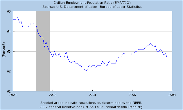 |
Technorati Tags: macroeconomics,
employment,
economics
Very nice integration, Professor, and a plausible conclusion.
Related, GDP alone is tricky to use for forecasting a recession, I believe: e.g., it does not make sense that the housing services component shows strong real growth in the light of falling prices and high vacancies, and the GDP data is often revised markedly way after the fact.
Is there a good real-time indicator of recession that does not uses ‘finessed’ data (e.g., GDP and BLS employment), and only uses raw, true leading data, such as retail sales, auto sales, sales tax collections, and consumer confidence?
I guess the Conference Board attempts to do that, but it includes elements that are not true leading indicators, I think.
Unemployment is a variable, which can be precisely predicted at 5-year horizon in the USA.
there is no possibility to illustrate this prediction here – no picture can be shown. So, I refer to my blog and Figure 5, where the current evolution of UE was predicted in 2005.
http://inflationusa.blogspot.com/2007/07/forecasting-unemployment-rate-in-usa.html
Hi,
I love the graphs of the Household and Payroll Data over the last several years.
I wonder which is a better leading indicator.
I notice from the graphs comparing Household Data to the Payroll Data that both turned to a positive trend at the start of 2002. But the Household reached a positive figure in mid 2002 while the Payroll Data did not until end of 2003 – almost 18 months later.
Now both sources are in a negative trend but again the Household is leading the Payrolls Data.
I see from the weighted average of all the indicators that the weighting give the Household Data 20% but I imagine that is for the inherent month to month volatility rather than the trend accuracy. Or is it not considered to be a reliable indicator compared to the Payrolls.
However based on previous performance during the period from 2002 to 2004 would it be fair to say that the Household Data is a better leading indicator than the Payrolls? Or would that be an erroneous conclusion to reach.
Rory, there is some evidence that even though the household series is noisier, it can do a better job with turning points due to the problem of opening or closing establishments. Those concerns led me to increase the weight on the household survey from 0.1 to 0.2 last summer. However, I agree with you that, with the volatility in the household numbers the last three months, the weight should really go back to 0.1. Those are the weights on the monthly numbers; I’m not so sure about the year-on-year comparisons.
JDH,
Why are the household survey numbers so noisy? Has this always been true, or is this a recent phenomenon? I have a vague recollection that in the early 1980s the Reagan Administration reduced the sample size in the household survey. Not sure if it’s been adjusted since then or not. I wonder how much of the volatility is due to sampling problems and how much is due to interviewees simply not having firm ideas as to whether or not they are employed or not.
Professor Hamilton, do you get into hot water with Professor Chinn for using a citation from the Heritage Foundation? I don’t think that such is allowed amongst polite company in Madison (ha, ha).
Carnival of the Capitalists
Hello, and welcome to the November 5, 2007 edition of the Carnival of the Capitalists. This blog is called Small Business Essentials, which has been recently relaunched after a hiatus and redesign. I also run a web design and marketing firm, NHG Consul…
If you look at a much longer historic series — say since 1967 — you will a very strong tendency for the household survey to lead the payroll series — especially at turning points.
This was true even before the birth/death model.
I always believed that the difference stemmed from small business reacting quicker to a change in the economic environment because the household survey tends to capture small business better then the payroll survey.
In reality, the employment figure is unreliable as a future economic indicator. Consider:
April 1960 +354,000 jobs – Recession began April 1960.
December 1969 +152,000 jobs – Recession began December 1969.
October 1973 +324,000 jobs-
November 1973 +304,000 jobs – Recession began November 1973.
January 1980 +131,000 jobs – Recession began January 1980.
June 1981 +196,000 jobs-
July 1981 +112,000 jobs – Recession began July 1981.
GDP growth can also be strong at the onset of recessions as defined by the NBER. For more information see our website at http://jpetervanschaik.googlepages.com