From yesterday’s White House press conference:
CHAIRMAN LAZEAR: … The jobs report contains a variety of information in it, and one of the pieces of information, and only one of the pieces is the jobs number. In addition to that, there are also numbers on unemployment, wage growth and weekly hours. And it’s important to recognize that those numbers were actually good numbers; the unemployment rate actually went down; the wages continued to grow; and weekly hours stayed stable. All of those things are strong indicators that the economy is continuing to move.
It’s in this context I’d like highlight three pictures.
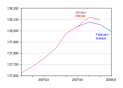
Figure 1: Nonfarm payroll employment (‘000s), January release (red) and February release (blue). Source: BLS via St. Louis Fed FRED II.
Payroll employment growth was negative. But on top of that, the previous month’s figures were revised downward from a positive to a negative growth rate as well. What news for skeptics of the nonfarm payroll series?
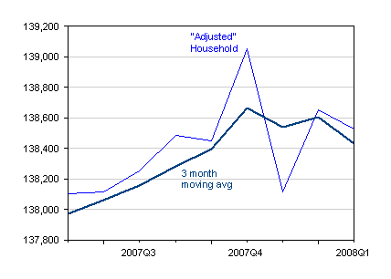
Figure 2: Civilian employment (‘000s) adjusted to conform to the payroll concept. Source: BLS [pdf].
The “adjusted” household series, which attempts to conform to the payroll employment concept, provides little succor [1], SF Fed Letter. It’s on the decline as well, although the trend is only readily apparent in the three month moving average.
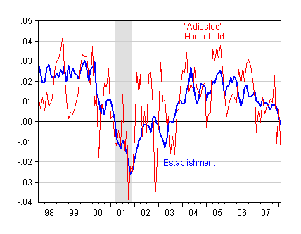
Figure 3: Annualized three month growth rates in nonfarm payroll employment (blue) and in civilian employment adjusted to conform to nonfarm payroll concept, all calculated as three month differences in log levels. Source: BLS via St. Louis Fed FRED II, BLS, NBER recession dates, and author’s calculations.
Finally, the last month of data is the first time the three month change has gone negative since 2003. Typically, the three month growth rate only goes negative around recessions (since 1967, the only other instance is a 2 month episode a couple months after the 1990-91 recession).
Technorati Tags: recession,
employment,
unemployment,
payroll employment,
establishment survey,
household survey.
Looks grim … so why did unemployment go down? People leaving the workforce? And wages didn’t really “continue to grow” did they. Or maybe wages grew but household income continued its relentless decline: $49,244 in 1999 to $48,201 in 2006, per the Census Bureau via NYT and Calc. Risk. I presume these trends will just accelerate as things continue to fall apart.
Checker – the labor force participation rate fell. And you are right to question this wage thing. As I just noted over at Angrybear, Eddie is referring to nominal wages. Real wages have recently declined. Eddie knows better than this. Why the White House gets to abuse the CEA in this way is truly beyond me.
“Eddie is referring to nominal wages. Real wages have recently declined. Eddie knows better than this.”
I had the same reaction. If year-over-year nominal growth is 3.7 percent, and CPI year-over-year is increasing at 4.3 percent, that doesn’t sound like growth in real wages to mean. These people either think we’re completely stupid, or are completely full of crap. I’ll give them the benefit of the doubt and say the former.
The bigger drop to me is the clear erosion over the last 16 months in average payroll growth. This was declining in early 2007 and has sped up to negative territory now.
Remember, unemployment jumped from 5.0% from 4.7% from a massive surge in LFP rates. So things are evening out.
If this trend continues, unemployment should move higher next month and the month after and the month after.
Two more (quite amazing) pictures related to labor market:
unemployment rate vs. (scaled)change rate of labor force shifted 4.5 years ahead
http://thumbsnap.com/v/mT0YSbBQ.jpg
unemployment rate vs. (scaled)CPI inflation shifted 2.5 years ahead
http://thumbsnap.com/v/lBplfMoL.png
Bearing in mind multiple revisions to all of these variables one can consider the curves very similar if not coinciding