Many people may not care whether our current situation meets the formal definition of a recession, but as I’ve explained previously, you should. Here’s a summary of how I see the economy at the moment. I begin by discussing a new paper by UCLA Professor Ed Leamer, which has also been highlighted by Greg Mankiw, Frank Stephenson, Calculated Risk, and Brian Blackstone.
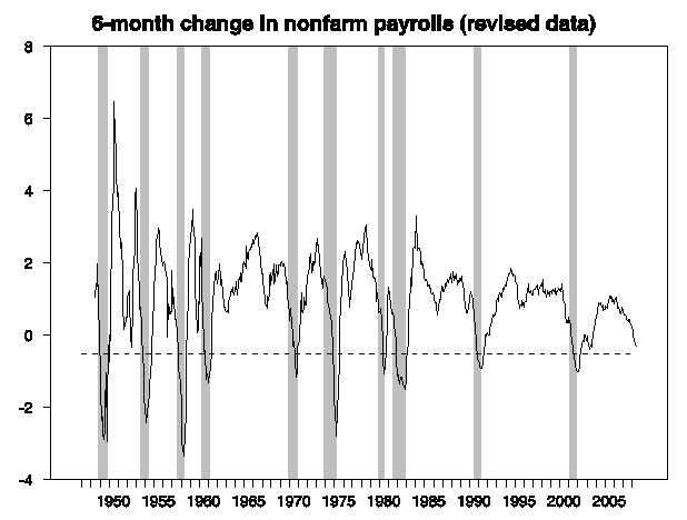
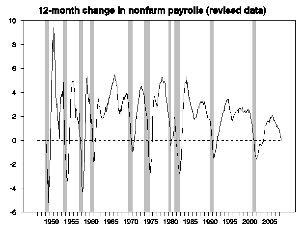
Leamer looks at four key series, asking what threshold each has to cross in order to be included in episodes that the National Bureau of Economic Research characterized as economic recessions. Leamer observes that it’s typically called a recession if the 6-month growth rate of nonfarm payroll employment falls below -0.5%.
|
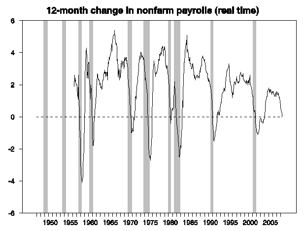
Leamer also says that in a recession, the 6-month change in the unemployment rate rises above +0.8%,
|
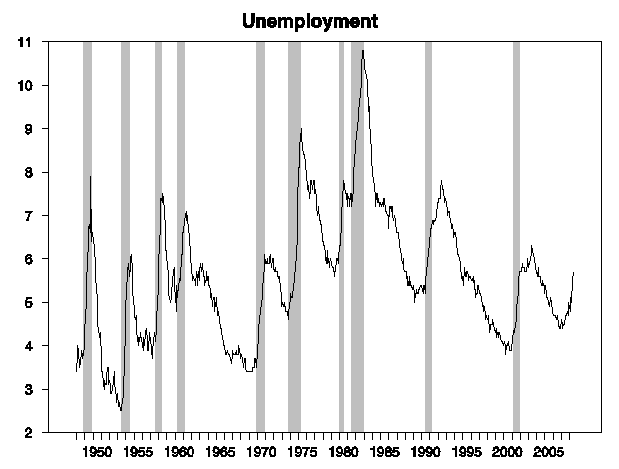
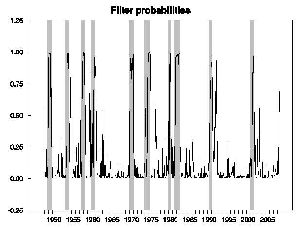
the 6-month growth in industrial production falls below -3%,
|
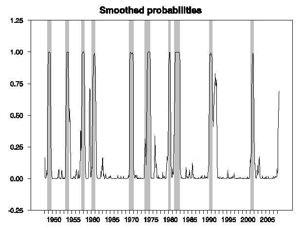
and we see a 6-month change below -0.4% in civilian employment as measured by the BLS household survey:
|
Of these measures, the increase in the unemployment rate has crossed Leamer’s historical threshold, and with the latest data the drop in civilian employment is getting pretty close. But industrial production and NFP do not yet meet Leamer’s criteria, leading him to conclude that we are not yet in a recession. Things would have to get much worse, he writes, before he would designate the current slowdown as a recession.
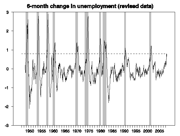
The growth rate of nonfarm payrolls is also an indicator stressed by Calculated Risk, though CR favors the year-over-year change rather than Leamer’s 6-month change. Using a threshold of no change in year-over-year employment seems to satisfy Leamer’s sort of selection indicator, and on that basis the July NFP numbers would lead you to say we’re in a recession:
|
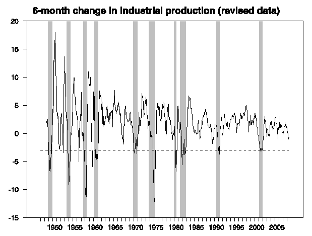
One challenge with using any of these indicators is that the series can be revised over time. The patterns in the series as they’ve now been revised may be clear, but how good is the inference we can draw with the data actually in hand? Looking at real-time year-over-year NFP growth rates seems to be pretty robust by this criterion:
|
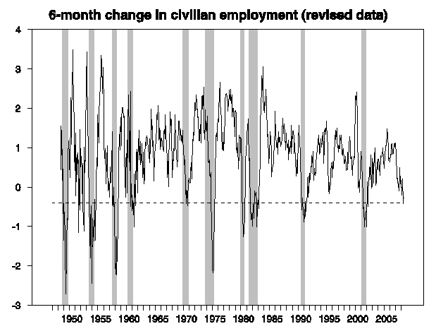
And I must say that when you look at a graph of the level of the unemployment rate (rather than the changes plotted above), the recurrent mountains seem like a pretty prominent feature that could almost be taken as the defining feature of a recession.
|
I argued in a paper published in 2005 that the recessionary pattern one’s eye detects in the unemployment rate is due to a nonlinearity in the time series, with the unemployment rate increasing more quickly than it decreases. In that paper, I modeled the unemployment rate as depending on an intercept and its previous two lagged values, with the intercept changing between one of three values– a low level for normal times, and two higher values for mild and severe recessions. A shift into recession causes the unemployment rate to rise quickly, while it drops more slowly in recoveries. The analyst doesn’t have data on whether the economy is in expansion, mild recession, or severe recession at any point in time, but we can draw an inference based on what we see happening to the unemployment rate. I was curious to see what that model says when you update it with the most recent unemployment numbers.
|
Historically this seems to give you a pretty fair recession inference using the unemployment numbers alone, though it would have lengthened both the 1960 and the 1990 recessions into double-dipped downturns. The interesting thing to me is that the model also assesses the probability that another recession has now started as being 69%.
Once again, however, recognizing these patterns with all the historical data now on hand is an easier task than trying to call the events in real time. For example, here’s what the above graph looks like if you tried to base the inference on data available at the time, without knowing what the future is going to be:
|
It’s obviously a lot harder call on this basis, though the signal from the latest unemployment jump is strong enough that you might still feel justified in making it.
A key challenge in trying to make these determinations is the continuing changes in demographics and the structure of the economy. For example, with a decreasing manufacturing share, the downturns in industrial production may be becoming less pronounced. One can always find some rule that seems to fit the historical data pretty well, but will it continue to work in the future? The more variables you’re free to choose from and the more variety in the rules you consider, the better you may seem to fit the available data, but the more problems you’re likely to encounter applying that to the new situations that are always developing. I do think there’s a pretty strong case, based on the employment and unemployment numbers, that we are currently in a recession. Nevertheless, we will be making the Official Econbrowser Declaration, for what it’s worth, using the GDP-based recession indicator index, which is deliberately very simple and limited, and hopefully therefore the most robust.
And with 1.9% second-quarter growth as currently reported, GDP growth doesn’t meet the criteria for a recession so far.
But the whole reason I’m interested in this question of whether our current difficulties should be classified as a recession, is that if we are in a true recession, the process is going to feed on itself, and more bad things are ahead of us. If it’s a real recession, it should be evident in the 2008:H2 GDP numbers.
And if you want an Official Econbrowser Declaration, you’re going to have to wait for those.
Technorati Tags: employment,
recession probability,
recession indicator index,
macroeconomics,
economics
Thank you for doing all this work. It’s much appreciated.
Picking up your comments regarding unemployment – the most recent cycle of increasing unemployment rates has coincided with significant increases in the minimum wage. That’s disproportionately affecting teenage workers, who have borne the greatest blunt of the increased level of unemployment, given that they make up such a large share of workers paid at those levels.
Since the links above only consider the situation through the end of 2007, I thought I might run some back-of-the-envelope numbers from the latest Employment Situation report (July 2008, Table A-1)
Since March 2008, the number of people in the civilian labor force counted as unemployed has increased from 7,815,000 to 8,784,000 in July 2008. For those Age 16-19, the number of unemployed has increased from 1,070,000 to 1,415,000. As a percentage of the people counted as unemployed, those Age 16-19 have risen from 13.7% to 16.1%.
Looking now at the numerical change in the number of people counted as unemployed between March 2008 and July 2008, we find an increase of 969,000. Meanwhile, for those Age 16-19, we find an increase of 345,000. In percentage terms, 35.6% of the increase in the number of unemployed is represented by the increase in the number of unemployed teenagers.
And that report only covers about a week of the latest minimum wage hike, which took effect in late July. One wonders what August will bring for the unemployment numbers!…
Great work, as usual.
In any case, the mere FACT that real GDP is going to increase at rate below potential (0.5% annual rate in H2-2008), indicates a stagnant economic system, along with a core inflation awfully above the Fed’s comfort zone.
My question is:
should the NBER declare the beginning of a nasty “STAG-FLATION” period instead of officially stating that the RECESSION happened from YYYYmm to YYYYmm ???
Maybe using the word “STAG-FLATION” could be very unfriendly for risky financial market assets.
And no one at this point wants to destroy value again.
The capitalist dream is rising industrial production coupled with falling employment.
But who will buy he goods,, one might ask.
The capitalist answer, in 2008 America, is “the Chindians.”
Two things to note about Leamer’s algorithm:
1) BLS made a significant change to the Birth Death adjustment (implementation began 2003). What used to be a minor tiny factor has taken over the entire report.
How much so? In 2007, of all the NFP job growth that was reported, 75% was due to Birth Death adjustments.
2) Leamer’s prior argument “Housing IS the Business Cycle — was far more persuasive.
http://bigpicture.typepad.com/comments/2008/08/why-so-much-hou.html
Leamer’s money Quote: “Of the components of GDP, residential investment offers by far the best early warning sign of an oncoming recession. Since World War II we have had eight recessions preceded by substantial problems in housing and consumer durables. Housing did not give an early warning of the Department of Defense Downturn after the Korean Armistice in 1953 or the Internet Comeuppance in 2001, nor should it have.
The ECRI declared a recession a couple of months ago. That, for me, is the real indicator.
The recession began in Dec/Jan 2008. Thus, we are already 7 months in, and probably are past the half-way point. The chances of the recession lasting much further beyond March are slim, as that would be 14 months.
Nice distillation, Professor; thanks!
Excellent work! The graphs speak loudly.
I assume that the professor is using official stats, not those from shadowstats.com. Without deciding whether the official stats are more useful or accurate than the stats calculated under prior methodologies, isn’t it deceptive to compare current stats with past stats when the statistical models have changed?
When considering teenage unemployment, you have to look historically. When there was no increase in the minimum wage and there was a recession, how much did teen unemployment increase as compared to the rest of the population? Two factors are at work during a recession: 1. The least productive are often let go. 2. More teens enter the labor force.
A key challenge in trying to make these determinations is the continuing changes in demographics and the structure of the economy. For example, with a decreasing manufacturing share, the downturns in industrial production may be becoming less pronounced.
It’s interesting that in the earlier recessions the spike in unemployment was followed by a pretty quick decline whereas the last two have had the initial spike then a grind higher. Payrolls seem to start moving up again after the initial downward spike, but at slower pace than earlier recoveries.
Perhaps in the earlier recessions we were more dependent on manufacturing so we had a sharp spike in layoffs followed by rapid callbacks of idled workers after inventory was depleted, whereas in a post industrial economy the “recovery signals” to employers are less direct than an inventory report and so they hesitate longer before hiring.
Perhaps a secular deindustrialization trend is at work here, NFP has a pretty decent declining upper bound from the early 80s onward. Maybe you have the spike in layoffs at the beginning of a downturn but, instead of workers being called back when inventories are depleted, a new factory opens in a low wage country. Another version of the story would have increasing productivity resulting in fewer workers being called back after each downturn.
Goodrich, show me a publicly available spreadsheet where I can reproduce the Shadowstats calculations. Until someone does so, I will completely ignore the claims of that web site, and recommend that you do so as well.
“If it’s a real recession, it should be evident in the 2008:H2 GDP numbers.”
I am not sure why one would choose to rely on government stats such as GDP as a basis for analysis. Do government number crunchers – and their politically appointed bosses – somehow inspire people with confidence as to their objectivity and competence?!?!
Isn’t it likely that the government manipulates the stats it generates in order to align with the political messages they want to send? OK, forget ‘likely’ and substitute ‘dead certain’…
P.S. Don – the only alternative to shadowstats are government stats, AFAIK. We *know* the political class lies for a living. We *know* governments – including ours – are in fact specialists when it comes to lying, misleading and misinforming when it serves their purposes, and on every conceivable subject. So if you choose to disbelieve shadowstats, fine, but if by default that means you are choosing to believe *government* stats, I gotta say this seems like a massive leap of faith in the wrong direction. Good luck with that.
Interesting article. A couple of points:
1. Your final comments on GDP growth might be tempered by the tepid recovery of the past few years. If you chart real GDP vs. the CBO’s potential GDP, then this was the first post-war recovery that didn’t make it back to potential. The gap between potential and actual is already almost to the peak of the 1991 recession.
2. Ironman’s thoughts re youth unemployment are good, but do not hold if you take a closer look. If instead of March vs. July, you look at February vs. July, then youth are only 20 percent of the increase in unemployed, and Jan vs. July is only 13 percent. It’s very sensitive to your starting point! If you use the 6-month change, as is done in the article, then the current period doesn’t differ much from past recessions.
3. The methodology for headline unemployment, as used in this article, has not changed since 1967, and the changes made then were not measurable (less than a tenth of a point in the rate). The definition of discouraged workers has certainly changed, but they never factored into the headline unemployment rate (except for that insignificant portion in 1967, and that was only a small number of the discouraged workers who were counted as unemployed).
4. Barry’s comments about the birth/death adjustment apply to preliminary estimates (basically, the current calendar year) but not to revised numbers. BLS has completed but not published an analysis about how good the model is. If Barry is correct, then nonfarm numbers for this year will be revised sharply downward. We’ll have to see.
Ray Fair’s FAIRMODEL isn’t predicting anything close to a recession either. It IS predicting some startling inflation numbers (over 5%).
Another important point :
Whether each of the indicators crosses the barriers mentioned in the article, or not, is secondary.
The main takeaway is that none of the indicators have stayed below their respective recession thresholds for very long. They are usually worse that that horizontal line for a few months at most.
Thus, an economic recovery by the middle of 2009(at the latest) is inevitable.
We should be so lucky as to see huge inflation, or even stagflation.
Unfortunately, a look at the money stats — M1, M2, and the (now privately estimated) M3, along with lending activity, CP, and securitization — paints a far bleaker picture: no, our future begins with a capital D….
There’s no financing for a recovery, so there will be no recovery in 2009. In an age when all entities, both consumers and businesses, are more dependent on credit than ever before, given the amount of lending capacity that we have destroyed, the amount of lending infrastructure that has been sidelined or eliminated, and the lending product lines that have been curtailed, our trajectory is set: pray that Inflation or her less attractive sister, Stagflation pays us a visit!
I find JH’s analysis very reasonable and tempered. No doubt, there have been some signals in the U-Rate and other indicators of a possible recession in the making. However, if one looks closely at the U-Rate, its rate of ascent and degree of change has been slower and smaller. Likely, we would have already looked much better without the oil price shock compounding the unwinding of the mortgage issue. For all of the Roubini-like recession doomsayers looking for the sky to fall, I guess conspiracy theories are the last resort for recession certainty in the face of the durables goods and non-farm orders data today.