The employment situation release seems like old news, and Jim has already teased out some of the most important aspects in his post. However, I thought a little more context would be useful, given that some observers still think a recession can be avoided. From the White House economy fact sheet (accessed 9/7/08):
On September 5, 2008, the Bureau of Labor Statistics released new jobs figures for August. Nonfarm payroll employment decreased by 84,000 jobs in August, and the unemployment rate rose to 6.1 percent. While these numbers are disappointing, what is most important is the overall direction the economy is headed. Last week, the economy posted a strong gain of 3.3 percent at an annual rate in the second quarter, led by growth in consumer spending, exports, and a well-timed and appropriately sized stimulus package. This level of growth demonstrates the resilience of the economy in the face of high energy prices, a weak housing market, and difficulties in the financial markets. Orders for durable goods have been rising in recent months. In addition, productivity growth over the past four quarters has been strong at 3.4 percent — above the averages for each of the past three decades over the course of the Administration.
See as well [1].
Consider first a plot of the payroll employment series of various vintages.
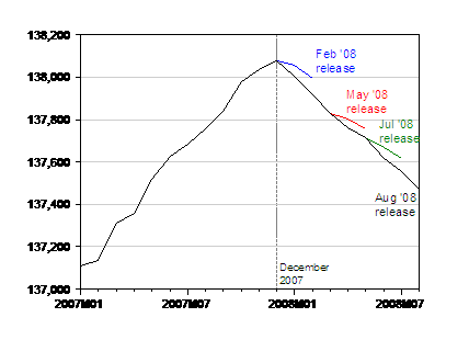
Figure 1: Nonfarm payroll employment figures from February (blue), May (red), July (green) and August (black) releases, seasonally adjusted. Source: BLS.
What’s obvious is that each successive release has revised downward the employment figures; in other words, the last downward revisions to the previous two months’ worth of numbers was not an isolated event. (It’s no use plotting the earlier vintages — those are pre-benchmark and hence show a much higher level of employment — roughly 100,000 higher.)
Aggregate weekly hours also continued to decline. They are calculated to have declined about 0.9 percent in log terms relative to the December 2007 peak (nonfarm payroll employment has only declined about 0.4 percent).
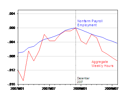
Figure 2: Log nonfarm payroll employment figures (blue) and log aggregate weekly hours index (red), seasonally adjusted, normalized to 0 in 2007M12. Source: BLS, August employment situation release.
Finally, note that there is no solace to be had in looking at the household survey data. The civilian employment series has declined about 0.5 percent (log terms) relative to 2007.12, and is obviously declining. (The civilian employment series adjusted to conform conceptually to the payroll employment series is up 0.3 percent relative to December 2007, but down 0.5% relative to its most recent peak in April 2008.)
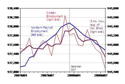
Figure 3: Nonfarm payroll employment figures (blue, left axis), civilian employment (red, right axis), and 3 month moving average of civilian employment (maroon, right axis). Source: BLS, August employment situation release.
So while GDP is up in Q2, July and August employment — in Q3 — suggests a lot slower growth.
Technorati Tags: nonfarm payroll employment,
household employment, recession,
aggregate weekly hours.
Isn’t it wrong to base recession expectations only on employment numbers? What about productivity growth? If you lay the increase in labour productivity onto the employment graph you may find less pessimistic results. If americans are producing more per hour they may as well be substituting labour for leisure – hence the fall in average weekly hours. And the rise in unemployment may be the result of substitution of labour for capital. The price of capital is the interest rate. The long-term rate is rising even in the face of soft monetary policy, which means the price of capital is rising. May be due to increased demand?
miszkam: Yes, that’s correct — but employment is the most timely indicator we have; the others are more retrospective to one degree or the other (industrial production is one of the others that is more timely in release). Output per hour, which depends on the GDP statistics, is one of the more retrospective. See more details here: [1] and [2].
Leisure for labor substitution – yeah, right.
That’s why the employment-to-population ratio for *every* age cohort under 55 has stagnated or fallen since *2001* (7 *years*) but the employment-to-population ratio of the 55+ age cohorts has soared.
Yep, near-retirees and retirees suddenly decided to work a lot more around 2002 and those younger than 55 decided to go to the beach.
Yep, that makes a lot of sense.
As opposed to a situation where the 55+’ers took a massive hit in the wake of the tech bubble – and therefore *had* to keep working.
And the sub-55’ers saw their job opportunities displaced by the oldsters clinging desperately to their positions and foreign labor working at 30% (or less) of US wages.
Which scenario sounds more like the true history of the last 7 years?
One argument is that we’re seeing a post-summer vacation response to the boost in minimum wage. Since a lot of people are now costing employers more, thanks to Congress, a rational business response is to trim employment.
Anyone care to test that prediction against data?
As to people over 55 working more, good. “Early retirement” schemes of recent years have induced too many productive people to sit on their duffs watching TV, or worst, clogging up the roads in RVs. While getting a check for nothing might make sense for the early retirees, it represents a huge waste of society’s resources.
Menzie – interesting. As for GDP that was a QtQ figure while real GDP on a YoY basis was 2.5% and 2.2% in Q1,Q2. Much more interestingly Gross Domestic Purchases were 1.1% and 0.4% – the GDP deflator controversy you know which using Purchases sidesteps (found ’em thanks). Another striking thing is that running the time series back to 46 or so this is the first time they’ve diverged in direction in that entire time. Or had that big a difference.
Another indicator I’ve come to like is the sum of YoY changes in real wages and employment which is now down significantly. Paul Kasriel at Northern Trust uses something quite similar and gets about the same directional and turning point results. And both our results our consistent with Prof. Hamilton’s earlier finding that the probability of a severe recession has increased.
With teen employment doing better than average, minimum wage is highly doubtful as a cause.
I am waiting for someone to propose the Great Depression should be called the Great Leisure, a measure of the awesome prosperity of the thirties together with promises to return it to us.