Rather than engage in long commentary, I thought a set of pictures would be sufficient to convey the deteriorating macroeconomic situation, at least as reflected in the labor market.
First, the decline from peak in nonfarm payroll employment at 2007M12 (1.911 million), and how revisions have continued to be in a negative direction. Whereas in the past, commentators could say that the job loss figures were not consistent with recession, I think that is no longer a plausible assertion.
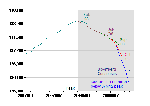
Figure 1: Nonfarm payroll employment, seasonally adjusted, various releases. NBER defined recession dates shaded gray (assuming recession has not ended by 2008M12). Bloomberg consensus for November in dark blue square. Source: BLS, employment situation, various releases, via St. Louis Fed FRED II, Bloomberg.
Second, note that the decline in hours of employment has been much more drastic than the decline in employment (2.9% vs. 1.4%, in log terms).
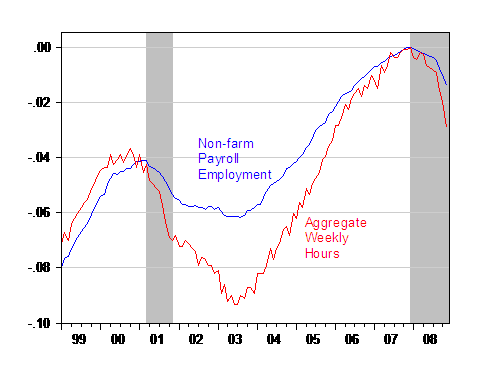
Figure 2: Log Nonfarm payroll employment, seasonally adjusted (blue) and log aggregate weekly hours index, seasonally adjusted (red), normalized to 2007M12 peak. NBER defined recession dates shaded gray (assuming recession has not ended by 2008M12). Source: BLS, employment situation, December 5, 2008, via St. Louis Fed FRED II.
Are these figures an artifact of the establishment survey? I don’t think so. See Figure 3:
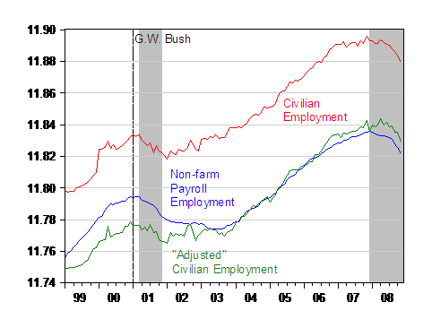
Figure 3: Log nonfarm payroll employment (blue), log civilian employment (red) and log civilian employment adjusted to conform to NFP concept (green). NBER defined recession dates shaded gray (assuming recession has not ended by 2008M12). Sources: BLS via FRED II, and BLS, and NBER.
The household survey figures indicate a comparable decline (1.3% vs. 1.4% for NFP). The BLS research series — the smoothed household series adjusted to conform to the payroll concept — evidences a smaller decline (0.7%) relative to 2007M12, but has been declining faster since its peak in 2008M04 (1.5%).
Finally, we know the losses are broad based (see Haver today). One interesting aspect is that manufacturing employment has been noticeably declining since mid-2006, despite the surge in exports in 2007.
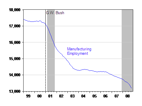
Figure 4: Manufacturing employment, seasonally adjusted. NBER defined recession dates shaded gray (assuming recession has not ended by 2008M12). Source: BLS, employment situation via St. Louis Fed FRED II.
It is hard to glean many positives from these data. Using Okun’s law, output is likely to have taken a hit in November. Below is e-forecasting’s take on the situation for November.
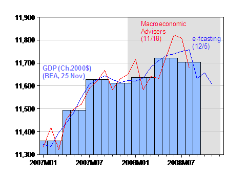
Figure 5: GDP (light blue bars), GDP from e-forecasting, 12/5 (blue), and from Macroeconomic Advisers 11/18 (red) in Ch.2000$, SAAR. NBER defined recession dates shaded gray (assuming recession has not ended by 2008M12). Source: BEA, GDP release of 25 November, e-forecasting 12/5 and Macroeconomic Advisers [xls] 11/18 release.
For more, see Real Time Economics.
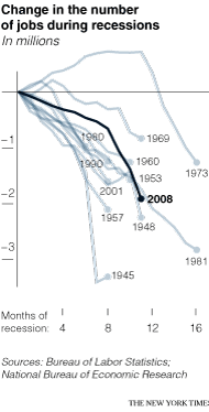
Update, 12/6, 10:10am Pacific: A graphic comparing NFP net losses, from NYT today.
[Update, 12/8, 10:30pm Pacific: In response to Marcus Nunes‘s allegation that I have distorted the trend/cycle pattern in manufacturing employment by truncating the start date to 2000. Here is a longer term picture:
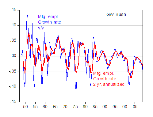
Figure 6: Year on year growth rate of manufacturing employment (blue) and two year growth rate (annualized) of manufacturing employment (red), calculated as log differences. Source: BLS via FRED II and author’s calculations.
Technorati Tags: nonfarm payroll employment, recession,
hours worked, job loss, GDP, manufacturing employment.
Excellent presentation (aside from your need to inject politics into figures 3 and 4, but it’s your blog so I’m not complaining).
It is certainly ugly and with the tendency of the data to be revised downward could look even worse next month.
Oh, look everybody, Menzie the non-partisan economist found it necessary to equate W’s presidency with declining manufacturing employment.
It does make it look a little bit like a pot shot at GWB to include when he took office in this graph, only to include the last couple years of his predecessor and none of the prior presidents. That’s not a criticism or accusation, just sayin.
Well, as long as we’re showing pictures of worsening employment levels….
Nice breakdown Ironman. I need to give it a thorough reading.
Does this mean that teenagers will have less disposable income and CD price will come down to a better level?
(If highend CD prices go below $10, I suspect it would spur enough demand from 25+ers like myself that it could lead to a recovery for the recording industry.)
aaron – who buys CDs any more? Fun anecdote – a record label had a teen focus group come into their office to give their opinion of new acts. After they were done, they set up a freebie table that included a bunch of CDs of some of their bigger names. The teens completely ignored them. And that was the real day that the music industry as we’ve known it died….
More seriously, teens having less disposable income has affected retailers that cater to teen consumers. I believe Mrs. Fields (cookie stores at the mall) was one of the early casualties.
At least job loss is happening fast. Duration is a bigger problem than depth.
I hope we lose another 1 million jobs in the next 3 months. Then at least the recession will end soon, with a good recovery.
The slow bleed of jobs over a much longer period is actually worse.
A somewhat disturbing thought GK, but first that other ” non-partisan economist” disturbing thought by some Above-it-Alls that you can do economics without respect to the political environment. Time to have Scotty beam you people back to Earth.
As I was sayin, GK, regarding the ‘quick flush’ or ‘slow bleed’…what do you have in mind after the quick flush, that “good recovery”? Tell me some facinating story about how this won’t actually bleed through letting all that horse manure we have been storing since the premature and desperate housing wagon pulled in to rescue us from further losses in the hi tech boom…where we can at least point to some artifacts of progress, unlike housing.
Oh, look everybody, Menzie the non-partisan economist found it necessary to equate W’s presidency with declining manufacturing employment.
~~~~
Yeah Bush , who never saw an unfair trade practice , or a deficit he could use Gatt to challenge …
BL: I used a template from a previous graph where I was making a different point. But it is factually correct to have that dashed line in the graph.
That being said, I do not believe I have made the assertion that I am nonpartisan, so I do not understand your statement.
Thanks for grouping together the pictures – it really tells the tale.
One of the issues I don’t see in the debate on unemployment policy response is that the major problem is all on aggregate demand side, demand has fallen and I don’t think we are going to address that by pushing $300-600b to a few industries through fiscal stimulus when 100 industries are going into a fall in AD.
Macroecon Advisors just came out with new Q4/08 & Q1/09 estimates -5.6 for Q4 & -4.2 Q1 thats almost 10%
using Okun’s Law
U= ^u-h[100(y/yn)-100]
that will mean adding 5 % to unemployment in the next 6 months. That takes us from 6% at beginning Q3 to 11% by Q3 next year.
The issue at the heart I think is corporate earnings, which are falling and with demand falling we are in a thrift paradox on the corporate, consumer & public side.
As corporate earnings keep falling, corporate investment falls, employment falls, demand falls etc..
With AD falling as fast as it is 10+ % of GDP from Q3 08 to Q4 09 estimates. I think we could shock the economy with a 10+% of GDP tax cut for 2009.
This will shock corporate earnings side if we had a 2009 only massive tax cut.
Corporate rates taken down to 0 for 09 (corp taxes are only going be $300-400b) in 09 anyways.
R&D tax credit that is huge $400b at $100b a quarter available only for R&D/CapX,/Plant Equip etc..
Cap gains to 0% for 09 only
Payroll tax cut to 0% for all of 09
All of these will stimulate corporate earnings in 09 by 10-30% Equity prices will raise 20-50%, debt prices will come down from 8-18% to 5-10% and drive demand in CapX which will have solid multiplier effects. With large value to the balance sheet.
On the individual side
a 2009 payroll tax cut to 0%
a 2009 indiv. tax cut of 20%
both of these will drive large savings, debt payments, bank deposits & better credit ratios, asset prices will rise 401k’s, home buying will begin and the consumer balance sheet will be cleaned up
Add the $600b to state & local governments for cleaning up their balance sheets and allow them to cut state taxes
All of these would drive huge aggregate demand shock across the whole macroeconomy and would replace 10% of GDP
I also think we could encourage the G20 to adopt the same policy with 2009 0% of GDP tax cut $4 trillion. This coupled with a US $2Trillion tax cut would jolt global AD.
I’d be more impressed if the scales of the graphs weren’t so ridiculously magnified. The actual changes are small. Not every blog viewer is dense.
Who was president when Treasury refused to brand China as a currency manipulator?
mmckini – You can’t use WTO to challenge the main causes of deindustrialization of the U.S.
Dr. T: Indeed, the typical Econbrowser reader is not dense at all. I’ve cited lots of percentages and percentage changes. Hence, an educated person should be able to understand what is going on in the graphs (especially since Figure 2 presents a longer span of the data in Figure 1, Figure 3 is in log terms, Figure 4 spans a decade, and in Figure 5, if you think that’s a small decline, well feel free.
Aaron from NJ: I think you’re using q/q figures at annual rates, so the implied decline is on the order of 4% by end-2009. That means something like 2-3 ppts increase in unemployment, depending on the value you choose for h.
Indeed, the typical Econbrowser reader is not dense at all.
I’m doing my best to drag down the average to an acceptably dense level, but there are just too many of you and Menzie’s weighting us wrong.
61.4% employment-to-population ratio. It’s getting really close to levels not seen since the 1980’s. I’d imagine it’s one of the lowest on record if you only look at men.
A lot of people may seek to re-enter the labor force if asset values can’t support them anymore. We’d need a spectacular rate of job creation to keep pace with them and population growth at the same time.
On the bright side, some of these jobs were the sort that made for a precarious economy (not micro-biology, but mortgage brokers)…where housing related jobs crowded out other jobs that paid less and required more training.
So shedding these jobs will make the economy more resistant to future short term heists, right? Right?
And those that have made their short term heists will see the error of their ways and become micro-biologists, now that they can afford it right? Right?
And now that they have the financial security, possibly be moved to a less self-interested predatory outlook, right? Right?
I’m hoping that Bill Gates could make this stunning gesture, now that he is in charge of his Foundation…seeing as how Warren Buffet is still playin Wise Investor.
One of the most interesting things about the current crisis is how little everyone seems to understand about it. Whether it is traders, economists or politicians, all seem to be mystified about what is happening. This fear of the unknown leads to fear of a depression happening. A good example of utter bewilderment is to read Macroman’s blog and his trading.
The other interesting thing is that people now realise that in the last 8 years or so no one in the financial markets and science of economics seemed to know what they were doing, and that they were causing this crisis. In all that accumulated knowledge, except for a few doomsayers everyone thought things were ok. And even with Roubini, he claims to have foreseen all this but has no real idea of how to fix it. So I wonder if his predictions were more habitual pessimism than real insight.
But how can all this be? How can all of economics and finance be reduced to this? Can experts be so incompetent or out of their depth as to cause a world wide depression in this, the 21st century?
The only aspect of all of this that is so misunderstood be people is derivatives. We hear over and over that the experts simply didn’t understand them, and it seems no one ultimately did understand them. So a combination of derivatives too complex to understand and high leverage ultimately can be the only cause of this crisis. Everything else is too well understood.
There is then only one answer. All derivative contracts in the world need to be listed on exchanges, and all aspects of them be totally transparent as with stocks and bonds. All unlisted derivatives need to be investigated and unwound before they too blow up. If this crisis passes without derivatives being fully regulated the next crisis will have us living in caves. The human mind cannot understand derivatives well enough, they are too complex.
61.4% E/P Ratio was last seen February of 1993.
Short version: the entire employment gain from the Clinton Administration onward has been wiped out.
Looking at Figure 4, which appears to be the one so many people whined about above, what becomes clear(est) is that manufacturing did not recover following the 2001 recession, and trended down again starting in 2006.
Next time some tells you about recoveries in manufacturing being part of the Business Cycle, show them that graphic and ask them to explain, in economics terms, what changes in policy lead to 2003 and following.
“That means something like 2-3 ppts increase in unemployment, depending on the value you choose for h.”
Since the workforce will grow by 1.4 million in 2009, to get to 9% unemployment, we need to lose another 1.7 million jobs. 1.7 million more jobs lost will make unemployment 9% by the end of 2009 (all else being equal).
The last chart about the ‘change in number of jobs during recession’ is not useful because :
1) Jobs often continue to be lost after the recession ends, as in 2002-03. Look how much aggragate hours worked dropped after Nove 2001.
2) The number of jobs lost has to be indexed to population. Losing 2m jobs in 1974 was a bigger slice of the workforce than losing 2m jobs today.
Menzie,
I do not believe you deserve criticism for including indication of the Bush presidency. BL needs to study the decline in manufacturing jobs a little more closely. These jobs have been declining since the 1980s and in the mid-1990 under, Clinton, government employment passed manufacturing employment.
Anyone who looks at the graph can quickly see that the economic decline of the early years of the Bush administration began in 1999-2000, personally I believe it started in April 2000 with Greenspan attempting to correct his error in monetary injection before Y2K. But let me not digress.
Within two years of Bush taking office the employment picture turned up. I would give credit to Rep. Bill Thompson for creating a true supply side bill that reduced taxes on producers and allowed them to retool and repair and produce. The result was remarkable as employment began to rise and government revenue increased as deficit predictions were never realized even with the 9-11 attack. Even with two major wars involving worldwide engagement, massive hurricane damage in Florida, Mississippi, and Louisiana and dealing with one of the worst tidal waves in recent history the economy thrived.
But the graphs also show the startlingly rapid decline in employment once the Democrats took the House and Senate. Ironman supplies us with the fact that youth unemployment led the way, a very clear reference to the impact of the increase in the minimum wage. The minimum wage was raised a whopping 14% from $5.15 to $5.85 on July 24, 2007, then another 12% July 24,2008. The minimum wage is scheduled to rise another 11% on July 24, 2009 in the face of massively rising unemployment. This 41% increase in the minimum wage in two years is so large that it will not only effect the youth population but will reach into the lower incomes creating more critical family unemployment.
But Bush should not get a pass on this. He was the primary reason the Democrats took the House and Senate because he did not provide the economic leadership that he should have. It became clear that Bush did not understand why Reagan’s economic policies were successful and he quickly implemented Keynesian demand side policies the reversed the impact of the Thomas Supply Side cuts. As problems worsened the failure of President Bush and congress became more manifest peaking with Hank Paulson in concert with Ben Bernanke pushed the entire economy over the cliff with massive bailouts estimated at trillions of dollars, half of total 2007 US production.
So what does the future hold. If we are to believe Barak Obama, and I do, he plans to increase and extend unemployment payments keeping workers idle; he also plans to create New Deal government works projects adding to the unemployed approximately one ex-producing worker for each non-producing government worker hired at a lower wage rate, then add to this the impact of the increased government bailouts of failing businesses (last amount Obama plans to submit after he takes office is an additional $500 billion). When I pull all of this together sadly my forecast of double digit unemployment by 4th qtr of 2009 seems like a done deal.
Oh, how I want to be wrong on this one.
Interesting in the recent jobs report are those sectors that did not lose jobs.
Natural Resources and Mining +4K
Government +7K
Education and Health Services +52K
If we are real, education is a government job because most schools are funded and run by government. Also the US government spends more on health care than any other government in the world. The US already has the most expensive national health care system in the world; so, this increase should also be classified as government employment.
Menzie, that is one graph that would be interestin to include. The increase in government employment over this same period.
An aside: What needs to be understood about the call for nationalized health care is that it is not actually about nationalized health care. We already have that. It is actually a drive to eliminate for fee services so that you cannot supplement the national system to pay for the health care you actually want.
One last thing. In the 1990s Clinton changed the way unemployment was determined by eliminating those who were unemployed but stopped looking for work. Notice this quote:
The unemployment rate would have risen more if not for the exodus of 422,000 people from the work force. Economists said many of those people probably abandoned their job searches out of frustration.
Had these been included in the numbers as they were prior to the 1990s the number of unemployed would have been approximately 1 million. Think about it.
DickF: The minimum wage has risen only 18.5% in real CPI-deflated (log) terms since July 2007, and is exactly equal to the value recorded for June 2003. You’re blaming the employment decrease in certain age groups on the increase in the minimum wage? Many other things are happening at the same time (can we blame the credit crunch on the minimum wage increaes too?), while most econometric studies detect little quantitative impact from minimum wage increases.
DickF: You should be able to generate that graph of government employment easily; they’re all available here.
Your point about unemployment calculations is not directly relevant to the graphs presented above, since I am using employment, not unemployment, numbers. That being said, you could just use U6 to get a comparable series of numbers over time, if you are worried about data-breaks.
Thanks Menzie.
The government employment graph is pretty straight up about a 60 degree angle with about a 500% increase since 1940, doubling about every 20 years. The graph for Education and Health is low until Johnson’s Great Society and then is parabolic with a huge run up to the current date. This is probably due to Medicare.
Looks like government spending is really working in this case, of course offset by the crash in the rest of the economy.
Menzie wrote:
The minimum wage has risen only 18.5% in real CPI-deflated (log) terms since July 2007, and is exactly equal to the value recorded for June 2003.
Menzie,
Are you salary increases based on their percentage of the CIP? Just curious.
Menzie
I quite agree with Ed leamer (Macro Patterns and Stories) but you have to be careful not to mislead. You fall into that trap. Others above have noted that it is not correct to compare the absolute fall in employment over different recession periods (and conclude this one appears terrible). I understand the NYT doing that but not you reproducing it verbatim!!!
Also the manufacturing employment plunge beggining in 2000 (before Bush) is irrelevant. What matters is to note that Manufacturing Employment/Labour Force ratio has been declining after reaching a 25% peak at the end of the Korean War!!!
Anonymous: No, my salary increases are not based on the CIP.
Marcus Nunes: I don’t see how I’ve mislead — although you’ll forgive me for not painstakingly normalizing each recession employment decline into log percentages — I only have so many hours in a day. I will note that the rule-of-thumb cited about what sort of job loss constitutes recession-like has been in absolute numbers.
Regarding manufacturing, I have shown the (longer-term) graph you’re asking for in the past: see here, and here. It’s quite a sight.
I’ve also added a Figure 6 in the post, fyi.
Menzie
The rule-of-thumb is misleading (no question abot that), good only for the media (because “more millions is more shocking”). Also, why single out manufacturing employment if this activity has been shrinking monotonically for more than 50 years (from 25% of LF to 8.5%). Why not show the inverse pattern of service employment (that kept on rising even in the GWB presidency)?
In your figure 6 there are “two worlds”; pre mid 1984 and post mid 1984. The “high vol” world and the “low vol” world, so the differences in growth rates are not very illuminating (more apparent than real)and certainly over the last 25 years service has increased in importance anyway.
Marcus Nunes: Ah, the “Great Moderation”. Well, perhaps. See Brad Delong’s comment.
By RCH “There is then only one answer. All derivative contracts in the world need to be listed on exchanges, and all aspects of them be totally transparent as with stocks and bonds. All unlisted derivatives need to be investigated and unwound before they too blow up. If this crisis passes without derivatives being fully regulated the next crisis will have us living in caves”.
Here is a comment I can support. Read the material that precedes this conclusion.
This view is clear sighted, it is farsighted and it is prescriptive. Just what is needed.