A year and half ago, I asked “Does it matter that yield curves (around the world) are sloping downward?” (October 12, 2007). I included this snapshot of term premia in the post:
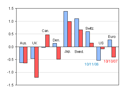
Figure 1: Ten year benchmark bond yield minus three month yield spreads, from Economist, Oct. 12, 2007 and Oct. 11, 2006 issues, and author’s calculations.
In response to my speculation that recession was impending, one reader wrote:
The yield curves are different today because so many central banks are buying long-term debt with their freshly created Yuan, Yen, etc. They do not express what they did in the past.
At that juncture, I was also pretty circumspect myself about the predictive power of the yield curve, given the conundrum, the “saving glut”, and the Great Moderation. Ensuing events (e.g., worldwide recession) inspired Kavan Kucko and myself to write this paper (recently presented at this EABCN conference in Frankfurt). In the paper, we assay the predictive power of the yield curve for (i) growth of industrial production, and (ii) recession. Our key findings are:
- The term spread has significant predictive power when forecasting industrial production growth over a one-year time horizon.
- However, the predictive power for one-year growth is much weaker in the post-1997 period.
- Four out of six European models exhibited relatively high R-squared statistics when using data from 1998-2008 (and the adjusted R-squared actually increased in Italy and Sweden).
- The yield curve does have some predictive power for recessions (defined using ECRI criteria for non-US countries, and NBER criteria for the US).
- However, the predictive power is greatest for U.S., Germany, and Canada. Interestingly, in the latter case, the statistical significance of the term spread disappears when the short rate is included.
- We do not replicate Wright’s (2006) finding that adding in the short rate improves the fit of the equation for predicting recessions.
- The yield curve is hopeless in terms of explaining Japanese recessions.
The detailed results are contained in the paper. Figure 1 depicts the slope coefficients estimated over the full sample period for each country, while Figure 2 depicts a goodness of fit statistics.
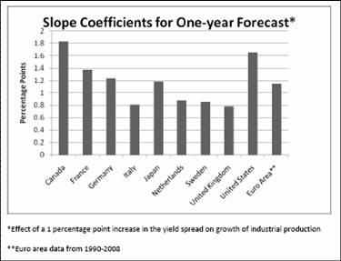
Figure 1: Slope coefficient from regression of one year ahead growth on current term premium (10 year/3 month). Source: Kucko and Chinn (2009).
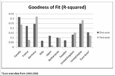
Figure 2: Adjusted R-squared from regression of one year ahead growth on current term premium (10 year/3 month). Source: Kucko and Chinn (2009).
As remarked earlier, the probit models are not particularly successful in predicting recessions. Once again, recessions are best predicted in the U.S., Germany and Canada by the yield curve. But similarly, in the latter case, the significance of the yield curve is not robust to inclusion of the level of the short policy rate.
Unfortunately, given the small number of recessions in the latter subperiod, it’s not possible to make clear conclusions regarding how the predictive power of the yield curve has changed over time.
Of course, these are preliminary results. In particular, it’s not clear what lessons can be gleaned from the current yield curve for the US (and other countries) as the policy rates hit the zero lower bound. (On the other hand, Charles Goodhart argues that the yield curve has greatest power when uncertainty is high — and I can’t think of a time in the recent past where uncertainty has been higher.)
Moreover, as is obvious, we do not allow for some of the effects and complications laid out in this post by Jim.
Other current commentary on the yield curve: Cleveland Fed, [0] (!).
Update: 4/7 11:25am Pacific
My coauthor reminds me that it does appear that the probit models do better at predicting earlier in the full sample. Below are the estimated probabilities of recession in the succeeding 12 months, according the to yield curve (blue) and the yield curve augmented with the level of the 3 month interest rate (red).
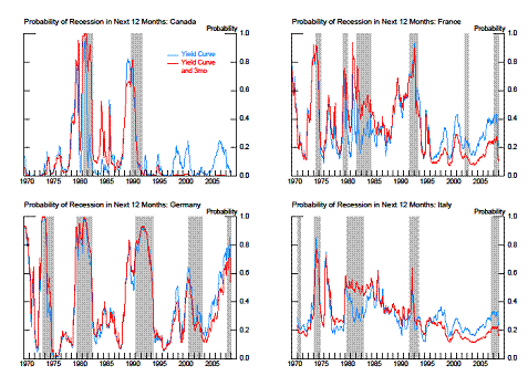
Figure 3: Estimated probabilities of recession in succeeding 12 months for yield curve specification (blue) and yield curve augmented with the level of the 3 month rate (red). Shaded areas indicate recession dates as indicated by ECRI, with exception of the US (NBER). Source: Authors’ calculations.
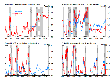
Figure 4: Estimated probabilities of recession in succeeding 12 months for yield curve specification (blue) and yield curve augmented with the level of the 3 month rate (red). Shaded areas indicate recession dates as indicated by ECRI, with exception of the US (NBER). Source: Authors’ calculations.
Technorati Tags: yield curve, term premium,
recession, growth, and industrial production.
The US yield curve presently has a spread greater than 2%. This points to recovery in the next several months.
Informative post Menzie.
The yield curve does seem to be predictive, even if there are not enough recessions in the data to improve statistical significance.
What does today’s yield curve tell us about the current environment?
Menzie-
Forgive me for stating the obvious… A positive yield spread, indicates INFLATIONARY expectation over a longer term. Consequently, more money is spent than saved (boosting money velocity and GDP), and savings are invested at higher risk in pursuit of higher yield. Of course, the higher the magnitude of the spread, the more severe the inflationary expectations and economic/financial response.
The converse, (a negative yield spread), suggests DEFLATIONARY expectations. This would be characterized by shrinking liquidity and/or deleveraging with reduction in money velocity and GDP.
I would suggest, that lower correlation to term spread occurs in those countries with weak central banks relative to commercial interests (Japan, Italy, Holland, Sweden), and higher correlation in powerful central bank regimes (US, Germany, France, Canada).
MikeR– Discussions about “today’s yield curve” in terms of classic correlations are probably reduced, due to the manipulation and intervention by the FED in the government bond market, as well as the “flight to safety” of savings during the current rec/depr-ession …
MarkS,
I agree that the Fed’s intervention adds some distortion, but if the market thought things would stay bad, woudn’t the yeild curve be flat? In terms of the flight to safety, isn’t gold a lot safer than treasuries?
This relates to your point about inflation and an upward sloping yield curve. There is a lot of information in the yield curve in addition to inflation. There is the time premium, a volatility premium etc. I think Menzie’s paper shows that it is difficult (but not impossible) to distill out the individual signals.
Menzie:
So can I interpret the fact that yield curves across the globe were flattening/inverting a few years ago as meaning these yield curves were pointing to a global recession?
While that above seems a reasonable interpretation to me, many prominent observers argued a few years back that the flattening/inverting of yield curves across the globe was occurring because the term premium was declining across the globe.
What story do you find more compelling?
GK: In a normal situation, where the policy rate had not hit the zero lower bound, I might agree. I’m not certain in the current situation.
MarkS: If we lived in a world where the pure risk-neutral expectations hypothesis of the term structure held (so that long term interest rates were merely the average of expected short term rates), then what you say would be uncontroversial. Since the risk-neutral EHTS is something that is not widely acknowledged to hold cross-country, I would say that your assertion is not obvious.
David Beckworth: I don’t think that our analysis can indicate one way or the other what were the determinants of the flattening of the yield curve. I would say that assertions the flattening was due to decreased risk associated with the Great Moderation seem a little less convincing now than they did two or three years ago.
Are people making the same mistake today that was made when the curve was inverted? It seems that a lot of people made excuses when it was inverted as to why its predictive nature had changed (even Bernanke if I remember correctly). Now that it is steep again, we hear similar comments about how it is no longer predictive in the other direction. I suspect those who ignore the current condition will once again be surprised.
Menzie, a technical analysis tool for the stock market says that when the 10yr vs 3 month yields are inverted for 16 months or more, a recession and bear market will follow. For the US market, this analysis has a perfect record. In the most recent case, the inversion went from July, 2006 to Sept., 2008. I don’t have the time to read your paper (unfortunately) but if you have not included the 16 month duration, explore it.
I agree wholeheartedly when “Charles Goodhart argues that the yield curve has greatest power when uncertainty is high”. Uncertainty is in the eye of the beholder. The really high uncertainty in this case was during May to Sept., 2007, when lots of people and some statistics said no recession and bear market was in sight. (Remember those discussions on this site?) It was greatly uncertain to put investment money on the long term short side of the market at that time. The analysis I describe above was a terrific tool for making that highly uncertain investment decision. Later in 2008, the uncertainty of being short the market was very low, i.e., it became evident the market was going down. Though some would say we are in great uncertainty now, I would argue uncertainty is moderate and stable at the moment – a dispassionate review of the facts tells us that we are in big trouble – that is not uncertain. It is unpleasant, but not uncertain. The key point here is to be very time and event specific about labelling uncertainty.
GK, a positive yield spread is not adequate to conclude that a recovery will occur. One needs to define the amount (its larger than 2%) and the duration at that amount (its many months). Go run the charts and analyze it.
Explain the positively sloped yield curve during 1930-32 and 1937.
OT:
It was Hamilton day at the EIA conference in DC. (The EIA is the information arm of the DOE.)
The day opened with a speech from Energy Secretary Chu. He started by noting that US energy policy had to assure energy affordability, national security and climate sustainability.
An ensuing slide had a Hamilton chart, and Chu said something to the effect that “Jim Hamilton prepared this graph that shows that increases in oil prices are linked with recessions. You can see the recent oil price rises on the chart. This graph was prepared in 2006 and there wasn’t a recession then. Of course, there is now.”
And that was pretty much it. He then brought out the maligned ‘hockey stick’ graph of temps for the last thousand years (what Medieval Warm Period?) and launched into scenarios of melting snowpack in California.
Now, had I been the Secretary, I might have spent a little more time on that recession thing, but, oh well.
In another presentation, Adam Sieminski, Chief Economist of Deutsche Bank, also used a Hamilton chart in a presentation on speculation in the oil markets.
Amazing. Econbrowser has become the Wikipedia of the economics business.
I did some more rudimentary analysis in January, 08 on this subject of just US yield curve inversions. Not academically rigorous, but still has some worthwhile data for reference.
http://scriabinop23.blogspot.com/2008/01/yield-curve-inversion-recession.html
Steve,
You probably intended to post this comment in JDH’s thread about oil, but I am curious as to any opinion’s on Chu.
I do not know him well, but I find it curious that a physicist would not be a bigger advocate of nuclear power. He rails against coal (and rightly so) but the reality is that without nuclear power, fossil fuels will provide the vast majority of our enerrgy needs for the next 50 years. I am all for investing in clean fuels, but they are a ways off.
Mike Laird,
The yield curve spread is already larger than 2%. It is over 2.5% at the moment.
The duration is already about 3 months and counting.
The New York Fed just updated its “Probability of U.S. Recession Predicted by Treasury Spread”.
Not wanting to link to a spreadsheet file in this comment, I’ll link to MJ Perry who has more information, with charts and graphs and all:
“Looking forward through 2009, the Fed’s model shows a recession probability of only about 1% on average through the next 12 months, and below 1% by the end of the year (0.82% in December 2009).”
Now, whether or not such historical relationships should be expected to continue with the Fed persuing so many unprecedented functions as it is today, one can consider for oneself.
@ MikeR:
The problem with sweeping generalizations is that my daily driver commuter (26 miles) street legal highway capable electric vehicle is already powered by 100% wind power thanks to a subscription plan, used at my home and by my workplace, offered through my regional power company at prices lower than coal in most states. If everyone did what I already do …