Revisions are downward (but getting smaller over time), the growth rate becomes less negative, but hours continue to decline rapidly.
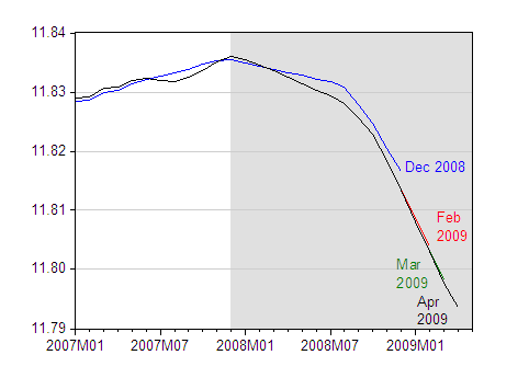
Figure 1: Log nonfarm payroll employment, seasonally adjusted, various releases. NBER defined recession dates shaded gray (assuming recession has not ended by 2009M05). Source: BLS, employment situation, various releases, and St. Louis Fed FRED II.
One point mentioned in various accounts is the impact of temporary government employment associated with the 2010 Census. I take out government employment as tabulated in the employment outlook and calculate annualized growth rates (in log first differences):
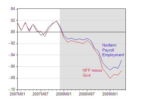
Figure 2: Month-on-month nonfarm payroll employment growth, annualized (blue) and month-on-month nonfarm payroll employment minus government employment, annualized (red). NBER defined recession dates shaded gray (assuming recession has not ended by 2009M05). Growth rates calculated as first log differences. Source: BLS, employment situation via St. Louis Fed FRED II and authors calculations.
While the growth rate for nonfarm payroll (NFP) ex.-government is lower than that for overall NFP, both series show smaller decreases in April than in March.
Finally, note that aggregate hours in private industry continue to decline faster than employment. This difference is not completely accounted for by differences in composition (i.e., between total NFP and NFP minus government).
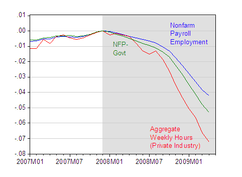
Figure 3: Log Nonfarm payroll employment (blue), log nonfarm payroll employment minus government employment (green), and log aggregate weekly hours in private industry (red), seasonally adjusted, normalized to 0 in 2007M12. NBER defined recession dates shaded gray (assuming recession has not ended by 2009M05). Source: BLS, employment situation, February release, via St. Louis Fed FRED II, and author’s calculations.
In other words, hours worked are now over 7 percent (log terms) below 2007M12 levels, even though employment in private industry is only down a bit over 5 percent.
Technorati Tags: nonfarm payroll employment, recession,
hours worked, job loss.
Very good graphs. Need a translation of the cliff dive of hours worked into drops in national income and thus aggregate demand reduction. Overtime pay is an oddball multiplier in its own way on the upside (too busy working making extra money with little free time to spend it). Usually, the first thing that is cut is unnecessary contractors, then the temp workers, then overtime hours for regular employees, then a reduction of hours from 40 for the regulars, 3-4 day workweeks, first layoff wave of regular employees, then wait and see. That’s where we are now. The second big wave of layoffs is up next after companies assess inventories and the new level of orders.
Menzie,
Can you extend the aggregate hours graph all the way back 10 years, to 1999? That way, we can get a whole decade view.
I think that stock market bottoms can corelate with the bottoms of aggregate hours. For this reason, I am hesitant to say that March was the stock market bottom.
GK: You keep on asking for this…See this post from February, where I responded to this same request. The current value of log(AWHI) = 4.608.
Menzie,
Yes, but we don’t know the latest log(AWHI) value, that happens to be 4.608 now.
So we happen to be at no net increase in aggregate hours for 11 years.
Persuasive narrative from Doc, but I wonder if there is also a transition from traditional payroll jobs (those auto jobs) to something less fixed, and less reliable (those jobs reported in the household survey). If you can report that your contract has been extended, that’s a job, even if the parameters of that extension are less.
The self-made zillionaire RE workers sooner or later find those jobs “Americans do not like to do”, less foreboding than…going hungry. The Household Survey records this improved attitude…and effort, less…and performance, least, yes?
I see that there is a July 31 benchmark revision coming. I hope it includes a larger budget for data collection, now that we see what an array of economic opinion can be generated from current practice. (What is the current guess for the remnant of the infamous “12M illegal aliens”?)
Well, if job cuts seem to be leveling off while hours worked in existing jobs is declining, it seems likely that employers are taking reductionary actions to mask the need for more actual cuts. But I don’t know how to test that theory…
Along the lines of what Calmo said, is there a tracker of salaried vs. hourly workers? Has there been a large conversion of one to the other? Hourly workers can have their hours cut to reduce costs if there’s less work to do, but salaried folk can be made to work longer for the same salary if there’s more work than workers – one group is flexible in one direction, and the other more so in the other direction. Perhaps that might shed some light?
calmo and legion, yes you have very good points. The traditional hourly employee with benefits most certainly composes much less of the workforce than ever before. I also wonder what percentage of the labor force is insured (UI) versus uninsured? It does seem a bit tough to compare previous recessions because of these structural changes. I believe the indicator with the worst severity right now is the number of people working part time who desire full time employment.
It appears that the House (HB 4785 and HB 4786) and Senate are going to take up unemployment insurance expansions. That being the case I expect that unemployment will reach 10% no later than 3 months after it is signed by President Obama. I also expect President Obama to take credit for creating 3 million jobs even though the unemployment rate runs up to 10%.