…and an initial read on monthly GDP.
First, note that nonfarm payroll employment has flattened out, at least according to this initial estimate for November. Previous months figures have been revised upward. In the figure below, I present the September as well as November release.
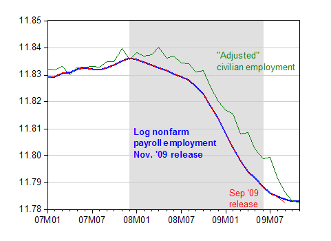
Figure 1: Log nonfarm payroll employment, November release (blue), September release (red), and civilian employment smoothed, adjusted to conform to NFP concept (green). NBER defined recession dates shaded gray, assuming recession ends in 2009M06. Source: BLS, via FREDII, BLS, and NBER.
Interestingly, the BLS’s alternative series, adjusting the household survey based employment series to conform to the NFP concept, indicates the same level of employment, although it seems to be continuing its decline at a slightly more rapid pace than NFP.
Second, private employment has apparently flattened out as well, while private aggregate weekly hours have actually risen.
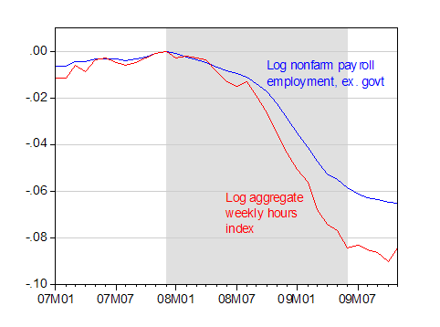
Figure 2: Log NFP ex.-government, (blue) and log aggregate weekly hours in private sector (red), both relative to 2007M12. NBER defined recession dates shaded gray, assuming recession ends in 2009M06. Source: BLS via FREDII and NBER.
Third, government employment actually rose, as pointed out by RTE (taking out education, employment m/m would’ve been down). While this is true, government employment is actually down by about half a percent relative to April 2009.
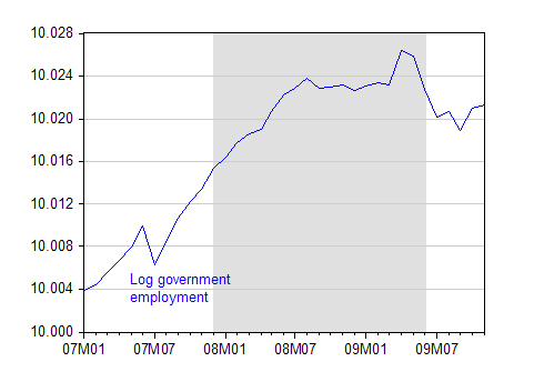
Figure 3: Log government employment (blue). NBER defined recession dates shaded gray, assuming recession ends in 2009M06. Source: BLS via FREDII.
The latest reading from e-forecasting on monthly GDP indicates continued increase in November.
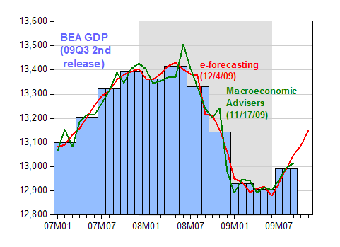
Figure 4: Log real GDP, 2nd release for ’09Q3, SAAR (blue bars), e-forecasting release of 4 December (red line), and Macroeconomic Advisers release of 17 November (green line). NBER defined recession dates shaded gray, assuming recession ends in 2009M06. Source: BEA, e-forecasting, Macroeconomic Advisers and NBER.
All these observations subject to the caveat that the November employment figures will be revised next month (and again revised with the incorporation of the comprehensive benchmark revisions). The e-forecasting first estimates are, in my experience, subject to substantial revisions, as additional information regarding the relevant month comes in.
Those GDP charts are starting to look V-ish.
There should have been a much bigger rebound considering the Fed has printed nearly $1.5 trillion and the US govt injected about $500 billion thus far via the fiscal stimulus. There was also the money used for the Fannie/Freddie bailouts, the AIG bailout, GM bailout, the TARP, as well as other additional spending. But what happens with the Fed stops printing, mortgage rates go up, the fiscal stimulus is all spent, and taxes necessarily go up? That future to me, which not far down the road at all, looks pretty bleak.
Probably the most compelling part of the report, I felt, was the rise by 54,000 in temporary help services within the broader category of Professional and Business services. That, combined with the rise in hours worked, indicates that some of the slack in the labor markets is beginning to be absorbed. A long way to go, but a nearly unambiguous good sign… for now. Of course, we need more than a single month of increases in aggregate weekly hours to confirm anything.
Well, unemployment-wise at least, it’s looking like not “the worst recession since the Great Depression” after all, but the worst since 1982.
What are you looking at Jim?
U6 is higher than it was in 1982; also, structural unemployment in the late 70s-early 80s was around 7%.
At most the cyclical unemployment increase in the 1982 recession was 4%.
This recession started from a base unemployment of 4.5-5% and we’ve gone up to 10.2%.
No matter how you measure it, this is the worst in terms of long term unemployment; underemployment + unemployment, etc.
Just because the headline metric isn’t 10.8% this time doesn’t make this not worse…
V shape not,inverted exponential pulse yes.Panic and fast information exchange had frozen the economic system,making it totally elastic and predictable, linear. It is an example of new type of mobilization phenomena ,survival instinct of large number of humans acting as one organism.
I wonder,where does this leads us in future.
ivars,
The Matrix.
Humans, existing in virtual reality, will be the power source for the ATMs. ATMs amuse themselves by turning credit on, then credit off. Humans are thereby terrorized in virtual reality, and give their full attention to the Federal Reserve Program and the Fiscal Policy Program which then kick in with their predictable outcomes. The Federal Reserve Program re-flates all asset values, except the one that blew up in the last game, but not the economy. The Fiscal Policy Program saves jobs, but does not create new ones. Political frustration is vented thru the choice of voting for the Red Pill or the Blue Pill.
Not even the Oracle knows when the Federal Reserve Program will raise interest rates, but does know this is the reset button for the game to start all over again.
Off-topic, but serious publicity for Econbrowser (and even poster Cedric Regula!) in the Madison paper today.
http://host.madison.com/ct/business/article_2ea485a7-98a0-57c6-8f44-9e70e9135bc0.html
Not sure how author Mike Ivey discovered the site, but glad to see you paying attention.
As for the numbers themselves. It’s not break out the champagne time yet, but it is safe to say that things have at least stabilized in the last 6 months compared to where we were this spring.
But now the key is how quickly do the jobs come back. The high productivity numbers make me worry about that, but I also can see a legitimate argument for a V recovery between the effects of stimulus, overshooting on job cuts, and a breakthrough in lending (either gov’t forced or by a bandwagon effect of “not being the last ones loosening up”.)
The other item to look for is the second hit to government employment barring more aid from the feds. This would be throughout H1 2011.
Cedric
That is manipulation. I do not like it… Is the only way to avoid it to rise on top of it?
Ivars
Avoid it?
1001010100000010101001
1000001010101001010101
0001001010101101010010
0100100000111111010010
This is article number one, I guess, to be read in order to make quantitave predictions about human collective activities, including economy and stock market, currency exchanges.
http://marketing.wharton.upenn.edu/documents/research/Adoption_Velocity.pdf
By shifting time scale according to systems inertia/time constant, any process can be approximated by one of the 3 name curves.
e.g. The time constant of the US stock market is approx 2,3 times longer than time constant of Polish Zloty/EUR exchange market.
The time constant is only dependant, it seems , given the observation speed is equal, on the number of observers in the system.
The dependance of time scale on number of observers should be logarithmic, i.e
T US stocks/ T PLN/EUR = ln (( N US stock)/ n PLN /EUR))
So one can evaluate there are exp(2,3) = 10 about 10 times more observers in the US stock market then ones watching PLN/EUR rate.
So, if there are about 1 billion people following US stock market, about 100 million would follow PLN/EUR exchange rates.
As I have said before graphs are nice art with some historical significance but not much more.
Emerson Electric has just announced that it will not be hiring in the US because of the limited chance of expansion with the current government/business climate but they will move their expansion to India and China.
Both Dupont and GE are considering the same thing.
Ford Motor Company has been very successful with its Mexican plants and is planning to expand to other international markets leaving US manufacturing as is.
I am sure there are others. How would you graph this?
Big business has the power to move from the US, while Mom and pop operations do not. Guess who the government is attacking the most? But the reason is obvious. Politicians can’t get much money from the mom and pops but big business and its pacs are cash cows – for now.
How do you figure that a recession with a 6-month trough is V-shaped? Looks like a U to me.
I love how the e-forecasting number seems to track reality for the whole chart.
Use the first forecast (i.e. the one with the same predictive power used to make the Q4 prediction) not the revised forcast (i.e. not a forecast at all, but a last minute correction or ex post facto reset) and you’ll see the forecast is always sunny, even when we get rain.
I’ve sat through to d%&$# many quarterly meetings that show revenue ramping up two quarters out to believe anyone with an honest bone in their body could construct such a chart.