The BLS released preliminary annual benchmark revisions for March 2012. Nonfarm payroll series and private nonfarm payroll series, in logs, normalized to 2009M01, are shown below; adding on the revised levels for March 2012 yields the series shown in red.
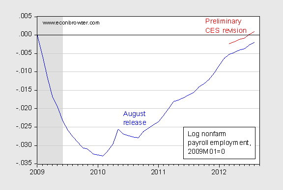
Figure 1: Log nonfarm payroll employment (blue), and adjusted upward to account for benchmark revision at 2012M03 (red), both normalized 2009M01=0. NBER defined recession dates shaded gray. Source: BLS (August release) via FRED, BLS, NBER and author’s calculations.
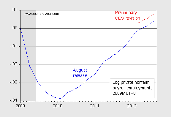
Figure 2: Log private nonfarm payroll employment (blue), and adjusted upward to account for benchmark revision at 2012M03 (red), both normalized 2009M01=0. NBER defined recession dates shaded gray. Source: BLS (August release) via FRED, BLS, NBER and author’s calculations.
This benchmark revision occurs each year. The calculations I’ve implemented in the graphs assume a constant upward shift equal to the March 2012 amount. If, as is typically the case in upswings, subsequent benchmark revisions further shift up the March 2013 figures, then the red lines will represent an undercount of job growth throughout 2012.
This also tells me Q1 2012 growth will be revised upwards. Looks like the slower growth didn’t start Q2 or roughly March. That 2% doesn’t jive. Probably more like 3.5%-4.0%.
Economy pumped out around 250,000 jobs in about 6 months. Solid recovery and above trend growth.
Explains why the FED hesitated. Interesting to see if Q3 begins a little recovery in the recovery.
… but fewer people are participating in the “recovery”…
http://data.bls.gov/timeseries/LNS11300000/
Americans’ Incomes Have Fallen $3,040 During the Obama ‘Recovery’
Using constant 2012 dollars (to adjust for inflation), the median annual income of American households was $53,718 as of June 2009, the last month of the recession. Now, after 38 months of this “recovery,” it has fallen to $50,678 — a drop of $3,040 per household.
Yet it gets worse. Amazingly, incomes have dropped even more during the “recovery” than they did during the recession. In fact, they’ve dropped more than twice as much as they did during the recession. From the start to the end of the recession, the real median income of American households fell $1,413, or 2.6 percent. From the end of the recession to the present day, it has dropped $3,040, or 5.7 percent.
http://www.weeklystandard.com/blogs/americans-incomes-have-fallen-3040-during-obama-recovery_653116.html
Why is this occurring?
There’s also this in the WSJ op-ed this morning –
Michael Bordo: Financial Recessions Don’t Lead to Weak Recoveries
I recall some of Menzie’s posts on this, which seemed reasonable to me, but it looks like the results depend on the methodology.
Here’s a description of Bordo’s methodology – We measured the depth of a contraction by the percentage drop in quarterly real gross domestic product from peak to trough. We measured the strength of the recovery in several ways: first as the percentage change in quarterly GDP in the first four quarters after the trough, then also looking further into the expansion. So, for example, since the 1920 recession lasted six quarters, we looked six quarters into the subsequent expansion
Contrasted with Reinhart/Rogoff…the Reinhart/Rogoff analysis focuses on how long it takes the economy to return to its precrisis output level. Since contractions related to financial crises are generally deeper and longer than other recessions, they are followed by recoveries that take longer than normal to see output return: Since 1887, the growth of real GDP over both the recession and the recovery was 1.2% in recessions with financial crises and 2.2% in those without.
But that says little about how fast the economy grows once the recovery starts. As we found, since the 1880s, the average annual growth rate of real GDP during recoveries from financial-crisis recessions was 8%, while the growth rate from nonfinancial-crisis recessions was 6.9%.
Hecksher Ohlin theory is working with a shoehorn, competitivity is declining abroad with upwards pressure on domestic salaries.
Domestic jobs perenity is questionable.
Empirical evidences from Reinhart/Rogoff analysis are binomial,recoveries start at the optimum point of debts and not during their formation.
Why is it occurring? Why has it been occurring since the mid-70’s Steve?
Yes, recoveries with a major financial crisis took longer. Who knows why they recovered. Though some like the recovery from the 1873-85 depression were messy. The 19th century however, is a bad example for the US because of major differences between now and then.
Probably 19th/early 20th century Europe is a better comparison in some respects. Yes, we are getting older.
Median household incomes showed an extremely small drop in 2009, compared to hefty falls in 2008 and 2010. Given that 2009 was the worst year of the recession, this is suspicious. About 21 percent of household income represents transfer payments. It is reasonable to hypothesize that the Obama stimulus boosted personal income in 2009. In fact, it had a substantial effect (http://www.cbpp.org/cms/index.cfm?fa=view&id=2910) with some Census estimates that it kept about 6 million Americans above the poverty line in 2009. Hence, a statistician using 2009 (the year the recovery began, and also the year of maximum stimulus on household income) as the base would find a larger than normal fall in median income since stimulus provisions expired. That could explain the counterintuitive result that median household income fell more in 2009-11 than 2007-09.
Michael Bordo writes… “Two cases underlying the averages were the financial-crisis recession of 1907-08 (which led to the founding of the Federal Reserve) and the infamous nonfinancial-crisis recession of 1937-38. In 1907-08, the recession drop in GDP was 12% and the recovery was 13%—perfectly consistent with Friedman’s plucking model. In 1937-38 the drop was 13% and the recovery 7%.”
The problem with using the 1907-08 recession is that it was a classic liquidity-driven financial crisis, whereas the 2007-09 financial crisis was driven by solvency, or fundamentaly issues related to the price of housing and the worthiness of housing-related securities. Bordo agrees, writing
“Thus the slow recovery that we are experiencing from the recession that ended in July 2009 is an exception to the historical pattern. This can largely be attributed to the unprecedented housing bust, a proximate measure of which is the collapse of residential investment, which still is far below its historic pattern during recoveries.”
And indeed, if looking at other developed countries that experienced big housing booms that are now deflating, such as Ireland and Spain, or in the earlier case of Japan, one finds that those recoveries are even slower than the US recovery, or have simply never materialized at all.
The other problem with the Bordo paper, as I hinted at, is that it only looks at US business cycles. The Reinhart/Rogoff study looks at a comprehensive global list of all of the financial crises for which they could find data. That’s significant because the US hasn’t really had a financial-crisis driven recession from 1929 until 2008. All of Bordo’s data points for financial crisis recessions must come from either the Great Depression or 1908 and earlier.
@ Tony
I would like to react to your last but one paragraph. You are definitely right that those recoveries are slower, or are not recoveries at all (as in a case of Japan, where they experience the downturn since the 80s – again their economy can grow 1 per cent but it is lower than inflation so it is basically decrease). But the other two countries you mentioned are inside of the European Union, where are the rules much different to the American ones. It is almost impossible to do what was done in US. There are many banks that are included to the whole system and also the public finance proved to be in much worse condition than it seemed to. Furthermore, those two countries don´t have control over their monetary policy, since they use Euro. They have very few possibilities what to do, especially when European Union was not able to decide whether to borrow them money or not. I hope that with the last decision, there will be a clear move towards resolving the crisis, which needs many changes in the Lisbon Treaty and in the structure of the monetary politics of EU.
I´m also aware about the slowdown in Canada’s housing market and its consequences on the Canadian economy. Many critics are now comparing Canada to the US from 2008, so it will be really interesting to observe how they can deal with the possible crisis, when they already now what has happened in the world. This of course depends on the presumption the crisis will even start.
Rage –
A drop on $3k in median income in three years of recovery is astounding.
Find me another recovery, not recession, where median income dropped like this. If I were an economist, this topic would be at the top of my inbox. So who’s covering the issue?
Steven Kopits Find me another recovery, not recession, where median income dropped like this.
How about 2003 and 2004? How about 1992 and 1993? How about 1983? All of those years saw year over year reductions in median income and all of those were recovery (not recession) years. And why wouldn’t you expect median income to fall during the early phases of recovery? A fall in real median wages is something that economic theory would predict up until the point where the economy returns to potential GDP. We wouldn’t expect median wages to start to rise until the economy returns to potential GDP, which is something that doesn’t happen until long after the recession ends.
http://www.census.gov/hhes/www/income/data/historical/household/2011/H06AR_2011.xls
Regarding the median household income, take a look at the log of real median household income from 2007 to 2011, normalized to 2007 using methods Professor Chinn has taught us. It looks like a sky-jump ramp.
A “sky-jump” is a “big” ski-jump.
Our good Profesors,have taught us as well to be more curious on the nature of the GDP’s deflators.
How valid are GDP’s comparison,when encompassing such wide and long term range of 200 years.
In regards to median household income. I think the more salient question is why has inflation adjusted household income been essentially stagnant for some decades.
In 1989, adjusted for inflation, median household income was $50,624. About the same as now. During the more than two decades, with up and downs, it slowly climbed to a high of $54,932 in 1999, and floated right back down.
Even more troubling, if you think about it, is that way back in 1967, the adjusted median income was $42,056.
Granted, the number of households as defined by the Census Bureau has doubled since then – indicating a nice aggregate increase, but still, a net 20% improvement per household over nearly 45 years?
SecondLook The answer to your question is to remind yourself that the cost of a plutocrat’s luncheon plate at a Romney fundraiser is about the same as the median family income. Compare the change (or lack of change) in the median income with the increase in mean income. That should give you some insights into the skew of the distribution.
Thanks, Slugs. That’s an interesting spreadsheet.
US Median income, in 2011 dollars, is now 8.9% below its 1999 peak (-7.7% if we adjust for HH size, see Table H-11AR. Size of Household, All Races, by Median and Mean Income: 1975 to 2011). Median income has fallen in 9 or the last 12 years, and 13 of the last 22.
Historically, median income does tend to fall into the recovery, although the pattern seen since the end of the last recession is somewhat anomalous. It’s not common for median income drops to accelerate into the recovery.
I’d also be curious to see how household composition changes over time at, say, 10 year intervals, notably the impact of seniors, single head households and the such.
2slugbaits,
I’m well aware of the skew of income distribution; why I generally prefer to use income by quintiles rather than median.
However, I was struck by something I noted earlier: The doubling of households since 1967, yet, the population increased by only 50% from 1967 to 2011.
The simple explanation is the prevalence of smaller households. From 3.3 on average in 1967 down to 2.6 currently. That can explained by both a decline in the number of children families have, and by later marriage rates: 23.1 and 20.6 for men and women in 1967, 27.1 and 25.8, currently.
That does suggest that household incomes, based on unit size have done a bit better than the base numbers give.
As for income distribution, I’m in the Pareto camp – that 20/80 rule (20% of a population tends to own 80% of the wealth), regardless of a country’s socio-economic conditions. I may not like it, and I don’t, but I haven’t seen a convincing rebuttal of his now classic study. Although reexamination has indicated that the real ratio is more 30/70.
Some median income stats, regarding development of household income by race:
US Total
No of HH 2011: 121 m
Incr in HH over 2000: 13 m (12%)
2011 Med Inc: $50k
Chng in HH Inc versus 2000 (2011 $): -8.7%
White
No of HH 2011: 100 m
Incr in HH over 2000: 7 m (8%)
2011 Med Inc: $52.2k
Chng in HH Inc versus 2000 (2011 $): -9.0%
Black
No of HH 2011: 15.6 m
Incr in HH over 2000: 2.4 m (18.3%)
2011 Med Inc: $32.2k
Chng in HH Inc versus 2000 (2011 $): -16.8%
Hispanic
No of HH 2011: 14.9 m
Incr in HH over 2000: 4.9 m (49%)
2011 Med Inc: $38.6k
Chng in HH Inc versus 2000 (2011 $): -10.8%
Asians
No of HH 2011: 5.7 m
Incr in HH over 2000: 2.0 m (54%)*
2011 Med Inc: $65k
Chng in HH Inc versus 2002** (2011 $): -1.0%; versus peak of 2006: -9.2%
[* Census data tracks Asians only to 2002, my estimates for 2000 numbers; ** US median income for all other groups peaked in 2000; for Asians, in 2006. No income data for 2000.]
Some general comments here:
Lower income groups–blacks and Hispanics–have been growing faster than the average. This should tend to lower median income ceteris paribus.
However, white median income has fallen about as fast as the national average, thus growing lower income segments do not seem the driving factor in declining median incomes.
Blacks have had a very disheartening last decade, with median income down more than 16%. Black households were up 2.4 million from 2000-2011. Population was up 2.4 million 2000-2010. It’s not to see the reduction in average household size as a contributor to lower household income.
Perhaps the most striking statistic of the above is the median income of Asians. This is 25% higher than that of white households. The gap in percentage terms is almost as big as between whites and Hispanics. Indeed, in 2006 mean Asian household income was an astounding $98,600 in 2011 dollars. Tiger Mom was right after all.
One has to wonder about the impact of the increase of Asians–2 million households over the last decade–on the top income brackets. Is this a contributing explanation to the rise of the 1%?
I would also add that it questions the old-before-rich view of China’s future (albeit Asians includes Indians and others). There is a certain preconception that the Chinese in the future will be somehow happy with some lesser level of income than Americans. Even allowing for selection bias, that’s not what the data suggests.
Steven Kopits There’s been a long run flatlining in median incomes, and that bad news story is more or less true regardless of which political party is in power. Part of the answer is probably due to non-wage compensation that isn’t always captured in income statistics. But I don’t think that explains all of it because the days of robust non-wage compensation packages seem to be in the past. Non-wage compensation packages were the things that unions tended to get. Those days are long gone.
Here [http://www.clevelandfed.org/research/commentary/2012/2012-13.pdf] is a new short paper on income inequality from the Cleveland Fed’s September 25, 2012 edition of the publication “Economic Commentary”. Depending on which data source is used labor’s share of income has been falling for decades. The BEA’s NIPA data show the drop starting in the late 1960’s.
The authors say,
Most of the rise in income inequality since 1980 has been attributed to an increase in the returns to education and in the wage differential between high-skilled and low-skilled labor. Over time, the marginal productivity of high-skilled workers has increased relative to low-skilled workers, which has driven the demand for their labor higher and raised their relative compensation. As a result of this change, labor income became less evenly distributed and more concentrated at the top.
In addition the authors say,
However, part of the increase in income inequality was due to the decline in labor’s share of income, and the associated shift from the more evenly distributed type of income to the more concentrated one.
For what it’s worth. The BLS has been tracking total employer compensation since 1987.
In 1987, non-wage compensation accounted for 27% of total compensation.
In 2011, the estimate is about 30%.
That might account for some, but relatively modestly, of the the lack of meaningful growth in median incomes – and that also assumes that employers would have paid out more directly if non-wage compensation had been stable.
I don’t have the time to look deeply into the subject, but I suspect a key tell would be to look at the respective growth rates of total compensation over the last decades with the growth of business profitably.
That employers, for multiple reasons have managed to keep their labor costs in line, while net productivity gains have increased their earnings. An understandable goal of employers, if consequential to the economic health of the bulk of the population.
Slugs, again thanks for the spreadsheet. I have to admit finding myself irritated when I read pronouncements in the press on this or that statistic, and then there seems to be precious little follow up in the academic community–and only from a few economists can I count on the analysis to be balanced.
So at some point, if I have some time, I sit down and work up the numbers myself. (That is what commercial breaks during football games are for, no?) In any event, I now have a better feel for the numbers, but no clearer sense of the chain of causation than I did before. It would be nice of some economists actually ran the topic to ground.
In few Econbrowser posts and comments the wages spread sheets have been exposed, the capital gains tax benefits have been approached.
T.Philippon is so far providing the most thorough paper on salaries in the 30’s versus the glorious 90’s.
When furthering the surrounding subjects, the most abscond is the definition of corruption.
When corrupting markets is a « force majeure« , when involving markets agents is not a crime, when violating constitutional laws is benefiting democracies.
Of course when performing those violations there is an underlying axiom, the politicians know better than the sum of the citizens, have better qualifications and Intelligence.Is reasoning by the absurd the demonstration of otherwise?