Paranoia and Conspiracy Theory in a Time of Excel
I debated whether to discuss the hysterical assertions of manipulation surrounding the BLS’s September employment situation release, since it had been so well covered. Rogow/WSJ RTE Rampell/NYT Economix [Thoma/EV] [Thoma/Fiscal Times] [Krugman] [Mishel/EPI] [Johnston/MinnPost] But it is so depressing to see the descent of a large portion of the commentariat into delusion and/or mendacity that I thought I would show exactly how pathetic the assertions of data manipulation are. Exhibit 1 is Jack Welch’s tweet, the subsequent flailing attempt to defend his unsubstantiated assertion on Anderson Cooper’s show, and finally on the Op-Ed page of the WSJ (perfectly appropriate, I must say). Welch himself describes the controversy:
… In my first tweet, sent the night before the unemployment figure was released, I wrote: “Tomorrow unemployment numbers for Sept. with all the assumptions Labor Department can make..wonder about participation assumption??” The response was a big yawn.
My next tweet, on Oct. 5, the one that got the attention of the Obama campaign and its supporters, read: “Unbelievable jobs numbers..these Chicago guys will do anything..can’t debate so change numbers.”
As I said that same evening in an interview on CNN, if I could write that tweet again, I would have added a few question marks at the end, as with my earlier tweet, to make it clear I was raising a question.
I’ll let readers decide whether Mr. Welch is trying to have it both ways; inspecting the video of Mr. Welch on Anderson Cooper would be particularly instructive. Representative Allen West agrees with Jack Welch:
I agree with former GE CEO Jack Welch, Chicago style politics is at work here. Somehow by manipulation of data we are all of a sudden below 8 percent unemployment, a month from the Presidential election. This is Orwellian to say the least and representative of Saul Alinsky tactics from the book “Rules for Radicals”- a must read for all who want to know how the left strategize.
Since we are seeing elected officials considering hearings on the validity of these numbers [1], it seems useful to re-examine the question of whether these numbers are truly unbelievable. Let’s look at the actual numbers that are used to calculate the unemployment rate. For the mathematically challenged, a “rate” is the ratio of two numbers — the unemployed (let’s call that U ≡ L – N, where L is the labor force, and N, which is employment), and the the labor force (L).
u ≡ (L-N)/L = 1- N/L
One can then ask if the components of the unemployment rate behaved anomalously in 2012M09. Most trained economists and statisticians have refused to say they are out of the bounds of plausibility, but let me verify this explicitly by providing some time series plots.
First, look at civilian employment (N) and civilian labor force (L) over the past thirteen years:
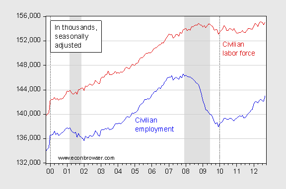
Figure 1: Civilian employment (blue) and civilian labor force (red), in thousands, seasonally adjusted. NBER defined recession dates shaded gray. Dashed lines at application of population controls associated with Census data. Source: BLS Employment Situation (CPS) September release via St. Louis Fed FRED, and NBER.
Eyeballing the two series, I would be hard pressed to see movements in September as being out of historical precedent. (Note that there is a large discrete break at the beginning of the 2000’s — and in previous decades, not shown in the graph — due to the application of population controls; analysts ignore these statistical breaks at their peril, e.g. here).
In order to formalize the argument that the movements in the two series were not out of the ordinary, I examine the log first differences of employment and labor force over the entire span of available data (1948M01-2012M09). I plot the two series and the associated plus/minus two standard error bands in Figures 2 and 3, respectively.
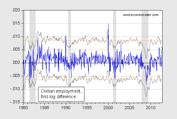
Figure 2: First difference of log civilian employment, seasonally adjusted (blue) and plus/minus two standard errors (5 month centered moving average) (gray), mean first difference plus/minus two standard errors (orange), all adjusted for population controls. NBER defined recession dates shaded gray. Source: BLS Employment Situation (CPS) September release via St. Louis Fed FRED, NBER, and author’s calculations.
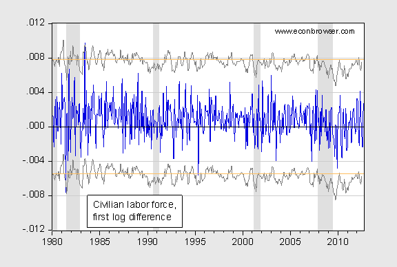
Figure 3: First difference of log civilian labor force, seasonally adjusted (blue), and plus/minus two standard errors (5 month centered moving average) (gray), mean first difference plus/minus two standard errors (orange), all adjusted for population controls. NBER defined recession dates shaded gray. Source: BLS Employment Situation (CPS) September release via St. Louis Fed FRED, NBER, and author’s calculations.
[Digression: I adjusted the log first difference series by regressing on dummies for Census population controls and a constant, and subtracted the estimated coefficients on the dummies to obtain the adjusted series. That is what is plotted in Figures 2 and 3. The gray lines are 2 standard error bands around the first difference, while the orange lines are the 2 standard error bands around the mean first difference, estimated as the constant in the regression.]
The relevant question is whether in either figure, the blue line moves close to the gray lines, or spills over the orange line. I do not see this occurring in either figure.
What about the unemployment rate series? Here is the analogous figure.
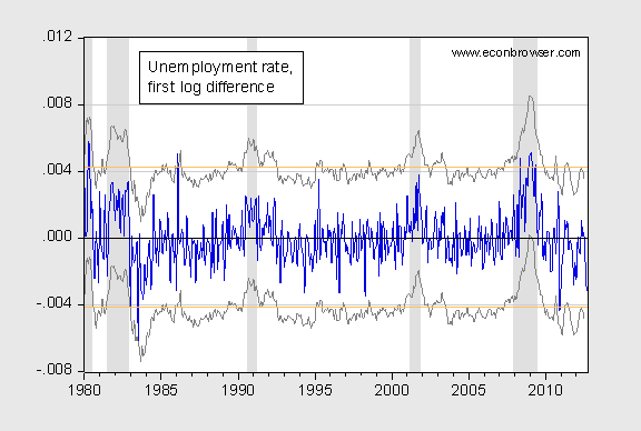
Figure 4: First difference of unemployment rate, seasonally adjusted (blue), and plus/minus two standard errors (5 month centered moving average) (gray), mean first difference plus/minus two standard errors (orange). NBER defined recession dates shaded gray. Source: BLS Employment Situation (CPS) September release via St. Louis Fed FRED, NBER, and author’s calculations.
Here too, it seems as if the change is not out of the ordinary in terms of the historical record. In fact, the anomalous downward movements were in 2010M12; and in 1983M07. Yet I do not recall hearing any concerns about anomalous movements at those times (I might be wrong about the 1983 observation, which was a long time ago).
It constantly amazes me that in an era of widely-available spreadsheet programs that can run regressions, and when ostensibly our policymakers and analysts are as educated as they ever have been, that crazy and easily-disprovable assertions of conspiracy have been leveled. It suggests to me that for some, destruction of the trust we have in a professional civil service is considered acceptable in the quest to gain political advantage.
Finally, it is of use to consider how different indicators of employment are moving. Figure 5 illustrates the fact that the employment series behavior is not anomalous.
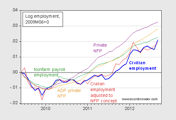
Figure 5: Civilian employment (bold blue), civilian employment adjusted to the nonfarm payroll employment concept (dark red), nonfarm payroll employment (green), private nonfarm payroll employment (purple), and private nonfarm payroll employment according to ADP (orange). Source: BLS Employment Situation September release, and ADP September release, via St. Louis Fed FRED, via BLS.
Note that all indicators are trending up, and in some respects the civilian employment series is catching up with the others. Indeed the September 2012 movement seems large, but it is well known (at least by those who understand statistical sampling) that the volatility in this series is higher than the others exactly because the household survey sample is relatively small.
There is a related critique, which asserts that the growth rate of employment is not consistent with the growth rate of output. As Jan Hatzius at Goldman points out:
- Mismeasurement of output. One might worry that the preliminary GDP data could be understating the true pace of activity growth. However, it is difficult to find much evidence for this. Real gross domestic income (GDI)–an alternative measure of output that has been shown to perform at least as well as GDP–has only grown marginally faster than real GDP (2.3% vs. 2.1%) since early 2010. There is also no obvious sign that survey measures of activity such as the ISM manufacturing and nonmanufacturing surveys have been running ahead of where one might expect them to be in a 2%-2.5% growth environment.
- Catch-up hiring. In March 2012, Fed Chairman Bernanke discussed a closely related puzzle, namely the rapid fall in the unemployment rate despite sluggish GDP growth. His preferred explanation seemed to be that employers, having reduced their headcount excessively during the most frightening phase of the crisis, were now forced to re-hire workers as the environment was becoming more predictable. This remains a possible explanation, although it is becoming less attractive the more time passes.
- Capital scarcity. Another explanation is a temporary slowdown in capital accumulation resulting from the crisis. Even in 2011, when the crisis was already clearly in the rear-view mirror, the real stock of private nonresidential fixed assets grew just 0.9%, the slowest pace since the end of World War II except for the years 2009-2010. If this slowdown results from the underutilization of capacity over the past few years and/or the reduction in credit availability, it should gradually unwind. After all, utilization rates have been rising gradually, and credit availability for businesses has been improving. For example, today’s NFIB survey showed that only 6% of small firms viewed credit as “harder to get”, the smallest proportion since February 2008. (Despite the wording, we would interpret this survey as a measure of the level of credit availability, not the change.)
- More lasting productivity weakness. Finally, it is possible that productivity growth has slowed for more lasting reasons. These might include exogenous variations in the pace of technical progress or a lasting increase in uncertainty (and therefore a lasting reduction in investment rates) on the part of businesses. If so, the gap between GDP growth and job growth might stay slim on a more permanent basis.
Hatzius also points out that using data on inflows and outflows from employment and unemployment in a model based on work by Shimer yields estimates of unemployment consistent with the downturn in the official unemployment rate.
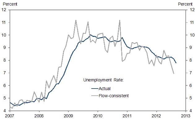
Figure 6: Official unemployment rate (blue) and rate implied by flows (gray). Source: Jan Hatzius, US Daily: Gradual Progress in the US Labor Market (Hatzius), Goldman Sachs, October 9, 2012.
Jack Welch is right on one point: we could do a better job of tracking the economy. Yet I have yet to hear one critic of these latest figures propose the one thing that would help fix the problem: provide more resources to the statistical agencies. (Of course, Republicans of late have been targeting statistical data gathering by the Federal government for budget cuts. [2] [3] The ironies abound.)
Other examples of craziness: [Examiner], [Red State] [Daily Caller] [Reason] Caution: reading any of these links will likely kill some brain cells. Best line from the Reason.com article:
Welch still doesn’t present any evidence of fraud. But the administration’s dedication to accuracy on items that are more important than jobless numbers seems notably less fervent than its commitment to protecting America’s lady parts and its wildly popular children’s television characters from the mortal threat posed by Stacey Dash. Good on Jack Welch for keeping this question alive.
So…since we cannot disprove lack of interference, we should believe interference has occurred…especially if one can’t understand statistics.
To better understand these issues, I would appreciate your commenting on Tyler Durden at Zero Hedge graphing this as a six sigma outlier and that
Similarly:
Compare WSJ’s Predicted 8.1% Unemployment Rate
Note too that Durden further shows little change in:
Durden notes:
It seems like the unemployment rate would have been about the same in September 2012 as compared with the beginning of 2012 if the participation rate were the same for both measurement periods, 8.4% for September 2012 versus 8.5% for December 2011. participation rate
The true state of GDP output is indeed being understated…..when it surges. Q4 2011 and Q1 2012 take a bow.
Durden is trying to hard. Everything just doesn’t add up, but makes sense when you look at the “error” of the previous summer. This was a fix it.
David L. Hagen: I edited your comment to fix the hyperlinks. Please remember to insert quotation marks around the URLs, so the html hyperlink commands work.
I don’t know anything in particular about the claims data; I haven’t cited them because they are too high frequency for me to understand/accord to much weight to.
On the other hand, I don’t understand your reference to the Barnichon-Nekarda paper on now-casting and forecasting unemployment rates. The point estimate reported in WSJ was 8.1%. The RMSE reported in Table 5, at t+0, using SSUR-2 was 0.17. 2 times 0.17 = 0.34 ppts. So in that context, the 7.8% outcome doesn’t seem statistically significantly anomalous. Or am I missing something?
My issue with the unemployment reports is not that the BLS isn’t doing its job, but that the way the data are presented by the BLS and then rebroadcast by the media are hopelessly wrong.
There has been a lot of cherry-picking of data points and failure to explain uncertainties and statistical variations. By both sides. But in this case, most egregiously by those who failed to point out that the 7.8% unemployment rate shows up because of a gross statistical anomaly in the household survey data for young people (who normally start college in the fall, and do not starting jobs, based upon decades of monthly data from prior years).
Similarly for yesterday’s unemployment claims report, which attempted to present an anomalously low number as real. Only after being pressed did the government explain that this time the data was not all in order, and “some state” (why can’t we name the state, again?) was late with some of their data.
More generally, the BLS every week revises the prior weeks claims numbers upward, yet they compare the current week’s unrevised claims against the upwardly-revised prior claims in order to make the change appear better. I’ve documented this over on Economist’s View for the entire year 2012. There have been several weeks where the claims data were worse, yet due to the fraudulent comparison the press release said “claims decreased”.
Many people look at this data (some very carefully, others not so much) and make substantial financial decisions based on what they learn from it (or don’t). We need more intellectual rigor from those who provide it, and full disclosure when the data integrity isn’t perfect.
Jack Welch is a perfect example of Republicans suffering from psychological projection. Jack Welch was a dishonest fraud who cooked the books for GE and therefore he projects his own dishonesty on everyone else.
This is what cooking the books really looks like, via Barry Ritholtz:
http://www.ritholtz.com/blog/2012/10/ges-jack-welch-on-bls-book-cooking/
Perfectly smooth data is evidence of fraud. Noisy data is not.
Do you really think it is necessary to go to all the trouble you have to show that Welch is a cranky old fool with an obvious axe to grind? That was obvious from the start.
Menzie,
I don’t think you need to do all this analysis to show that there is nothing really unusual about this month’s employment report. The labor force increased 847K in January of this year and the unemployment rate dropped by 0.25%. Eight months later in September, the labor force increased by 873K and the unemployment rate dropped by 0.31%.
ok I am too stupid to understand your egg head charts, but with this administration blatantly
lying about knowledge on libyan embassy ,can they be trusted with anything .
The comment on the participation rate is the most significant.
Welch has a followup: Jack Welch: I Was Right About That Strange Jobs Report
Menzie
Note that the six sigma was on actual vs distribution of all the model projections.
PS – thanks for correcting to formal HTML (not required on most blogs).
Anonymous (10/12 7:02PM): Thank you for proving my points. By the way, I believe you are referring to the US consulate in Libya. Also, egg head is typically spelled “egghead”.
Chris: The point is not that Jack Welch made the assertion; the point is that so many jumped on the bandwagon (see links at the end of the article) — and so many failed to condemn the comments (Governor Romney made no mention while campaigning with Rep. Allen West).
David L. Hagen: I suspect you did not read the post closely as the WSJ article you linked to for me to read as a follow-up is the WSJ article I quoted from in the post.
How about CBS Evening News reporting on the big drop in unemployment claims then noting that Thursday’s Unemployment Claims data had an error. However, they failed to report the direction of the error, then telling viewers to ignore the error because the 4 week moving average fell.
I guess they don’t realize that the error they refused to identify put a huge downward bias on 1/4 of the 4 week moving average.
I think the former USSR had a more critical press. Geesh!
Interesting comments from Pr J. Taylor on the subject of financial crisis and economic growth.
Simple Proof That Strong Growth Has Typically Followed Financial Crises
It would have been more educative to include the growth constraints as outlaid in “This Time Is Different,” by economists Carmen Reinhart and Kenneth Rogoff,
That is national debts that are associated with financial crisis, as for other studies leaning on the side of protracted recoveries Pr Taylor may be willing to add the IMF BIS ECB and few economists studies on the same subjects, which outcomes are blatantly contradicting Pr Taylor’s conclusions.
It is interesting to notice that since 1929 the GDPs growth after financial crisis are meeting with low and lower high, may be national debts and private debts could enrich the charts and their findings. Often on the same captioned subject the Pr’s blog is repeating to fix the debts as they matter but one may assume when they only matter.
« The crowd will ignore your name and will be unaware of your existence. But you will be known by a handful of eminent experts ,your peers and only them will have the right to assess your work and to provide you with a ranking ,a deserved one that neither ministerial influence or a capricious population will manage to raise your place or lower it as long as you will be faithful to sciences
tj Once again you are clueless. The “error” did not have a “huge downward bias” on the 4 week average. As BLS explained, this was not an “error” in the sense of “OMG…we forgot to count California!” The “error” was a common processing problem of regional offices not providing timely updates for various reasons; e.g., short staffing, higher workload priorities, etc. The “errors” are very common and affect just about every weekly unemployment claim figure. That’s one of the reasons the BLS uses a four week moving average, because those errors get cancelled out. So this “error” of about 15,000 claims will show up in next week’s figures as 15,000 too high.
Your posts are becoming increasingly unhinged from reality. You’re buying into all the fringe wingnut nonsense floating around in the blogosphere. A few days ago you regurgitated the long discredited claim that billions of dollars in green stimulus was just for Obama cronies. When your claim about Solyndra didn’t pan out you pretended that you were talking about all of the other green projects, but not Solyndra. You apparently don’t know that many of those supposed programs were never funded and of those that were, most have worked out well. And you don’t seem to know that most of those programs were initiated under Bush after 2007 and only reached the funding stage in 2009. If you understood government budget cycles this should have been obvious. You should also look up the dictionary definition of “cronyism” because it isn’t what you seem to believe it is. You bought into that ignorant Jack Welch comment. And now you are peddling some supposed scandal about BLS and the media acting like Isvestia and Pravda. Unhinged.
Re weekly claims: BLS does not generate the claims number. It is generated by the Employment and Training Administration, which is a separate part of the Department of Labor. Weekly claims are not an input to the unemployment rate, which is based on a survey
Re the missing state(CA): The CA agency issued a statement saying they didn’t miss and that they fully processed and delivered their file. EDD blasts Business Insider
Should one take the pulse of an economy or a state economy through the banks profit’s,the state of California looks better and so should the employment.
Bloomberg news October 12th 2012
« Wells Fargo reports narrow profits margin as loans growth slows »
Bloomberg news October 11th
« Wells Fargo hits records profits on mortgage banking »
Accountants may require more informations but as readers and investors only that should suffice.
“TJ” is nothing more than a rentier internationalist. He wants to give capital owners the rule of law and destroy countries.
His “wingnut” is actually not much different than what Marxists wanted 100 years ago.
Nice try boys.
You bought into that ignorant Jack Welch comment. Huh? I never said anything about Jack Welch. I didn’t disagree with Menzie’s post. I agree with it.
Your posts are becoming increasingly unhinged from reality. How? Do you have some recent examples of “increasingly” unhinged? I assume that you think I am always unhinged, so “increasingly unhinged” ???
Facts are facts – 16 of 20 billion went to companies linked to obama. 2slugs brought up Solyndra, not me.
Regarding unemployment claims. I realize that next week’s report will have the revised number. My point was that CBS referred viewers to the 4 week moving average as if the 4 week moving average was somehow accurate (As 2slugs seems to believe). If you dig a little deeper you find that the error was associated with a quarterly report, so it wouldn’t be offset by similar errors in the previous 3 weeks.
These are facts my friends. Get over it.
tj: “Facts are facts – 16 of 20 billion went to companies linked to obama.
You haven’t even begun to scratch the surface. If you dig a little deeper on your favorite web sites you will also find that 24 murders were linked to Bill Clinton.
Thanks for that “fact” Joseph.
If Menzie wonders why people are skeptical perhaps he should read this. When the government reports numbers they know are incomplete and inaccurate it tends to make people question just how good the numbers are. In business where numbers mean something such a missing number would have at least been estimated to reduce the distortion. In government it is no skin off their nose if the bad number just sits around for a month or two.
It still begs the question as to why CBS and other ‘news’ outlets would report the number without a disclaimer, or mislead their audience by pointing to the 4 week moving average.
At the least, they should have told viewers to wait for the following week’s 4 week moving average.
You can bet that if the error made the number look worse, they would have been stumbling over each other to find experts to explain the details of the error to the public.