I’m dubious, but I will not “pull a Lazear”. Or a Don Luskin for that matter.
Video here. Some text here. I thought it of use, then, to plot seven of the ten series the NBER Business Cycle Dating Committee (BCDC) uses to date peaks and troughs (these are the ones available to me).
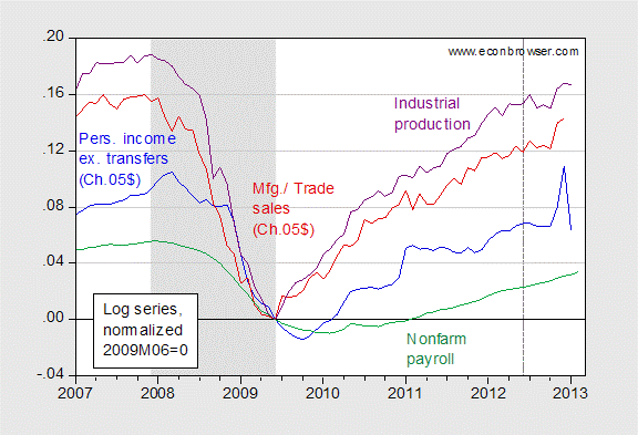
Figure 1: Log personal income excluding transfers (Ch.05$) (blue), log manufacturing and trade sales (Ch.05$) (red), log industrial production (purple), and log nonfarm payroll employment (green), all normalized to 2009M06=0. Dashed line at 2012M06. Gray shaded area denotes NBER recession dates. Sources: BEA (income, sales), Federal Reserve Board (industrial production), BLS (employment), NBER, and author’s calculations.
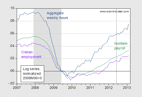
Figure 2: Log nonfarm payroll employment (green), log aggregate weekly hours (dark blue), and log civilian employment (violet), all normalized to 2009M06=0. Dashed line at 2012M06. Gray shaded area denotes NBER recession dates. Sources: BLS, NBER, and author’s calculations.
For comparison, I include the latest GDP estimates from BEA (2nd release), as well as from Macroeconomic Advisers (used by NBER BCDC) and e-forecasting.
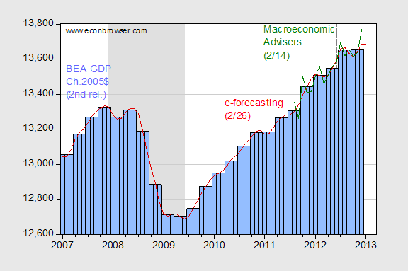
Figure 3: GDP in Ch.05$, SAAR, from BEA (blue bars), from e-forecasting (2/26 release) (red line), and from Macroeconomic Advisers (2/14 release) (green line). Dashed line at 2012M06. Gray shaded area denotes NBER recession dates. Sources: BEA, e-forecasting, Macroeconomic Advisers, and NBER.
Obviously, all of these series will be revised [1] [2] [3], so one wouldn’t want to state definitively we are not in a recession – therein lies the path to embarrassment. But the case still has to be made for recession.
(Of course, with the sequester in place, I certainly wouldn’t bet against negative growth for a quarter or perhaps even more, going forward!) [4] [5]
GDP has to be the most worthless now time “index” the government creates.
It is revised 10 years over and is changed a bunch. That is a good area where the government can cut back on. Get rid of useless quarterly reports and have fewer people work on yearly report given out on January of each year, with revisions of the previous 10 years also given out.
Nobody follows quarterly reports.
I just don’t get Achuthan’s recession perception from the data. A business cycle peak and deceleration to a tipping point of no growth or contraction, yes; but no definitive evidence of contraction.
Yet, with trend nominal GDP at 2% since ’07, less than 1% real, and negative real per capita, the real GDP is trending over 4-5 years at a rate well within the margin of error of estimates of inventories and the deflator, which is what Japan has experienced since ’98 (onset of their debt-deflationary regime).
http://www.cbo.gov/sites/default/files/cbofiles/attachments/43975_MBR.pdf
With federal spending at around trend nominal GDP, and the adjusted rate flat, federal gov’t spending is contributing barely 0.1-0.5% annualized to nominal GDP and virtually nothing (or less) to real GDP.
Even without fiscal cliff diving while sequestered, trend real GDP and real GDP per capita is getting no help from US gov’t spending, positive multipliers or otherwise.
This implies that the US economy is that much more vulnerable to tipping into contraction months, if not a quarter or two, before we know it.
P.S. Not only is the stock market no longer a “leading indicator” of the economy, it has not been even a “coincident indicator” since ’01. Stock prices are now an offshore bank PTF and HFT leveraged equity index futures indicator.
@Rage: GDP = God-awful Data Point. 😉
From the data I look at, we hadn’t entered a contraction as of 4Q2012. But we are close to a contraction.
I show the limits generally forming around these numbers… quarterly based
Capacity utilization = 79.2%
Unemployment = 7.3%
Labor share of income (business sector, 2005=199) = 95
This gives a UT index of 8.3, which is very close to pushing the zero lower bound compression for factor utilization. We are somewhat close to all these numbers now. Real GDP can still increase at these limits but history shows we can’t push against the compression very long.
Consulting few available indicators composites and models of recession forecasts may drive to doubts, the stepping stones to wisdom and sciences:
The OECD composite leading indicators by countries is not foretelling of recessions but not denying it may be there, for few countries. The CLI outcome, is strongly influenced by the interest rates and equities markets
http://www.oecd.org/std/clits/
http://stats.oecd.org/Index.aspx?DataSetCode=MEI_CLI
Trying the 10 years bond rate versus the 3 months bill rate would drive to the Fed website and Political calculation website. Unfortunately the interest rate differential has lost its integrity since long and the model outcome its ingenuity, anyway no recession at sight.
http://www.newyorkfed.org/research/capital_markets/Prob_Rec.pdf
The Fred smoothed US recession probabilities goes along with a zero probability of recession. We know that among the four components of the model forecast, employment data is the most volatile.
http://research.stlouisfed.org/fred2/series/RECPROUSM156N
The M2 velocity of money is the doubtful part a positive reading of all data and models forecasts. The total assets under Central Banks management, at least 6 Trillion USD among the ECB and the US Federal reserve, could as well cast doubts on the validity of the real GDPs, the real output gap and may reveal a hidden deep recession.
http://research.stlouisfed.org/fred2/series/M2V
Time for the poets, those economies are looking like faces that have been submitted to multiple facelifts, not much elasticity, maxillary rigidities,sans la liposuction.
The usual one is
MV=PT
Where M is money supply measure, V is money velocity in 1/year (turnaround rate in economy, by the way 1/V= average hoarding length) , P are prices and T are transactions, BUT, as prices here are only commodities and products and wages. Financial assets are not included, hence formula gives wrong picture about potential inflation:
P= MV/T – since T does not include financial asset transactions ( which in fact are 80% of all monetary transactions), P goes to sky-hyperinflation- which is just plain wrong.
A simplest assumption would be to conclude that real economy and financial overhead economy functions independently in monetary terms in first approximation. Then reasonable formula would be:
MV = P financial assets*T financial assets+ P real economy * T real economy
Then money supply would be divided between ( as it obviously is from QE) inflation of financial assets (stocks, bonds, real estate) which has been 20%year in stocks and bonds and roughly neutral in real estate since 2009 , and inflation in real economy prices which is roughly CPI plus fuel plus food.
The fact of separation in case of QE is true as printing has not lead to increase in debt in private sector, and printing can achieve consumption increase only via debt increase. As that is not happening, QE money is rotating in financial sphere, generating interest rent to the wealthy.
I use this to think about QE and it clears things a lot.
In full separation, formula would be falling apart in 2 formulas:
M in financial sphere*V financial sphere= P financial * T financial sphere
M in real economy *V in real economy = P real economy * T real economy
And M financial sphere+ M real economy = USUAL M, e.g M2 or Austrian True money etc.
I have never understood HOW and why the financial overhead has been inteegrated in normal economy as wealth creating by assset inflation. As it is all based on debt, and debt compound interest grows exponentially, such formula as MV=PT are correct only for a limited period where surplus from productive economy IS able to finance interest. But , due to exponential character of debt (surplus was growing worldwide exponentially for long period only because of discovery of coal and oil utilization in economy efficiently ) , sooner or later debt rent will exceed surplus, especially if the asset prices are pushed up by Greenspanomics or Bernankenomics.
Hence, the formula that excludes financial asset price from it is correct only for a limited periods of time where real economy has as fast growth as compound interest. As soon as real economy falters, debts are not paid, asset prices go into ground, “wealth” disappears, and assets move to the creditors.
Real economy is economy that increase wealth by adding value via capital investments and labor creating products and services needed in the economy. Real estate asset prices actually should fall relative to income (wages) in such economy.
But, financial sector of economy thinks differently and has taken then control over from productive sectors. So here we are, with 2 formulas that lead to planning by financial sector and movement of real wealth from down to UP. And its accelerating with every USD fathered by Bernanke.
Menzie: I’m in sync with your skepticism.
Comment on: “GDP has to be the most worthless now time “index” the government creates. It is revised 10 years over and is changed a bunch. That is a good area where the government can cut back on. Get rid of useless quarterly reports and have fewer people work on yearly report given out on January of each year, with revisions of the previous 10 years also given out.”
I assume you know that all economic statistics, including the monthly ones that feed into GDP, are revised. Are you making a case for monthly (rather than quarterly) GDP? If you don’t like revisions, you will like monthly GDP even less than quarterly GDP.
Menzie wrote:
(Of course, with the sequester in place, I certainly wouldn’t bet against negative growth for a quarter or perhaps even more, going forward!)
Sequestration is a nit!
What is real is the increase in taxes. The average taxpayer was shocked to see that a combination of the payroll tax increase and Obamacare taxes has reduced their disposible income. At a minimum workers saw a loss of 2% with the average loss closer to 4.5% due to increased taxes. That is huge for a worker trying to feed his family.
I am opposed to huge cuts in government programs before the economy recovers so that the private sector can step in to provide the services and a more efficient cost, but sequestration is much-ado-about-nothing.
Achuthan is out on a limb sawing himself off. The first rule of forecasting is not the commonly stated “forecast often”. Rather it is to avoid being subjectively wedded to your forecast. More than anything, the human tendency of wanting to be right is what plagues the forecasting profession. When new data arrives, you must be willing to revise your prior belief on the basis of that data. Achuthan operates out what is a black box from the perspective of the rest of us. His current argument is based on data revision making his over-a-year-old recession forecast eventually right (he hopes), and on the four key coincident indicators used by the NBER to date recessions having (in a joint sense) peaked last summer (July). We have 7 more months of data since then. As is usually the case, some data points one way and some the other. But in the large, the data overwhelming say the economy is not in recession. Moreover, forward looking data (key leading indicators) strongly imply no recession on the horizon at least 6 months ahead.
The Conference Board’s coincident indicator – constructed from the above mentioned key indicators – was 104.3 in July, dipped slightly the next 3 months, and then in November moved to a new high. By January the index had risen to 106.5. In February employment rose, its 29th consecutive monthly increase. In no recession in the postwar period did payroll employment not fall. It may not have fallen in the early months of the recession, but it did eventually fall. Industrial production was on a new high in December, about a percentage point above Achuthan’s July benchmark month, and was down a smidgen in January. Personal income less transfers did an anomalous up/down in Dec/Jan in reaction to the fiscal cliff, so the real story is some average. The simple average of Dec/Jan is far above July and at a new recovery high. Manufacturing and trade sales are on a recovery high as of January according to the Conference Board’s estimate, 2% above July. January will be revised down, however, making December the thus far high. On the basis of this data, the expansion is alive and well. 99% assured, and how much more can you ask for in an inherently uncertain world?
There’s more. Initial unemployment claims always rise before a recession. The 4-week average of claims is currently on its recovery low. And the stock market is making a new high. The stock market (inflation-adjusted) always leads recessions. Besides these other things always happen too, but this is enough to substantiate that the US economy is not in recession no matter what the ECRI says. Of course it is always possible for a meteor shower to hit exactly the right spots on the right desks at the right federal agencies so that just the right data is permanently wiped so just the right numbers are downward revised.
Very soon after ECRI’s recession call on September 30, 2011, a guest column on Econbrowser argued that a recession was not a likely outcome: October 8, 2011
JBH’s comment is exactly right about the dangers of being subjectively wedded to one’s previous forecast.
Ricardo worried about taxes?…wow thats an oxymoron. Ricardo of all folks should know that taxes v. debt is a wash. Even Dean Baker points this out (when it suits him). That is why the stimulus was so lame,since it was mostly useless transfers. Most important currently is the drop in wasteful defense spending. Defense spending no doubt raises the costs of machinery, electronics and so forth, as rents accrue to defense contractors. With these resources freed up, much like in the drawdown in the 90s, the economy will do fine.
Are we in a recession? Not at the moment… no.
Here is a link to a graph of my UT equation.
https://research.stlouisfed.org/fred2/graph/?graph_id=111871&category_id=0
UT is a value for total unused available factor utilization (labor and capital). The key word is available, because beyond a certain point, labor and capital are not available to the economy. Effective demand based on labor share of income won’t allow more utilization of labor and capital.
The equation is…
UT^2 = ls*0.78 – cu*(1-u)
UT is non-negative meaning that below zero, factor utilization is not available.
ls = labor share of income (2005=100)
cu = capacity utilization
u = unemployment rate
You will see in the graph that the line comes close to zero than heads back up.
The most important thing to see in this graph though is the shaded areas for the recessions of the US. Once the value for UT starts rising, we have a recession. and as we can see in the graph, UT has not started to rise yet. However, it is reaching its lower limit, which means the economy has reached its limit of being able to utilize labor and capital. A contraction will eventually occur from this level.
A brief description of the equation is this…
Effective demand (ls*0.78) determines the limit for the combined utilization rates of labor and capital (cu*(1-u)).
The questions you may ask yourself are…
What are the dynamics behind this equation? How does labor share of income limit factor utilization rates?
The bottom line is that we are not in a recession… yet.
Another thing… When the line in the UT equation graph reaches its upper peak and starts back down, it is a very good signal the recession is over.
Look at how the UT peak aligns with the end of recessions. Pretty good match…