I’m writing a piece on recent thinking on fiscal policy efficacy, and in looking back at the debate over the American Recovery and Reinvestment Act, I read this choice comment from an Econbrowser reader in September 2009:
After today’s unemployment report, and in light of your past running blog fight with Posner, I’m thinking that Q3 GDP is going to come in much, much less than you would have predicted based on stimulus spending. You won’t take this as a repudiation of your multiplier theories, but I will.
With hindsight, we can evaluate the pattern of events since that time. In figure 1, I show GDP growth (in log terms, SAAR) and stimulus as a share of GDP.
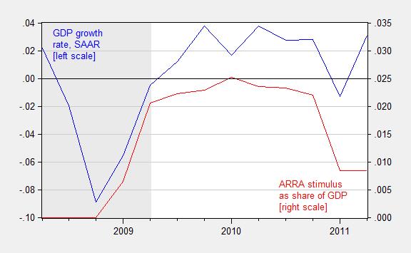
Figure 1: Quarter on quarter growth rate of real GDP, annualized (blue line, left scale) and sum of total receipt effects (reversed) and total expenditure effects from the ARRA, as a share of nominal GDP, 2008Q2-2011Q2. NBER defined recession dates shaded gray. Growth rate calculated as log first difference. Source: BEA and BEA 2013Q3 3rd release, NBER, and author’s calculations.
Growth resumed in 2009Q3, as the ARRA kicked in. Given the deep dive that started in 2008Q4, it’s either evidence consistent with fiscal policy efficacy, or one heckuva coincidence.
For more on recent thinking on fiscal multipliers, see this piece written for the New Palgrave Dictionary of Economics. More on counterfactuals here.
Oh, and for a good laugh, here’s the debate with Posner: [1] [2] [3] and [4] — a cautionary note that the phrase “SAAR” has meaning!
Update, 8:30PM 1/18: Reader Rob asks to see how the UK compared to the US, in terms of post-crisis stimulus. Here is a cross sectional graph of cumulative growth against change in cyclically adjusted budget balance.
Figure 2: Cumulative GDP growth 2010-2012 against change in cyclically adjusted budget balance, 2010-2012, in ppts of GDP, for advanced countries. Source: IMF WEO October 2013 database and author’s calculations
The bond vigilantes, in calling the Interest Rate on the US Ten Year Note, ^TNX, higher, since May 2013, have caused the greatest investment destruction in the Emerging Markets EEM, Turkey, TUR, Peru, EPU, Chile, ECH, Indonesia, IDX, Thailand, THD, Philippines, EPHE, and Malaysia, EWM, as is seen in combined ongoing Yahoo Finance Chart ……. http://tinyurl.com/klm74fj
……. The periphery-to-core dynamic of funds that flow into Japanese Stocks, NKY, US Stocks, VTI, UK Stocks, EWU, and Eurozone Stocks, EZU, came to completion on January 17, 2014. The Great Swell, is history. The tail risk of Global ZIRP will be economic deflation and economic recession.
Would it be possible to expand this post and compare/contrast US experience post 2008 vs countries that did not pursue stimulus or pursued stimulus that was too small or short lived?
Britain may be a good example?
Results from the stimulus package should be compared to the forecasts that pro-stimulus economists were making at the time that the stimulus was being debated in 2009. These economists predicted a downturn in unemployment and a much stronger economy – neither of which happened. The reason to compare actual events to forecasts (and not counterfactuals) is that it is the forecasts that politicians and the general public will use to determine if massive amounts of money are necessary. And, of course, the actual results were significantly worse than predicted results, despite the fact that we continued to run massive deficits each year after 2009.
The stimulus bill may have increased GDP, but it didn’t ‘work’, if you define working as meeting pro-stimulus economist’s forecasts.
Anonymous: “Results from the stimulus package should be compared to the forecasts that pro-stimulus economists were making at the time”
I don’t know which economists you were listening to but I was hearing economists say that the stimulus package was much too small to be very effective and that the administration wouldn’t get a second chance because the naysayers would point out its ineffectiveness.
Reading your comment, it seems that the economists were exactly right on both counts.
Rob: See added Figure 2. The cross section seems to show a pretty clear correlation — the more contractionary the fiscal impulse (as measured by change in cyclically adjusted budget balance) the slower the growth.
Anonymous: Plenty on counterfactuals here from a variety of sources, including RBC, skeptical NK DSGE, and Neoclassical synthesis type macroeconometric models in the Cowles Commission tradition. I don’t think of Smets et al. as “politicians”. I don’t think of Macroeconomic Advisers as politicians. But perhaps you have a more expansive definition than I do of “politician”.
Menzie
If I am reading the first chart correctly, you have the spending for ARRA beginning fourth quarter of 2008. The ARRA bill passed the senate in Feb. 2009. I am not certain when the first actual spending began.
If the spending you have graphed began in 2008, it was from a separate spending bill, shouldn’t the notation be changed to reflect this.
Ed
Ed Hanson: You are not reading the graph correctly. The data is quarterly, so the quarterly observation for 2008Q4 is 0, the quarterly observation for 2009Q1 is .0064 of GDP. In a time series line graph, the dots are connected. I hope this clarifies what the graph reports.
If you want to know when the first spending occurred, you can click on the BEA link in the Figure notes to see (this is the revolutionary idea of what the notes to the figures are for — so people can access the data, and do the addition/subtraction/multiplication and division themselves if they can, or if they have access to a calculator or a spreadsheet program such as Excel, if they cannot).
Menzie,
Could you add annotations for more countries to Figure 2? It provides a fascinating comparison, and it would be nice to see where other countries fall.
Am I correct in interpreting Figure 2 to mean that all countries to the right of zero on the x axis had contractionary fiscal policy?
Ed Hanson The ARRA spending is on the right vertical axis. I think you were looking at the left axis, which is for GDP growth.
NickG: Too cumbersome for me to add all the annotations — at least given my command of Excel. Here is a link to my spreadsheet so you can see yourself (have added link to spreadsheet in notes to Figure 2 as well).
Menzie
Thank-you for the explanation of what which quarter increments applied to each year. I needed it, although there were enough hints within the graph that I should have figured it out myself.
So not to make such mistakes again, I have spent Sunday, except during hours of the Bronco game, modifying my tape measure I use constantly in my work. I have carefully erased and rewritten my inch numbers to correspond to the first 1/4 increments. I look forward to use of my “Menzie” tape.
Ed Hanson: Excellent; a wise investment, as all the EViews generated graphs I post on this blog have this same format.
Menzie My focus is on figure 1. The correlation between GDP growth and fiscal stimulus is visually apparent to all. Even the causality of fiscal stimulus toward GDP is (in my eyes and that of most economists) in the short run beyond doubt both theoretically and empirically. However, the real question is about magnitude.
In the course of all human endeavor, the instinctive question we ask ourselves is: Will the short (and long-run) benefits outweigh the flow of present and future costs appropriately discounted? This is done on an individual scale often instantaneously using the Kahneman fast and slow types of thinking in which we all engage. We can set aside fast thinking here, though. On this blog we are engaging in analytic, rational, empirically-based slow thinking. At least presumptively. Also, though it is holistically essential to weigh future costs so as to get the complete picture, let us for the purpose of this comment abstract from the future beyond the endpoint of the graph. All the while noting we have done so.
The graph is a two-space abstract representation of what happened in the initial wake of the Great Recession. It isolates and emphasizes one important causal variable – that of fiscal stimulus. But both you and I and many other readers of this blogsite know full well other important things were happening simultaneously. (1) Interest rates had been driven to zero and QE1 was taking effect both literally and in the expectational sense. This massive monetary stimulus validated and enabled the fiscal stimulus. (2) An understanding of the internal workings of the economy at business cycle troughs makes clear that inventory investment drives the initial recovery. In this case (2009:3 to 2011:1 inclusive which is the white space on the chart), real GDP growth averaged 2.5% with inventory investment contributing 0.9 percentage points of this. (Somewhat helped in a second-order sense by the fiscal spending.) (3) A grab-bag of other forces independent of the fiscal stimulus also helped take the economy up onto the path illustrated on the chart. Again being careful to acknowledge second-order effects arising from the fiscal stimulus, these forces include pent-up demand that built during the long terrifying deep contraction, a stock market wealth effect, the economy-wide psychological effect of consumer sentiment lifting from a trough of 55 to a high of 77 in 2011:1, and other lesser forces too numerous to mention.
You state that “we can evaluate the pattern of events” (implicitly) by the graphic you throw up. As though QED, the graphic is all the proof we need. Yet the bulk of the recovery was in the variables mentioned and alluded to in the previous paragraph. Fiscal policy was a slender tail when all is said and done. Yet the unwary and unknowledgeable would never know that from your post.
I have both an observation and a request. The observation is that novice (in economics) acolytes of your ideology have only the vaguest clue of the fuller story I have presented here. By not presenting the full story, by in effect spinning the data with the not-even-half-truth of a single graph, you misinform them. That then ramifies into their comments. The request is that from now on you tell the full story as best you understand it. If from time to time you want to gnaw at the tail, well and good. But please tell your readers that. Thanks.
JBH: Well, I am sorry I did not write a 300 page blog-post for your benefit. But I have a whole set of entries (some of which I linked to in the post) under the multiplier category, which the interested reader can refer to, and in which I have addressed the issue you mention — I don’t think anybody can say I have been reticent on the subject; if you think I have been, then you are the first. (In addition the paper linked to in the text does mention monetary policy, by the way). But, here is one assessment:
Thank you once again for your comments. I deeply regret to not rising to the level you require in each and every post, and I will endeavor to match the levels you attain in your writings in the future; further I will perhaps investigate how to post a hyperdimensional graphic.
anonymous, you claim the stimulus did not work because it did not accomplish everything its proposers claimed. as pointed out by other posters, many economists at the time noted we needed more stimulus to work. we had a house fire, and if all you used was a garden hose-you were not going to put out the fire, just save a part of the building.
but i ask you this question: if we had not enacted stimulus, what would have happened to gdp and unemployment? are you implying these parameters would have improved if we had not proceeded with the stimulus? i have yet to see any justification for a lack of stimulus producing a better outcome than any type of attempt at stimulus. you and others know attempting stimulus was the smarter path than doing nothing, but you cannot acknowledge that as a legitimate path because it was obama and the democrats who were the ones associated with it? what “worked” was a halt to the economic collapse the country was facing.
“Growth resumed in 2009Q3, as the ARRA kicked in. Given the deep dive that started in 2008Q4, it’s either evidence consistent with fiscal policy efficacy, or one heckuva coincidence.”
There were some developments taking place in monetary policy during this time as well. The purchase of $500 billion in MBS and $100 billion in other Agencies was announced in late November 2008 (QE1). And in March 2009 this was expanded by another $750 billion in MBS and $300 billion in Treasuries. QE1 was concluded in March 2010.
“Reader Rob asks to see how the UK compared to the US, in terms of post-crisis stimulus. Here is a cross sectional graph of cumulative growth against change in cyclically adjusted budget balance.”
1) Out of the 33 advanced nations included in the scatterplot, 17 are Euro Area nations or nations pegged to the euro (i.e. Denmark). If you separate them into two groups accordingly and remove Hong Kong as it is pegged to the dollar (leaving 15 non-euro nations), what you will notice is the apparent correlation is confined to the set of euro nations. This can be verified by regressing growth on the change in cyclically adjusted balance. The R-squared value of the euro nations and the non-euro nations is 0.661 and 0.093 respectively, the euro result is significant at the 1% level, and the non-euro other is not statistically significant. The point is of course that the non-euro nations each have their own independent monetary policy which may be able to offset fiscal policy.
2) As I’ve mentioned in another post, the UK has been subject to a large decline in labor productivity effectively meaning it has suffered a negative aggregate supply shock. Consequently it might be better if nominal GDP were used instead of real GDP, as that is a more direct measure of aggregate demand. (A shift in aggregate supply can also change real GDP.) Replacing real GDP growth with nominal GDP growth raises the R-squared of the euro group to 0.720 and reduces the R-squared of the non-euro group to 0.015.
3) The cyclically adjusted balance tends to understate the amount of fiscal consolidation taking place in the Euro Area periphery. A better measure is the cyclically adjusted primary balance which can be found in the IMF Fiscal Monitor. Using this in place of the cyclically adjusted balance reduces the R-squared of the euro group to 0.602 and raises the R-squared of the non-euro group to 0.017. (It also reduces the number of nations to 14 for each set.) Interestingly, the slope of the non-euro group is now positive although it is obviously still not statistically significant.
4) In my opinion the end dates should be changed. Most of the Euro periphery and the UK began fiscal consolidation in earnest in 2010. Furthermore, the US just underwent its heaviest year of fiscal consolidation. Thus I would choose 2009 and 2013 as the end dates. Doing this results in an R-squared value of 0.827 for the euro group and 0.000 for the non-euro group.
5) One can go further with the non-euro group by focusing on those nations at or near the zero lower bound in interest rates. But this would only leave five nations (the Czech Republic, Japan, Switzerland, the US and the UK). Adding the Euro Area as a whole expands this to six currency areas. The R-squared value is 0.219 but the result is statistically insignificant. Interestingly the slope is positive and this is driven primarily by the US and the UK.
Corrections:
Part 2) euro group R-squared = 0.746
Part 3) euro group R-squared = 0.586
Part 5) R-squared = 0.318
Mark Sadowski: Thanks for the comments; note that the productivity shock is hardly unique to the UK. See Simon Wren Lewis on the topic.
I used the structural budget balances, and regressed the four year change of growth on change in cyclically adjusted budget balance for non-euro countries and obtain the same result you do — a positive coefficient. If I drop Singapore (an outlier in growth) I recover the negative coefficient, significant at the 20% msl.
Menzie Chinn,
I’m a little puzzled why you think Singapore is an outlier in 2009-13 NGDP growth among the 14 non-euro countries for which there are CAPB estimates (excluding Hong Kong of course). Yes, its growth is the highest, but the range is from 2.6% to 31.5% and the median is 19.4%.
Buzzcut,
You should never accuse Menzie of making a prediction. He never presents an original thought that is verifiable. He always attributes predictions to others so he has plausible deniability.
You leave out the part where we have to pay the stimulus back. If the Govt were to cut spending to offset the stimlus spending this year to pay back the debt we borrowed to stimulate, I have a feeling the economy wouldn’t do so well. If you argue the return of capital, so to speak, doesn’t need to ever occur, I have some stock to sell you.
anonymous, of course the debt is paid back. but if you can make gdp grow faster you will have more revenue to pay back faster. letting the economy collapse because you are too cheap to use stimulus means you will try to pay back even existing debt from depressed gdp levels-hence smaller revenue. use compounding to your advantage not detriment!
“anonymous, of course the debt is paid back. but if you can make gdp grow faster you will have more revenue to pay back faster.”
Really? When will we be getting all this glorious revenue to pay it back? We’ve added 7 trillion since Obama was elected. When will we get the extra 7 trillion in revenue to pay that back? How dumb are you? The deficit spending NEVER results in enough extra tax revenue to pay it back.
anonymous, since a significant amount of “stimulus” was actually tax cuts-then you have some explaining to do on why the stimulus failed. explain away how to pay for those tax cuts…and just for clarification, a significant part of that $7 trillion you talk of resulted from bush legacy actions (wars, TARP, etc.) and lost revenue from recession-events caused by bush policy!
and if deficit spending never results in enough extra tax revenue, explain the policies of saint reagan? ever seen the runup in debt to gdp under your patron saint?
Will you be blaming Bush when Hillary “HAS TO” run 2 trillion dollar deficits because of the next recession? Agreed, Bush is certainly responsible for some percentage of that, but when will Obama reverse his policies? Under Obama, military spending is up significantly, even inflation adjusted. Obama is exactly like Bush. Big military spending, trivially higher taxes, and new entitlements. He followed the Bush reelection strategy.
If running a deficit is expansionary, it doesn’t matter if it is labeled a “stimulus package” or not. Where is the growth in revenues sufficient to pay it back?
What makes you think I like Reagan? He initiated the borrow and spend cycle we can’t get out of. It worked better for him because the economy was full of boomers entering peak productivity and the nation wasn’t saturated with debt.
I’m not a republican. I think Nixon is the most disasterous president of all time. The worst thing about people like you is that you think that the govt will fix this. Our debt spirals out of control, and guess what, we can’t tax our way out of this. Major cuts will occur, whether you want them to or not, because that which is unsustainable will not be sustained.
this graph is also for you
http://www.creditwritedowns.com/2008/07/chart-of-day-debts-diminishing-marginal.html
http://economicedge.blogspot.com/2011/10/monetary-madness-part-ii-diminishing.html
This graph is up to date. Keynes’s long run has caught up with us.
anonymous,
deficits have been falling under Obama-look it up.
why would you think Hillary would need 2 trillion dollar deficits? democratic presidents reduce the deficit each year. Clinton even ran a surplus.
when your party gets control you can make all the cuts you want. it is disingenuous for republican’s to say we “need” to make cuts when democrats are in power, but then if republicans have control this “need” for cuts disappears. if it’s such a great call, then do it under your own watch.
you say “The worst thing about people like you is that you think that the govt will fix this.” I simply say a fix is needed, and provide a solution. You seem to think if everybody retrenches, the magical confidence fairy will appear and growth will occur. Economy does not work like that, growth does not occur when demand retracts. You honestly think if the govt decreased spending the private sector would suddenly increase spending over the past 5 years? then I have a bridge to sell you…
Menzie: Thank you for the additional graph and excel data. Very interesting.
Ok Baffling, I see you’re just here to troll…
anonymous, not trolling simply correcting you misguided souls. you provide all the errors which need correcting. learn to live with it, or better yet, start stating the truth!
Menzie: Thank you for your meaty response. Sorry to not get back until now. A 300 page blog-post would be quite something. Put you in Guinness for one thing. Which would raise blog-readership a discrete notch higher. The downside, which I should find quite disturbing, would be carpel tunnel. So, glad you are standing aside. You are prolific enough!
No need for a follow-up. But if you look at the Blinder-Zandi 2012 GDP projection their model threw off in the process of arriving at their estimate of the impact of fiscal policy, you must question the validity of those results in their entirety.