The BLS reported on Friday that the U.S. unemployment rate fell all the way to 6.3% in April. That marks significant progress in terms of the bull’s eye of Fed accountability proposed by Federal Reserve Bank of Chicago President Charles Evans which Econbrowser discussed 2 months ago. The unemployment rate has dropped steadily over the last 4 years with no increase so far in the inflation rate.
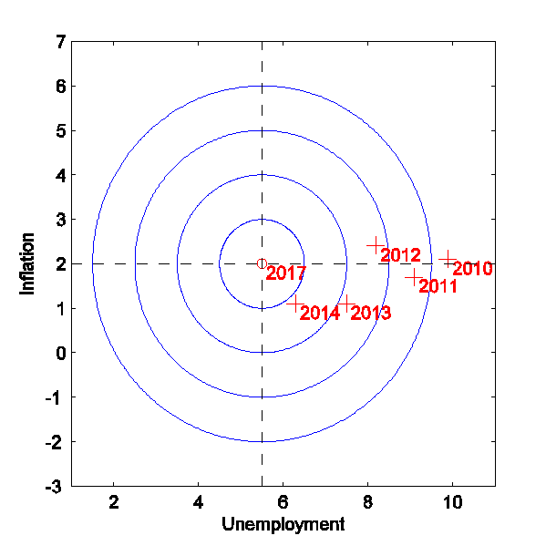
Horizontal axis: civilian unemployment rate. Vertical axis: inflation rate as measured by year-over-year percent change in implicit price deflator for personal consumption expenditures. Center point represents FOMC “longer run” economic projections. Crosses denote values for April unemployment and Q1 year-over-year inflation for indicated year. Adapted from Evans (2014).
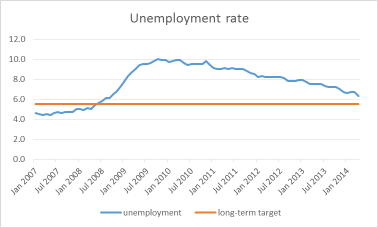
Civilian unemployment rate, Jan 2007 to Apr 2014, along with Fed’s long-term 5.5% objective. Data source: FRED.
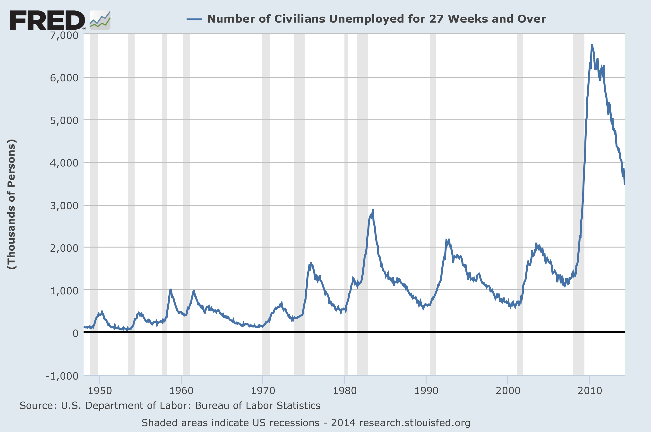
The current unemployment rate of 6.3% is actually slightly below the average 6.4% that the U.S. economy has experienced since 1970. But while the labor market is starting to look more normal according to conventionally measured unemployment, other labor market indicators remain distinctly unhealthy. The number of Americans who have been looking for work for longer than 6 months is still higher than it had been even at the worst of any previous postwar recession.
Source: FRED.
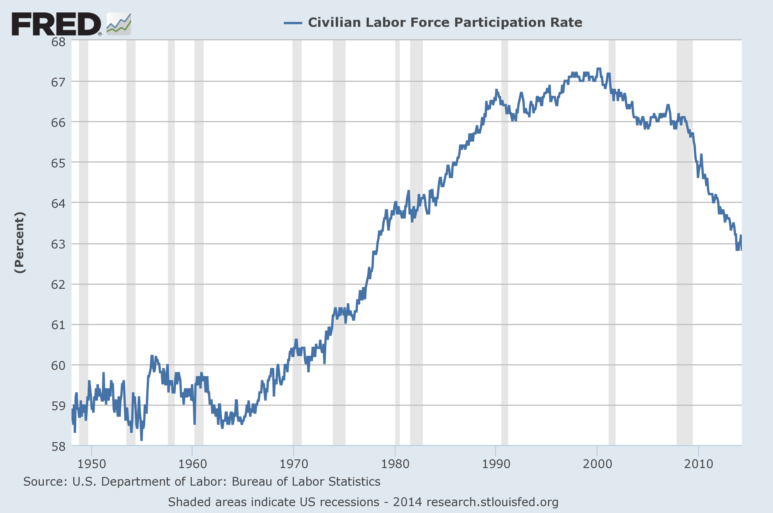
And last month’s improvement in the unemployment rate came entirely from a drop in the labor force participation rate. Some individuals who reported in March that they were out of work and actively trying to find a job (in which case the BLS counts them as “unemployed”) instead reported in April that they are still not working but did not actively look for a new job within the last four weeks (in which case the BLS counts them as “not in the labor force”). To be sure, much of the decrease in the participation rate seems attributable to long-term demographic factors, as the decline was evident well before the Great Recession.
Source: FRED.
Even so, while the distinction between “unemployed” and “not in the labor force” might be a sharp one from the point of view of the definitions of the BLS, as a practical matter for many potential workers it clearly is not. In any given month, the number of people who change from being “not in the labor force” to “employed” is always greater than the number of people who change from being “unemployed” to “employed”, suggesting that many of those counted as not in the labor force may in fact be more interested in getting a job than some of those counted as unemployed.
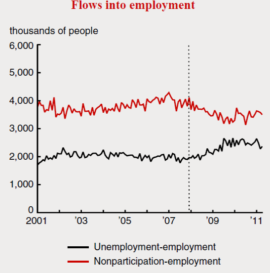
Red: number of people who were employed in month t but not in the labor force in month t-1. Black: number of people who were employed in month t and unemployed in month t-1. Source: Veracierto (2011).
And ongoing research by UCSD Ph.D. candidate Hie Joo Ahn finds that it is common in the underlying individual BLS data records to find a given individual who was reported to be “not in the labor force” in month t-1 but self-reports in month t as being unemployed and having been looking for work for the last six months. Again, that’s something that makes perfect sense if you think in terms of actual people instead of narrow statistical definitions, provided you recognize the blurred practical boundaries between being “unemployed” and “not in the labor force”.
Turning next to inflation, the Fed’s second objective, despite the improving unemployment rate the U.S. inflation has continued to drift below the Fed’s long-term target of 2%. That means that if you summarize their score card in terms of the “bull’s eye” in Figure 1 above, the fact that inflation is now about 1% below target is a bigger “miss” for the Fed than the fact that unemployment is still 0.8% above target.
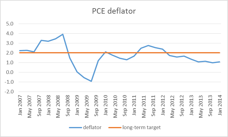
Year-over-year percent change in quarterly implicit price deflator for personal consumption expenditures, 2007:Q1 to 2014:Q1, along with Fed’s long-term 2.0% objective. Data source: FRED.
Here again there are other indicators one could propose using for the Fed’s scorecard. Tyler Cowen and Josh Zumbrun call attention to a curious anomaly. For a number of years, MIT professors Alberto Cavallo and Roberto Rigobon have been managing the Billion Prices Project, which collects prices off the internet daily to form an objective summary of what customers actually pay to purchase products online. For 2011 and 2012 the BPP measure coincided very closely with the conventional consumer price index calculated by the BLS. But for the last two years, BPP has measured inflation as coming in a half percent above the Fed’s target instead of 1% below as the CPI and PCE deflator have been signaling.

Year-over-year percent change in prices as measured by BPP (red) and CPI (blue). Source: Billion Prices Project.
A separate question is whether inflation below 2% in and of itself is a bad thing, as Figure 1 implicitly assumes. In the theoretical models currently most in use by macroeconomists, an increase in expected inflation would help stimulate spending and thereby provide further help on the unemployment front. But Bachmann, Berg, and Sims (2014) find little evidence in support of this assumption from individual household data, and Mian and Sufi question the common presumption that higher house prices would provide much stimulus to spending in the current environment. A recent study of mine with Bank of Canada researcher Christiane Baumeister found using Bayesian methods that if you started with a prior belief that higher inflation raises aggregate demand, U.S. data since 1986 would cause you to change your mind, favoring the view after seeing the data that higher inflation is more likely to lower demand than increase it.
My bottom line on all this is as follows. Although a casual look at the April data might leave one thinking we’re getting pretty near the Fed’s ultimate objectives, the preponderance of evidence argues that the economy still needs more stimulus. And while I am not as sold as some other analysts on the idea that more inflation in and of itself would be a good thing, I think that until we receive clear evidence that inflation is coming in significantly higher than it was during 2011-2013, the scales are still tipped in the direction of wanting to see additional stimulus.
Notwithstanding, this strikes me as a less unambiguous call than it was a year or two ago. The key indicator to watch for is whether traditional inflation measures make a very clear move up. If that happens, we would have to acknowledge the possibility that long-term unemployment and falling participation rates may not be problems that monetary policy can do much about. For now, however, they still look like important issues that should factor into the Fed’s deliberations.
Despite the Fed’s claim that its inflation target is 2%, I’m not entirely convinced that people actually see it that way. The Fed’s reaction treats 2% as a ceiling, with the long run banging between 0% and 2%. People might be more inclined to believe the 2% target if the Fed treated a 4% observation the same way they treat a 0% observation. But the Fed doesn’t. Inflation comes in barely above 0% and the Fed gives us one of those oh-so-deeply-concerned looks that only established banker types can muster up. And except for Janet Yellen, the Fed members might even treat us with a little chin-whisker scratching just to complete the look. But no real action. OTOH, if Inflation posted a 4% rate you can be pretty sure that the Fed’s collective hair would be on fire. All of this begs the question why can’t the Fed achieve its 2% target? Is it because people don’t believe the Fed can (i.e., its impotent, needs monetary Viagra and won’t admit it)? Or is it because the Fed believes it is possible to achieve a steady state 2% inflation rate while approaching from below and never overshooting? If the latter, then they need to unlearn some of those bad habits they picked up from taking differential equations too seriously.
The Billion Prices Project index is a little biased because it only measures the price of goods and does not include services. And it also includes the cost of goods produced overseas, which may not be entirely relevant for present purposes.
The idea that higher inflation expectations are more likely to lower aggregate demand seems like something that is regime dependent. If the reason inflationary expectations are high is because the economy is overheating, then you would expect the Fed to raise the interest rate and cool aggregate demand. But right now we’re in a ZLB regime in which pre-2008 history might not be relevant. And it would be folly to conclude that if higher inflationary expectations are associated with lower future aggregate demand, therefore lower inflationary expectations should be associated with higher future aggregate demand.
Krugman was right all along. Instead of putting all our eggs in the monetary policy basket, we should have gone the full Monty with both QE on steroids and fiscal spending on infrastructure & education.
General Yellen, can now return her bomber feet to their
operational bases, as their incendiary campaign has destroyed
the high level of the unemployed.
All is well now, yes?
Hats off to, MIT professors Alberto Cavallo and Roberto Rigobon, for their brilliant index!
(use a caution when using Flash Player)
If is services represents 2/3 of the economy, why is it so underrepresented in the CPI?
It requires a singularly incompetent Federal Reserve to undershoot both of their legal mandates simultaneously, something that was considered impossible just few years ago.
What is the point of having a so-called independent Federal Reserve if independence simply means free of populist influence, but certainly not free of creditor-class influence?
joseph, what should the fed be doing at this time?
If the LFPR continues falling at the trend rates since 2000 and 2007, the U rate will reach 3.5-4% by 2016-17 without having had to create a single net new job since 2007. Now, if we can persuade still more Millennials and peak Boomers to become students and partially live off student loans, Boomers to retire early, and unemployed/underemployed Americans to move to the underground/”sharing” economy or leave the country, we might get to a 4% U rate faster.
And if we consider as “stimulus” giving peak Boomers over age 50 the option to begin receiving 100% (Nah, make it 125%.) of their Social Security (and SSI) grant (including spousal benefits) they would otherwise have to wait until age 66-67 to receive, and permit them to qualify for Medicare at age 55, we could REALLY reduce the U rate faster and perhaps to a(n) “(un)natural rate” of 4%.
Given that the real rate of the growth of the aggregate of employment and working-class wages since 2006-07 is around 0-0.5%, that’s the “new normal” trend hereafter for real final sales per capita as peak Boomers age and exit the labor force (voluntarily or otherwise) and peak Millennials, i.e., the “Last Generation”, enter with grim growth prospects for employment and real wages hereafter.
Okun’s Law, be damned.
Looking at the limited history of the BPP they have listed on your source page, the index has diverged before and then come back to CPI. That suggests, at a minimum, that CPI captures something else – like services – that isn’t in BPP and the prices in this other something responds with a different cycle or lag. So the BPP could go down or the CPI could go up so the lines meet, but without understanding the difference between the series we can’t tell which will happen. My guess is down, which would likely be only a trend difference not a rapid adjustment.
Excellent post. Actually, a bit diabolical, I thought.
Professor,
Thank you for the thoughtful analysis.
First, on the employment picture you are spot on. “Unemployment” today is a joke when adjusting for some impossible to measure participation rate. Thank you for pointing out the absurdity of the assumption that those “not participating” are not unemployed because they are not looking for work. They are.
Second, as I have stated before the inflation rate is not a cause in our economy but an effect. The Quantity Theory of Money has been refuted over and over. Throwing money at the economy does not create inflation, if the money simply goes into bank reserves. When an economy crashes prices always decline. With inflation and deflation now defined as price changes (rather than the exchange value of money) obviously we will see low inflation rates in a sluggish economy. Without production and recovery there will be no inflation. The current low inflation rate is a signal of economic sluggishness rather than not enough currency sloshing around. It appears you have cause and effect backward.
“To be sure, much of the decrease in the participation rate seems attributable to long-term demographic factors, as the decline was evident well before the Great Recession.”
Horse manure. All of the job gains were in the 55+ age group.
Yes demographics are at work. But it isn’t demographics that is driving employment of 55+’ers. And … yes as an employer I’d ( and do) hire the 55+ because they’re more likely to show up for work.
This is not good for the long haul.
Prescriptively … replace unemployment with a WPA’esque program. And … take the GDP numbers associated with financialization and put people to work locally. Taking the fruits of local communities and sending it to parts unknown (New York) deprives (our) communities of investment.
And … since I’m on a roll … give me the $350,000 it costs for the “government” to produce a job and I’ll create 10 jobs.
Happy Monday.
Sorry to go off topic but RIP, Mr Becker.
http://online.wsj.com/news/articles/SB10001424052702303417104579542320695853450?mod=mktw
“Krugman was right all along. Instead of putting all our eggs in the monetary policy basket, we should have gone the full Monty with both QE on steroids and fiscal spending on infrastructure & education.”
Yes, the problem we have in America is not enough “education.” We need more idiots with degrees.
actually we could use more skilled labor, but last time i checked no business wanted to train their labor. they are always looking to steal somebody else’s skilled labor. businesses have truly failed to understand they are responsible for the “lack of skills” which exists to a degree in our working community.
Skills that they do not want to pay for either the training or higher for the people who are out there with that skill means the “skills gap” is purely mythical!
Interestingly, the monthly Billion Price index does not show a divergence from the CPI as the daily BPI does.
Before I get to excited about the divergence of the daily price index I would like to find more about why the two Billion Price Indices are showing different trends.
You’re being misled a little bit right now by using core PCE. That measure is artificially depressed right now (and for the last 11 months) by the fact that Medicare cut prices it paid for services, beginning last April, due to the sequester. The PCE, which overweights medical inflation and underweights housing inflation relative to the CPI, is therefore quite a bit below CPI; moreover, even the conventional CPI is biased to the downside due to the large drag from this effect.
You can see this by looking at the Median CPI, which is unaffected by big moves in small categories. The Median CPI never dropped below 2%, and ticked up last month to 2.1%. That’s still a bit below the Fed’s target given the average relationship between CPI and PCE, but negligibly so.
I guess some noise in prices is still viewed as desirable.
2% inflation ‘noise’ seems to be the consensus number. But like public debt, theory does not guide to an optimal figure.
Then there is some theory that suggests no noise (i.e., 0%) inflation would be best.
American economists–working hard to fool people into better looking after themselves….
Since corporations report revenue and earnings in nominal terms (and thus make hiring and capex decisions based on that), and since home equity is perhaps the single biggest driver in whether people ‘feel’ prosperous or not…
An America with 3% inflation would be a happier and more prosperous place than an America with 1% inflation.
People still think all inflation is bad, especially from idiotic metrics like the ‘misery index’, which implies a) that a percentage point of inflation is just as painful as a percentage point increase in unemployment, and that b) deflation would actually be good.
An America with 5% UE and 3% inflation would have the same misery index as an America with 10% UE and 2% deflation. A dumb metric if there ever was one.
Darren,
House prices rising at 3% or more a year did make people feel giddy – for a while. I am not sure most would like to exchange that giddy feeling for the sick feeling in their stomachs when their home prices fell 50% during the crash. Yes an illusionist is entertaining but you still have to pay the price.
Ricardo,
You completely missed the point. By a huge margin.
Here’s an interesting chart on US cost inflation. It doesn’t give a start date, but I would guess it’s 2000.
Bottom line: Costs have gone up in education and healthcare, down in just about everything else. And which sectors have the biggest government involvement? Education and healthcare. It’s pretty clear that government involvement is increasing costs and preventing efficiency gains.
Even better with the link: http://fistfulofeuros.net/afoe/inflate/
Oh, it is even worse than that. The government has gotten into the business of shielding incumbent industries from technological disruption. Taxis (Uber, Lyft), Hotels (AirBnB), auto dealers (Tesla), education (MOOCs), restaurants (Munchery). The govt. is just an obstructor of progress.
Hint : Only 20% of men and 1% of women actually value productivity gains. The rest would prefer to keep a status quo rather than embrace change that will create more wealth, even if some people will be temporarily disrupted.
steven, couple of comments:
the rise in college education costs may be misleading. is that the actual payment of the service, or a monitoring of the list price? huge difference between what a college lists its price and what its students actually pay. in addition, we have had significant cutbacks in state funding for universities. this shows up as an increase on the buyers side of the ledger. in this case, government is contributing to cost increases, but not in the spirit you are arguing.
also, what exactly in education and health care is the government doing to drive up the prices? are you sure it is government driving up prices? could it be increased demand? constraint in supply of doctors? how many new universities are being built each year to accommodate increased enrollment?
i also see an interesting trend in the graph. costs are increasing for services-education, health care, child care. and they are decreasing for objects-computers, tv’s, phones, etc.
you say “It’s pretty clear that government involvement is increasing costs and preventing efficiency gains.” I would have to disagree with you on that blanket statement. it is not pretty clear this is the case.
I’ll be frank with you. I preferred the math quizzes as the cost of posting a comment. It seemed appropriate somehow. I thought we’d get some problem sets on the use of logs.
“I’ll be frank with you. I preferred the math quizzes as the cost of posting a comment. It seemed appropriate somehow. I thought we’d get some problem sets on the use of logs.”
LOL!!! A clever, straight-faced quip only a geek could love (and get).
BTW, the accelerating cost of “health care” (sickcare for 5-10% of the sickest of the population accounting for 50-65% of spending) and “education” (gov’t-sponsored jobs program for people, 80-85% women, who would otherwise not be able to secure gainful employment in the increasingly competitive private sector at a race to the bottom for wages and salaries) is APPALLING and a prohibitive cost to (un)economic activity and trend growth of real final sales per capita.
I love market statists. sound like marxists with all that ‘efficiency’ nonsense.
Steven Kopits,
You are not a very good Keynesian. In the aggregate things are fine.