The employment release reported a 209,000 net increase in nonfarm payroll (NFP) employment was below consensus, but still represented the sixth straight month of +200K net job creation. The net change in private NFP was 198,000. Here I want to note (1) the household survey based alternate measure of nonfarm payroll employment also continues to rise; (2) revisions in NFP and private NFP have typically been positive in recent months; (3) the 2014Q1 drop in GDP seems a little out of line with labor input.
Regarding employment, trends in the official NFP and the household series adjusted to conform to the NFP concept are positive.
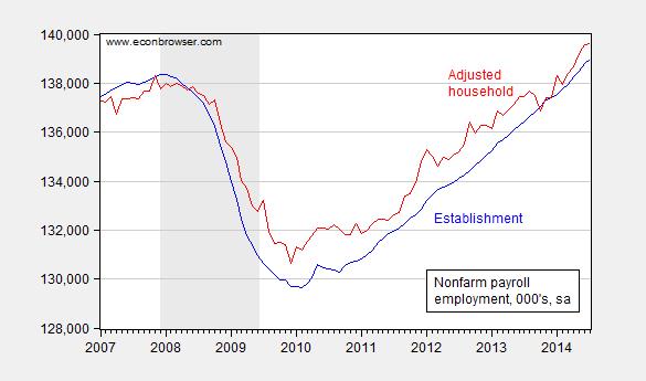
Figure 1: Nonfarm payroll employment (blue), and household survey employment adjusted to the NFP concept (red), both seasonally adjusted, in ‘000s. Source: BLS via FRED BLS.
The household adjusted series is a check for those who are skeptical of the BLS firm birth/death model. It’s interesting that the series is above the official series during the expansion, in contrast to the pre-recession period when it typically lagged.
Next, observe that recent revisions have typically been to the upside.
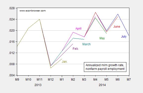
Figure 2: Annualized growth rate in nonfarm payroll employment from July release (blue), June release (red), May release (green), April (pink), March (teal), February (purple), and January (chartreuse), all calculated using log-differences. Source: BLS (various releases) and author’s calculations.
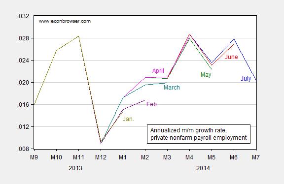
Figure 3: Annualized growth rate in private nonfarm payroll employment from July release (blue), June release (red), May release (green), April (pink), March (teal), February (purple), and January (chartreuse), all calculated using log-differences. Source: BLS (various releases) and author’s calculations.
This pattern suggests that July’s figure will be revised upward as well.
Finally, it’s of interest to see how labor input has covaried with output, particularly over the past couple quarters. In Figure 4, I present the first log difference in GDP, NFP, and aggregate private hours.
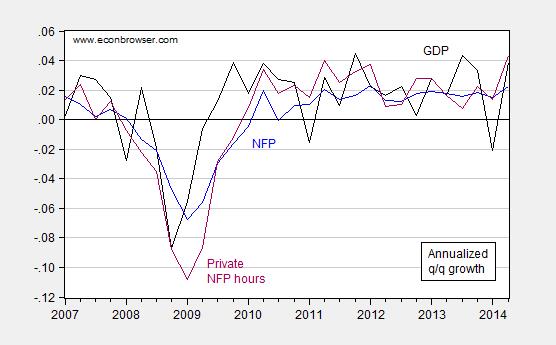
Figure 4: Annualized quarter-on-quarter growth in GDP (black), nonfarm payroll (blue), and aggregate private sector hours (purple), all calculated as log-differences. Source: BEA (2014Q2 advance GDP), BLS (July release), and author’s calculations.
Notice that the first quarter growth rate was revised up from -2.9% to -2.1% (SAAR) in the comprehensive annual revision. Nonetheless, the gap between (the growth rates of) hours and output seems pretty large. This point is shown in a slightly different form in Figure 5.
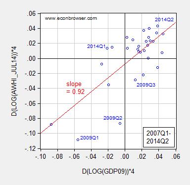
Figure 5: Annualized quarter-on-quarter growth in aggregate private NFP hours against real GDP, all calculated using log-differences.. Hours data is average of monthly observations. Red line is OLS regression line. Source: BEA (2014Q2 advance GDP), BLS (July release), and author’s calculations.
The 2014Q1 observation is far off the regression line — but not as far as in 2009Q1-Q2. However, these two quarters are periods when government consumption and investment rose substantially, in part due to the ARRA (recall aggregate hours are only for the nonfarm private sector). Hence, it may be that Q1 growth rates will be eventually revised noticeably upward.
Side note: Joint Economic Committee Chair Kevin Brady writes:
“Every new job is welcome news, but with millions looking for work we can’t celebrate a modest 209,000 jobs a month. Five years after the recession ended, the Obama recovery remains stuck in second gear.”
For purposes of comparison, five years and six months into President Obama’s presidency, nonfarm payroll employment is 3.8% higher than when he came into office. At a comparable point in President George W. Bush’s presidency, employment was only 2.9% higher than when he entered office.
More on the employment situation from Furman/CEA, Izzo/WSJ RTE, Portlock/WSJ RTE, Madigan/WSJ RTE, Tim Duy, C. Stone/CBPP, and McBride/CR.
The Obama depression began in June 2009, after the Bush recession ended.
Despite QEs and sustained optimism in the news, it’s been a rolling depression, where the economy improves for a while, deteriorates for a while, etc..
Economies change. We needed bold tax cuts and much less regulation more than ever.
Instead, we got small and slow tax cuts, that didn’t help household balance sheets and spur demand much, and much more regulation, on top of excessive regulation.
Lower taxes, less regulation, and a higher minimum wage would’ve been a recipe for stronger economic growth.
The output gap could’ve been closed, long ago, and the Fed could’ve completed a tightening cycle, by now, to slow growth.
We need to spur entrepreneurship, and make it easier for small business to grow.
It is gratifying to see that it remains true that people and the economy can adjust, given enough time, to bad policy. Time being emphasized. But why is the timing when it is, instead of months before or months later?
I postulate the main cause in timing is a significant change in policy from the very bad to reasonable. That change being the end of the terrible policy of extending to nearly two years unemployment benefits.
I also point out that the current administration made great and loud noises against the end, but is happy to take credit for the results.
Ed
The 12 month moving average of monthly private payroll increases has been setting on 200,000 since late 2011, long before extended unemployment were cut.
I know, the public knew that extended unemployment benefits were going to be cut long before it happened and that is why employment gains reached 200,000 in 2011.
“That change being the end of the terrible policy of extending to nearly two years unemployment benefits.”
that’s the spirit. crucify those poor souls who caused the financial meltdown by being laid off from their jobs. nothing like kicking a guy when he’s down to help you overcome your own insecurities.
66% –> 63%
I think, every American, including billionaires, should serve the public for at least two years, at some time in their lives. And, every public servant, including politicians, shouldn’t be paid more than the minimum wage. They should live like monks and sacrifice to serve the public, in one job or another.
No more high salaries, Cadillac medical and dental care plans, fat pensions, and other excessive benefits. Money can be used, instead, to actually help people, and improve systems, for example.
Moreover, politicians shouldn’t receive any money for campaigns. They should receive equal and free media time, and reporters should just report the news, rather than tell the public what politicians didn’t say or mean.
Politicians should be able to run for office as many times as they want. However, they shouldn’t become rich for just serving the public.
An interesting related article from the WSJ: http://blogs.wsj.com/economics/2014/08/01/why-so-few-people-are-marginally-attached-to-the-labor-force/?mod=blogmod
Comparing Bush and Obama’s unemployment reduction in the manner you looked at is odd as Bush started with a lower unemployment rate.
There are advantages to following a better president.
Steve
From Instapundit :
Democrats exhibit pattern of anti-Asian racism.