Hiro Ito has updated our de jure financial openness index through 2016, with all the data located at here, in Excel and Stata files.
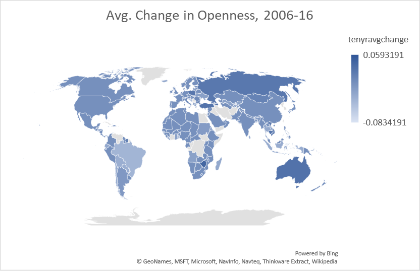
Figure 1: Ten year average change in normalized (0 to 1) Chinn-Ito index, 2006-2016. Source: Chinn-Ito and author’s calculations.
Data, documentation, all located here.
Perhaps one might add a few explanatory sentences to tell us what this actually means.
Also, is 2016 as far as it goes? That’s a long time ago, politics-wise.
Steven Kopits: Anybody who’s any familiarity with international finance knows; it’s probably the most widely used capital controls index in use (check in Google Scholar). If you don’t do academic research in international finance/open economy macro, then it’s likely irrelevant to you. If you are interested, click on the link provided.
The index is based on the IMF’s AREAER which has just come out, hence, the index lags — so blame the IMF.
I understand that, Menzie. But some of us are interested in the topic, but not expert in it, with enough on our plate that we would appreciate a three sentence summary of what the map is telling us. Has (had) openness improved or deteriorated? Are there any particular trends regionally or by country of note? Do we see lasting signs of the Great Recession, or perhaps a recovery therefrom? What’s the key takeaway?
A link to their seminal paper which Google/Scholar says has been cited 1927 times.
https://pdxscholar.library.pdx.edu/cgi/viewcontent.cgi?article=1066&context=econ_fac
Nothing to say abt the index, just a reminder. Capital restrictions are NOT exogenous random variables standing ready to be loaded up on the rhs of regressions. The restrictions are policy decisions by people who care about stuff, where stuff has been and where it is going. To see the IMF index used properly, consult the work of Juan Yepez – now at the IMF.
Bob Flood: Excellent point – ideally the index (like exchange rate regime) should be instrumented using exogenous variables; unfortunately it is hard to find plausible IV that are correlated with the index.
So , have a look at Juan’s work yfyepez@gmail.com
Speaking of floods, I hope your location is above water.
Bob –
You had mentioned that we needed to consider the impacts of austerity in Puerto Rico on excess deaths.
I have made such a calculation. (It turns out that’s actually possible.)
By my count, austerity imposed by the Fiscal Control Board under Congressional PROMESA legislation was responsible for 2300 excess deaths in Puerto Rico during 2016-2017. By contrast, Hurricane Maria, as I earlier contended, was reponsible for 1440 deaths through year-end 2017.
If I use a slightly different set of assumptions (more along the lines of Milken), you could get to around 2,100 deaths from Maria, and maybe 1200 or so deaths from austerity.
Thus, austerity probably led to 1200-2300 excess deaths in the 2016-2017 time frame. That’s actually a pretty big number.
To your point, the plight of Puerto Rico cannot be considered in isolation from its fiscal reality. As I wrote in my analysis:
Hurricane Maria is thus but one chapter in two decades of Puerto Rican misery. Of course, a clear accounting of mortality from the hurricane is important. But we should not lose sight of the bigger picture, that the island is besieged from many sides, and Hurricane Maria is just a particularly bad chapter in a longer story of suffering and decline.
https://www.princetonpolicy.com/ppa-blog/2018/9/5/sl9dh24cg4ybqesnzx6ran1lskm8uv
Steven Kopits: Personally, I cannot understand the trends you estimated (particularly, without incorporating seasonal dummies), and hence I am dubious of your calculations. I use time series techniques to estimate the counterfactual relative to both austerity and Hurricane Maria in this post and come to a different conclusion.
Donald Trump today: “The GDP Rate (4.2%) is higher than the Unemployment Rate (3.9%) for the first time in over 100 years!”
In other news, driving to the grocery yesterday I noticed that my miles per hour exceeded the outside air temperature for the first time since March.
By the way, “in over 100 years” apparently does not include the years 2000 or 2005.
The grammar sucks too. GDP rate? Growth rate of GDP.
And I don’t think Trump is smart enough to come up with something this dumb on his own. It smells like Kudlow — a dumb premise to begin with and finishing with an easily falsifiable conclusion. That’s classic Kudlow.
I’d recommend a different color scheme on the map. White or grey at 0 and two different contrasting colors for + and – readings (I.e. blue + / orange -).
Mike v: Agree – but my technical expertise extends only to using the app in Excel…