The Bureau of Labor Statistics announced Friday that 2.5 million more Americans were working in May than in April. That’s the biggest monthly increase since 1946, both in terms of the number of workers and as a percentage of the workforce. The unemployment rate dropped from 14.7% in April to 13.3% in May, the biggest monthly drop since 1950. All this is very good news. But there are also indications that we are in a deeper hole than the headline numbers suggest. Here I explain why I believe the true unemployment rate in May was a number more like 19.8%.
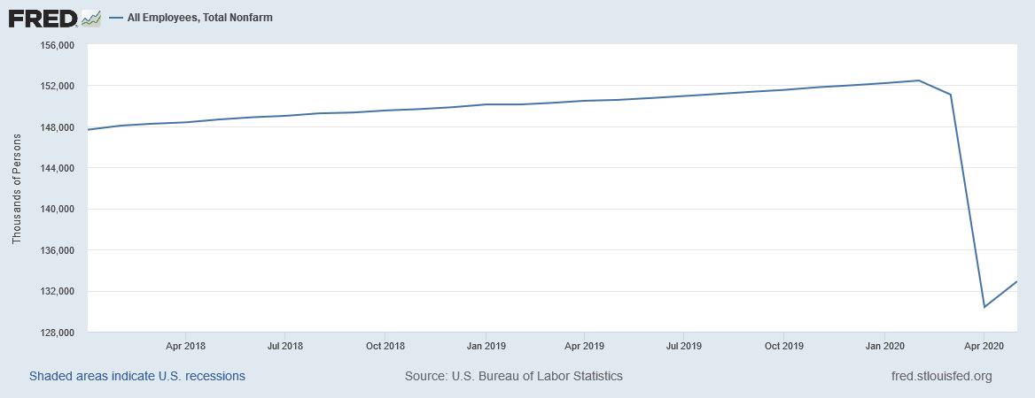
Seasonally adjusted number of people on nonfarm payrolls, Jan 2018 to May 2020. Source: FRED.
The strong employment report shocked many observers, since so many other indicators had been very discouraging. Bill McBride, as always incredibly insightful, suggested that the good news on employment may have come from small businesses rehiring in order to take advantage of the half a trillion dollars that has been lent through the Paycheck Protection Program.The New York Times and Marketplace quoted some business owners who said PPP funds made all the difference for them.
Some analysts worry that PPP can’t be a sustained source of support for the labor market. But it doesn’t have to be. The whole idea was to keep workers on the payroll until customer demand picked back up as restrictions on activity begin to be relaxed. About half the May gains came from the leisure and hospitality sector. It’s hard to imagine that restaurants, bars, theaters, and hotels will see anything like their previous level of activity even after all official restrictions are lifted. And the employment gain in May did not come anywhere close to making up what was lost in April. But so far, so good.
But there are some other details of the May employment report, particularly those coming from the separate survey of individual households, that are hard to square with available facts. According to the BLS survey of households, 21 million Americans were still unemployed as of the second week of May. But during that week, states reported that 2.7 million new people filed for unemployment compensation, in addition to the 24.9 million who were already collecting. Not everyone who is unemployed is eligible for compensation, and not everyone who is eligible applies. In a typical month, the number of people unemployed is about three times as big as the number collecting compensation. But now in May, the number collecting is somehow larger than the total number who are unemployed. The headline unemployment numbers do not seem consistent with what we know about how many people are collecting unemployment compensation.
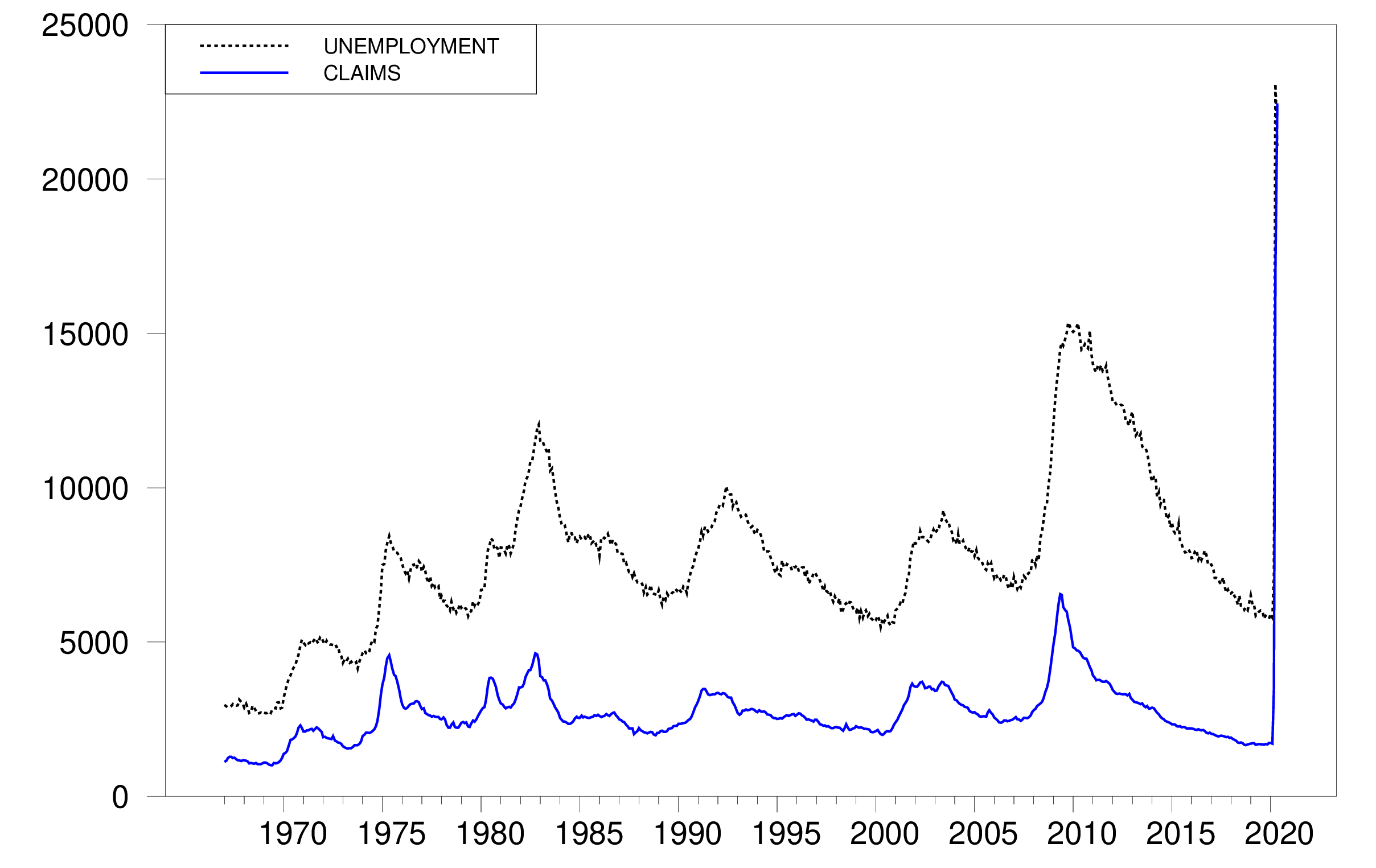
Dotted black: seasonally adjusted number of people who are unemployed according to the household survey (UNEMPLOY). Solid blue: sum of 4-week average of seasonally adjusted new claims for unemployment compensation (ICSA) and continuing claims (CCSA), in thousands of workers, Jan 1967 to May 2020.
Another striking feature of the headline numbers is the huge drop in the labor-force participation rate. The numbers claim that there were 6 million more Americans in May than in February who were not working and who were not looking for a job. Those people are not counted as unemployed, but instead are counted as having dropped out of the labor force.
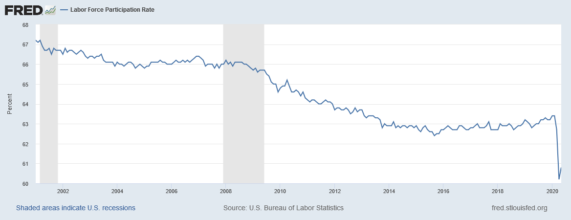
Labor-force participation rate, Jan 2001 to May 2020 (CIVPART).
Below I offer an interpretation of the latest numbers in terms of some of the findings I developed in a recent paper with Federal Reserve Economist Hie Joo Ahn. Our paper documents a number of internal inconsistencies in the employment numbers that economists rely on and reaches the conclusion that the headline numbers significantly understate the number of people who are unemployed. Below I use those results to interpret the May employment report. But before getting into that, I should emphasize that none of the statements we make in our paper, nor any of the statements I make in this blog post, should be interpreted as reflecting the views of the Board of Governors of the Federal Reserve System or of any other person associated with the Federal Reserve System.
Did 6 million people really drop out of the labor force between February and May? The historical correlations reported in our paper would lead to the prediction that of the 102 million Americans who were counted as not working and not looking for work in May, 2.7 million will be counted as unemployed in June and will say when asked in June that they were in fact looking for a job in May. The figure below summarizes some of the evidence that leads to that prediction. The vertical axis plots the percentage of people in a particular demographic group at a particular point in time who were counted as not in the labor force in one month yet were counted in the next month as unemployed and say that month that they having been looking for work for 5 weeks or longer. Every month there are many hundreds of thousands of people in this category, which we call NU5+ transitions. The incidence is higher for some demographic groups, such as younger workers, and lower for others, such as college graduates. But it was higher for everyone during the high unemployment rates of the Great Recession. For example, the percentage of college graduates with NU5+ transitions during the Great Recession (point C2 on the figure) was about the same as it had been for the overall population before the Great Recession (point A1 on the figure).
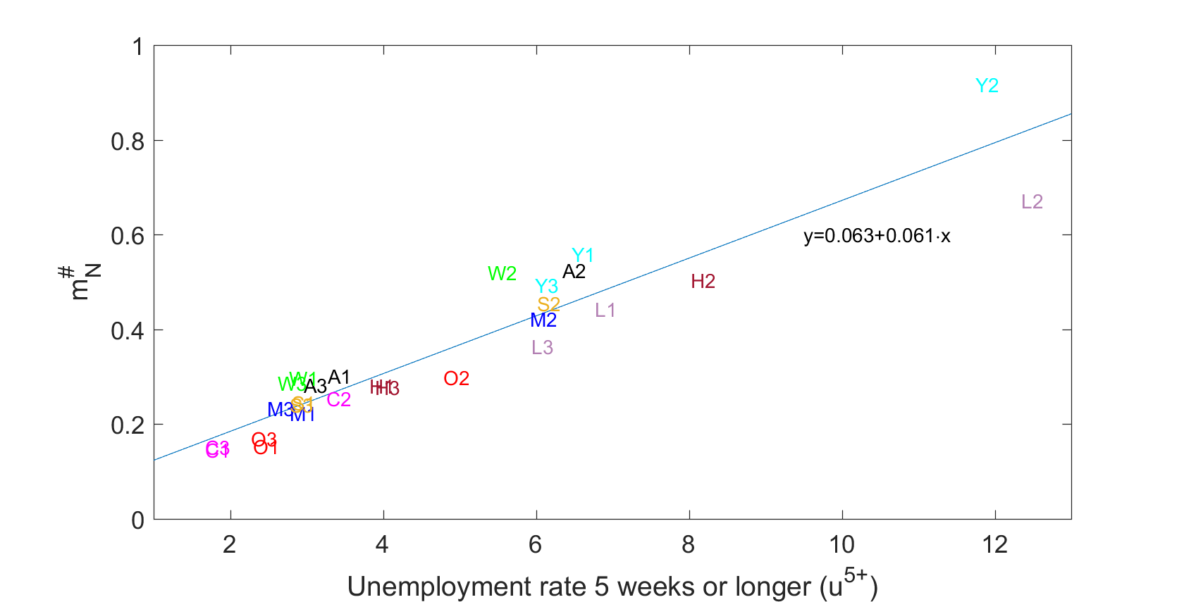
Vertical axis: percentage of group classified as N in month t-1 and U in month t with duration of job search in t reported to be 5 weeks or longer for different demographic groups and three different sample periods. Horizontal axis: Percentage of the labor force who are counted as unemployed in t-1 with duration of job search of 5 weeks or longer. Demographic groups: A: Total population, Y: aged 16-24; M: men aged 25-54; W: women aged 25-54; O: aged 55 and over; L: less than high school education, H: high school graduate; S: some college; C: college graduates. Sample 1: 2001:7-2008:6; sample 2: 2008:7-2014:6; sample 3: 2014:7-2020:1. Also shown is regression line fitted to the 27 observations. Source: Ahn and Hamilton (2020).
The horizontal axis plots the overall fraction of that group who are unemployed with duration greater than 4 weeks. There is a pretty close historical correlation between these numbers, with a regression R2 of 88%. One can use the coefficients from that regression, which is based on average differences between demographic groups, to give what turns out to be a quite accurate prediction of how many of this month’s N (not in the labor force) will be counted the next month as unemployed with reported unemployment duration of more 4 weeks. Applying the coefficients from the demographic regression above to the May 2020 number of people counted as unemployed with duration currently greater than 4 weeks gives the prediction of 2.7 million individuals who in May were counted as not in the labor force but in June be counted as unemployed and having been looking for work at that time for more than 4 weeks.
We know a number of other things about these NU5+ individuals based on the historical correlations. We know many of them said in May that they wanted a job, but were nevertheless not counted as unemployed in May because they did not say they took specific steps in May to get a job. We know that they have similar probabilities of getting a job in July, and similar probabilities of staying unemployed in July, as those who got counted as unemployed in May. And the numbers they will report in June for how long they’ve been looking for work will be strikingly similar to the numbers for others who are already counted as unemployed. Our paper concludes that these people really should have been counted as unemployed in May. Doing so would raise the May unemployment rate from 13.3% to 14.9%.
Disengagement with answering the survey. Another striking inconsistency in the data underlying the headline unemployment numbers is that the answers people give to the survey questions change the more times they are asked the same questions. For example, in February, the average unemployment rate (not seasonally adjusted) reported by people who were being asked the questions for the first time was 4.5%. The average unemployment rate in February reported by people who were being asked the questions for the eighth time was 3.2%. The seasonally unadjusted unemployment rate that the BLS reported for February (LNU03000000 divided by LNU01000000) was 3.8%, which is just an an average of all the answers people gave in February.
This difference in answers based on the number of times people have been interviewed is seen in every demographic group and every time period. The vertical axis in the figure below plots a summary of how steeply the reported unemployment rate falls as a function of the number of times people have been interviewed for different demographic groups and different sample periods. A number of 0.1, for example, means that the average unemployment rate the second time people are asked is 0.1% lower than the first time and the number when they are asked the third time is 0.2% lower than the first time. The magnitude of the effect is biggest for demographic groups and points in time when the average reported rate of unemployment (plotted on the horizontal axis) is higher. The data are suggestive of a universal law: given any group of individuals who indicate that they are unemployed the first time they are asked, 1.26% of those unemployed individuals will no longer be classified as unemployed in each subsequent interview. This law seems to hold for every education group, demographic group, and point in time.

Horizonal axis: unemployment rate as reported by BLS. Vertical axis: average decline per interview in the reported unemployment rate. Demographic groups: A: Total population, Y: aged 16-24; M: men aged 25-54; W: women aged 25-54; O: aged 55 and over; L: less than high school education, H: high school graduate; S: some college; C: college graduates. Sample 1: 2001:7-2008:6; sample 2: 2008:7-2014:6; sample 3: 2014:7-2020:1. Also shown is regression line fitted to the 27 observations. Source: Ahn and Hamilton (2020).
What accounts for this phenomenon? We review a variety of evidence in our paper that persuades us that unemployed individuals feel more stigma and disengagement from the interview process. We observe the drop most sharply when people answer the questions for themselves than when someone else in the household answers for them. We also observe that people tend to give answers in subsequent interviews that they think might end the interview more quickly, such as indicating that they aren’t working because they are retired or disabled. Interestingly, people who report “retired or disabled” in interview 2 are more likely to return to the labor force in interview 3 than people who are “retired or disabled” in interview 1. Our conclusion is that the first-interview concept of unemployment is the best one to use. One can use the regression line above to calculate what that number would be, given any reported unemployment rate. Plugging the May value of 13.3% into the equation gives an unemployment rate normalized on the first-interview standard of 14.0% (13.3 + (3.5)[0.029+(0.0126)(13.3)] = 14.0).
Nonrandom missing observations. The BLS failed to reach some of the people it tried to survey in May. Over 2001 to 2019, we observed that people who were missed in month t-1 but successfully interviewed in month t had an unemployment rate that was 1.7 times as large as the overall population. People who weren’t successfully reached in May don’t show up in the numbers that get reported for May. Because those people are observably different from the rest of the population, this is another identifiable source of bias in the headline numbers.
The BLS employment situation summary indicated that the household survey response rate in May was about 15 percentage points lower than it had been prior to the pandemic. Obviously some factors outside of the ordinary were influencing the low response rate. But as a first guess we could rely on the historical averages. If the May sample had been expanded by adding 15% more individuals who had an unemployment rate 1.7 times as high as those who were sampled, it would imply an unemployment rate of [0.133+(0.15)(1.7)(0.133)]/1.15 = 14.5% instead of the reported 13.3%.
Were that many people actually employed? A final issue has received a lot of coverage in the press because it was highlighted in the BLS report itself. There were large numbers of individuals who were classified as employed but absent from work due to coronavirus-related business closures. BLS intended to classify such individuals as unemployed, but stated in the report:
it is apparent that not all such workers were so classified…. If the workers who were recorded as employed but absent from work due to “other reasons” had been classified as unemployed on temporary layoff, the overall unemployment rate would have been about 3 percentage points higher than reported (on a not seasonally adjusted basis).
Summary. The headline unemployment rate in May likely understated the true unemployment rate by 1.6% as a result of overestimating the number of people who dropped out of the labor force, by an additional 0.7% as a result of repeated-interview bias, 1.2% as a result of missed individuals, and 3% as a result of people who were misclassified as employed,
leading to the conclusion that the unemployment rate in May was more like 19.8% than the reported 13.3%.
None of this should be construed to mean that the improvement in May was not real. We see a dramatic improvement not just in the household survey numbers, but also in the establishment-based estimates. And, although still very high, the number of new and continuing claims for unemployment compensation dropped by 2.6 million between April 25 and May 23. So the good news is quite real.
But we still have a long, long way to go.
Well, I guess someone has gotta be a Debbie Downer. 🙂
There’s a lot of screwy stuff with the May data. For example, the BLS data shows Average Hours Worked per week set an all-time high in May 2020 with data going back to March 2006. That just doesn’t smell right. And in the Leisure and Hospitality sector average wages spiked bigtime in April and then fell somewhat in May but were still well above March and February wages. I’m also wondering if the BLS analysts having to telework might have affected data quality.
Some analysts worry that PPP can’t be a sustained source of support for the labor market. But it doesn’t have to be. The whole idea was to keep workers on the payroll until customer demand picked back up as restrictions on activity begin to be relaxed.
Yes. And a comment that is worthy of another post all on its own.
Some analysts worry that PPP can’t be a sustained source of support for the labor market. But it doesn’t have to be. The whole idea was to keep workers on the payroll until customer demand picked back up as restrictions on activity begin to be relaxed.
The maximum PPP amount allowed is 8 weeks payroll. Most will be running out by the end of June, just three weeks away. Do you think things are going to be back to normal in three weeks? There’s likely to be another spike in unemployment filings as employers run out of PPP funds and have to lay off their employees.
Jim,
Good expliation of a number of odd things in the data during this period of large and highly unusual things going on in the labor market, indeed unprecedented things. It will be some time before what is really going on now is clear.
One reason I think there should have been less surprise that labor market conditions would tutn out better than many were forecasting, if not maybe as good as they look in the data, is that almost certainliy real output in the US has been rising for some time now, probably ast least a month or even longer. If that is the case, it is completely reasonable that there would be hiring going on well beyond just being done for ceertain mostly small businesses to receive government aid. Reasons to believe that indeed output has been rising include that gasoline demand appears to have been rising in the US for some time as well as carbon emissions.
A reason why we did not see the hiring going on has been that hiring data effect onlly gets reported monthly with these BLS reports whereas data on thos losing jobs or appeatring to do so shows up weekly with the unemployment claims numbers, which remained hight throughlut May, even as they have been declining. This is consistent with substantial differences i nconditions across sectos, with some such as education still losing jobs even as others turned around and began rehiring whether to actually increase production or just to receive money from the government.
What hiring??? The BLS is just mumbling with numbers, fitting propaganda. I mean you could lose jobs overall why employees are taken off of furlough. Maybe it’s time to defund the bls
Some great analysis and details. I’ll repeat only one sentence:
“Another striking feature of the headline numbers is the huge drop in the labor-force participation rate.”
This is why looking at the employment to population ratio is important. It dropped by almost 10% in April but recovered by a mere 1.5% in May.
The other strange number is the diffusion index.
Both the 3 month payroll and manufacturing diffusion indices surged from 3.9% and 3.3%
respectively, in April to 64.0% and 70.4 in May. Those May reading are right at or near all time record highs.
I find it difficult to accept that such a widespread and record rebound would have happened
without something in the real economy making it into the newspapers and the general knowledge
of economic and business analysts.
It is 3 month because they no longer report the monthly data.
Sorry, I misread the footnote. It is the one month data, not the 3 month.
i think the bls already reported the most significant factor, which is related to miscategorizing workers resulting in a lower unemployment rate. i think in the back of the mind of many data analysts and collectors is the spector of trump castigating the department for not producing results that he wants. this makes them error on the side of lower unemployment, as they unintentionally bias their results in a way that will not bring down the wrath of trump. i think these are good, honest workers. but trump has shown the ability to make others deviate from their preferred mode of operation.
trump really wanted this report and the headlines it draws. it is great for propaganda today. however, this report poses a problem for trump. as prof hamilton indicated, in reality the workplace is still much weaker than these headline numbers imply. so trump is boasting of a strong recovery. he is also using that strength to argue we do not need another stimulus, because that would admit weakness. but we probably do need continued support. absent that, there really will be a limited recovery and the economy will be lousy through the november election. this is trump’s dilemma. touting a strong recovery today while not supporting another stimulus (not admitting weakness) is contradictory for an election win. on the other hand, a report showing better employment gives trump more ammo to propose tax cuts, since tax cuts are meaningless for the unemployed.
Morning Joe showed a clip of Lawrence Kudlow basically going “two bits, four bits, six bits, a dollar – go Team Trump”. Well not his exact words but he might as well have been wearing a cheerleader’s mini-skirt. I have yet to find this embarrassing display on the internet but when I do, I promise to provide the link here. We all need a good laugh!
he might as well have been wearing a cheerleader’s mini-skirt.
Well, that was a visual I could have done without. Then again, based on Friday’s stock market jump it appears that some of those lonely old brokers kind of like Kudlow’s mini-skirt. No accounting for taste.
I’ll note that NBER tagged February as the business cycle peak and determined that we’re now in a recession. NBER’s conclusion was hardly a surprise, but I’ll admit to being surprised at how quickly NBER came to that conclusion. Do you think Kudlow will be wearing a grandma’s floor length flannel nightgown when asked about NBER’s recession call?
February was before any systematic closures. I’m a little surprised the recession hit that early. I thought March would be the start, with COVID. Without COVID, my expectation was roughly now.
Technically what the NBER Business Cycle Dating Committee concluded was that February was the date of the business cycle peak. Sometimes people summarize that as “February was the end of the expansion”, and others say “February was the beginning of the recession.” I think the first usage is a little more natural in the current situation, where the delineation was so sharp, we could almost pin it to the day, maybe March 16, which is the week when initial claims for unemployment compensation started to take off.
Thank you Professor Hamilton. I appreciate the clarification and appreciate your indulgence in enlightening an outhouse economist like me.
And, more than 19% unemployment, even after 2.5 million returning to work, is staggering.
baffling,
If one uses the other measure for both Aptil and May one still finds a decline in unemployment rate between the months as one sees a higher UR for April than was reported, around 19%.
I seriously doubt BLS doing this to please Trump. That would be a Trump argument if a Dem were prez, and indeed he made such arguments aback in 2015 and 2016, claiming BLS was fooling with the numbers to make the Obama admin look better than they should, but then pivoting the minute he got in to office and the UR numbers continued their gradual decline to declare that they were just great.
Everybody and his/her sibling who knows anything about BLS (and I do a bit) declares that there is now way Trump had any influence on this at all. They are simply professionals doing their jobs as well as they can. Indeed, as has been noted, having a better UR report now makes it harder for Trump to claim great gains nearer the election if this does not turn into a more solidly sustained recovery, with several sectors still going downhill and possibly worsening later in the year, such as local governments if no more stimulus, now less likely thanks to this report, not to mention sectors where hiring puffed due to aid that will disappear during the summer.
As it is, a number of commentators have really gotten egg on their faces with these sorts of claims about the BLS. The most striking and surprising has been Paul Krugman, who I gather has backed off and apologized for his accusations of politically inspired data manipulations at the BLS;. He, of all people, really should have known better and has probably damaged his credibility worse with this blunder than anything he has ever done.
“I seriously doubt BLS doing this to please Trump.”
i am not a conspiracy theorist. let me be clear, i don’t think trump and his cronies were able to directly tamper with the numbers. but every day, people in the bls (and other agencies) have the trump twitter hanging over their heads. while they may not do things to please trump, they certainly will not do things to displease trump. the agency knows of a discrepancy in the number of employed/unemployed due to a characterization flaw. this originated in march. while it was noted in the may report, the problem has NOT been corrected. it should be corrected, immediately. why has that not been done?
lets put this in more general terms, barkley. an agency collecting data realizes in month 1 there may be an issue with the data collection and analysis. in month 2, using the same system, they become more confident that this issue exists. in month 3, they are certain this issue exists and changes the published results for months 3, 2 and 1. but the agency does NOT correct the discrepancy. they publish the results with the known error. exactly when should the bls report what it now concedes is the accurate numbers? june? december? never? if the bls had corrected the numbers for may, and revised them for march and april, how would trump react? don’t for a minute believe the wrath of trump has not impacted the pace at which this correction will be implemented.
trump has had a similar impact on the cdc and its ability to confer accurate and reliable data and advice to the public as well.
Sorry, baffling, your discrepancy theory explains zero.
If one “corrected the discrepancy” in both April and May what one would find is that the UR was about three precent higher than otherwise reported. What that means is that there would still have been a decline in the UR from April to May, the surprising-to-many (but not me) headline that has you posing craven BLS employees knuckling under to Trump.
Sorry, no go. You are wrong, period.
“If one “corrected the discrepancy” in both April and May what one would find is that the UR was about three precent higher than otherwise reported. ”
and that is my point, so you get it. the unemployment rate would be higher than reported. that would not please trump at all. your month over month decline was not my point. i accept whatever the data says, but i want the real data not a flawed report.
barkley, be careful where you tread here. as an academic, you are approaching the defense of knowingly publishing incorrect data that others use for research and policy making. i do not believe this is where you want to stand on the issue. the bls has handled this situation poorly. your defense of this is surprising.
Look, baffling, you have been charging BLS with tip toeing because of Trump. If they had done the alternative there would have been a larger increase in UR from March to April, going all the way to about 19%. Is it your claim that they were tip toeing then out of fear that Teump would tweet mean things about them? I doubt it, and I doubt you think so. The issue here has been the surprise to many(not me) that there was an increase in net hiring and a decline in the UR from April to May, whivh triggered Krugman of all people to argue (before he took it back and apologized) that BLS was manipulation numbers to please Trump. Nobody is claiming anything about the March to April change.
So, if they had been using the alternative measure (probably superior, but this is in fact a not completely clear technical matter) for both April and May, one would have had about the same amount of decline in the reported UR and increase in net hiring, and it was this unexpected-to-most decline that created the ahubbub. You probably would have had some of the same parties making the same complaint if the other measure were used in both months. There would have been the same issue.
I think they should use the best measure, but there is a problem in going from one measure to another. Things become misleading. If indeed they had shifted from using the current measure in April to the other one in May, that would have made it look like the unemployment rare rose, which would have fit what most expected and kept people like Krugman from making their off-the-wall criticisms. But that would have been misleading. The hard fact is that using a consistent measure, whichever one, would have shown a decline in the unemployment rare.
Bot it, baffling?
“If they had done the alternative there would have been a larger increase in UR from March to April, going all the way to about 19%. Is it your claim that they were tip toeing then out of fear that Teump would tweet mean things about them? ”
yes. trump was able to influence data coming from the cdc and other health organizations, which influenced life and death issues. he has been able to influence career defense department people in their public statements. i have no doubt he can also influence bls folks. you think they are any better than the cdc or defense department? no.
“I think they should use the best measure”
barkley, it is clear you do not think they should use the best measure. you think they should continue to use a knowingly faulty measure. if you believed they should use the best measure, you would have an issue with them continuing to use a flawed system. got it?
barkley, you seem to be confused. i have no issue with the drop in recent unemployment. i am willing to let the data speak for itself. but if we are off by several percentage points on the unemployment rate, i do have an issue. We would most certainly take different actions if the unemployment rate were 9% instead of 6%. policy decisions are only as effective as the data that drives them. once again, i am quite surprised that an academic would be so supportive of using and continuing to use what has been shown to be flawed data. that makes no sense.
This will be my last post on this, baffling.
Sorry, you are spouting a garbage conspiracy theory. I am neither “confused” nor am I advocating bad measures, although the BLS faces a problem of transferring from one measure to another without misleading the public in doing so.
That you “have no doubt” that Trump can influence the people at BLS shows that you do not know anything about the BLS. Do you know anybody at BLS? Do you know how they operate? I do on both counts. You do not.
Stop making insulting accusations about people you do not know. Stop lying and making yourself look like a stupid and ignorant creep.
barkley, deborah birx can sit on the stage with trump and say absolutely nothing to correct him while he tells people to cleanse themselves with high powered sunlight and bleach. i think she is a fine person. i also think she has been influenced negatively by trump. there is no way she should have sat there silently. same goes for fauci. and the rest of the cdc, who have been quieted because of the threat to trump. nih and va have committed malpractice by continuing with hydroxychloroquine studies, due to the threat of trump. it can happen. somehow you believe that the bls is filled with more credible and righteous people? i find that a difficult position to accept.
as i stated before, over the course of several months it has become apparent to the bls that there is a significant error in their reporting methodology-they even noted this in the last report. but rather than correct the error, they have continued to publish the erroneous results. being knowingly off by over 3% on the unemployment measure is not an acceptable mistake. people use these numbers to justify policy.
i am quite baffled that an academic would continue to defend the publication of knowingly incorrect data, which is what you are doing. you have taken the stance that the bls is infallible and should not be questioned. i take the position that they are good people, but can be influenced. birx and fauci are also very fine people. you would be hard pressed to find anybody in the bls that are better people. and yet they have been influenced. it can happen. this is not a criticism of the bls as much as a criticism of the trump effect. trump is able to distort the moral compass of all he encounters. your defense of this effect is what is “making yourself look like a stupid and ignorant creep.”
The problem is the furloughed workers. Structurally, the economy lost jobs. But being temporarily unemployed is not the same thing. So the U series went down from 19% to 16% unofficially…. no surprise.
Excellent analysis.
Great analysis James.
I think I now understand the somewhat baffling release.
sluggsy whom or what is a Debbie Downer.
Not Trampis A well known character on a long running late night American comedy show, “Saturday Night Live.”
https://en.wikipedia.org/wiki/Debbie_Downer
Thanks Mate
Bravo! Thanks for this informative and high-quality blog post!
I like the analysis.
There seems to be an inherent assumption in your numbers that There is no overlap between categories from which you have added people to the unemployment number. I would think that your number is too high because there is an overlap. Maybe you accounted for this, I did not see it though.
Thank you for the analysis
Excellent question, Jamie. In the analysis in the paper, we’re very careful about this. We first jointly model the way that all the possible outcomes — employed, unemployed, not in the labor force, and missing — are observed to change as a function of the number of attempted interviews. Once we have that, we use corrected counts of U and MU transitions to measure the systematic differences between the fully sampled population and the people who are missing and then show up. We use NU5+ transitions as a final step with a direct correction for double-counting.
We don’t have the detailed data yet to do that analysis with the April numbers, so I was making some educated guesses. The average gap between the reported unemployment rate and our estimate was 2% over our historical sample, and we know from direct observation in the sample and from the evidence sketched above that the gap is bigger when the unemployment rate is higher. When the moves in the reported unemployment rate and labor-force participation rate are as big as they were in March and April, the guess that those corrections would be on the order of 3.5% for April seems pretty reasonable to me. The added 3% comes directly from the BLS statement, and refers to people who are counted as employed but should have been counted as unemployed. There is zero overlap between this and the first three corrections, which refer to people who were counted as not in the labor force or missed by the survey — if you’re missing or not in the labor force, by definition you were not counted as employed. So I stand by the estimate that the BLS numbers likely understated the level of unemployment by 6.5%. But I acknowledge that when you extrapolate historical correlations to a situation that’s such a big outlier from what was seen historically, there are many ways you can go wrong.
Dear Folks,
Every time I argue with Jim Hamilton, I never win. But in this case, the protests after the death of George Floyd may have some effect in reversing the numbers.
J.
This analysis is very helpful, but it does not satisfactorily reconcile the May Employment Situation with the incoming data since the April Survey week. Here are 4 major pieces of data inconsistent with the May report showing +2.5 Million NFP and a decline of the UR from 14.7% to 13.3%:
1. The ADP survey showed -2.7 million NFP for May
2. Continuing claims matched for survey weeks showed an increase of 2.8 Mn
3. There were about +16 Mn initial claims between survey weeks
4. The Dallas Fed RPS showed an increase in their measure of the unemployment rate from 17% in the April survey week to 24.7% for the May survey week