I fell a little behind on blogging with the holidays, so today I’ll outsource to Calculated Risk.
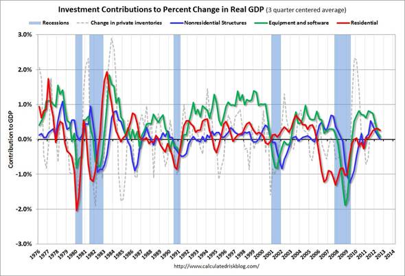
The graph below shows 3-quarter averages of the contribution to GDP growth of each of the four categories of private investment. Red denotes residential fixed investment, green equipment and software, blue nonresidential structures, and dashed purple changes in inventories.
 |
Bill McBride explains the significance:
This is important to follow because residential investment tends to lead the economy, equipment and software is generally coincident, and nonresidential structure investment lags the business cycle…. The usual pattern– both into and out of recessions– is red, green, and blue. [Inventory investment shown in dashed purple] has significant ups and downs, but is always negative during a recession, and provides a boost to GDP just after a recession.
The key leading sector– residential investment– has lagged this recovery because of the huge overhang of existing inventory. Usually residential investment is a strong contributor to GDP growth and employment in the early stages of a recovery, but not this time– and that weakness was a key reason why the recovery was sluggish so far.
Residential investment finally turned positive during 2011 and made a positive contribution to GDP in 2012.
What does this mean for the business cycle? Usually residential investment would turn down before a recession, and that isn’t happening right now. Instead residential investment is starting to increase….
The key downside risk for the US economy in 2013 is too much austerity, too quickly. However, barring a policy mistake (I expect a fiscal agreement), it seems unlikely there will be a sharp decline in private investment in 2013. This is because residential investment is already near record lows as a percent of GDP and will probably increase further in 2013, and that suggests the US will avoid a new recession in 2013.
One thing I worry about is that the uncertainty itself associated with the current budget “negotiations” could be a factor dragging down the equipment category and possibly consumer spending as well, so that even if the direct fiscal drag is short-lived, it could end up having bigger consequences. But I’ve found it’s never a good idea to take the opposite side of Bill McBride when it comes to predicting what’s about to happen next.
Happy Holidays, All!
You know, I’m hard pressed to find the housing bubble on the chart above.
I’ve got doubts about that “3 month averaging” business.
During the period of the housing boom, 2001-6/7, housing increased steadily from 23 percent of all fixed investment, to 37 %. The bust was to 22 percent
Starting a year or so later 2002, non-residential equipment began sliding from 56 percent of fixed investment to 44 percent at the housing peak, while non-residential structures jumped down from 20 to 17 percent.
They both began climbing a quarter or so later.
My story is that the bankers who were dismissed in the non-residential fall-off went into residential, but forgot to change their fiduciary methodology. In the old job, anybody who told them that company income was forecast to increase next year by 25 percent, could be “trusted,” if only under a presumed sanction if wrong. The same could hardly be said of real-estate brokers and construction managers. who would likely be fired sooner if they didn’t forecast big!
Anyway, that’s my take; but it couldn’t be read off the above chart, whatever it is!
In my previous post
“a quarter or so later” should read “a quarter or so after housing hit bottom.”
Steven,
I agree the housing bubble was not so obvious … it can be seen from the lack of decline of red line during the 2001 recession: the recovery might seem normal, but there wasn’t any payback needed, unlike in the previous recessions.