A contrarian perspective on employment growth
The report on the employment situation was taken as a very positive sign. Superlatives abounded. Foxnews begins its article:
Employers added 211,000 jobs in a springtime hiring burst that benefited almost all sectors of the economy and lowered the national unemploment rate to 4.7 percent.
Most observers concurred, although with some caveats, and a bit less gushingly. There’s been extensive discussion at Angry Bear (Kash and PGL) and Macroblog, among others. I don’t want to disagree with anything noted there. Rather, at the risk of saying something that’s already been said, I want to highlight some aspects of the recent numbers that have been neglected. First, it is interesting that the civilian employment numbers (adjusted to conform to the payroll employment series) has converged to the payroll employment figures. Hence, one cannot say that the civilian employment numbers are substa ntially more robust than the payroll numbers.
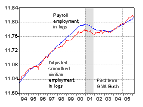
Figure 1: Payroll employment and Adjusted civilian employment series, in log terms. Source: BLS.
Second, despite the recently accelerating growth, the paryoll employment numbers remain well below what they would have been had the recovery evolved as it did after the 1990-91 recession.
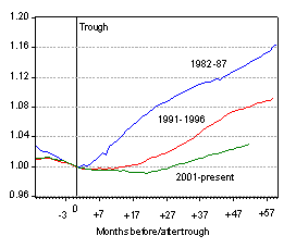
Figure 2: Payroll employment trends for 1982-87, 1991-2000, 2001-present episodes, normalized to 1.00 at trough. Source: BLS and author’s calculations based on NBER recession dates.
Even using the unadjusted civilian employment series (for discussion of the adjusted civilian employment series, see this post), the current recovery only matches the post-1991 recovery, itself not known as a period of rapid employment growth.
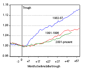
Figure 3: Unadjusted Civilian employment (over 16) trends for 1982-87, 1991-2000, 2001-present episodes, normalized to 1.00 at trough. Source: BLS and author’s calculations based on NBER recession dates.
Technorati Tags: href=”http://www.technorati.com/tags/payroll+employment”>payroll employment,
civilian employment
what a waste of your time
As always excellent. My “YEA” was simply that we FINALLY got the employment to population ratio up to 63%. It took a long time and I’m on record hoping for an employment to population ratio closer to 64%. David Altig respectively argues that the full employment rate of the employment to population ratio is closer to 63%. I respectively disagree with David.
When I talk to Wall Street Analysts who cover staffing stocks such as Robert Half, Manpower, and Monster, they seem to understand this “slow recovery” phenomenon and in fact, argue that we should own stocks such as the above longer into the cycle than in prior cycles. The earnings performance of Manpower today-a very strong quarter rather late into the cycle-suggests that the analysts might be right.
Someone please explain to me why 211,000 for one month is so great, yet when Clinton was president we averaged 232,000 every month for 8 years?
pgl: Yes, I counted you as one of the less “gushing” observers. Not being a labor economist, I don’t have a strong feeling on the issue of the long term participation rate, although it seems odd that it should have dropped so precipitously in the wake of the recession.
Martin Baily, formerly CEA chair under Clinton (and hence my boss for half a year), has an interesting slide (number 6 in this powerpoint presentation) arguing that about half the decline from the 67.1% to 66.0% participation rate is temporary, supporting your conjecture that a further bounce-back in the employment-population rate is in the cards.
Baily makes a related observation in the presentation (slide 8) — namely that the decline in the unemployment rate is consistent with a deceleration in potential GDP growth from 3.5% to 2.7%
edgardo: I look forward to hearing your suggestions on more profitable uses of my time.
another failing of many reports, is the lack of context. We have a huge current account deficit, and the jobs that are being created are not the kind of jobs that will lower the deficit.
The jobs report does not occur in a vacuum. The current economic situation does matter.
why do these participation rate
stat feel so slippery ???
out to be more stable
could be
the survey
has to crude a mesh
also could be
the surveyors are told
like drop outs
not fruitless job hunters
beautiful graphing
best in the biz
bet u’ve heard that alot
I wonder if it is that Participation rate stat is why the the unemployment rate is “surpisingly” caculated low right now. If it is, then 4.7 unemployment say in 1997 is better than 4.7 unemployment today as more jobs were being created which brought more people into the labor workforce, which created a tighter labor market in some regions. In the Midwest, it isn’t nearly has tight as it was in 1999, when employers were begging.
I’m not sure I’m understanding the numbers, but are we using one of the tightest labor markets in modern US history as the baseline for normal?
According the Paul Craig Roberts, 92% of the jobs created in March were lower value service jobs.
I won’t have time to read the full BLS reports for a while, any comments from anyone?
Menzie, do you think the 81-83 recession is genuinely comparable?
The top unemployment rate in the 80s was nearly 10.8 percent (dropping 4 points in the 3+ years after). In 1991, the rate jumped to 7.8 and dropped 2 and half points afterwards. The 2001 recession saw the unemployemnt rate peak at 6.3, and has dropped “only” one and half points since.
It is poor analysis to say the recovery is weak in light of these numbers — in which it is clear that some recessions are bigger than others. The recession was mild to begin with, and as sebastian notes, it came when the labor market was at its tightest. So your graphs are actually very misleading, in my opinion.
And believe me, what you are pointing out has not “been neglected.” The line that “This employment recovery is weaker than previous ones” with graphs nearly identical to yours have been part of the daily talking points for Democrats on Capitol Hill and Wall Street pessimists since 2002.
Kane: All recessions are different. I agree that the 1981-83 recession was the deepest recession since the Great Depression, and hence it would be understandable if the “bounceback” was correspondingly large. That is why I included the 1990-91 recession and recovery. The graphs indicate that at best the recent increase in employment is only as good as that lackluster episode, and perhaps substantially worse.
What I meant by “neglected” is in the context of the press coverage immediately surrounding the release of the employment figures. All I’m asking for is context. However, if somebody is willing to create a corresponding set of graphs for hours worked, real wages, or real total compensation, I’d certainly welcome those if they were to add substantially to the discussion.
Menzie,
Nice work with the numbers, I’ve seen several takes on this from Mish’s GET, Angry Bear Kash, Calculated Risk, Big Picture Barry and Macroblog Dave.
I take issue with the whole “non farms” bad math fiasco and believe that the numbers are far worse than advertised.
As Friday we will hear how many “new” hypothetical jobs were created, and the markets will “knee jerk” to the tune, (I suspect 200K+ and a stock & bond market tanking), tomorrow I will have some recent historical BLS numbers posted.
And the numbers, despite being straight from “the horses mouth” appear to still be rather dismal.
Perhaps edgardo will think it a waste of time as well.
Menzie,
Here are the numbers, read em and weep…
http://naybob.blogspot.com/2006/05/more-tasty-non-farms-cake.html