The dramatic upward move of long-term interest rates gives me an opportunity to look back on some of the predictions made on the basis of the inversion of the yield curve, and what might be in store next.
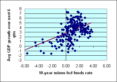 |
In December of 2005, I presented the above scatter diagram, in which each diamond represents a different quarter between 1959:Q1 and 2004:Q2. The horizontal axis measures the difference between the 10-year Treasury bond yield and the average fed funds rate over the last month of the quarter. The vertical axis gives the average logarithmic growth of real GDP (quoted at an annual rate) for that quarter and each of the following 5 quarters. The positive slope of the fitted regression line reflects the historical fact that the higher is the current 10-year Treasury yield relative to the fed funds rate, the faster GDP growth you should expect over the next year and a half.
A year and a half ago, in discussing that historical relation, I wrote the following:
this is not something that only matters when the yield curve completely inverts or the spread becomes negative. Rather, the scatter diagram above suggests a gradual concern– the narrower the gap between long- and short-term rates, the slower growth we can usually expect to see.
With the 10-year rate currently at 4.38% and fed funds at 4.25%, the spread 0.13% is 73 basis points below its historical average of 0.86%. The regression above suggests that this would typically mean growth that is 0.44% slower than average, or under 3% annual growth for the next year and a half.
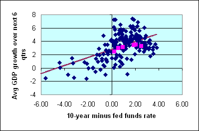
We now have the six quarters of GDP numbers that followed that prediction, and know that average GDP growth did indeed come out below 3%– it was 2.45%, to be exact. In fact, we now have six new observations (2004:Q3 through 2005:Q4) on the yield spread along with what actually happened over the subsequent year and half. These new observations are plotted as fuchsia squares on the figure below. All of these observations turned out to fall very near to the historical regression line. Over the last year and a half, we have watched growth rates slow, just as the yield curve predicted they would.
 |
The most bearish signal from the end-of-quarter yield spread came in 2007:Q1, when the 10-year rate stood 69 basis points below the fed funds rate. According to the historical regression, that would imply a prediction for average GDP growth between 2007:Q1 and 2008:Q2 of 2.37%.
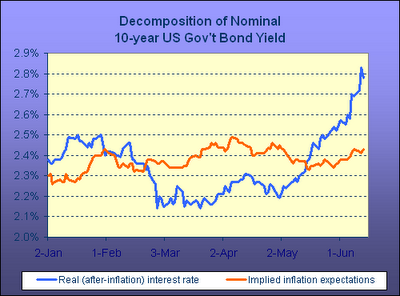
But since then, the 10-year yield has shot back up to par with the fed funds rate. Like Menzie, Dave Altig, and Kash Mansori, I have a hard time buying the oft-repeated claim that this movement signals a surge in inflation expectations. Kash’s plot using the behavior of inflation-adjusted TIPS seems pretty convincing:
 |
If instead you thought this move was driven by an upward revision of expectations of future real growth, according to the regression relation above, that would require that the predicted 6-quarter average real growth rate just went from 2.37% to 2.79%.
Do you believe that? Don’t know that I do. But it’s hard for me to avoid reading some increased optimism into this month’s move in long-term yields.
Technorati Tags: macroeconomics,
Federal Reserve,
interest rates,
yield curve,
recession
What about the idea that this reflects a repricing of American debt by foreign investors growing more concerned by the situation in the mortgage/credit markets here?
2.8% average over the next six quarters? I don’t know if that’s what we’ll get, but it seems plausible. Why wouldn’t it be?
Stuart,
If that was the case, wouldn’t you expect the dollar to weaken over the same period? The dollar strength of late seems more consistent with the growth acceleration story, doesn’t it?
I suspect the current debt market is not like anything seen by anyone currently alive, so I suspect the rear view mirror scatter plot is going to be of little use for driving. But steady-as-she-goes….until things change…tis better to fail conventionally, to be sure.
Yield curve inversion has typically meant the expansion is on its backside. Sometimes right into a recession, but other times several months before.
The current strength of the US dollar doesn’t make much sense, but that strength is relative. The loonie, with Canada’s twin surpluses vs the US’s twin deficits, is heading in a direction that makes sense. It’s backed off a little, but maybe that’s just the US dollar taking a ‘dead cat bounce’. If you really think the US dollar is strong, take a vacation in Norway.
Stuart, if the driving factor were concerns about the U.S. mortgage market, I would have expected to see that show up in mortgage rates rather than inflation-indexed Treasuries.
Stuart, data show you’re correct to worry about this. There’s a term shift going on.
Capital flows to the U.S. shot up to $111.8 billion in April. Foreigners in April were active buyers of short-term Treasurys but shied away from longer-dated securities.
Steve, this also explains the dollar situation you ask about.
I think there is a serious correlation/causation problem here, at least when prediction is applied to short-term movements in interest rates.
What I mean is that there are many reasons why interest rates at one end or the other might move, and each reason has different implications for growth. A collapse in the housing market implies a decline in demand for long-term borrowing and a decline in growth. Short-term money coming off the sidelines and going into real investment implies a decline in supply for short-term borrowing but a rise in growth. So, the same long-short differential could have very different outcomes.
This is evident from the large envelope of uncertainty around the least-squares lines. Since measurement of both rates and GDP is fairly precise, the uncertainty means that other factors are important. I would guess your r^2 is about 0.3, plenty to prove significance of the relationship, but meaning that 70% of the variation is unassigned. A differential of zero could just as well forecast 4% growth as 0% growth.
So, while I would agree with your conclusion that there is a preponderance of evidence toward increased growth, my guess is that the tilt is very small.
One final note. One key uncertainty in GDP is due to the methodology of calculating inflation. John Berry (for example) makes the case that inflation is actually overstated, meaning that GDP growth has actually been much better than stated. But in deconvoluting complex problems (like whether purchasing power is increasing or decreasing), one learns to provide an analysis in which the data provide a consistent picture. High debt levels, increased workforce participation levels, and many other indicators are more consistent with a population experiencing declining living standards. Rising longevity, larger home sizes, and other indicators are more consistent with a rising living standard.
My opinion leans toward inflation being understated (though I would be hard-pressed to answer Berry). But until we really understand this issue, making GDP predictions based on short-term yield differentials is risky at best.
Charles writes:
“One final note. One key uncertainty in GDP is due to the methodology of calculating inflation. John Berry (for example) makes the case that inflation is actually overstated, meaning that GDP growth has actually been much better than stated.”
Real GDP growth is calculated by dividing nominal GDP with GDP deflator. GDP deflator is not the same as CPI or PCE. GDP deflator is the most accurate method.
Indices are indices, Patriot, subject to similar weaknesses. I think this is the latest relevant working paper on BEA methodology.
But I take your point.