Last week’s trade release induced some wide-ranging thoughts, that spurred more questions than answers. In an experimental post, I’ll pose some questions that I hope readers will help me answer.
First, background. The trade release showed continued declines in the trade deficit, both total and ex.-oil imports, in absolute dollar (and hence in share-of-GDP terms).
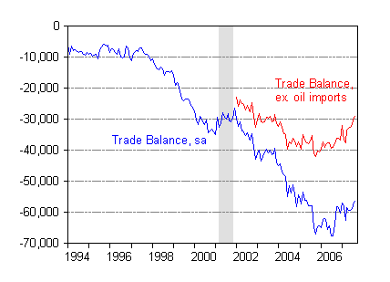
Figure 1: Trade balance (blue) and trade balance ex.-oil imports (red), seasonally adjusted in millions of US$ per month. Source: BEA/Census trade release for September (Nov. 9).
This much is well known (although as oil prices surge higher in October and November, the overall trade deficit might still increase in subsequent months). This picture reflects the fact that net exports contributed positively to GDP growth in Q3 (see this post).
Now, we know that most reported government statistics are “backward looking” to the extent that they often pertain to periods far back in time. So last Friday’s release pertained to September’s trade figures (and will be revised in next month’s release).
Yet, in looking at consumption goods imports, I noticed that there was a substantial flattening off. This is easiest to see in the 3 month moving average (red line).
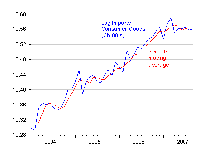
Figure 2: Log real imports of consumer goods, seasonally adjusted in millions of Chained 2000$ per month (blue), and 3 month trailing moving average. Source: BEA/Census trade release for September (Nov. 9), and previous releases, and author’s calculations.
How does one interpret this, with reference to future expectations? It think it’s hard to say, because this series combines durables (which we know are subject to interest rate effects, and other factors that might particularly affect liquidity constrained consumers), as well as nondurables. So to get a better view, I took the data from the NIPA release of 31 October to see what real consumption imports, disaggregated into durables and nondurables, looked like.
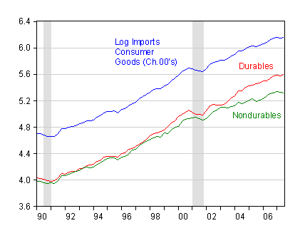
Figure 3: Log imports of consumer goods (blue), durables (red) and nondurables (green); NBER recession dates shaded gray. Sources: BEA NIPA release of October 31, and NBER.
As one can see, the total flattening out of real consumption imports is a function — in this last case — of a mild uptick in consumer durables and fairly pronounced downtrend in nondurables consumption.
This discovery (at least it was a discovery to me — I don’t often look at these series closely) prompted me to look at the total consumption expenditure to GDP ratios for durables and nondurables+services. (After all, imports are a residual — expenditures on foreign made goods not satisfied by domestic production; the change in the dollar’s value should’ve had an effect here.) These expenditure ratios are shown in Figure 4.
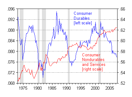
Figure 4: Share of consumer durable expenditures (blue), nondurables plus services expenditures (red); NBER recession dates shaded gray. Sources: BEA NIPA release of October 31, and NBER.
As one can see, consumer durables have been declining as a share of GDP for a substantial period, with a big drop in early 2005. Consumtion of nondurables and services has been rising, but certainly not at the same pace as before.
To me, the question is what this implies for the economy going forward.
Going back to graduate school days, I was taught the flow of consumption services (the services from consumption of durables, nondurables, plus expenditure on services) should follow a random walk. That was before the days of thinking about liquidity constrained consumers, buffer stock models and loss aversion, and a whole lot of other things (habit formation, etc.) (here’s an excellent refresher course from Professor Christopher Carrol at JHU). With this in mind, I leave you with this graph.
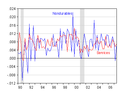
Figure 5: First difference of log consumer nondurable expenditures (blue), log services expenditures (red); NBER recession dates shaded gray. Sources: BEA NIPA release of October 31, and NBER.
If consumers are optimizing, and unencumbered by liquidity constraints, then the best guess of consumption growth (for these compponents) is given by the average values over the past few quarters. If these other factors are important, then one might think of the of how income growth interacts with increasingly binding liquidity constraints and/or how uncertainty increases the precautionary saving motive.
For my money, I’m guessing that consumption expenditures will eventually decline more than anticipated by standard macro models that take into account only first moment effects, and assume constant liquidity constraints.
[Late addition, per request: Nov. 16, 7am Pacific]
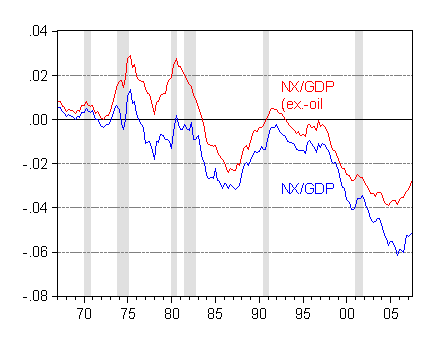
Figure 6: Net exports to GDP ratio (blue) and net exports to GDP ratio ex.-oil imports (red), SAAR. Source: BEA NIPA release of 31 October.
Technorati Tags: trade deficit,
imports,
consumption, durables,
nondurables.
Our entire trade deficit is due to only two things – Oil and China. Outside of this, we have virtually no trade deficit.
On China, I think the weak dollar will force them to unpeg.
On Oil, I continue to scream from the rooftops why I want Oil to hit $120/barrel, and stay there. Note how the oil component of the trade deficit is not rising any more. We are at the point where further price increases decrease consumption. I don’t think Oil imports will ever get above $30B/month, no matter what the price of oil, due to consumption dropping off.
Can you also, in addition, make a version of Figure 1 as a percentage of GDP? That will also tell us a lot, rather than have nominal non-adjusted dollars.
GK: The trade numbers are monthly, while the GDP numbers are quarterly (I don’t have access to monthly nominal GDP), so I added a Figure 6 depicting net exports to GDP. I didn’t include this before, as I try not to repeat the same graph over and over (see Figure 1 in this post for the last posting) — but here it is. It tells the same story as Figure 1.