Some observations on the employment situation and other economic indicators: (1) Not only is nonfarm payroll employment slowing its rate of descent, so is private employment; (2) but perhaps more dramatically the decline of aggregate hours halted last month; (3) the rate of decrease has diminished even faster for civilian employment measured by the household survey, and indeed; (4) the household (research) series adjusted to conform to the payroll series is now improving; and (5) a first “estimate” of July GDP supports the case for stabilization of output.
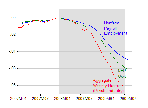
Figure 1: Log nonfarm payroll employment (blue), log private sector nonfarm payroll employment (green) and log aggregate weekly hours for the private sector (red), seasonally adjusted, all normalized to 0 at 2007M12. Gray shading denotes NBER defined recession, assuming end of recession at 2009M06. Source: BLS July release via St. Louis Fed FREDII, NBER author’s calculations.
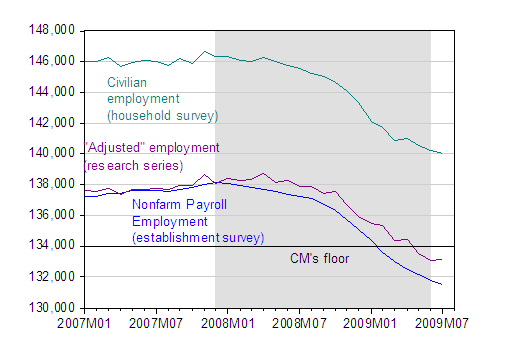
Figure 2: Nonfarm payroll employment (blue), in thousands, civilian employment (teal), civilian employment adjusted to conform to nonfarm payroll concept (violet). CM’s Floor denotes Casey Mulligan’s 10/26/08 forecast floor on NFP. Gray shading denotes NBER defined recession, assuming end of recession at 2009M06. Source: BLS July release via St. Louis Fed FRED II, BLS, NBER, and Casey Mulligan.
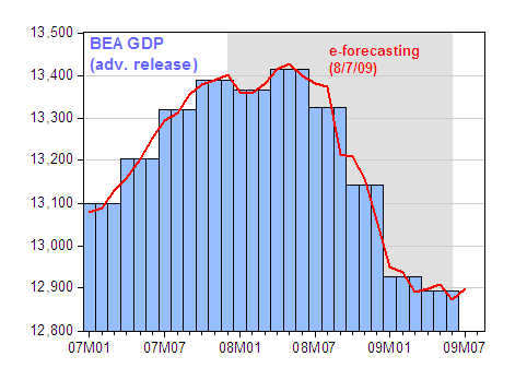
Figure 3: GDP (blue bars) and GDP monthly estimate from e-forecasting (red line), in billions Ch.2005$. Gray shading denotes NBER defined recession, assuming end of recession at 2009M06. Source: BEA GDP advance 2009Q2 release, e-forecasting release 8/7/09, NBER.
In all cases, the usual caveats apply: the NFP series will undergo revisions (as will the hours series), the household survey based civilian employment series has high variability, and the July GDP estimate will undergo substantial revision as more data comes in. And, of course, one observation does not a trend make.
Update 3:10 pm: More at Economist’s View, CR [1], [2], [3], WSJ RealTime Economics, Justin Fox, Economix.
Technorati Tags: nonfarm payroll employment, recession,
hours worked, civilian employment, Casey Mulligan.
Well, I told ya so. Predictions unchanged since December include.
1) Recession NBER trough in Q309
2) 131M jobs at the employment bottom
3) UE rate to cross 10%
the miniscule uptick in hours worked means that for every eliminated job there were less than 33h of already existing idleness for exactly those eliminated positions and some work got transferred to the remaining workforce. example: 100 workers worked 33h each for a total of 3300 work hours, now 90 workers work 34h for a total of 3060h.
you have not given the exact numbers, but considering the reliability of NFP, i would not be surprised if we come up with the paradox of increasing total cumulative hours worked, while decreasing the workforce. the distribution may be very uneven between industries, but i just dont see who would be working longer hours in jul/aug besides auto dealers while the cash for clunkers program is going on.
How about the chart on Calculated Risk that shows labor market participation continuing to fall?
http://2.bp.blogspot.com/_pMscxxELHEg/SnwgkCFPCgI/AAAAAAAAGBs/npx0UCzm8Ms/s1600-h/EmploymentMeasuresJuly09.jpg
baychev: The standard deviation of log differences of aggregate weekly hours has been 0.004 since 1986M01; the change in June was 0.007, while that in July was 0.000. The t-statistic for the difference between the values was thus 1.75.
An alternative way of looking at this is to look at revisions. Over the 2007M10-09M06 period, the standard deviation of nonth-to-month revisions is 0.00048, so this bounds the likely revision.
Joseph Somsel: Yes, that’s in hyperlink “CR [3] under the update paragraph.
I think Federal reserve should consider the policy to tackle the speculative bubble in asset pricing because the boom and bust in asset price create the financial crisis. Fed kept the interest rate too low for too long in 2003 and created the bubble in real estate. Now the Taylor’s rule suggest 2% interest rate for the latest economic figures. I think at least FED should cancel all QE program that is the major catalyst to push up the long term bond rate and mortgage rate and push up oil price to double in six months. If FED still use the loosening policy like this, we could expect the oil will be double in the next six months and the inflation will go to two digit at the end of this year. The higher oil price will kill economy by reducing ability of consumer to spend. Now the real personal consumption move lower because of the higher oil price and the higher long term interest rate.
Therefore, FED should stop QE program that create the inflationary expectation and should initiate the policy to tackle speculative bubble in risky asset to stop the financial crisis. Now all risk appetite indicators show euphoria level of investors and that means people are confident in economy but the high confidence will create the unexpected loss if bubble occurs. The higher cost of funding or policy like China to control lending or investment in the speculative risky assets. If we have monetary tool to control bubble and the support the bust in asset price, we will have more stability in economic growth and price.
Government should consider transaction tax for the risky asset. Now if you invest in real estate, you have to pay a lot of tax but we have no tax on risky investment and there is the way for tax evasion.
FDIC should consider the fee system to tackle the speculative asset bubble. If the banks increase or have the exposure in risky asset, FDIC should increase FDIC fee to discourage the banks to invest or lend in the risky business or assets.
A good bet on why “total” hours have increased is that the healthcare industry is “gearing up” in advance of the massive leading edge of “baby boomers” who hit 65 in less than three years. Key to healthcare inventory build up is “trained,” “experienced” and “licensed” professionals. In other words if the “standard of care” (also known as “monopoly”)is to be upheld then healthcare givers need to add more hours now.
Menzie,
look at this article on the accuracy of headline NFP numbers:
http://ftalphaville.ft.com/blog/2009/08/07/65976/the-problem-with-non-farm-payroll-numbers/
Menzie,
i was not referring to the distribution of your numbers but about heavy layoffs in one industry and significant worktime in others and no change in either in yet other industries.
healthcare added 17,000 jobs, autos was fudged to 28,000 additions due to unrealized seasonal layoffs. david rosenberg cast his doubts on the number.
if i can remember correctly, hours worked went up by 0.2h. spread that over 150,000,000 workforce and you get the equivalent of 900,000 additional jobs in the summertime. maybe all this comes from increased waiters hours at summertime jobs?!?
all this sounds unreal while the slack in the economy is still increasing. maybe we’ll see what a british economist said on their economy: we expect an increase in gdp while capacity utilization continues to increase and jobs are shed. one gets all this at the same time while increasing the money base to fudge the numbers.
Great analysis. The two building blocks of GDP are labor and capital. Hard to grow with less of both.
GK your prediction is not much help if GDP growth is 1% over the next 18 months.
PhD student, does the marginal tax system act as a risk tax? I think we do not want less risk, only smarter risk takers. Anyone still buying subprime in 2005 had it coming. Even Fannie was cutting back by then
Do not get fooled by the reported numbers. They are adjusted. The unadjusted U6 number was at 16.8% in June and 16.8% in July. I makes no logical sense to have job losses of almost 250,000 yet the unemployment rate goes down. The truth is the numbers are manipulated, whether justifiably or not the fact remains, they are manipulated.
In the year [1931] that US Government spending increased 45%, GDP fell a whopping 17%…. In Australia, where government spending fell 15%, GDP increased 5%. In the following year, while the U.S stimulated economy fell 2%, Australias grew a whopping 7%. While the U.S economy eventually begins to improve, as the business cycle kicks in, it does so at a considerably delayed rate to Australia, where the government did not crowd out the private sector thereby delaying the recovery.
There could be no better example of how the economics behind stimulus packages fail.
Then I decided to look at unemployment rates, again using ABS statistics and combining them with the BLS. Again, please note, the critical year here is 1931, the year the two countries diverged in policy.
…From 1931-1932 unemployment index in Australia stabilizes, while in the US it increases almost 8%. Whilst the US rate begins to stabilize the following year, it is clear from the Australian experience that this would have occurred faster, and more effectively, without the stimulus. Not captured here is the fact that Australia had double the U.S rate of unemployment to begin with, and in 3 years had less than half.
I suppose there is a reason why Henry Morgenthau FDRs very own Treasury Secretary from 1934-1945 said we have tried spending money. We are spending more than we have ever spent before and it does not work. . . . I say, after eight years of this administration, we have just as much unemployment as when we started . . . and an enormous debt to boot.
[More along with graphs can be found here http://blog.libertarian.org.au/2009/08/01/stimulus-economics-the-data-says-no/%5D
DickF,
The chart that I provided the link to (and picked up by Professor Chinn in the update) showed that the percentage of the population working continued to fall, actually “plunge” might be a better word.
Either the “unemployment percentage” has serious shortcomings as a metric, or it has been cooked for political purposes – or both.
I would say that the administration’s responses have been either disturbingly incompetent or deliberately destructive. One could say the same for FDR.
Dick F: “I[t] makes no logical sense to have job losses of almost 250,000 yet the unemployment rate goes down.
On the contrary.
Joseph: “Either the “unemployment percentage” has serious shortcomings as a metric, or it has been cooked for political purposes – or both.”
Or neither.
A person is counted as unemployed only if they are jobless and actively seeking work. If unemployed people stop looking for work, they move from being counted as unemployed to being counted as not in the labor force, and so are not part of the U3 calculation. Paradoxically, under these circumstances, the unemployment rate (U3) may decrease. BLS data and their monthly press release makes it perfectly clear that is what happened. This is a well-known effect, and has been observed during previous recessions.
The labor market is complex. No one metric can capture it. It’s important to look at all of the different metrics–U3, U6, labor force participation rates, hours worked, etc.–to get the full picture.
Before casting aspersions on government statistics, please do a bit of homework and read the BLS press release and the definitions.
Menzie,
Can we get a chart that shows job losses from T-12 before the recession started, extending to T+24 after the recession started, for the current recession, the 1974 recession, and 1980-82 combined recession?
This type of chart was done at econbrowser before, but not in the last few months.
GK: Suggest you look at the tracking graphs at St. Louis Fed.
Mr. Bailey,
The drop in the unemployment RATE has been healded as glad tidings. The actual situation shows little or no cause for optimism. Without “adjustments” the unemployment rate announced would have been higher and politically embarrassing to the administration.
Since the unemployment rate did not reflect the continued drop in labor participation, I would call that a shortcoming of the metric.
I skeptical of this administration as they have been deceptive in many other areas of economic reporting.
I’ll stand by my earlier statement.
The labor market is complex. No one metric can capture it. It’s important to look at all of the different metrics–U3, U6, labor force participation rates, hours worked, etc.–to get the full picture.
Scott,
This is exactly the problem. The government thinks it can run the economy on data that is years old and inaccurate at best. Also any time numbers are manipulated by government there is a political element involved. The whole reason the numbers are manipulated is to the will be “more normal” but who decides what is normal? In the government political bureaucrats who know their jobs depend on pleasing the politically connected. This is just another reason why centrally planned economies always fail. The hubris in government economic circles is enormous.
I think PHD student makes some very interesting and critical points about the Fed and its role in asset bubbles. I would argue further that the Fed is in many ways directly responsible for many of the asset bubbles that have developed in the economy over the past 30 or so years.
And a relevant piece of news that I saw last week is that the European Central Bank made some hawkish statements on withdrawing further stimulus from their economies.
It will therefore be important to see if Bernanke follows suit given the improving, or at least less worse, economic conditions in the US. These events could have major implications on the global currency and bond markets, as well as other assets classes like oil and the gold price
DickF: Just to clarify your views on virtual paper, are you asserting then that National Income and Product Account statistics (including GDP, PCE deflator), the employment situation reports (including establishment and household surveys) and price series (CPI, PPI), industrial production and capacity utilization (from the Fed) have all been manipulated due to pressure from the policy level? If that is your assertion, I am sure all the readers of Econbrowser would like to see your documentation.
Menzie,
I am asserting that you would not deposit your money in a bank that maintained your account with the accruacy of all the numbers you mention, yet you will allow bureaucrats to run our whole national economy based on such inaccurate numbers.
Can I prove that the motivation behind manipulated government numbers are political? Of course not. But are they manipulated? Of course. Do people fudge numbers to make the boss happy? Of course. Can this be proven? Not most of the time.
When the CBO released numbers President Obama did not like did President Obama call the head man into his office? Yes. Did President Obama overtly pressure him to change his numbers? I doubt it, but sitting in front of the President of the United States will certainly make you check any numbers that throw cold water on one of his programs.
Are you asserting that politics never plays a part in the release of government statistics?
DickF: You’ve got to make a distinction. Did OSTP sit on reports on global climate change during the Bush years? You bet. But, I’m asking something quite specific — are you alleging that our statistical agencies (not White House agencies), namely BEA, BLS, and the Fed manipulate the GDP, CPI, PPI, industrial production and capacity figures, to make each respective Administration look good? Because these are the types of numbers I am working with, and discussing. In my opinion, if you are going to make blanket accusations, you had best be willing to document them.
No Menzie, I am not saying that the agencies are manipulating data to make “each respective Administration look good.” Sometimes they manipulate date to make an Administration look worse than it actually is. It depends on their political inclination.
The problem is that you are dealing with numbers that are so soft that there are sometimes huge revisions and yes, these can be political.
I do not track these things but I do have the following that I kept from October 2006 because all during the Bush administration employment numbers were understated.
“Researching possible sources” — let’s call that the bureaucratic understatement of the year. The BLS has a benchmark restatement that is 300% of its 10 year average, and they announce: “We are looking into this.”
if we were to take this data at face value, then the economy is MUCH STRONGER than previously data would have us believe. From March 2005 through March 2006 NFP growth averaged 236,000 a month versus the past 2Qs of ~119,000.
If these people were making this kind of error in business they wouldn’t last a moment.