How much can an independent Scotland rely upon? updated 9/16
The U.S. Energy Information Administration has just released its 2014 International Energy Outlook.
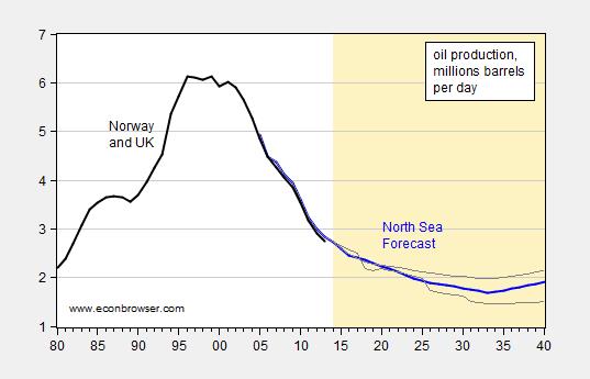
Figure 1: Norway and offshore UK Oil production in millions of barrels (black), North Sea oil production, actual through 2013 and forecast (blue), and high and low price forecasts (gray lines). Source: EIA, IEO 2014, Sept. 9, 2014, and EIA.
EIA does not report forecasts of the UK share of North Sea production. UK production accounted for about 33% of total Norway and UK production in 2013, down from 80% in 1982 (the EIA statistics only go back to 1980). See this Economist article for a graph of UK oil-equivalent production extending back to 1970.
Obviously, the revenue implications depend on the price of oil as much as the production levels. However, declining quantity of production seems the be in the cards, and in any case, production levels will be substantially below where they have been.
Update, 9/16, 11:35AM Pacific: Frequent commentator Steven Kopits presents his views on the outlook for UK North Sea oil production, and the implications for Scottish independence.
End of oil boom threatens Norway’s welfare model
May 8, 2014
“Norway is the world’s seventh biggest oil exporter, and it supplies a fifth of the European Union’s gas…It also boasts the world’s highest GDP per hour worked…per capita GDP around $100,000…while unemployment is low, there is large underemployment, made possible by benefits.
In 2012, a new word entered the Norwegian lexicon – to “nave”, or live off benefits from welfare agency NAV…job security seems to be taken for granted, almost like it’s a human right to have a job.
How Norway handles this “curse of oil” – huge wealth that bring unhealthy dependency in its train – may hold lessons across the North Sea in Scotland, which votes on independence from the United Kingdom later this year.
Norway had the foresight to put aside a massive $860 billion rainy-day cash pile, or $170,000 per man, woman and child. It also has huge budget surpluses, a top-notch AAA credit rating and low unemployment.
But costs have soared, non-oil exporters are struggling, the government is spending $20 billion more oil money this year than in 2007 and the generous welfare model, which depends on a steady flow of oil tax revenue may not be preparing Norwegians for tougher times.
The Scottish National Party’s argument in favor of independence has centered on the promise that Scotland can replicate the success of Norway’s oil economy, creating a sovereign wealth fund for future generations, while public coffers would be only half as dependent on oil and gas.
Unfortunately for Scotland, the glory days of British hydrocarbon production are already in the past, with North Sea output down around two thirds since its peak.”
Here’s what someone from Britain said:
“The Nordic Countries “success story” economies are a joke. I’ve been living here the last couple of years after being dragged here by my wife, and trying to run your business here is tough. It just isn’t a business friendly place at all. Taxes in Denmark are 60-odd% as soon as you have the cheek to earn more than £35,000 a year! My guess is that 50-70% of the population are in government jobs, and they rely heavily on exports of oil, timber and fish in order to generate the foreign earnings to pay for it all.”
Sounds like a failed businessman. Somebody who needs to accept their failure and admit they can’t do that particular vocation.
Maybe, he should’ve moved production overseas. From article above:
“Kongsberg Automotive has only 5 percent of its workers left in Norway, having moved jobs to places like Mexico, China and the United States, and keeping only high-tech, automated functions at home. It says it is struggling with high labor costs and even problems such as excessive sick leave.
“It’s a bit discouraging that the sick leave in Norway is twice the level of other plants,” Havdal said. “That is to me an indication that something is not as it should be.””
A “Net Export Math” Analysis of UK + Norway’s Production
Given an ongoing production decline in a net oil exporting country, unless they cut their consumption at the same rate as the rate of decline in production, or at a faster rate, the resulting net export decline rate will exceed the production decline rate, and the net export decline rate will accelerate with time.
Following are the EIA data for combined production (total petroleum liquids + other liquids) and total liquids consumption for the UK + Norway in 1999, 2007 and 2013. The rates of change are shown in parentheses (1999 to 2006 and 1999 to 2013).
P = Production, C = Consumption, NE = Net Exports ECI Ratio = Ratio of Production to Consumption, Rates of change relative to 1999
1999:
P: 6.0 mbpd
C: 2.0
NE; 4.0
ECI Ratio: 3.0
2006:
P: 4.4 mbpd (-4.4%/year)
C: 2.1 (+0.7%/year)
NE; 2.3 (-8.0%year)
ECI Ratio: 2.1 (-5.0%/year)
2013:
P: 2.6 mbpd (-6.0%/year)
C: 1.7 (-1.1%/year)
NE: 0.9 (-11.0%/year)
ECI Ratio: 1.5 (-5.0%/year)
In simple percentage terms, a 67% decline in production, with a 15% decline in consumption, resulted in a 78% decline in net exports, from 1999 to 2013.
Note that the 1999 to 2006 rate of change in the ECI Ratio (-5.0%/year) was the same as the 1999 to 2013 rate of change in the ECI Ratio, as declining consumption after 2006 partially offset an accelerating rate of decline in production after 2006.
Based on the -5.0%/year rate of change in the ECI Ratio, combined net exports from the UK + Norway would approach zero (when the ECI Ratio hits 1.0) around the year 2021.
An important aspect of “Net Export Math” is CNE (Cumulative Net Exports) depletion. A rough, but pretty consistent, rule of thumb is that about half of post-export peak CNE are shipped about one-third of the way into a net export decline period. If we extrapolate the rate of decline in the ECI Ratio, we can also estimate post-export peak CNE. For the UK + Norway, based on the 1999 to 2006 data, estimated post-1999 CNE would be as follows:
1.46 Gb/year (annual net exports in billions of barrels at peak) X 22 years (estimated number of years to zero net exports) X 0.5 (area under a triangle) less 1.46 Gb (annual net exports at peak) = 15 Gb (rounding off)
The UK + Norway had probably already shipped about half of their post-1999 CNE by the end of 2006.
Six Country Case History
The UK was a component of what I call the Six Country Case History, the major net oil exporters, excluding China, that hit or approached zero net oil exports from 1980 to 2010. Following is a link to a graph showing normalized values for the Six Country Case History from 1995 to 2002:
http://i1095.photobucket.com/albums/i475/westexas/Slide2_zps6c3a6280.jpg
Note that the Six Countries showed an accelerating rate of depletion in remaining post-1995 CNE, i.e., remaining post-1995 CNE were being consumed at an accelerating rate.
Global Net Exports of Oil (Top 33 net exporters in 2005)
Based on the preliminary EIA data for 2013, estimated post-2005 Global CNE (Cumulative Net Exports) fell sharply, from 530 Gb (based on 2005 to 2012 ECI data) to 440 GB (based on 2005 to 2013 ECI data), partly because of production disruptions in some exporting countries, e.g. Libya.
However, the preliminary post-1995 CNE estimates for the Six Country Case History were too optimistic, and supply disruptions may be increasingly more common in the years ahead.
In any case, based on the 2005 to 2013 data, remaining estimated post-2005 Global CNE fell by 29% from 2005 to 2013, as we burned through about 128 Gb of GNE in 2006 to 2013 inclusive. And globally, just like the Six Country Case History, the data suggest an accelerating rate of depletion in remaining Global post-2005 CNE.
Following a graph showing normalized values for the (2005) Top 33 net exporters, and remaining estimated post-2005 Global CNE, through 2012 (not yet updated with 2013 data):
http://i1095.photobucket.com/albums/i475/westexas/Slide14_zpsbd9a272e.jpg
Note that GNE (Global Net Exports of oil) are defined as the combined net exports from the (2005) Top 33 net exporters. The combined ECI Ratio for the Top 33 fell from 3.75 in 2005 to 3.10 in 2013 (at an ECI Ratio of 1.0, Global Net Exports of oil would be zero).
At the 2005 to 2013 rate of decline in the ECI Ratio, it would hit 1.0 around the year 2060 (2005 +55 years). Based on the 2005 to 2013 rate of decline in the Top 33 ECI Ratio, estimated post-2005 Global CNE (Cumulative Net Exports) would be as follows:
16.6 Gb/year (Global Net Exports at peak) X 55 years (estimated number of years to zero net exports) X 0.5 (area under a triangle) less 16.6 Gb (net exports at peak) = 440 Gb.
Globally, we consumed 16.5 Gb of GNE (Global Net Exports) in 2006, which would be a 3.8%/year rate of depletion in estimated remaining post-2005 Global CNE (Cumulative Net Exports).
Globally, we consumed 15.6 Gb of GNE in 2013, which would be a 4.9%/year rate of depletion in estimated remaining post-2005 Global CNE (Cumulative Net Exports), i.e., we have seen an accelerating rate of depletion in estimated remaining Global post-2005 CNE.
Menie,
You are right. Brent has dropped below $100. I hope the Scotts are not making the mistake of voting based on revenue from their North Sea Oil?
Jeffrey, thanks for keeping us updated on the net export decline. Is the decline rate in GNE accelerating? The decline in IOC investment in exploration makes me think we should start seeing an global decline in production in a few years. How soon are we going to see it?
When we talk about IOCs, are we just talking about BP, Chevron, ExxonMobil and Shell? AFAIK, they produce about 16M bpd right now, or about 20% of world production. That makes them important, but not the most important factor, right? Rising US production, for instance, isn’t coming from these four companies.
What I define as GNE* fell from 46 mbpd in 2005 to 44 mbpd in 2012, and then to 43 mbpd in 2013. As noted above, political unrest and sanctions contributed to part of the decline, but as also noted, it doesn’t look like instability is going away, and more importantly, in my opinion we are seeing an accelerating rate of depletion in remaining post-2005 Global CNE (Cumulative Net Exports).
Steven Kopits has take a hard look at global production data, and if memory serves I think that he is forecasting short term supply problems within a 2-3 years.
*Combined net exports from (2005) Top 33 net exporters, total petroleum liquids + other liquids
I suspect supply is a good bit more price sensitive than most people appreciate.
The IOCs are indeed cutting capex, that that’s not just the western majors. China’s SINOPEC, for example, is doing the same.
North American production is advancing at a 2 mbpd / year pace; Libya’s up 280 kpbd in the last two months, and according to the EIA, Saudi is up 350 kbpd over the same period. (This is hotly contested: IEA, Barclays, Saudis say August production was down 400 kbpd.)
So, a supply-constrained model works when the supply is constrained. Right now, we’re running at the edges of the that model, which would convert us to demand-constrained mode. This would be accompanied by a rapid and dramatic fall in price–something like we’re seeing now.
As goes US shale oil, so goes global supply. The EIA sees shale growth tapering in a few months, so we’ll see. I was (gently) admonished by John Kemp (http://www.reuters.com/article/2014/08/28/shale-usa-kemp-idUSL5N0QY45020140828) for being unnecessarily agnostic on shale oil economics. As a consequence, I’ve invested some considerable effort in the last week in tying together aggregate shale numbers and company financials . I have to prepare my own views on future decline rates, as these are the key to sustainability in the industry. For now, let me say that, if decline rates continue to rise, industry economics are unsustainable, and that these will fall apart not on the EBITDA line, but rather on the Net Income line, as increasing DD&A will, over time, expose the lack of underlying, sustainable profitability.
I’ll try to have an independent view on Scotland later today.
Of course, if prices fall, so do royalties and the cost of suppliers, who’ll suddenly have less business. I should think you’d need to explicitly include those feedbacks in any price-based model.
Interesting article by Roger Baker follows. Also shown is an EIA graph from the article showing the gap between expenditures and income for major oil companies.
America: You’ve got three more years to drive normally!
By Roger Baker
http://www.theragblog.com/roger-baker-america-youve-got-three-more-years-to-drive-normally/
EIA Graph:
http://www.theragblog.com/wp-content/uploads/2014/09/roger-energy-profit.png
Given the narrowing margin between the price floor, that oil companies need in order to maintain current supply, and the price ceiling, that consumers can afford, in order to maintain current demand, it occurs to me that both producers and consumers are relying on debt to maintain supply and demand (especially central bank injections of liquidity on the demand side).
Following is a graph showing the GNE/CNI Ratio* versus total global public debt from 2002 to 2012. The declining GNE/CNI trend continued in 2013, although there were some revisions to prior years. And of course, global public debt continued to increase, up to $52 Trillion in 2013. Currently, the EIA shows that the GNE/CNI Ratio fell from 5.3 in 2012 to 5.0 in 2013.
http://i1095.photobucket.com/albums/i475/westexas/Slide23_zps62b6932a.jpg
*GNE = Combined net exports from (2005) Top 33 net exporters
CNI = Chindia’s Net Imports
the price ceiling, that consumers can afford, in order to maintain current demand,
This is a very puzzling meme. The average US driver is paying about $.17 per mile for fuel (22MPG and $3.75 per gallon), and they could easily pay far less by switching to a hybrid or EV. Relatively few people are in a low-income liquidity trap where they can’t afford to move to something that’s cheaper to drive and own.
considering replacing my 10 year old compact suv with a prius in the near term.
The estimated five year True Cost to Own for a plug-in Prius Hybrid is about $37,000, assuming about 15,000 miles per year, or about 50¢ per mile total estimated cost over a five year period, and 75,000 miles.
http://www.edmunds.com/toyota/prius-plug-in/2014/tco.html
5 year True Cost to Own for a plug-in Prius Hybrid…about 50¢ per mile
And that’s cheap. The IRS allowance is $.56 per mile. That’s a weighted average for all vehicles, based on AAA data.
Look at the Ford F-150: }The longtime sales champion among American vehicles”
http://247wallst.com/autos/2014/03/27/americas-10-most-popular-cars/#ixzz3DQiVfcY2
“Once again, the Ford F-Series, which includes the F-150, F-250 and F-350, has blown the competition away, with more than 68,000 units sold in August. No other vehicle came anywhere close to that number.”
http://autos.aol.com/gallery/best-selling-cars/#!slide=56363&kgal_next
The Edmunds TCO is $54,477, or $.73 per mile.
http://www.edmunds.com/ford/f-150/2014/tco.html?style=200489673
Or, the top selling sedan, the Honda Accord, at a TCO of $.53 per mile.
————————————————————
Fuel costs are less than a 1/3 of the cost of operating a relatively new vehicle: amortization and insurance are much more important. That’s part of why it’s hard to focus car buyers on fuel efficiency.
————————————————————
A Nissan Leaf is only $.35 per mile – even without the tax credit, I can’t find a cheaper vehicle.
A Chevy Volt is $.45 per mile.
Thanks for the link, Menzie.
Nick, do the calcs using levelized cost.
Steven,
Edmund’s approach seems to be pretty standardized (either in terms of overall cost, or cost per mile) and comprehensive. What else did you have in mind?
Well, a good number of people own their cars outright. I do. Therefore, replacing it is not just a matter of fuel costs.
But even if I sold the car, it doesn’t go away. Someone else buys it and uses it. So the fuel use equation for the country as a whole is the
I) number of vehicles
II) the current vehicle mix
III) current MPG
IV) average VMT
V) distribution of VMT (ie, less efficient cars should travel less on average with higher fuel prices)
VI) plus and minus vehicle retirements and new vehicle additions
Furthermore, the notion of carrying capacity has interesting distributional implications. If I’m in a high income bracket, and fuel prices are effectively capped, then my oil consumption may not be adversely affected that much. However, if I’m lower down the income ladder, my vehicle usage might be affected quite a lot. With oil prices at carrying capacity, the impetus to change behavior may not be equally distributed throughout society.
Here’s a chart to that effect. See slide 8 of the presentation: http://www.eia.gov/conference/2014/pdf/presentations/pickrell.pdf
replacing it is not just a matter of fuel costs.
Of course. Which helps explain why hybrids aren’t instantly replacing ICEs, even though they’re cheaper and better.
the fuel use equation for the country as a whole
Don’t forget that newer vehicles are used much more than older ones: 50% of VMT comes from vehicles less than 6 years old.
If…fuel prices are effectively capped,…my vehicle usage might be affected quite a lot.
That doesn’t quite make sense. If prices don’t change, why would there be an impact on anyone, let alone a differential impact on different income quintiles?
Here’s a chart to that effect. See slide
The best is slide 3, which shows that we’re looking at a long-term trend. VMT growth has been decelerating for decades, and now we’re seeing absolute declines. Young people are driving less, whether they’re employed or not – it’s a generational thing, in part propelled by social media replacing “cruising”, and in part by a generational desire to use less fossil fuels. Of course, younger people have less income, so there will be a correlation with household income.
Again, if VMT were declining due to “unaffordability”, why are the first and 3rd most popular vehicles very expensive, low efficiency vehicles like the F-150 and Silverado? Why is the average new car selling for $31k, instead of $12k?
For better or worse, cost effectiveness isn’t at the top of the list of priorities for car drivers or buyers.