What are these series?
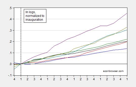
They are log GDP for the first terms of the most recent seven presidencies, SAAR, normalized to the quarter of inauguration.
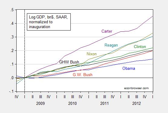
Figure 2: Nominal GDP, billions of $, SAAR, normalized to quarter of inauguration of first term for Obama (blue), GW Bush (red), Clinton (green), GHW Bush (black), Reagan (teal), Carter (purple), Nixon (chartreuse). Source: BEA (2014Q4 second release), and author’s calculations.
Some would object that using nominal GDP is misleading. In defense of reporting nominal magnitudes, reader Ironman writes:
It is our practice to always present nominal data because it is the data that doesn’t change as a result of inflation adjustments, which are always arbitrary in practice and are always in need of being updated, since almost all readers prefer that kind of information to be presented in terms of constant, current day dollars. Since we provide the relevant links to all original data sources, anyone who wants to confirm our numbers can get them and not wonder how they have been adjusted. Our readers are a pretty sharp bunch and are pretty capable of adjusting the nominal data to account for whatever measure of inflation they might like to consider, whether CPI-U, GDP deflator, etc.
Here for comparison is real GDP.
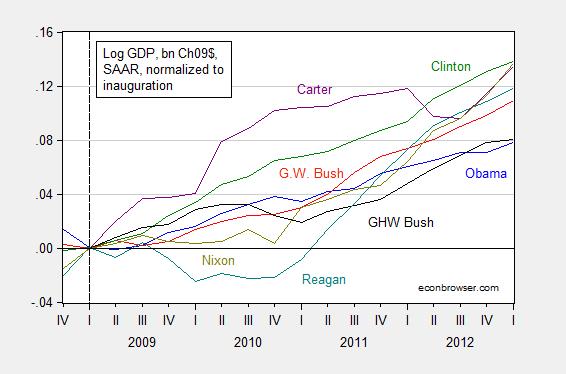
Figure 3: Real GDP, billions of Ch.2009$, SAAR, normalized to quarter of inauguration of first term for Obama (blue), GW Bush (red), Clinton (green), GHW Bush (black), Reagan (teal), Carter (purple), Nixon (chartreuse). Source: BEA (2014Q4 second release), and author’s calculations.
If you can do deflation, and the relevant graphing, in your head…you are a better man than I!
My view: deflation into real terms, even if not perfectly done, makes sense. The argument that deflators are revised over time, and hence makes deflation problematic is interesting, but in my mind not dispositive, given that nominal series are revised over time as well. For instance, after the third release of the 2014Q4 GDP figures next month, the series will be once again revised in the annual benchmark. Years thereafter, the real and nominal series will be revised again, as more data becomes available. So, unless the question pertains to nominal magnitudes instead of real (or one believes the deflators to be particularly problematic), it makes sense to report the variables in…real terms.
Here’s the real GDP series, for the entire presidential terms.
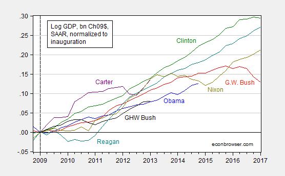
Figure 4: Real GDP, billions of Ch.2009$, SAAR, normalized to quarter of inauguration of first term for Obama (blue), GW Bush (red), Clinton (green), GHW Bush (black), Reagan (teal), Carter (purple), Nixon (chartreuse). Source: BEA (2014Q4 second release), and author’s calculations.
Could you give a short explanation for Dummies about the effect of a negative import price deflator on GDP figures at a time of a large drop in oil import prices? I am aware that a similar thing happened in 2008/9 and have read the arguments that happened then but can’t seem to get my head around it.
Thanks for any help.
John Duncan: See discussion of Marshall-Lerner condition in this handout. The “real” trade balance defined in US “widgets” (or US Ch.2009$) is exports minus imports expressed in US “widgets”. As import prices fall relative to export prices, then the “real” trade balance can widen even if the nominal does not.
From a simple measurment perspective, a decline in the oil import price index will reduce real GDP by raising the real value of imports, which are subtracted in the GDP calculation. This assumes nothing else changes.
Real GDP does not directly measure US production. Rather it measures consumption and adjust that for trade and inventory changes to indirectly estimate production.
Imports are subtracted in the GDP accounts — they are counted in consumption,investments, government so as to not double count them in measure domestic output they are subtracted.
But if you subtract a negative it becomes a positive.
Normally this does not matter, but when you have sharp drops in import prices the math causes it to be added to nominal GDP and makes it larger than it actually is.
In effect, you still end up double counting imports. It will also cause the GDP deflator to be larger than it actually is.
i don’t care how you graph this, it can’t be true, since i’ve been assured that under ronald reagan, we had economic perfection, and these graphs don’t show that.
maybe the data is wrong?
Reagan did create 15 million private sector jobs over his presidency even though he also faced a severe recession just like Obama who is far behind Reagan’s private job creation pace. Reagan did it by tripling the federal debt and running record deficits while simultaneously preaching the virtues of balanced budgets which, of course, he never achieved. That is why Reagan was the “Great Communicator” and the “King of Congress”. Obama could learn something from Ronnie.
Liberal bias of the data must be happening here.
Prove me wrong — with FACTS!
Oh right, you can’t.
Menzie It’s even worse than that. How about these two knee slappers:
Our readers are a pretty sharp bunch and are pretty capable of adjusting the nominal data to account for whatever measure of inflation they might like to consider, whether CPI-U, GDP deflator, etc.
Huh? So apparently it’s okay to just go ahead and deflate nominal GDP by CPI-U??? Apparently any old deflator will work.
And then there’s this one:
We deviated in our chart showing the amount of taxes collected per employed Wisconsinite, since we recognized that at least some of our readers would be interested in seeing the data presented in that context, with inflation measured by CPI-U, non-seasonally adjusted, average of October-December 2014 (See what we mean? It’s already dated!)
Non-seasonally adjusted? If you know what you’re doing, then there is a case for using raw, unsmoothed, non-seasonally adjusted data when crunching the numbers and then seasonally adjusting the numbers as part of the number crunching exercise, but that’s not what was said here. They just use non-seasonally adjust data. End of story. This is just dumb beyond belief. The sad thing is, I doubt that they even understand why it’s bad.
This is a good argument for why amateur bloggers should not be allowed to practice econometrics without a license.
2slugbaits: Thanks – did not catch the use of NSA numbers; yeesh! On the deflator issue, maybe Ironman meant the Political Calculations readers could figure out the relevant deflator in each case. I doubt that, as it is sometimes difficult to figure out which one is the relevant one, even for me. But I’m willing to give him/her the benefit of the doubt on this (but of course not on the SA/NSA issue!)
Carter remains under-rated. Reagan was good. Clinton really was a star. The country has performed poorly under Obama.
Poorly? Obama has created 11 million private sector jobs over the past 5 years. The Bushes combined created 1 million private jobs over 12 years and now another Bush will likely be the GOP nominee. That would be a poor choice.
Geez. I can’t believe you’d even waste your time on this one, Menzie. The comment’s you’re responding to are quite egregious, kudos to you.
*comments
More informational charts comparing Reagan and Obama, each who had severe recessions at the start of their first terms.
From John Taylor, using the measure of months since the recession ended (start of recovery):
Change in the percentage of population that is working
Someone hasn’t got back to zero yet.
real GDP growth
Reagan 4.8%, Obama 2.3%
Ed
I must be getting better, I was one for two this time. Try this link.
Change in the percentage of population that is working
Someone hasn’t got back to zero yet.
Ed
Well yeah. Reagan TRIPLED the federal debt. Obama slashed the deficit by 70%.
Who is the Keynesian?
Paul
Did you even read what Menzie wrote? He explained carefully the importance in recognizing difference and use of nominal and real statistics. I won’t even ask if you understand the difference between deficits and debts.
When you write that Reagan tripled the debt, do you realize that you are referring to nominal statistics? A common way and a better way to look at debt is to use debt to GDP percentage. Looking up those statistics, you will find the percentage of debt to GDP rose 18.39% during the Reagan years (Q1 1981, Q4 1988 – 32 quarters). During the Obama years so far, debt to GDP percentage has increased by 23.87% (Q1 2009, Q3 014 – 23 quarters).
As for deficits, some manner of comparison should be used rather than just nominal deficits. One common way is to use the percentage of deficit to GDP, but other viable and useful ways exist. During the 8 Reagan years the deficit to GDP averaged 4.1% per year. the Obama 6 years so far, deficit to GDP has averaged 6.8%
Ed
Ed,
When I said Obama slashed the deficit by 70% I was using debt-to-GDP ratio.
When I said Reagan tripled the federal debt I was using actual data that everyone can understand. For example, Obama has only doubled the debt so the comparison is clear. Reagan was far more Keynesian and that is why GDP growth during the Reagan recovery – 1983-87 – was twice as fast as during the Obama recovery – 2010-2014. Numbers don’t lie.
You aren’t seriously comparing the early ’80s recession with our most recent one, are you? And you aren’t seriously comparing the willingness of democrats in congress to work with Reagan with the policy position of the congressional GOP in 2009-2012 that the most important public policy goal for congress was to prevent Obama’s reelection? And you aren’t seriously comparing the willingness of congress under Reagan to run enormous stimulative deficits with the recent congressional insistence on austerity? And you aren’t seriously comparing the demographics of the workforce under Reagan (the completion of the entrance of the baby boomers into the workforce, the massive entrance of women into the workforce) with those under Obama (retirement of the baby boomers)?
Are you?
Reagan was the “King of Congress” because he was the “Great Communicator” and wasn’t afraid to kick a$$ to get his way. Obama, until now, has been “Mr. Nice Guy” who thought he could win over the GOP with his smile. He was dead wrong and fortunately failed to achieve the “Grand Bargain” that he wanted with the GOP that would have slashed the deficit even more than 70%.
Reagan wasn’t afraid to run big deficits and the result was GDP growth twice as fast as Obama’s. You can’t handle the truth.
So is John Taylor trying to tell us that the economy performed better before the FED decided to follow something akin to what later became known as the Taylor Rule?
I would think that of all people John Taylor might be sensitive to the differences between inflation and interest rates during the 1980s versus inflation and interest rates during the Great Recession. Just saying.
Most of the revision to real GDP is due to revisions to nominal GDP. Price indexes are rarely subject to significant revision. Revisions due to shifting the base year have been largely eliminated by the shift in the late 1990s from fixed-weight (constant dollar) measures to chained-weight (chained dollar) measures.
Have we dug out of the hole G.W. and his cronies created yet?
Ha! I am calling foul, Menzie. On Sept. 30, 2014 in this blog you explicitly stated that Minnesota and Wisconsin have similar economies. The blog you are critiquing says otherwise. Who is right?
Anonymous: I did look up the sectoral composition of the two states at one time; they were pretty similar, with manufacturing a bit higher in Wisconsin, professional services a bit higher in Minnesota; those points are in one of the comments I wrote at some point. I also think MN was 10% larger than WI at the time I checked. The gap has probably widened a bit as WI has lagged MN. In any case, you can look up the sectoral composition at the BEA site I provided Mike.
Anonymous: I have added pie charts of the sectoral composition of GSP in the two states. Tell me if you think they are similar or different.
They look the almost the same to, though hopefully you and Ironman did more robust comparisons than just looking at pie charts before you made your claims.
Anonymous: I added statistical analyses of “similarity” yesterday. See the update to the (Still) Not the Leader of the Pack. In fact, Michigan, which is the most similar to Wisconsin, far outpaces Wisconsin since 2011M01.
I have not seen a response by Ironman to either the newly reported indices, nor to my point about deflation.
To be fair, you should remove Michigan from the state coincidence index graph you often update. You should also include another graph that begins in 2014 (it does not refute your inter-regional comparisons at all, though it does show Wisconsin in a much better light compared to the US average).
In the above post you state that Wisconsin and Michigan are most similar. However, you did not mention that Michigan outperforms every other state in the Union when you look at the 2011M1 coincidence index (through 2014M12). I googled Michigan’s economy and as it turns out their automobile manufacturing industry is booming, which obviously increases employment due to its labor-intensive nature. There is nothing Walker could have done to keep Wisconsin’s manufacturing sector up with Michigan’s (unless you think he could have attracted GM and Ford to re-headquarter in Madison), so I would actually remove Michigan from your above graph just like you would probably remove Texas and North Dakota from similar graphs given their booming O&G industries.
Looking at Wisconsin specifically, though, the coincidence index tells us different stories if you use 2011M1, 2012M1, 2013M1 or 2014M1 as the initiation period. The logged gap between Wisconsin and the US closes from -0.0166 in 2011M1 (probably the year that Walker’s policies had the least effect, and the year that the previous administration’s policies had the most effect) and flips to +0.0004 in 2014M1 (that is 2014M12 vs. 2014M1). Using four indexes instead of one shows us that 2011 was very bad for Wisconsin, but that each year has been better than the prior year since then. One could argue that as Walker’s policies have had time to settle in Wisconsin has improved. What this tells us is that your graph is not as robust as it should be as it is giving undue weight to 2011M1 as the starting point. In the 2014M1 index, Wisconsin’s growth was about even with the US, according to these coincident indicators, which is difficult or impossible to determine based off of your graph. Your findings that Wisconsin has lagged the US are very important, I am not saying otherwise. But it is also important to note that in 2014, despite Walker’s policies still being implemented, Wisconsin’s labor force grew near the US average.
Given my recent embarrassing posts (that I admit were dumb as I misread them, though I do post on this blog from various computers and you have responded positively to 90% of them), I thought I would try to redeem myself slightly by examining the state coincidence data you use in your Wisconsin comparison graphs. This one could also have all of the math wrong, I don’t know, but hopefully it is not as embarrassing as my two previous posts you rightfully found so much amusement in.
Anonymous: I’m happy to remove Michigan; in most of my comparative graphs, MI does not appear — but Ironman brought it up so I included it.
I’ll re-do the comparison, with the 2014M01 base. But I am awaiting the revised coincident indices that will incorporate the newly benchmarked employment series coming out near the end of March. I know that the WI employment series will be substantially revised downward since DWD have released their data; hence the coincident index for WI will be downwardly revised (On this, wait for post coming on Monday night.)
Since rebasing to 2014M01 would put heavy weight on recent observations, it makes sense to wait a couple weeks to obtain a more accurate picture.
Implicit in this discussion is republican vs democrat politics. Instead of presidents, how about arranging that data by federal reserve chairman?