From the Senate Republican Policy Committee Chair, John Barrasso, commenting on the December employment report:
The December jobs report, while posting 252,000 new jobs, reveals it’s still too soon to be bullish on an economic recovery. Wage data and labor force participation remain concerning.
Stagnant wage growth remains a weight on America’s economic recovery. In December, average hourly earnings for all employees on private nonfarm payrolls fell by five cents, to $24.57.
It might be time to re-assess this characterization of stagnant wages and particularly of a low-wage job recovery.
First, with the revised figures released on Friday, the drop in December hourly earnings for production and nonsupervisory workers was reduced to four cents; and the seven cent increase in January more than compensated for the drop (which some commentators attributed to calendar effects). For all workers, the January increase was 12 cents, which more than compensated for the five cent decrease in December.
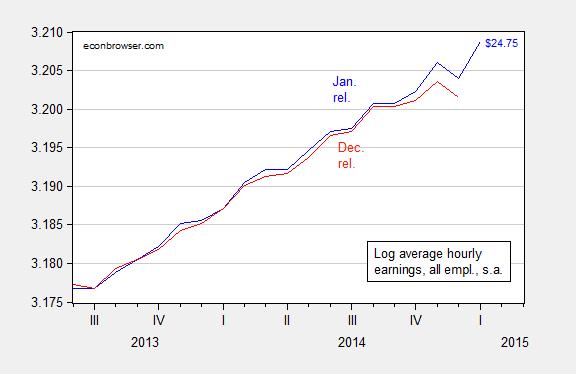
Figure 1: Log average hourly earnings for all workers, private sector, in dollars, seasonally adjusted, January release (blue), and December release (red). Source: BLS via FRED, and author’s calculations.
Second, nominal labor compensation, measured in a variety of ways, is higher, even as headline CPI inflation has been muted. The CEA compiled the following table which summarizes the evolution of compensation over the past year, and compares to the CPI.
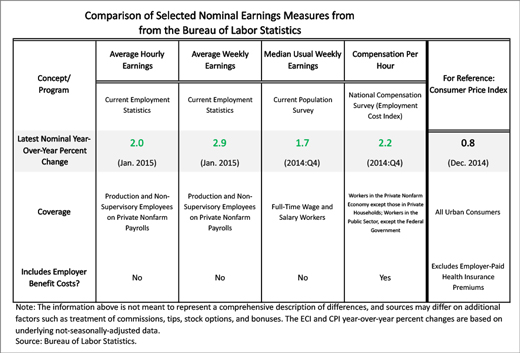
Table from CEA (February 2015).
Finally, an interesting communication today from Torsten Sløk at Deutsche Bank (not online), who critiques the observations that ‘“this remains a low-quality recovery” and “the jobs that are created are all low pay”’.
This is simply not correct. Average hourly earnings [for all private workers] currently stand at $24.75. The chart below shows job growth in industries that pay more than the average and job growth in industries that pay less than the average. It is clear from the data that this recovery has not only been low wage jobs.
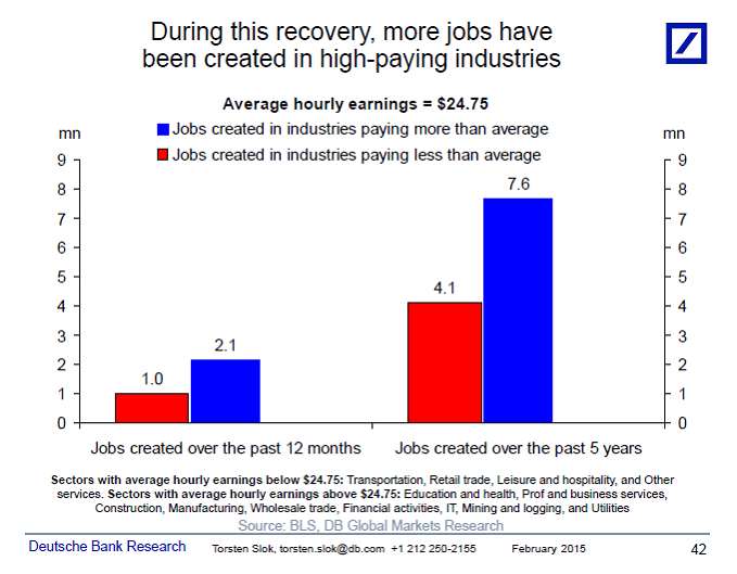
Figure 2: from Torsten Sløk.
In addition, here is a depiction nominal and real average hourly wages for all private sector workers (not just production and non-supervisory).
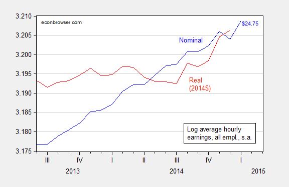
Figure 3: Log average hourly earnings for all workers, private sector, in dollars, seasonally adjusted, January release (blue), and in 2014$ (red). CPI-all used for deflation. Source: BLS via FRED, and author’s calculations.
I have yet to see abreak down of these income figures.If the top earnings jump is that read as an increase for all?
How do wages appear in real terms after taxes and debt service, and then adjusted for population?
Then, instead of using CPI, adjust for M2, which historically tracks closer to the actual increase in the cost of living (driven increasingly by the effects of financialization since the 1980s, especially for housing and health care costs as a share of wages and household income). Adjusted thusly, wage and salary disbursements have declined at an average rate of 2%/year since 1970, which is approaching a staggering order of exponential order of loss of purchasing power of earned income over the period.
The foregoing adjustments to wages show that the CPI-adjusted figure is at the level of 1999-2000, and the M2-adjusted figure continues the long-term decline to a record low since the 1970s, whereas the YoY and secular change rates remain recessionary. This also fits with the record low level of labor’s share of GDP, which in turn is down a debilitating 10% since the average from the 1970s to 2000, and down 12-15% since the peaks during the same period.
Then, if one further adjusts for the increase in health care and education costs to wages and household income, the decline in the fully adjusted purchasing power of earned income is simply breathtakingly scandalous.
In effect, the US cannot afford to sustain an increase in the number of full-time, private jobs per capita. For a growing majority share of the US population, it no longer pays to work for a wage or salary after regressive payroll taxes, debt service, and health care, education, child care, and commuting costs, which then suggests why there has been a surge in the number of food stamp and disability recipients, as well as explains one of the primary causes of the obscene, Third World-like wealth and income inequality in the US.
http://www.psmag.com/business-economics/the-california-chasm-inequality-in-one-of-the-most-unequal-states-in-the-country
Speaking of Third World-like inequality.
how much stagnant wage growth is attributed to demographics? many baby boomers are now retiring, possibly from the highest salary of their career. they are now being replaced by millennials at the opposite end of the spectrum, under their lowest career salaries (beginning of career). wouldn’t this wreak havoc on the interpretation of wage gains? how well is this accounted for in these wage reports? we are fighting two bulges, as one leaves and the other enters the workforce. seems this would counter the past decades trend as the baby boomer bulge moved upward through the salary scale?
So, the story here seems to be that there are fewer jobs being created, proportionately, for, say, $10 per hour McDonald’s workers than jobs created for $25 per hour registered nurses. Fine. But, would this be inconsistent with the story that wages for McDonald’s workers and nurses are, respectively, “stagnant”? If you are a McDonald’s worker or a nurse, it probably not only seems that way, but is that way. Individual workers don’t care much about averages. The the trend whereby non-skilled jobs are going to to more skilled labor in the US has been going on for much longer than the past 6 years.
“It might be time to re-assess this characterization of stagnant wages and particularly of a low-wage job recovery.”
In making that re-assessment, is it accurate to suggest, as the above-referenced graphs do, that “the recovery” started in the second quarter of 2013?
In constant (1982-1984) dollars, average real wages reached an all-time high in December 2008 of $10.41 and were $10.40 in December 2014. If you want a graphic representation of real wages during “the recovery” select 2009 to 2015 to create a graph with the following tool. It makes the wage recovery look pretty “stagnant”:
http://www.tradingeconomics.com/united-states/wages
Yes, that correct. The data does not assert that incumbent workers have received big raises in the current jobs. However, new jobs and job switching may lead to higher wages.
Nevertheless, I think the JOLTS data might suggest higher wages overall. The low level of initial unemployment claims and the high level of employee quits suggests that employers are struggling to hold on to their employees, and ceteris paribus, that suggests wage increases, even to incumbent employees–if not now, then soon.
Steve, yes, as to your first paragraph above. Perhaps you’ve stated it differently, but that was largely my point. The incumbents (the vast majority of workers) may well have seen stagnant wages even though the overall mix of jobs for all workers may have changed somewhat.
As to the second paragraph, the data is what it is (or are what they are). Are you suggesting that average real (1982-1984) wages were not $10.41 in December 2008 and $10.40 in December 2014? If those are correct, they take into account the somewhat subjective factors you’ve mentioned. The future is, of course, another matter; however, what I thought was under discussion was the extent (or not) of wage growth “during the recovery”.
I love articles like this by anti-liberal Progressives. They spend pages and pages decrying the growing wage inequality and the demise of the middle-class. Then they crow about how many wealthy people their policies create.
But consider, if they are making the wealthy rich but wages are either stagnant or declining the middle class and the poor are seriously suffering to pay for the anti-liberal Progressive crony capitalism.
The election mantra from the left is, “we want to help the middle-class.” The truth from their policies is “we need more money and it is in the middle-class, raise revenue from the middle-class.”
The resources that should be used to create the jobs of the future are being confiscated and given to the politically connected. Where are the new businesses that are needed to create the jobs of the future?
To get the full picture, looking at the wage share would be helpful as well. Its way down I think. http://research.stlouisfed.org/fred2/series/PRS85006173
A request.
Could you show the median vs mean growth in real wages?
Thanks.
You can not draw the conclusion from the data that Deustches Bank does.
If there is a major difference in the number of low paying jobs and high paying jobs you need to look at the percent change, not the absolute number.
The percent change could be much different from the impression the charts give.
Of course, he does not tell us what the base is for these changes.
P.S. Since I do not know what the base is I could be completely wrong.
But he does not provide enough information to make that conclusion.
The more I think about this the more I am convinced that there are problems with this analysis.
the distribution of wages is not anywhere near a normal distribution.
First, there is no left hand tail because it is cut off by the minimum wage.
Second, there is a very long right hand tail as wages can in theory go to infinity, but in practice can go on to between $50 to $100/ hour.
Moreover, I bet the most frequent wage is somewhere to the left of the average.
MMMMM? I think there is a lot of zero compensation and less than min wage on the left. Data not captured.
Spencer,
I think you are looking at the wrong question when you question Deutsche Bank’s analysis – Torsten’s statement is: It is not correct to say that most new jobs have been low paying. There is no need to know percentages to answer that question: If there are twice as many new jobs created that pay above average than below, then that’s it! It *means* exactly that the new jobs have raised the average compensation rather than lowered it!
That doesn’t mean that everything is good, but it does mean the falsification of the charge that “the recovery only consists of low paying jobs”.
Now look at real median wage since, say, the mid 70’s and then get back to us. ‘Average’ tells you nothing about distribution.
Here’s a chart of median household real income by age bracket, 1967 – 2013:
http://www.advisorperspectives.com/dshort/charts/census/median-household-income-age-brackets.html?household-income-by-age-bracket-median-real.gif
The highest incomes represent Americans in “prime-age” [35-54].
Median household real income 65 years and older more than doubled [i.e. “…median real household income for the heads of household”]:
http://www.advisorperspectives.com/dshort/charts/census/median-household-income-age-brackets.html?household-income-by-age-bracket-median-real-growth.gif
While household income offers more information on distribution, it completely conceals the explosion in hours worked per week in households during that period.
Again, if your are at all interested in the truth – Real Median WAGE, hourly preferably.
And no cherry picking demographics.
The problem with the Deutsche analysis is that it lumps together overly large sectors. For example business and professional services are on average high-wage, but what if all the jobs added in that sector were low-wage temps. Even if the method were improved by using smaller subsectors, it would still be an overly crude way of estimating the distribution of wage levels of the newly employed.
I think we can probably all agree on two things:
The average wage speaks for itself. Since it went up, that means either the previously employed got raises, or the newly employed received on average wages higher than the previously employed, and even if one of those went the other way, their contributions summed to a positive.
The distribution of wages almost certainly continues to swell at the lower and upper ends and flatten in the middle. We need to look at data other than the sector breakdown of net job additions to prove that.
Menzie’s greatest nightmare If it can happen in Illinois, it can happen anywhere. Oh, horror of horrors! (Come on; this is a joke, ya’ll – about Menzie not Rauner. Rauner is for real!)
Increasing wages are good, but what about household income? More jobs were added, but how about FTSE? Are the new adds contractors? Can those contractors work the whole year at that same rate? No, not unless they’re hired. It’s back to the job search and until they are a new full time hire (or at least get a new contract) cash-in-hand demand from that worker will be diminished and even some portion of that may well be on a credit card.
My God, you would think we were still on a gold standard!