As a new year gets under way [Nobel Laureate Robert] Shiller fears that advanced economies could be on the cusp of another stock market and property bubble that could end in tears….
“I’ve tried to inquire why we are having these booms right now at a time of so-called secular stagnation with low interest rates, and arrived at the thought that low interest rates are promoting these bubbles.”
One of Professor Shiller’s academic contributions was construction of a monthly time series analogous to the current S&P 500 stock price index along with dividends and earnings going all the way back to 1871. One summary he has used for how expensive stocks are at any point in time is the ratio of the inflation-adjusted value of stocks in month t to the average real earnings on those stocks over the previous decade, with the averaging helping to standardize the measured P/E with respect to business-cycle fluctuations. The current value of that backward-looking P/E (even with last week’s stock market losses) is 24.4, well above the historical average of 16.6.
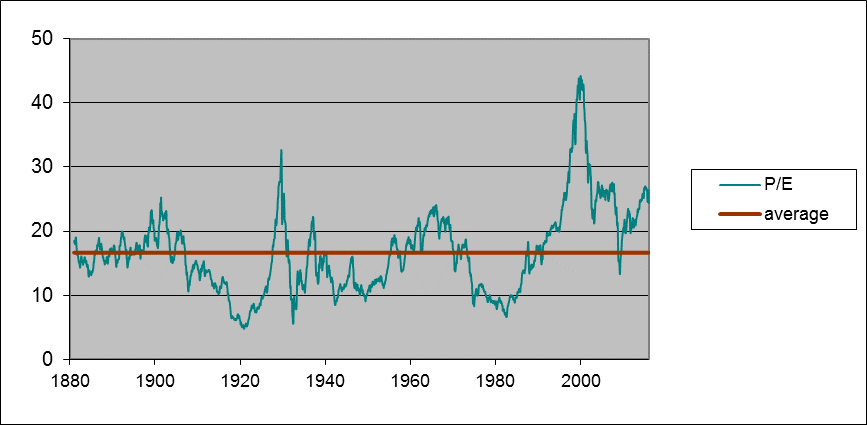
Green line: Ratio of real value of composite stock index to the arithmetic average value of real earnings over the previous decade, January 1881 to January 2016. Red line: historical average (16.65). Data source: Robert Shiller.
The way we’ve usually seen a high P/E return to the historical average is through subsequent below-normal growth of stock prices (that is, by lowering the numerator in the price/earnings ratio). Between 1881 and 2005, if you bought stocks in a month when the P/E was 25 or higher, your average annual real capital gain from holding stocks over the next decade would only be 1.2%. In a third of those months, the real value of the stocks would actually turn out to be lower after holding them for ten years than what you paid.

Each circle represents a month between 1881 and 2005. The horizontal axis is the P/E for that month, and the vertical axis is the compound return at an annual rate (excluding dividends) if you bought the stock in that month and sold it ten years later. Also plotted is the regression line return = 9.37 – 0.305*pe, whose coefficient on pe has a Newey-West 200-lag t-statistic of -2.9.
Another useful series that Shiller developed is an index of the real value of U.S. homes going back to 1890. For about a century, house prices in Shiller’s estimates rose on average at about the same rate as other prices, leaving the real value of the index in 1975 about where it had been in 1890. The house price bubble of 2000-2005 is a pretty dramatic outlier from that historical stability, and was followed by a spectacular crash that returned the index in the neighborhood of the historical norm by 2012. But since then U.S. house prices have once again been significantly outpacing inflation, with the index now back up to 157.

Real index of U.S. house prices, 1890-2015. Source: Robert Shiller.
Although Shiller’s estimates imply that U.S. house prices did not rise in real terms over 1890-1975, economic theory would suggest that at least the real value of the land component of house prices, being a fixed irreproducible asset, should grow at the same rate as real GDP. Even so, the 2015 price still looks like something of an anomaly on the above graph. Here’s more detailed recent data based on the Case-Shiller and CoreLogic house price indexes. For both of these the recent values still look higher than one would have expected on the basis of simple trend projection.
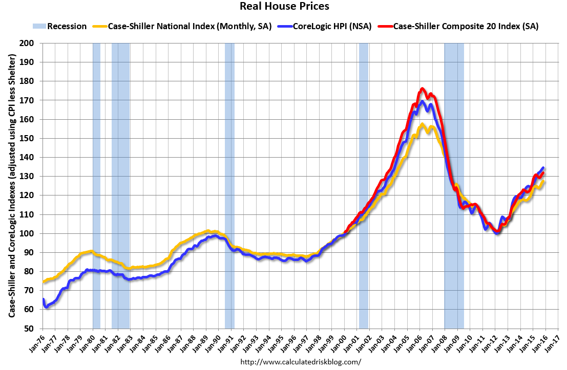
Source: Calculated Risk.
To some extent the elevated prices of equities and homes are not because investors believe prices can only go up but instead because the return on any asset right now is so low. You might well have to accept the low expected return available today on a stock investment that is implied by the regression line in the second figure above just because there is nothing else better. Another important difference between today and the early 2000’s is that although house prices have been climbing, there’s no indication of anything remotely like a bubble in terms of new home construction. Residential fixed investment in 2015:Q3 was only 3.4% of GDP, well below the historical average of 4.7%.
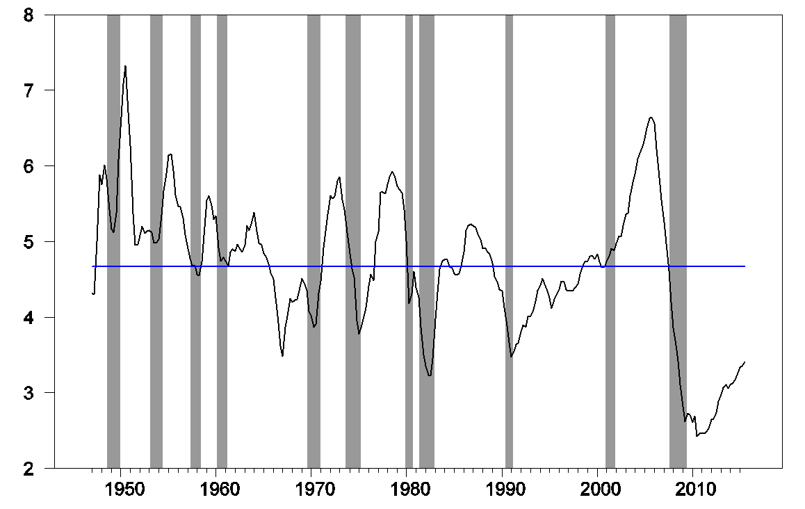
Nominal private residential fixed investment as a percent of nominal GDP, 1947:Q1-2015:Q3.
So I don’t think it’s accurate to say that the Fed today is committing an error akin to fueling the dot-com bubble of the late 1990s or the housing bubble of the early 2000s. Nevertheless, this long-run perspective is certainly something that the Federal Reserve (and individual investors) need to keep in mind. Last week’s correction in stock prices should serve as a reminder of the vulnerability that is inherent in current asset valuations.
The problem with Shiller’s stock price/earnings ratio is that earnings, or in his construction, the average of inflation-adjusted trailing year earnings per share over a rolling 10-year long period, he keys off the wrong measure for assessing the relative valuation of stock prices. That’s because earnings don’t drive stock prices – dividends do (so if you want to see if there’s an actual bubble in stock prices, the best way to make that determination is to plot Price per Share vs Dividends per Share and identify those periods of time where the relationship between the two becomes undefined, or nearly so.
For the record, in 2015, there was just one 20-day long period ending in mid-November where it could be reasonably argued that a small, speculation-and short squeeze fueled bubble had formed in the market, which has long since dissipated. Otherwise, the level of volatility seen in stock prices from mid-2015 through the present is quite consistent with a much more refined version of the relationship we first described back in 2007.
Keep in mind that’s something we couldn’t have developed without Shiller’s assembled data – he is to modern day finance what Tycho Brahe is to astronomy.
Ironman,
Your dividend pricing model implies permanently increasing valuations.
While this fits the last century or more, it defies logic as a predictor of the future.
I’d suggest you add interest rates to your model. It won’t explain historical data as well, but it’s a more likely predictor of the future.
We can thank the Fed for lower interest rates and higher asset prices to induce spending and borrowing, and reduce saving, a lower cost of capital to spur production, refinancing at lower rates to increase discretionary income, lower mortgage rates to make buying a home more affordable, 401(k)s and IRAs increasing in value, etc.. The Fed has created massive multiplier effects throughout the economy. Yet, the country is still in a depression with anemic growth.
About the best analysis of stock valuations and cape is http://www.philosophicaleconomics.com/2015/04/recycle/ which identifies some reasons for it overestimating priciness. As far as housing, there isn’t a national market so this is very dependent on where you live but lower rates have increased values.
This house, now asking $1.8 m, traded hands at $825k five years ago. I know this house (imagine if Nero lived in the suburbs). The current owners look like they put maybe $200-250k in improvements (modest de-Nerofying). It’s a big ask for this house.
The in-house view here at home is that Princeton is now again firmly in a housing bubble.
http://www.zillow.com/homedetails/917-Stuart-Rd-Princeton-NJ-08540/39009763_zpid/
Hi Steven,
It looks like they put in a lot more than 200-250K, unless 917 Stuart Rd was already substantially renovated when they bought it. But I guess I don’t see why the price for this house–$300 per square foot–is so out of line. If you look at 1063 Stuart Rd, that sold for $248 per square foot in March of 2015. 1079 Stuart Rd is on the market for $344 per square foot and it has not been renovated. But 917 Stuart has been completely renovated.
If you look at the zestimate for the 08540 area code, it was $525K in early 2011 when 917 Stuart was previously sold and it’s at $575K now, about 10% up in 5 years. Why do you think Princeton is in a housing bubble?
I’ll visit 917 Stuart at the open house next weekend, and I’ll give you a read.
Houses appear to be changing hands quite quickly in Princeton right now, with anecdotal reports of bids above ask. And that’s true more broadly. Jim didn’t show CR’s housing inventory graph, but it’s below average–a reason housing prices have been bid up across much of the country.
As for those $575k houses: A lot of them are being scraped, and $1.5 m houses are being built on those lots. I’ve never seen it as active as it is now (albeit, I’ve only lived in Princeton ten years).
Now, Princeton is unusual as it’s an aspirational market. A lot of people in, say, adjoining West Windsor or Cranberry would like to live in Princeton, so we’re on the top of the regional food chain here, and that shows up in property prices.
Steven, how much of these homes is financed? i don’t worry as much about a bubble until the price increases are created by significant leverage. If these homes are being purchased with a significant cash component, then a bubble is not as dangerous. if it is the banks and investors taking on that risk, then the bubble poses a bigger problem.
Don’t know, Baffs. I assume it’s mostly typical mortgages.
The interesting bit, however, is what’s going on in the western part of town. This is the old money section of town, with mansions built from the 1880s to 1920s mostly. They trade in the $3-4 million range and look like this:
http://www.realtor.com/realestateandhomes-detail/129-Hodge-Rd_Princeton_NJ_08540_M50503-67846
Now, a good number of these houses are being scraped and replaced with even more expensive houses. So essentially the owner is paying $3-4 million for a plot of land. But here’s the thing. You can go three blocks over and get that same property for $500,000. Essentially the same neighborhood, although not in the heart of millionaires row.
That means people feel that they can afford to throw out $2-3 million for a marginal upgrade of neighborhood (there are expensive houses everywhere in Princeton now). And this is happening on many lots in the western part of town.
Now, that 1960s ranchers should be serially scraped in Princeton, well, that’s a no-brainer. But when we’re seeing majestic houses torn down when much more cost effective, and essentially similar, locations are available within a couple of hundred yards, well, that tells me there’s a lot of loose money rolling around town. Usually these things end badly. I don’t think things will end badly soon, just that they will end badly eventually, and we already seem well into the process.
Steven,
I’d be interested if you do go to the open house. I lived in Princeton at one time but was long gone by the time you arrived there.
You read my latest on China? I actually thought it was pretty good.
http://www.cnbc.com/2016/01/08/china-might-be-succeeding-in-fixing-its-economy-commentary.html
My lander page is here: http://www.cnbc.com/steven-kopits/
Steven,
Yes, I’ve read all your articles and have enjoyed them. Keep writing!
Rather than worrying about mirage-like bubbles in the distance, it’s time to worry seriously about the looming recession in 2016.
This is going to be an interesting test of the evolving world we live in. Today in the US, most people work in the service sector and that’s the driver of the low level of unemployment around 5%. But the US manufacturing sector is an important engine of economic growth (though I recognize the economy is 2/3 consumer) and it’s right on the edge of a recession. I’m predicting the Fed rate hike of December was an enormous historic mistake, and that it’ll be seen as a contributing factor to the global recession of 2016.
Chart showing ISM declining close to 45:
http://tinyurl.com/gptbv7e
Chart showing PCE well below 2% inflation target:
http://tinyurl.com/z595pep
Chart showing correlation of QE and oil prices:
http://tinyurl.com/hn2rolj
Has Shiller ever written about the relationship between Fed Funds targets and long-term market rates? It seems like he is assuming a strong positive correlation, but most literature seems to skew from neutral to negative relationships. And is he claiming that certain assets are being repriced due to uniquely low market rates? Why doesn’t this seep into broader inflation and less unique market rates via arbitrage?
Robert Shiller always struck me as an overrated economist; he may or may not deserve his Nobel, but his semantics are very sloppy. He uses “animal spirits” like duct tape, patching up and ignoring holes in his analysis.
Could oil and gas be the source of a debt driven bubble?
No.
10,000 wells in Nodak. Based off production Texas is 3 times bigger. So 40,000 wells $10,000,000 a piece. That’s $400 billion in debt at least and based off of results 60% of that might get paid back… ya i think we are going to have a problem.
The real debt number is probably closer to $150 bn. Still large, but not that large. One-third of that might be at real risk of default. It’s a problem, but not a bring-down-your-economy sized problem.
Low interest rates, other things being equal, result in higher asset price values. It’s mechanical, not a “bubble”.
If he really thinks it’s a bubble, is he shorting it? Would seem that if this stuff was so simple and predictable (P/E high therefore a bubble, QE causing asset bubbles), that you could short it. Of course, the market is supporting those prices. So, I would be a little leery of knowing for sure (like some sort of grrr market timer) that you are smarter than the market.
A little less macro econ time series and a little more EMH and arbitrage consideration is needed. Doesn’t mean we can’t discuss if the market is high…heck that is interesting. But with a bit less confidence and more humility. And with trying to think a little why the market, which has an incentive to be right, is wrong.
Rest in peace David Bowie.
1 CAPE uses a moving average that currently is depressed by older negative earnings. Thus CAPE is overstated. Instead use trailing peak earnings in the calculation and you get better information.
2 CAPE and all PE distributions are bi-modal, thus “average” is nonsense.
Re: “CAPE …is depressed by older negative earnings” You mean it is inflated due to older negative earnings.
Also, the CAPE is currently depressed by the fact that corporate earnings as a percent of GNP, a strongly mean-reverting series, are at the very far high end of the historical range. If corporate earnings were close to the historical average share of the economy, the CAPE would be much higher.
Also, you can do your own adjustment to account for the “older negative earnings”. Simply trim the earnings of the past decade by removing the year with the highest and lowest earnings. Even better, do that with the past 12 years.
I use trailing peak earnings, which works brilliantly.
One could say “corporate earnings as a percent of GNP USED to be strongly mean reverting”.
Looking at Professor Hamilton’s graphs in his previous post the most striking observation is that the FED balance sheet is absolutely flat since Janet Yellen has been the Chair. Many conservative monetary economists find this a welcome sign but they do not understand the money supply.
Money is not just currency. Credit is a major component of the money supply not in the Austrian fears of credit from Fractional-Reserve banking but from the underlying collateral value of assets. Assets have value because of their ability to show a return on investment. When the ROI of assets declines the collateral value of the assets declines and the money supply in the real economy declines.
Fiscal policy coming out of Washington especially the congress has been very destructive of the collateral asset values and so has been highly deflationary. Under Chair Bernanke there was a huge expansion of the FEDs “alphabet” programs and two massive expansions of the money supply. This covered the destruction of collateral asset value.
Chair Yellen stopped the expansion of the money supply allowing the Bernanke “alphabet” programs to expire. For some time (2011) commodities have been in a decline signaling a decrease in the active economic money supply. Gold, as the best proxy, hit a Bernanke high of $1,895 in September, 2011. Since then the price has fallen to a low in December, 2015 of $1,077 or over 43%.
The lack of credit available and the fear of businesses to expand, preferring to use their financial leverage to buy back stocks or pay down debt, have caused serious deflation in the active economic money supply. 2016 is poised to be a very bad economic year rivaling 1937’s recession within the Depression.
Unless congress and the president act to restore the ROI on assets and the FED begins to loosen the money supply we will see significant business failures as they struggle with deflation, lower prices and higher fixed costs. Oil is already feeling the squeeze and a continued decline in the price, directly related to the deflationary decline in commodity prices, could seen oil production to fall. We saw this in the late 1980s and again in the late 1990s.
Both fiscal and monetary manipulation by the government has been devastating for both the US and world economies.
RE: I think you were referring to one of my charts.
On this issue: “Looking at Professor Hamilton’s graphs in his previous post the most striking observation is that the FED balance sheet is absolutely flat since Janet Yellen has been the Chair. Many conservative monetary economists find this a welcome sign but they do not understand the money supply.”
It’s not accurate to conflate the Fed’s balance sheet with the money supply. If the modern experiment of Quantitative Easing proves anything, it proves that the Fed doesn’t create money – bank lending is a better way to make money appear out of thin air. Lest you think this idea was plucked from the lunatic fringe of economics, first consider this essay from the Bank of England:
http://www.bankofengland.co.uk/publications/Documents/quarterlybulletin/2014/qb14q1prereleasemoneycreation.pdf
This chart is instructive:
http://tinyurl.com/jsy9ajf
Purists will argue that correlation is not causation, and I can’t dispute their point. I do believe in following things that work, and trying to ignore stuff that doesn’t . . . . . . However.
Anarchus, It appears you misread my post. The FED is only part of the money equation. You cannot remove the FED from that. Notice I mentioned that the Bernanke FED covered over other impacts of the money supply by their currency expansion. We have both inflation and deflation going on at the same time in different sectors of the economy driven by both fiscal and monetary actions. Government intervention has so screwed up the money supply that no one can predict anything.
I do not at all dispute that banks create money but not in the sense that Austrians make this assumption, for example with their view on FRB.
Banks create money based on collateral value of the underlying assets. If those assets are losing value due to lower ROI then the money supply shrinks no matter how much currency the FED throws into the mix. Their excess currency simply goes to excess reserves.
The demand component of the money supply is just as important as the supply component. Milton Friedman didn’t discover this until right before his death and admitted it was one of his greatest mistakes..
Well, the money supply isn’t shrinking yet – regarding: “Banks create money based on collateral value of the underlying assets. If those assets are losing value due to lower ROI then the money supply shrinks”, but Soros theory of reflexivity has good explanatory power. In the early stages of a boom, rising asset values make prior loans more secure and as companies move to expand credit is more readily available which pushes asset prices up further. Then time passes and after the peak, when the bust starts few loans start going sour and banks are more conservative in lending policies and so assets are put of for sale by companies in need of liquidity and asset values begin falling. Soon, banks are realizing that their lines of credit are based on aged asset values which are no longer accurate and as the lines of credit are scaled back, liquidity tightens further and the downcycle accelerates.
Anarchus,
I agree with you in part but Soros makes a huge mistake. Expanded production means more goods and so increased loans do not necessarily mean higher prices.
The problem many economists have is believing the money supply is supply driven while increased prices are demand driven. It is actually just the opposite. Monetary demand creates the money supply while the supply of goods and services determines prices.
This can be seen in real life if you look at the 19th Century. The money supply increased by 3 times (that is from memory it could be 4) while the price of assets declined. Modern economists mistakenly see price declines of the late 19th Century as deflationary because they ignore the huge increase in goods and services.
Lower income Americans spend and higher income Americans save. The Fed has been trying to get all Americans to spend more and save less.
However, it seems, lower income Americans can’t spend much more and higher income Americans won’t spend much more.
So, accommodative monetary policy has been less effective and the rich get richer.
Oil dipped below $32 in trading, today. Both WTI and Brent:
http://www.cmegroup.com/apps/cmegroup/widgets/productLibs/esignal-charts.html?code=XBZ&title=FEB_2016_Brent_Last_Day_Financial_&type=p&venue=1&monthYear=G6&year=2016&exchangeCode=XNYM&chartMode=dynamic
The strip (WTI) doesn’t hit $50 until JAN2020 and is below $55 all the way out to the end (DEC2024). Of course, there’s no certainty (pricing options will make that apparent), but still it’s the market’s best guess. The Bayesian prediction.
Oil stuck a toenail, briefly, into sub $31!
http://www.cnbc.com/2016/01/10/
“U.S. West Texas Intermediate (WTI) crude was down $2.06 at $31.10 per barrel by 1:20 p.m. EDT (1820 GMT), having briefly dipped below $31 to the lowest level since December 2003. Brent crude futures were down by $2.15 at $31.40 a barrel, after falling to the lowest level since April 2004.”
This question only seems to make sense if the word “bubble” is taken to mean any kind of precariously high valuation, rather than the usual Ponzi-like snowballing investment fad. The main question here seems to be the one that we’ve all been through over and over again since 2009 – has monetary policy inflated valuations by suppressing interest rates? Certainly there was an explicit intention to do that – read Bernanke – and I can’t see how one could deny that at least in 2009-2011 monetary policy was reinflating asset prices. But the argument that interest rates are low because inflation pressure is low and relatively predictably so into the future is also a very strong one, and over the years I’ve come to see that as the more important factor. And I do not take it as a given that it is objectively worse to have low stable inflation, low stable real interest rates and high asset prices than higher inflation and real interest rates and lower asset prices. There are a lot of complicated trade-offs involved. The 2% inflation target was I think utterly accidentally chosen, with so far as I know no one ever really even trying to demonstrate that 2% is inherently better than 1% or zero.
But valuation is inherently subjective. How will the rise of short rates feed into equity prices? I don’t see why it must knock them down, but who knows?
To me, at least, the word “bubble” implies speculative mania which creates valuations based on magical thinking rather than the math of economic reality. Not all bubbles are leveraged bubbles (I don’t think the internet bubble of 1998-2000 would qualify as a leveraged bubble), but leveraged bubbles (or maybe it was just a highly leveraged Boom) like we had in the oil and gas industry create an ugly aftermath because of the bankruptcies of operating companies and widespread financial losses among lenders.
By Ponzi-like snowballing I mean profits financed by others’ investment not real activity being put back into the fad. That is, magical thinking isn’t primary, Ponzi profits are, and if everybody who wins immediately takes their chips off the table, the bubble can’t get far. Doesn’t require leverage though there usually is some, and actually there was a good amount in ’98-’00.
As for leveraged tight oil investment, yes there is a segment losing their investment and shutting down production. And that is traumatic for them, and there are shock waves emanating from that. But from the macro perspective the additional real oil output and fewer and cheaper oil imports far outweigh.
Globally there’s also a lot of trauma for oil producers, and shock waves from them especially for industrial commodity producers, as oil producers had been building intensively. But Europe and China and Japan and many EMs – eg India, Philippines – are benefiting from cheaper energy. If China goes into recession it will be because it overbuilt industrial capacity and property, not because US frackers killed the oil price.
Oil dipped into the 20s!
http://www.wsj.com/articles/oil-flirts-with-30-a-barrel-level-1452572527
“U.S. oil prices briefly tumbled below $30 a barrel on Tuesday, underscoring the global economy’s difficulty with absorbing a relentless flood of crude supplies.
The magnitude of the oil rout, now in its 19th month, has defied the forecasts of industry experts and Wall Street prognosticators, who underestimated the ability of both big state-controlled producers and smaller private-sector energy firms to weather the historic slide in prices.
The benchmark U.S. oil contract has dropped from $40 a barrel to $30 in just one month, and the pace of the selloff has rattled stock, bond and currency markets from Moscow to Riyadh to New York. Oil is down more than 70% since last trading in the triple digits, back in June 2014.
Oil jumped back over $30 after dipping as low as $29.93 a barrel during intraday trading.”
I believe what some of you were missing whilst stating “As ROI decreases, the underlying assets decreases in value” is that lower acceptable ROI’s from other assets inflates the others prices. Like if In have a dividend paying stock that distributed all of its earnings at 10%, it should decline as it it’s earnings decrease, but if every other comparable assests prices were increased until the yield was 5%, that mythical stock should double in value.
Look at CAPM, the foundation of asset prices is the risk free rate of return. Money flows where it is best treated.
I wonder why our host did not post the price-to-rent ratio for residential real estate. That’s what caused me to expect a housing bust back in 2005. (I know, I was early.)
I think inflation is inevitable. I can’t see the Fed absorbing the current excess bank reserves upon recovery and I expect another recession to materialize before too long, in which case the only effective ammo the Fed will have left will be inflation targeting ala Krugman and Mankiw. The only hope I see is if the fall in oil prices brings prosperity to the U.S. by improving our real terms of trade. Seems to me it may also improve real income distribution.
Interesting EIA analysis of energy prices. In particular, the first graph showing SA production changes versus price changes.
https://www.eia.gov/finance/markets/supply-opec.cfm
The directions are opposite what one would suspect if the market were free competition. Crude oil price dropping when SA production drops and rising during the opposite. The simplest explanation is that SA was dropping production when price was low to keep it up. When price was high, they let open the taps to capture $$$.
Note also that if the changes in SA production were purely the result of operational issues, than one would expect a random correlation versus price or an anticorrelation. Instead we see correlation.
In addition, the changes don’t reflect some general trend (rising, declining) as one would suspect if this were just an issue of gradual buildout or of gradual decline. It appears that SA was deliberately restricting production at times.
Nony: Perfect competition is characterized by the condition that price equals marginal cost. The supply curve for a perfectly competitive market is the horizontal summation of the marginal cost curves for each producer. Under perfect competition, when there is a leftward shift of the demand curve, the result is a contraction in the output of each producer as it moves down and to the left along its marginal cost curve. What one would expect to see in a perfectly competitive market in response to a leftward shift of the demand curve is a drop in price and a drop in quantity produced.
You are describing the definition of a ‘swing producer’, Nony. However, to quote Scott Sumner, don’t reason from a price change. The Saudi response will depend on whether the price change is demand-led or supply-led, and whether non-OPEC can increase production or not.
In the case of a demand-led decline in price, we would expect the Saudis to cut production. They did so in 1998, in 2001, and in 2008/09. In the case of a supply-led price decline, we might actually expect the Saudis to increase production, as they did in 1986 and again in the last year.
In the case of a demand-led increase in price, the Saudis might not accommodate, unless they feared a recession or ticking off the US (when they still feared that). Otherwise, the Saudis will hold production steady and take the high oil price, thank you. That’s the whole point of having a cartel.