Today we are pleased to present a guest contribution written by Hal Varian, Emeritus Professor at the School of Information, the Haas School of Business and the Economics Department at UC Berkeley.
In a recent post on this blog Simon van Norden writes:
“….the time series provided by Google Trends are not replicable. Historical values available to us now are not the same as those that were available in the past, and values available in the future may be different again.”
As an example, he refers to data from my 2012 paper with Hyunyoung Choi, “Predicting the Present with Google Trends.” In that paper we predict contemporaneous initial claims for unemployment benefits using Google query categories on “Jobs” and “Welfare and unemployment”.
There are at least 3 reasons why the data extracted in 2011 could differ from the data extracted in 2017.
- The Google Trends index is due to a sample, and can vary from day-to-day based on sampling variation.
- The data extracted in 2011 was at a weekly frequency, and has to be converted to monthly data to align with the 2017 data, which will generally add some error.
- The normalization for the Trends index is to set the maximum value of the series equal to 100 and round the normalized values to the nearest integer. So if the actual values are (1000, 2000), the normalized values are (50,100). If next observation is 3000, we have the sequence (1000, 2000, 3000) and normalized values become( 33, 67, 100). Note that the ratios are preserved by this transformation.
For these reasons one should not expect the data extracted in 2011 to be exactly the same as that extracted in 2017. However, one would expect that the data covering the same time period would have roughly the same shape once adjusted for the normalization.
How different is the data extracted in 2011 from that extracted in 2017? This is easy to answer, since we created a data appendix that contains the data used in the 2011 analysis. Here are the necessary steps.
- Download the data appendix and unzip it.
- Extract the last two columns of the file Examples/Data/raw-month.csv. These are labeled “Jobs” and “Welfare…Employment”.
- Go to Google Trends and download the current Jobs data and the Welfare data for the US from 2004 to the present (or just click the links).
- Put the 2011 data and the 2017 data in the same spreadsheet and plot them.
Here is what I get for the Welfare indices. (I leave the analysis of the Jobs data to the reader..)
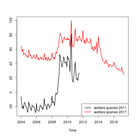 t is not hard to see that the black line is simply a stretched and shifted version of the red line. To check this, just run a regression of the 2017 data on the 2011 data and plot the fitted values. It is apparent from the figure below that the two data series are approximate linear transformations of each other and that the 2011 and the 2017 data are similar once one corrects for the shifting index.

This is true not only for the seasonal component, but also for the large scale features of the data such as the major jump at the beginning of the recession.
Of course there are some minor difference in the data depending for the reasons mentioned above. This is also true of government statistics since they are typically revised several times before being finalized. For this reason, it is good practice to save the data used at time of estimation, whether working with Trends data or with government data.
In the paper, we seasonally adjust the predictors using the stl function from R. Since we wrote that paper we have decided that it is better use seasonally unadjusted data for the analysis and then seasonally adjust the prediction. See Scott and Varian [2012] for an example using the seasonally unadjusted initial claims data.
This post written by Hal Varian.