Employment in manufacturing may be estimated to be rising, but output seems to be trending sideways through 2nd quarter.
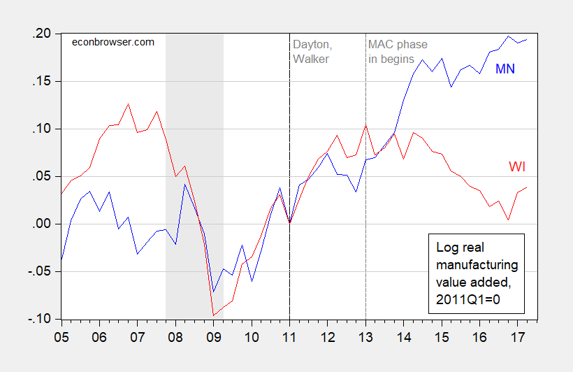
Figure 1: Log real manufacturing output in Minnesota (blue) and in Wisconsin (red), normalized to 2011Q1=0. NBER defined recession dates shaded gray. Vertical dashed line at 2013Q1 indicates beginning of Wisconsin Manufacturing and Agriculture Credit (MAC). Source: BEA, accessed 12/3/2017, NBER, and author’s calculations.
Note that the much touted Manufacturing and Agriculture Credit does not correlate with a resurgence in output. Real manufacturing output as of 2017Q2 is 3.4% below the level in 2012Q4, just before the MAC took effect.
Do you put more weight on this series than the Coincident Activity Index from the Philadelphia Fed? Because that one shows Wisconsin growing faster than Minnesota in recent years.
Neil: Hi frequency, I go with coincident. As you can see, the quarterly real GDP series lags quite a few months. In general, I prefer relative differentials in cumulative differences (as I typically plot; the coincident indices have to be rescaled in trends to match GDP at annual frequency, so levels alone might be misleading).