With August nominal consumption coming in above consensus (m/m +0.4% vs. +0.2% Bloomberg), and consumption and personal income continuing to rise, we have the following picture of some key indicators followed by the NBER Business Cycle Dating Committee.
u

Figure 1: Nonfarm payroll employment (dark blue), Bloomberg consensus as of 9/30 for NFP (blue +), civilian employment (orange), industrial production (red), personal income excluding transfers in Ch.2012$ (green), manufacturing and trade sales in Ch.2012$ (black), consumption in Ch.2012$ (light blue), and monthly GDP in Ch.2012$ (pink), official GDP (blue bars), all log normalized to 2021M11=0. Lilac shading denotes dates associated with a hypothetical recession in H1. Source: BLS, Federal Reserve, BEA, via FRED, IHS Markit (nee Macroeconomic Advisers) (9/1/2022 release), and author’s calculations.
Manufacturing and trade sales also rebounded in July, although the shift away from goods is still apparent (although they are still 3.7% above NBER peak levels).
GDP and other indicators seem to be at variance; however, if we look at GDO, they seem more consistent.
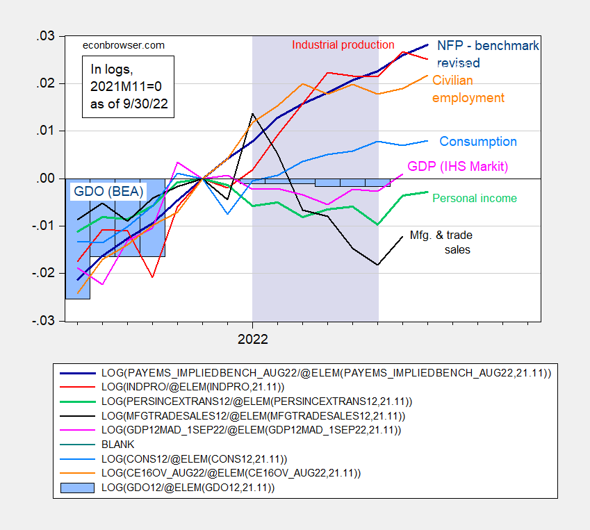
Figure 2: Nonfarm payroll employment adjusted to preliminary annual benchmark revision (dark blue), civilian employment (orange), industrial production (red), personal income excluding transfers in Ch.2012$ (green), manufacturing and trade sales in Ch.2012$ (black), consumption in Ch.2012$ (light blue), and monthly GDP in Ch.2012$ (pink), Gross Domestic Output, GDO (blue bars), all log normalized to 2021M11=0. Lilac shading denotes dates associated with a hypothetical recession in H1. Source: BLS, Federal Reserve, BEA, via FRED, IHS Markit (nee Macroeconomic Advisers) (9/1/2022 release), and author’s calculations.
For more discussion of GDP vs. GDO and other related measures, see this post from the beginning of the month, and discussion of GDP annual revision, here.
With consumption, employment and production measures rising throughout H1, and GDO trending sideways, it does not seem likely that H1 will be declared a recession, defined as a broad based and persistent decline in economic activity.
Employment is still strong but where is aggregate demand heading? Consumption remaining strong is a good sign but there are some concerns with respect to residential investment. So one can ask about the other components: business investment, net exports, and government purchases.
Residential investment makes up only 2-3% of gdp. It’s down from the prefinancial crisis days and frankly, I see reno’s replacing some of the lost single family starts.
Residential investment was 4.8% of GDP in Q2. The only time in the history of BEA data it fell below 3% was during the late-2000s housing crash.
Well he is not as far off as JohnH’s 10% to 15%.
“pgl: So one can ask about the other components: business investment, net exports, and government purchases.”
You can ask, but Menzie Chinn is answering a specific question of which indicators the NBER Business Cycle Dating Committee uses as its indicators.
From the NBER FAQ page:
Q: What indicators does the committee use to determine peak and trough dates?
A: The determination of the months of peaks and troughs is based on a range of monthly measures of aggregate real economic activity published by the federal statistical agencies. These include real personal income less transfers (PILT), nonfarm payroll employment, real personal consumption expenditures, wholesale-retail sales adjusted for price changes, employment as measured by the household survey, and industrial production. There is no fixed rule about what measures contribute information to the process or how they are weighted in our decisions.
The charts above show the listed indicators that the NBER uses to date recessions.
Fair enough – as I’m not sure how one would capture what I asked. I’m just hoping our hosts have some additional insights.
In a previous post, Menzie Chinn noted that, contrary to hopes that the spread between GDP and GDI would close with GDP moving up, instead revisions brought GDI down. As a result GDO, which is the average of GDP and GDI, turned from positive to negative with the revisions. That’s two quarters of negative GDO. Note that GDO is one of the indicators the NBER committee uses for dating recessions.
That’s bad news and a signal that the Fed should pause in their rate increases and allow disinflation to catch up. Patience rather than panic.
EIA 914 came in pretty flat for oil. Natty up a little more.
https://www.eia.gov/petroleum/production/
Very tame production, given the prices (drilling rigs not as high as expected either.)
Have a hard time believing that “peak oil in America”suddenly emerged from its grave.
https://econbrowser.com/archives/2007/05/peak_oil_in_ame
A more likely issue is that the industry does not trust the current administration. Oil and gas are multiyear capital investments. So the rational behavior of a firm is to look at long term political risk, not current press releases. Thus activity is slower.
The industry remembers what Joe Biden said about fracking in the primaries (yes, even if he walked it back, still affects their risk calculus). Similar with JenniG and her statements (in some cases actions) when she first came into office. Who wants to end up like the Constitution Pipeline? Or like the billions of dollars lost by companies that leased natural gas mineral rights in NYS, before their fracking ban.
This doesn’t mean the industry shuts down. It just means they have a higher oil price X to incent activity Y. And when Joe/Jenni try to reverse field and say “no, please produce”, the industry takes that with a grain of salt.
Heck, even in comments here several people have mentioned liking high prices (to drive switching) and/or limited US production. They don’t want to pay a political price. But they like those things.
This is not a convincing argument at all.
the lack of investment in petroleum supply infrastructure has been documented. the reason is mix political and slowing economic activity.
unfortunate, as the suitable replacement of the effect of petroleum is farther off than presumed.
We need oil to be in the $80-100 range to push conversion to sustainable energy. Given the fracking industries small margins at those price levels, it makes sense that companies are not investing in expensive US production. Furthermore, conversion to EVs is coming very fast and will reduce need for oil in the near future. US natural gas is a more sensible investment since we can expect a much longer increased demand for that, both for US power generation and for LNG exports.
See activity versus price.
https://twitter.com/RobertClarke_WM/status/1453017667137323010/photo/1
The low activity during the Biden administration is different than previously, even when price adjusted. Would seem to indicate the problem is political risk, not price.
A model for hydrocarbon production would have to include price and many other parameters. Not sure that “political risk” would have much input in such a model – would depend on how you defined that term.
Oil companies definitely take political risk into account. Nationalization (creeping or sudden). Security. And environmental stuff. It’s rational economics. Of course it’s impossible to exactly predict things. But it’s also impossible to exactly predict the price of oil But basic microeconomics (as well as my experience) is that they definitely put a higher hurdle rate with a higher risk. You see it all over the world. Do you rationally think oil companies don’t consider risk given how many billions were lost on Constitution pipeline or on NYS fracking leases? Little more micro, a little less macro, please.
the chained 2012 dollar figures for July and August PCE were 14,110.0 billion and 14,124.4 billion respectively, while the 2nd quarter PCE was at 14,099.5 billion in chained 2012 dollars; ergo, 3rd quarter real PCE has grown at a 0.5% annual rate for the two months of the 3rd quarter that we have data for…{ie, (((14,110.0 + 14,124.4) / 2) / 14,099.5) ^ 4 = 1.00503092}…that’s a pace that would add 0.36 percentage points to the growth rate of the 3rd quarter, should there be no improvement in September’s real PCE from that July & August average…
given a weak contribution from PCE, the trajectory of 3rd quarter GDP would seem to rest on improving trade vs weakening investment, both fixed investment and inventories..
“given a weak contribution from PCE, the trajectory of 3rd quarter GDP would seem to rest on improving trade vs weakening investment, both fixed investment and inventories”.
That is what I tried to say in an earlier comment. Hoping Dr. Chinn can weigh in with some useful new information.
yes, i saw your comment after i posted the above, and almost added a footnote to yours to see mine down here…
Thank you so much:
https://www.credit-suisse.com/about-us/en/reports-research/global-wealth-report.html
2022
Global Wealth Report 2022
By Credit Suisse Research Institute
I will slowly work through the report.
https://www.nytimes.com/2022/09/30/opinion/remote-work-housing-prices-covid.html
September 30, 2022
Wonking Out: Viruses, Zoom calls and housing
By Paul Krugman
When you’re telling stories about the economy, housing almost always looms large. It plays a huge role in the economy’s ups and downs: A burst housing bubble was the prime mover in the Great Recession of 2007-9, and the Federal Reserve’s leverage over the economy comes largely from the influence of interest rates on the housing market.
When it comes to inflation, shelter accounts for 32 percent of the Consumer Price Index and 40 percent of core consumer prices that exclude volatile food and energy prices. Other measures that try to get at underlying inflation, like the median increase in prices, are basically tracking housing prices at this point.
So the huge run-up in home prices and rents since the onset of the Covid pandemic is important. And I do mean huge. Home prices rose more than 40 percent from February 2020 to June 2022, although they may have recently peaked.
At first glance, the pandemic housing price surge may seem reminiscent of the 2000s bubble. But this time really is different, in a couple of ways.
What happened from 2000 to 2006 looked, even at the time, like pure speculative fever rather than a response to a real surge in housing demand. How could you tell? By the fact that the surge in home prices wasn’t matched by a surge in rents:
https://static01.nyt.com/images/2022/09/29/opinion/krugman300922_1/krugman300922_1-jumbo.png?quality=75&auto=webp
The last bubble didn’t touch rents.
This time, however, rents have soared along with home prices. Official data, which measures how much renters are paying, on average, has lagged the rental rates on new leases, which are a better indicator of demand. Rental data is, however, available from a number of private sources like Realtor.com, Apartment List and Zillow. This data suggests that market rents have gone up around 25 percent since the beginning of the pandemic — not quite as much as home prices but still a lot (although they seem to be plateauing):
https://static01.nyt.com/images/2022/09/29/opinion/krugman300922_2/krugman300922_2-jumbo.png?quality=75&auto=webp
Rents ahoy!
Another way in which the two house price surges differ is in their regional distribution. Soaring prices in the 2000s were generally limited to coastal metropolitan areas where zoning requirements and NIMBYism often made it hard to build more housing. Places like Dallas, where there are fewer restrictions, never saw as much of a price surge, probably because everyone understood that in the long run, prices would fall more or less to the cost of construction. This time, though, prices have soared everywhere:
https://static01.nyt.com/images/2022/09/29/opinion/krugman300922_3/krugman300922_3-jumbo.png?quality=75&auto=webp
Soaring prices everywhere, including Dallas.
The most likely explanation is that this time there was, indeed, a big rise in the underlying demand for housing, not just speculation, and that this rise took place too fast for housing construction to keep up, even in places where building isn’t overly restricted. (Supply-chain problems for construction materials didn’t help, either.)
So what happened? …
The rise in factory output, though too recent to give a clear signal, does suggest inventory building. Given the weak start for inventories in Q3, it may be too much to expect that inventories will add to GDP in the quarter, but Q4 could receive a substantial lift.
Real income is rising – for obvious reasons – which should support spending and, importantly, ease deterioration in household balance sheets.
https://fred.stlouisfed.org/graph/?g=UkmZ
https://fred.stlouisfed.org/graph/?g=QKPD
January 15, 2018
Consumer Price Index for Rent and Owners’ Equivalent Rent, 1992-2022
(Percent change)
https://fred.stlouisfed.org/graph/?g=RH0X
January 15, 2018
Consumer Price Index for Rent and Owners’ Equivalent Rent, 1992-2022
(Indexed to 1992)