Reader Ed Hanson makes a puzzling assertion regarding trade policy measures announced by Mr. Trump, and the evolution of policy uncertainty as measured by Baker, Bloom and Davis:
As for the uncertainty, I can not make your author’s calculation but I can look at the front page of the policyuncertainty.com site and look at the headline monthly index they present. All the countries, except India, show a similar chart. So I doubt if such uncertainty across the spectrum is caused by a minor thing such as TPP. But I would not be surprised if some of the spike is coming down from the Chinese US trade spiff. Both these countries show very similar recent chart.
In response to my expressed dubiousness, he writes:
I believe you when you say, “I honestly don’t see what he’s claiming.”
But if you had followed what I said and understood that I wrote of the Monthly Economic Uncertainty Indexes found on the front page at
http://www.policyuncertainty.com/
Just click or watch as they scroll by the circle blips 1,4,5,6,7.and 8. You will see the Global, US, UK, European, Chinese, and Indian monthly index. They look as I described. And no excel, the very good website does it. Quite user friendly.
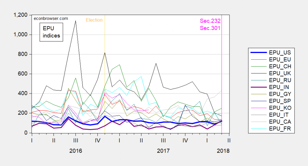
Here is a plot of the monthly indices for the past two plus years. My impression is that India actually covaries a bit more than the others, contra Hanson.

Figure 1: EPU indices accessed 4/13/2018, for US, EUrope, CHina, UK, INdia, GermanY, SPain, KOrea, ITaly, CAnada, FRance. Source: FRED and policyuncertainty.com.
So, apparently, similarity is in the eye of the beholder. Lesson 1: Eybeballing comovements by inspecting individual time series graphs separately, and inferring patterns therefrom, is a ill-advised.
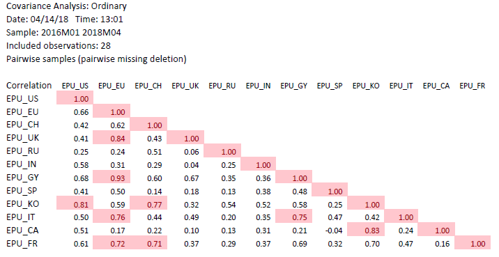
What does a formal evaluation of correlations indicate? In the table below, I present the correlation coefficients for the above indices, for the indicated sample.

Table 1: Correlation coefficients, 2016M01-2018M03. Korea extends only up to 2017M05. Correlations in excess of 0.707 highlighted pink. Source: FRED and policyuncertainty.com and author’s calculations.
A correlation coefficient of 0.707 is consistent with a R2 of 0.5 for a bivariate relationship.
Lesson 2: Formal statistical measures of covariation do not always match up with visual impressions. Hence, actually downloading the data and using formal statistical methods is sometimes (very) useful.
Failing to do so when all the data is publicly accessible, and we live in an era of Excel (or free access spreadsheet software), is — I think — I mistake.
Update, 2:15PM Pacific: Reader Ed Hanson takes issue:
[T]he monthly uncertainty index for the US you so kindly calculated and published shows no such whipsaw your daily chart did.
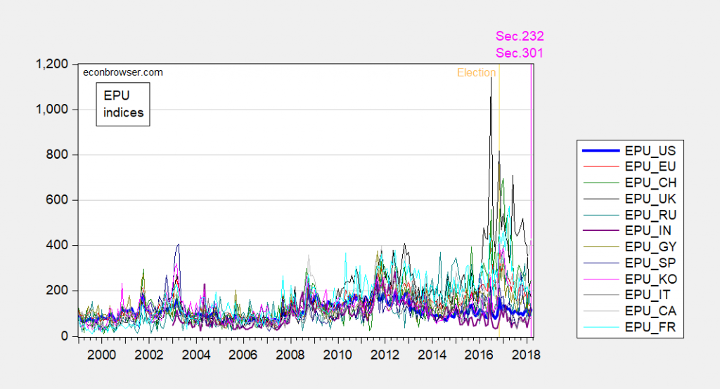
Note: I took the monthly indices from the website – no calculation on my part. Now, let’s take a longer sample. Here I take 1999M01-2018M03.

Figure 2: EPU indices accessed 4/13/2018, for US, EUrope, CHina, UK, INdia, GermanY, SPain, KOrea, ITaly, CAnada, FRance. Source: FRED and policyuncertainty.com.
Hard to see anything, but what I can do is see how the March 2018 change compares to usual changes — formally, compare the March 2018 m/m change to the standard deviation: 28.1 vs. 20.1. For a two tail test, about 16% significance. If I increase the sample to the 1985M01-2018M03 period (full), then the p-value declines (i.e., the significance increases).
Menzie Sadly, some folks might not realize that 0.707 is the square root of 0.5. Probably the same folks that use the trend line function in Excel.
I’m extreme lazy type (if that hasn’t been pieced together by regular readers by now). But there is an Apple program called “Numbers” that I think is quite useful. Sometimes I want to compute some financial ratios on my own when researching investments. Some of them can be quite long, including one made by some Indian dude that I forgot the name of, but involved multiple steps. I think it had something to do with finding false numbers, but I forgot. With this Indian last name ratio you could derive a number, and then based on if that number was over or under a certain number (similar to the 0.5 R-squared Menzie mentions) then you knew there was a high chance they had false numbers on the official balance sheets (i.e. “off-balance sheet” assets and accounting) ANYWAY……. the point is it’s very easy to put short equations inside the input cells and it does all the work for you. The first part of inputting the math into the cells is a pain in the rear, but if you think you will be wanting to crunch the numbers again multiple times it ends up paying off.
“Numbers” is not free if I remember correctly, it’s like an add on with your Mac. If anyone knows of “freeware” that is similar to “Numbers” I would love to hear about it, as I am always looking for free sh*t.
Menzie
Let’s go to the quotes.
“I plot below the monthly indices; I honestly don’t see what he’s claiming.”
Do you honestly not see how different your calculated monthly chart looks compared to the front page monthly chart of Uncertainty? Do you purposely always choose a different time period to obscure any comparisons? If you are aware how different your charts look, or not, would you kindly explain? As for me, for the subject of monthly indexes across countries, I will, as you suggest, try to further explain my observation in a separate post using the front page indexes of Uncertainty.
You wrote in the TPP topic
“With this whipsaw of trade policy announcements, is it any wonder that economic policy uncertainty is rising? As measured by the Baker, Bloom and Davis index:”
Regardless of my past observations which you disagree with, the monthly uncertainty index for the US you so kindly calculated and published shows no such whipsaw your daily chart did.
Further look at your charts show the daily uncertainty index fluctuations are also interestingly consistent, in a general way. It peaks up and down fairly consistently in times you assigned a news event as well as the times you did not. Your seven day moving average line may have more pertinence, but your time period is way to short to determined a any significance.
I guess what I am getting at, reading the themes of your numerous posts, the US has been in perpetual economic crisis. Yet now that you have produced a monthly index, no such crisis or even uncertainty is particularly discernable.
Ed
Ed Hanson: See the Update to the post. Recall the trade announcements have taken place in March.
Menzie
I commend your effort and time you are taking for this matter. I am sorry to seem somewhat all over the board but every time you post a new chart new information flows. And despite the lessen 2 warning, new information is visually apparent.
If the numerical level of the uncertainty index has any significance, the Obama administration had higher uncertainty than so far in the Trump administration. The uncertainty at the beginning of President Obama is easily explained by the financial crisis, and deep recession. He inherited that uncertainty. But 6 years to finally bring uncertainty down, that is way to long and this slow of easing. This slowness falls squarely on his shoulders.
So how is today’s uncertainty any different, besides lower? Besides lower, the uncertainty index from 2014 through 2016 looks quite similar to 2016 through to present. The uncertainty you see in the number simply does not correspond to the history of the index. Uncertainty now is quite normal.
Ed
Ed Hanson: The largest Obama administration peaks are associated with the debt ceiling and shutdowns/sequester conflicts between executive and legislative. Divided government is relevant.
Menzie
As I hoped here is the later post explaining index correlation from the front page of Uncertainty.
Is there any world wide correlation of the Uncertainty front page monthly indexes. I still say yes. And this is how.
First look at the 2 most recent independent high spikes in each monthly index. Note the date
Global (1st pip)……….Jan. 2017…….July 2016
US (4th pip)……………Nov 2016…….June 2016
UK (5th pip)……………Nov 2016…….July 2016
European (6th pip)…Nov 2016…….July 2016
Chinese (7th pip)…….Jan 2017…….July 2016
Latest peak – The western countries peak together in the US election month, the ROW peaks in the inauguration month.
…. I connect these peaks to how an when the world views the US election. Closely matched.
Older peak – The whole world is grouped around June and July.
Do not have an opinion on what caused this. Very closely matched.
Well Menzie, that is how the monthly Uncertainty front page Monthly index correlate. Your Lesson 2 duly noted, but with my lesson 1. My lessen 1 is the danger to statisticians who try to create more precision from the dat than actually exist. Just because you can calculate a number does not mean that number has precision. In other words, Menzie, you are attempting to get more precision out of the Index than actually exist. My visual and general note of spikes of uncertainty has more meaning and correlation than your over mathematical treatment which feigns accuracy.
Ed
Ed Hanson: Older peak June/July 2016 is Brexit.
Thanks Menzie, I should have known.
Ed