While VIX is elevated:
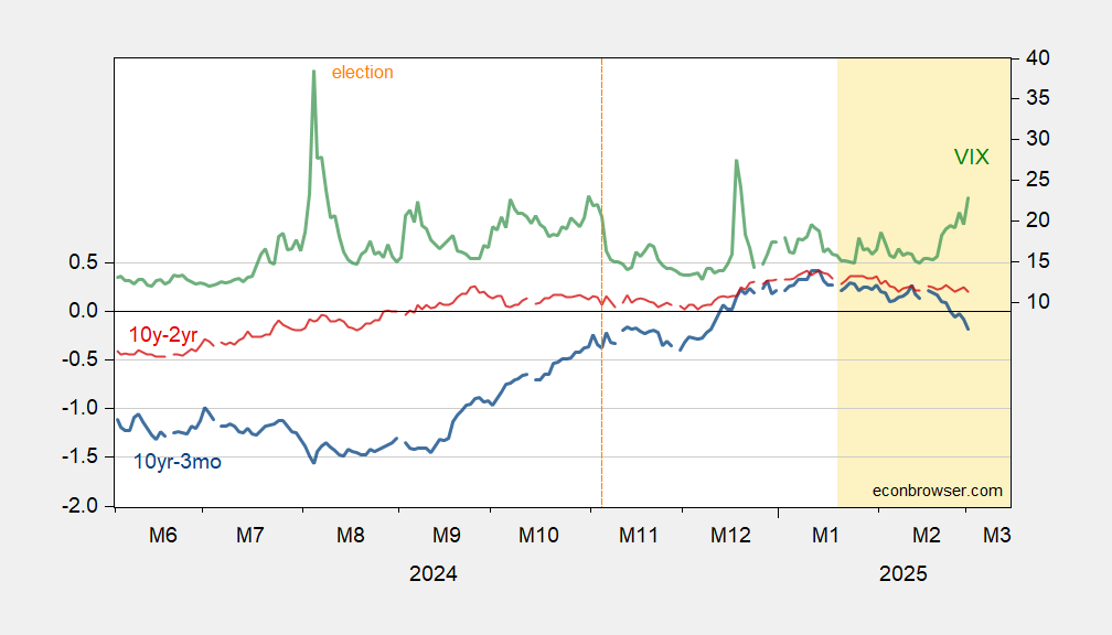
Figure 1: 10yr-3mo Treasury spread (blue, left scale), 10yr-2yr Treasury spread (red, left scale), both in %; VIX at close (green, right scale). Source: Treasury, CBOE via FRED.
Here’s a picture of the entire spectrum of the yield curves.
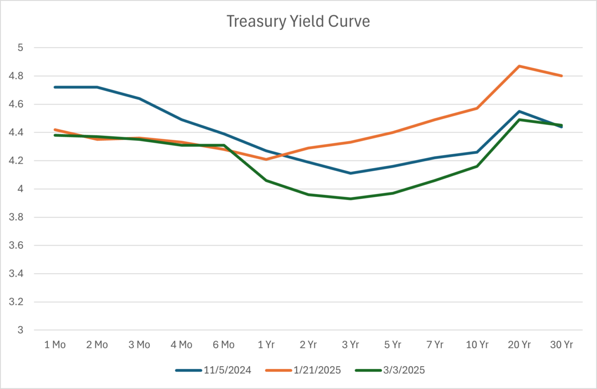
Figure 2: Treasury Yield Curve. Source : US Treasury.
This implies a slowing of growth between 6 months and 3 years.
The Vix is elevated, as in “above 20”, but there have been 6 episodes of the Vix above 20 in the past year. We’re not in the soup yet, say the Vix only a bit above 20. The shepherd boy has once again cried “tariff”, and the Vix hasn’t cracked 30. It’s odd. Republican presidencies are historically bad for stocks, tariffs are bad for stocks, high rates are bad for stocks, high P/Es are a forecast of lower equity prices ahead, and the Vix isn’t showing big jitters.
That’s why I don’t fiddle with stock trading.
China: Chicken, wheat, corn, cotton, sorghum, soybeans, pork, beef, aquatic products, fruits, vegetables and dairy products.
Canada: Beer, wine, bourbon, home appliances, Florida orange juice, perfume, peanut butter, coffee, apparel, footwear, motorcycles, cosmetics, pulp, paper and maybe electricity.
Mexico: We find out Tuesday morning.
No tariffs on meme-coins, so that’s good.