Here’re the Baker-Bloom-Davis categorical trade policy uncertainty measure and the Caldara et al. Trade Policy Uncertainty index. Why are these measures elevated? In my mind, why aren’t they even higher?
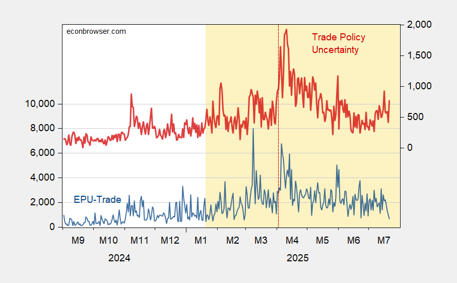
Figure 1: EPU-trade category (blue, left scale), and Trade Policy Uncertainty index (red, right scale). Source: Baker, Bloom & Davis policyuncertainty.com, and Caldara et al. TPUD.
Trade policy is definitely high.
In a longer time horizon context:
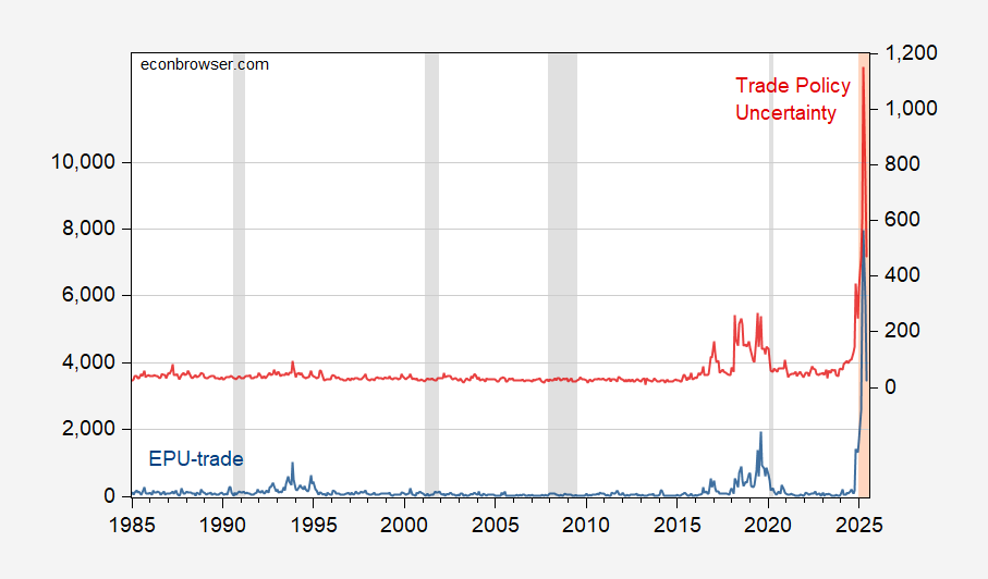
Figure 2: EPU-trade category (blue, left scale), and Trade Policy Uncertainty index (red, right scale). NBER defined peak-to-trough recession dates shaded gray. Source: Baker, Bloom & Davis policyuncertainty.com, Caldara et al., and NBER.
Are the textual analyses catching something that’s a figment. I don’t think so. Hatzius/Goldman Sachs graphically illustrates the possible outcomes under certain scenarios.
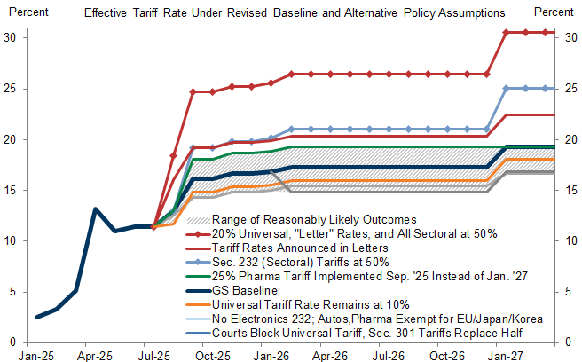
Source: Hatzius, “Global View: Stall Speed,” Goldman Sachs, July 21, 2025.
Another perspective on the sources of uncertainty is the TACO phenomenon, as graphically illustrated by Richard Baldwin (for the EU, below):
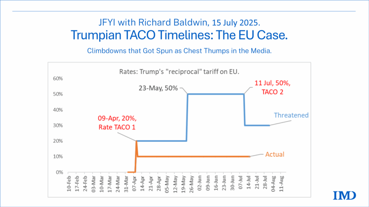
Source: Richard Baldwin.