From Newsweek today:
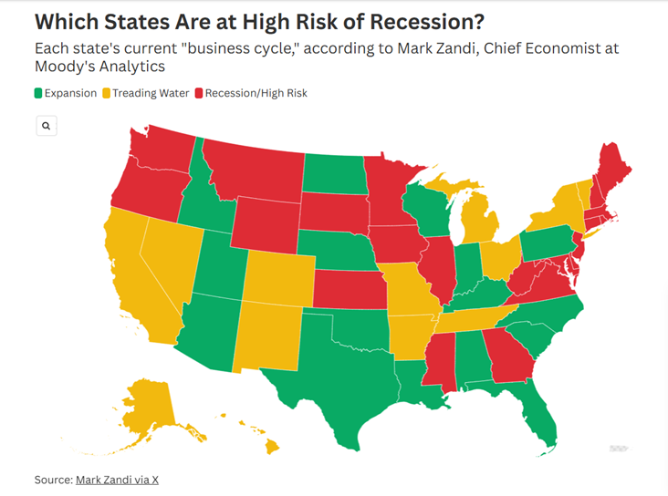
Source: Zandi via Newsweek.
Here’s a map indicating q/q AR NFP growth through July 2025, from yesterday’s post.
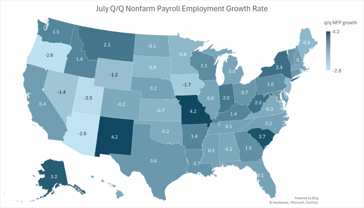
Figure 1: Nonfarm payroll growth, q/q annualized growth through July. Source: BLS, and author’s calculations.
For comparison, here’s the Philadelphia Fed’s coincident index map, through July. Note yellow is below zero, gray is zero, and light green 0.1% to 0.5% q/q (NOT annualized).
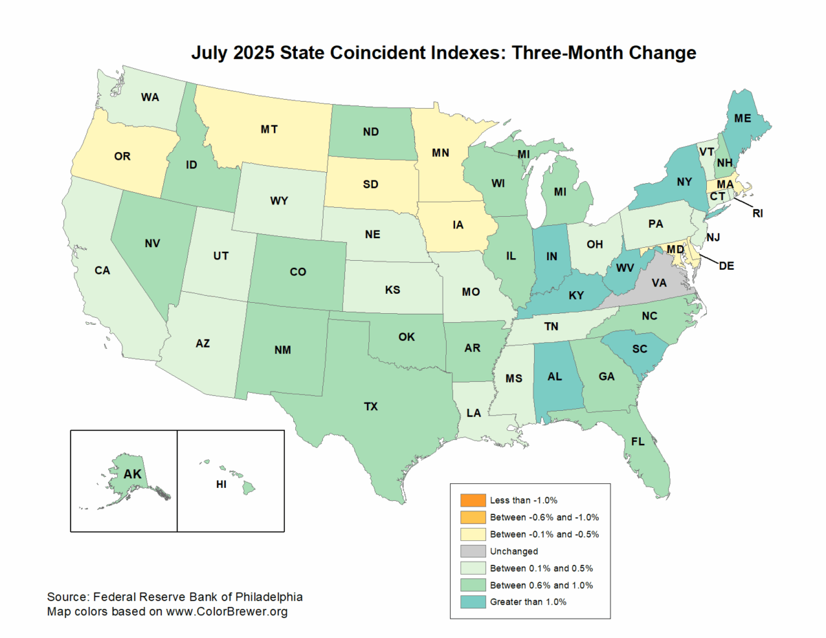
Source: Philadelphia Fed, accessed 8/26.
The coincident index maps to labor market conditions.