
To quote:
We read much about how housing is now “unaffordable”, but is that true?
We bought a 2300 sf home in 1979 with a 10.5% mortgage interest rate (a step up from our 1200 sf starter home). It was a bit of a strain, but our second child was on the way so we bit the bullet. Now it seems that this generation whines about housing being unaffordable and wants the government to “do something” about it.
Mortgage rates: https://fred.stlouisfed.org/series/MORTGAGE30US
Yeah, up from “free money”, but still in line with much of the last 50 years and far lower than the 1980-85 period that was supposed to be so “affordable” for “boomers”.A little AI Assist search comes up with this:
Search Assist
“Since 1970, the average size of new single-family homes in the U.S. has increased significantly, nearly doubling in size. For example, the median size of a new home was about 1,595 square feet in 1980 and grew to approximately 2,386 square feet by 2018.”Search Assist
“Inflation-adjusted home prices per square foot have remained relatively stable since 1973, averaging around $116 per square foot in 2015 dollars.”So the issue of homes being unaffordable is that young couples are no longer content with a 1,200 sf “starter home” that might be 30-years old. They “need” something twice as large and brand new.
Home unaffordability is a myth.
“Whatabout” everything else. Okay, what about it?
Again, no “free money”, but besides the period of reckless government spending in 2020-22 and resulting inflation, current price increases are not historically out of line.
https://mitsloan.mit.edu/ideas-made-to-matter/federal-spending-was-responsible-2022-spike-inflation-research-showsPersonal income increases have followed the historical trend.
https://fred.stlouisfed.org/series/PIUnemployment rate not so bad.
https://fred.stlouisfed.org/series/UNRATEMaybe it’s time to stop whining so much.
OK, some data:
House prices from 1979 onward:
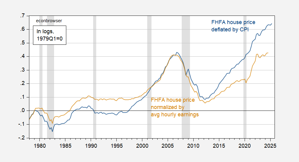
Figure 1: FHFA House Price Index, deflated by CPI-ex shelter (blue), normalized by average hourly earnings (tan), both in logs, 1979Q1=0. NBER defined peak to trough recession dates shaded gray. Source: FHFA, BLS via FRED, NBER, and author’s calculations.
Expressed either way, the cost of a house has risen relative to the price level or to average hourly earnings of production and nonsupervisory workers.
What about real interest rates? These are most relevant for the non-liquidity constrained agents.
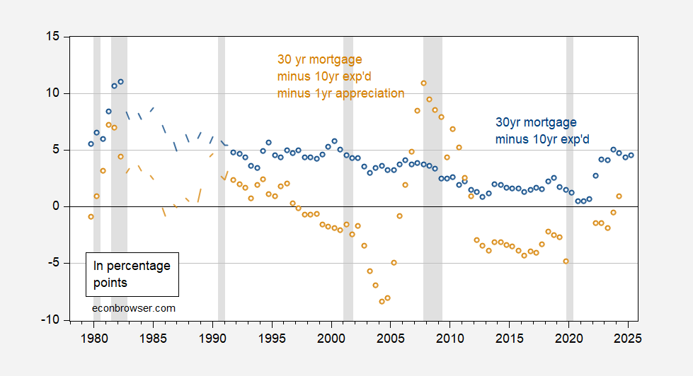
Figure 2: 30 year mortgage rates minus expected 10 year CPI inflation rates (blue), and 30 year mortgage rates minus expected 10 year CPI inflation rates minus ex post future year house price appreciation (tan), both in %. NBER defined peak to trough recession dates shaded gray.Source: Freddie Mac, FHFA via FRED, Blue Chip and Livingstone via Phildelphia Fed, NBER, and author’s calculations.
The conventional real rate is shown as the blue circles/lines. However, for assets, the appreciation of the asset over time should be included. The tan line incorporating only one year of future ex post price appreciation is shown. This real rate is approximately 2 percentage points what held in 1979.
One implication of Figure 2 is that bringing down the nominal rate in and of itself will not have a large influence on the “real rate of interest” for housing, defined as an investment.
We have more data over the recent period, particularly with respect to repeat-sales prices (the Case-Shiller index). Hence, in using this index, we are controlling for size of house. In addition, we have average and median prices per square foot of housing.
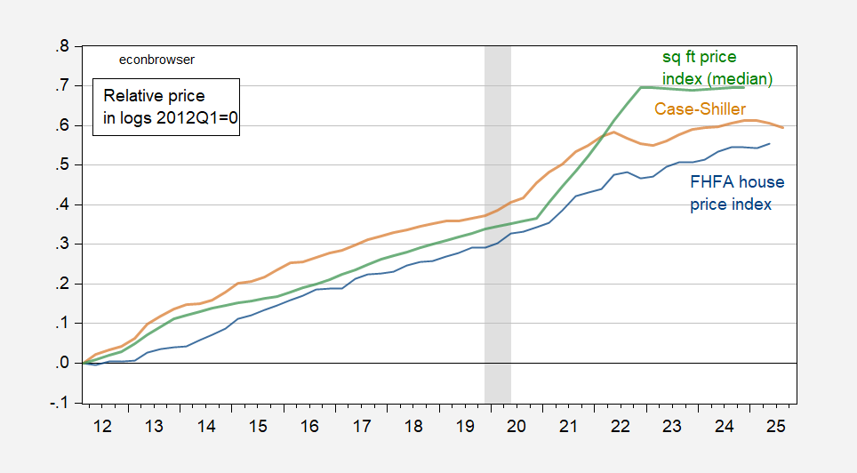
Figure 3: FHFA house price index (blue), Case-Shiller house price index – nationwide (tan), and median price per square foot of housing (green), deflated by CPI ex-shelter. NBER defined peak-to-trough recession dates shaded gray. Annual square foot price measures linearly interpolated to quarterly frequency. Source: FHFA, S&P, BLS via FRED, Census Bureau, NBER, and author’s calculations.
None of the calculations include measures of credit rationing, which would be important given changing restrictiveness of lending requirements.
What about affordability in terms of income? I could repeat the calculations using average hourly earnings, but since the household distribution of outside work has changed, perhaps it’s more useful to show series normalized by per capita disposable income.
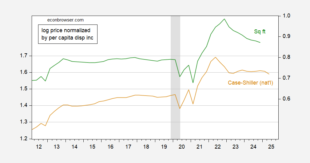
Figure 4: Case-Shiller house price index – national normalized by per capita disposable income (tan, left scale), and price of square foot of housing – median normalized by per capita disposable income (green, right scale), both in logs. NBER defined peak-to-trough recession dates shaded gray. Annual square foot price measures linearly interpolated to quarterly frequency. Source; S&P, BEA via FRED, Census Bureau, NBER, and author’s calculations.
In short, I don’t think people are “whining” without some reason.
Ah, so the average price per sf of homes has remained fairly constant in inflation adjusted dollars since 1973, but wages haven’t kept up with inflation. Okay, is that a housing problem or a wage problem?
Oh, wait… https://fred.stlouisfed.org/series/LES1252881600Q
Again, inflation adjusted price per square foot is the comparator, not average price of a home or any other superfluous metric. “Oh, but it costs so much more for that new Cadillac Escalade than that 1970 Volkswagen. Yeah, okay.
https://www.supermoney.com/inflation-adjusted-home-prices
Oh, so Grandpa thinks consumers can magically cause builders to build small houses. That’s where the confusion lies; Grandpa is basing his argument on a pretend world, while the rest if us are thinking in terms of the real one.
The “is it a housing problem or a wage problem?” set-up is classic low-brow argumentation. As I noted in another comment to this post, housing cost as a share of income is the right way to think about the problem. Grandpa is trying to trick us into thinking it’s either one or the other.
But then, Grandpa also insisted that the inflation of 2022 was due to government spending, with no recognition of the Covid supply shortage. By now, after we have pointed out his error over and over, this amounts to either dishonesty or senility on Grandpa’s part. We can’t expect Grandpa to tell us which.
“Okay, is that a housing problem or a wage problem?”
does not matter. that is the affordability problem, you idiot. seriously bruce, are you naturally this stooopid or do you work at it?
Housing as a share of income is what qe’re talking about. It’s high and it varies:
https://www.census.gov/newsroom/press-releases/2024/renter-households-cost-burdened-race.html
Series should start at some neutral date, say 2000, or alternatively, zero’d at 2019. 2012 was near the trough of the Great Recession, ie, a cherry-picked date.
Look at figuees 1 and 2. Same atory, but different reference dates. Not cherry picking.
You can, of course, go to FRED and do your own charting, to show us how the result would differ with some other end date. Meanwhile, maybe you could check the data series and think of some other reason for the end dates. Hmmm?
Maybe we could look to see whether the starter homes of 1979 exist on the market today? If you look, using Zillow, at the market around Nashville for houses between 1250 and 2500 sq ft you find 1705 properties but the median price is $550k, far above the inflation adjust cost for an -average- , not starter, home in 1979 (which I think is $334k, data from FRED, correct me please if I’m wrong).
When you look for homes priced at $334k you find just 50 listings. Browsing through these, many are clearly derelict or auction or listing errors. All but 1 have been on the market for more than 6 months suggesting that the property has significant problems.
So it kinda seems like the house the kids should be buying doesn’t really exist anymore. It’s certainly true in Nashville that the small houses are being bought, torn down and rebuilt at 2x or 3x the sq footage. Not making the home bigger is “leaving money on the table”
“Starter homes” were most often existing homes, not necessarily new ones with twice the square footage. Apples/oranges.
When you look for homes priced at $334k you find just 50 listings. Location, location, location.
https://www.zillow.com/detroit-mi/?searchQueryState=%7B%22pagination%22%3A%7B%7D%2C%22isMapVisible%22%3Atrue%2C%22mapBounds%22%3A%7B%22west%22%3A-83.33335111816406%2C%22east%22%3A-82.86505888183594%2C%22south%22%3A42.20316841220129%2C%22north%22%3A42.502049573018944%7D%2C%22regionSelection%22%3A%5B%7B%22regionId%22%3A17762%2C%22regionType%22%3A6%7D%5D%2C%22filterState%22%3A%7B%22sort%22%3A%7B%22value%22%3A%22globalrelevanceex%22%7D%2C%22price%22%3A%7B%22max%22%3A300000%7D%2C%22mp%22%3A%7B%22max%22%3A1500%7D%7D%2C%22isListVisible%22%3Atrue%2C%22mapZoom%22%3A11%2C%22usersSearchTerm%22%3A%22Detroit%20MI%22%7D
I can cherrypick, too.
So you are comparing prices in a place people are leaving to a place people are going. Detroits population dropped from 1.5M in 1970 to 0.64M in 2020 (Wikipedia). Nashville has grown from 0.4 to 0.7M over the same time (Nashville changed its boundaries and I believe this is using the same borders, again wiki).
I’ve lived in Nashville for 15 years, I’m not intending to cherry pick. But people are moving here (mid TN more generally) to work in auto manufacturing which left Detroit and many other industries.
Comparing a place that is losing jobs and the city has been demolishing housing to reduce abandoned property ( the Detroit demolition program has destroyed 17,000 homes since 2014, wiki again) to a city that has job growth seems more problematic to me. (Though the past couple of years there’s been a small uptick, a few thousand, in Detroits population. That’s great. )
Where I live which, again, is just one small part of the country, small houses are mostly owned by the elderly. When the owners die or move to assisted living, they are bought very fast by developers who rebuild much bigger. Often those homes are in very bad condition.
An anecdote (not data, but there are many stories like this here) a neighbor bought a <2000 sq ft house a few doors up from me. They planned to rehab the old unit then sell their current home. the owner passed away. But because they were in a very tight bidding war, they didn’t get inside until late. Turns out the sewer system wasn’t connected and the basement was full of years of sewage. This was very expensive to repair as you can likely imagine Young families can’t manage this and because there are a number of stories like this (former crack houses, brick home with the front facade peeling off, foundations sinking into sink holes, we are on karst here), it would be very risky for a young family to buy these old small homes.
I just don’t see 2000 sq ft homes that young families can buy at least here in a city that is growing and there are job opportunities for young people. Before this I lived way upstate in NY and the starter homes we saw there were also in very bad shape, most we ruled out by the time we walked in the front door as they would have been dangerous for our family. Before that we lived in the Bay Area and you couldn’t find small homes at all, even in the east bay flats.
So yes anecdotes. But from 3 regions of the country with three different economies, but each had the problem that “starter” homes were hard to find and often not the small starter that was safe for a family with young kids
But I’m just a former cancer biologist what the hell do I know about housing policy.
Yes, and you do.
If you ask the simple, honest question of how much of the average person’s income goes toward a home that is available to buy near where the average person works, you’ll find that it is a larger share of the average person’s income now than in the past.
You keep pretending that some fictional small-house world exists and that today’s whiney brats refuse to live in it. It doesn’t exist. Same old dishonesty from you that we’ve come to expect. Used homes are mostly mortgage-locked, so not on the market. New homes are big, thoughthe newest of them have stopped getting bigger. These are established facts. You refuse to acknowledge them. That’s dishonest.
there is a wealthy suburb in houston, close to downtown. 5000 to 8000 sq ft lots for the most part. neighborhood originally was built of cottages, most less than 1500 sq ft with some add on structures as well. out of say 1000 homes in this area, probably 20 remain that are these small cottages. most are now second and even third generation construction, multistory and 3000-6000 sq ft in size. starter homes are not available, they are torn down and rebuilt. that home simply does not exist anymore. those homes are sold for lot value.
Off topic – federal court blocks Texas gerrymander map:
https://www.msn.com/en-us/news/politics/federal-judges-block-texas-from-using-its-new-us-house-map-in-the-2026-midterms/ar-AA1QGlxV
Indiana’s Senate has already declined to consider gerrymandering for the mid-term. The Supreme Court can still overturn thelower court ruling, but as of now, the felon-in-chief’s effort to gerrymander a Republican House majority at the mid-term seems to have foundered. If California Democrats can avoid racial discrimination, the felon’s whole project may backfire.