How well are workers doing?
The President’s year-end list of accomplishments noted the following:
The Economy Is Growing And Creating Jobs. Since May 2003, the economy has added nearly 4.5 million new jobs. The unemployment rate is down to 5 percent – lower than the average for the 1970s, 1980s, and 1990s. Last quarter, the economy grew at 4.1 percent and has been growing steadily for more than two years.
(From Fact Sheet: President Bush’s Accomplishments in 2005)
The jobs figure caught my eye, not because the figure is wrong (it isn’t), but rather because of what that single figure obscures. I thought it’d be useful to trace out the performance of employment growth in this recovery relative to the last recovery (which was itself acknowledged to evince slow employment growth).
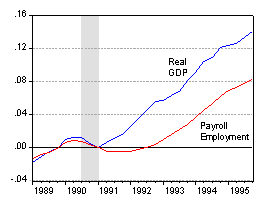
First is a depiction of real GDP and payroll employment growth in the 1990’s episode.
Second is the graph of the same series for the 2001 episode.
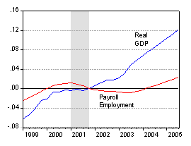
In both cases, the series have been normalized to zero in at the end of the recession. The gray shading denotes NBER-defined recession periods. The GDP data are in Chained 2000 dollars, December 21, 2005 release. The total payroll employment figures are in thousands, from the December 2, 2005 release, as reported by the St. Louis Fed. The monthly figures are arithmetically averaged. Both variables are then logged.
It is obvious from this graph that the new jobs figure is maximized by the judicious selection of the base date (May 2003 being the trough in payroll employment). Comparing the November number against the peak employment number in February of 2001 yields only an increase of 1.7 million (or 1.8 million from the beginning of the first Bush administration).
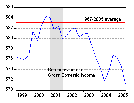
Of course, employment numbers don’t tell the entire story. For instance, the widely acknowledged rapid productivity growth may have manifested in rising wages and/or compensation. But as noted in James Hamilton’s post on wages and compensation, matters don’t look altogether that good for workers on those other dimensions. Yet another way of looking at the issue is to examine labor’s share of income. Below, the share of paid compensation in gross domestic income is shown, along with the 1967-2005 average. (These data are from the December 21, 2005 BEA release, Table 1.10)
Brian Horrigan has made the point that normalizing by Gross Domestic Income may yield misleading inferences given the higher rates of capital depreciation during the last decade and a half. Hence, I’ve added the figure below, which normalizes by Gross Domestic Income subtracting out the capital consumption allowance (I’ve omitted 2005q3 because of some aberrant behavior in the CCA series).
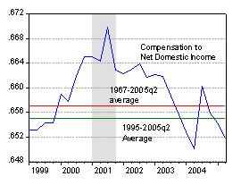
The same patterns persist; the wage share is smaller in recent quarters, with the spike in 2004q2-q3 largely an artifact of the upward spike in the CCA series (which I believe, but do not know for a fact, has to do with the tax return data the CCA series are based upon). In other words, the wage share is below the 1967-05q2 average, and even below the 1995-05q2 average, although the deviation is somewhat smaller than that obtained using GDI.
Time will tell if these trends persist or reverse.
Isn’t this what you would expect? At the trough of the 91 episode, you were further from full employment compared to the trough of the 01 version. More jobs to gain.
Wasn’t the 1990-1991 recession more severe? I think the peak unemployment period following that recession was June, 1992, when unemployment in the civilian workforce hit 7.8%. The peak unemployment after the 2001 recession was 6.3%, in June, 2003.
Is it possible that the eceonomy was overheated in 2000? Unemployment averaged just 4.0% for that year. By contrast, the employment levels before the 1991 recession were more normal, averaging 5.3% in 1989 and 5.6% in 1990.
Was there as much room to grow jobs after 2001? I guess we could return to the low unemployment levels of 1999-2000. But maybe corporations are simply being cautious about going back there.
It seems wrong to look at total labor compensation as a share of GDP. It should be computed as a share of national income instead.
As the share of depreciation in GDP has increased (from close to 9% in the second half of the 1960s to over 12% in the current decade), the gross share of capital income has trended up but not the net share.
Tim Rudderow and John Dewey: It is possible that the reason for the slow employment growth in the recent recovery is that the last recession was very shallow. But the CBO’s estimates indicate that in fiscal year 1990, output was 0.6 percentage points above potential GDP, and 2.4 ppts below potential in FY91. In fiscal year 2001, output was 0.2 ppts below potential, and in FY02, 2.3 ppts below potential. The actual CBO numbers are at:
CBO, The Budget and Economic Outlook: Fiscal Years 2006 to 2015 (January 2005), Appendix F
, Table F-11, while the NBER defined recessions are at:
US Business Cycle Expansions and Contractions .
I think that the CBO figures indicate that the 1990-91 recession was deeper than the 2001 recession, but not by a significant degree.
None of these data rebuts the argument that perhaps there was over-hiring pre-recession. However, the data are also not inconsistent with the view that other factors, such as a strong dollar, compositional effects from the conduct of fiscal and monetary policy, or rapid productivity growth (the Administration’s preferred explanation) are the cause of this slow employment growth.
Brian Horrigan: Good point regarding the advent of higher measured capital consumption and the impact on net domestic income. I’ve added an additional figure to the original post, which displays a similar downward path in the compensation to income share.
So what is different between the two? The 2001 recession response was extremely loose monetary policy, trickle down tax cuts, investment tax credits, but no extra money for worker training or infrastructure improvement. The response was too reliant on monetary policy with not enough fiscal stimulus. There was much more of a fiscal response to the 1990 recession to create jobs directly.
Each recession was preceeded by an overtightening of the money supply by the Fed. For the 1990 recession, the Fed failed to respond to the “Read my lips” tax increases. In 2000, the Fed failed to note that collecting 21% of GDP as revenue might be sufficient brake on the economy.
How much responsibility/praise does Bush deserve?
Question — Brian’s comments on the issue of higher depreciation this cycle is worth looking into. IT equipment and software has accounted for all the growth in fixed investment — as a share of gdp– over the last quarter century and now accounts for some 5% to 6% of real gdp as compared to about 6% for other capital spending. But the life span or depreciation period of IT equipment is much shorter than for much of other capital spending. this is why depreciation is growing as a share of gdp.
Does this mean that more and more of capital spending is just replacing existing old capital spending rather then new capital spending? In other words, are we having to run faster just to stay in place?
Spencer: The fourth figure in the post presents the compensation share divided by net domestic income, so in this graph, I have accounted for more rapid capital depreciation.
As an aside, gross investment will diverge more from net investment the faster the rate of depreciation. There is a separate matter of whether the capital consumption allowance measure captures the amount of economic depreciation; the spikes in the series suggest that measured depreciation is sometimes driven tax effects, including in 2005q3. Interestingly, the peak depreciation/gross domestic income ratio is in the early 1980’s (I suspect this is associated with the faster depreciation allowed under the Accelerated Cost Recovery System).
bakho: There are a lot of differences, as you note. There was fiscal consolidation in the early 1990’s, fiscal dis-consolidation (if I can coin a word) in the 2000’s. In addition, in this latter episode, energy prices were high on a sustained basis, tax cuts were oriented toward high income groups, and the dollar was strong (by about 20% in real terms, against a broad basket of currencies).
Menzie –
Whenever someone writes about payroll employment, I feel it is a disservice to neglect total employment (via the household survey). According to that BLS measure, there are nearly 5 million more workers since your preferred starting point of Jan 2001, and nearly 7 million more since its trough at the end of 2001. Needless to say, this is a much more positive number than the CES data indicate, and for good reason. Back in the early 1990s, the payroll numbers looked much worse than those published today for that period, and it is worth remembering that those numbers were significantly revised, and indeed found to be erroneous. Future CES revisions will change our assessment of this recovery. After much study, I am less inclined to worry about net job numbers (which are demographically baised) than about the unemployment rate (which is demographically neutral).
Your latter point about the share of income raises the question about what the deviation of this income share has been? The chart is scaled to show what looks to the untrained eye to be a severe drop, but amoung to little more than 0.01, or a 1 percent share, yes? The scale on other chart is unreadable. I suspect this drop is significant, but would be curiouos to know for sure.
Many thanks,
Tim
There’s no such thing as an abstract “worker.” Employees earn what they earn, for many and varied reasons. I suspect that immigration (legal and illegal) by workers with below-average skills has something to do with it. Also, if your data pertain only to production workers, construction workers, and nonsupervisory workers, the decline in wages probably reflects the decline in manufacturing relative to services. In any event why “worry” about such matters, as James Hamilton seems to do. If American workers aren’t responding to incentives and acquiring the skills needed to make more money, I certainly don’t want to subsidize their lack of initiative through some sort of redistributive scheme or re-training boondoggle.
Tim – the BLS provides a footnote about that household survey figure warning us not to compare across years as this figure is essentially the employment to population ratio times reported population. One way to avoid the problem noted in the BLS footnote is to simply look at the employment to population ratio, which fell from over 64% in 2000 to around 62.1% by mid-2003. It stands now at 62.8%.
Tom Anger: Why worry about employment numbers? Well, unless one is a true believer in real business cycle theory, the observed level of employment need not equal the equilibrium or optimal level. Even President Bush’s second CEA chair, Greg Mankiw, has written in numerous academic papers that, in the presence of menu cost-induced sticky prices, output and hence employment may be suboptimal. In addition, for whatever reasons, policy-makers seem to be concerned with trends in this variable.
Tim: On this point, I’m with pgl. Many an eminent — and not so eminent — economists have foundered on the shoals of the establishment/household distinction. pgl is indeed correct that it is very hard to compare across years in the household series.
I will appeal to the discussion of the issue by SF Fed economist Tao wu during the heighth of the employment series debate during the 1980’s:
The article concludes:
The entire article is located at:
FRBSF ECONOMIC LETTER
Number 2004-23
Tim: I neglected to answer your questions regarding the deviations. The 2005q2 deviation from the 1967-2005 average for compensation to gross domestic income (the third figure) is about 1 percentage point. The corresponding deviation for compensation to net domestic income (the fourth figure) is about 1/2 of a percentage point.
I suspect unemployment in 2003 was at least 7.8%. Real unemployment is at least that today as evidenced by the employment to population ratio. Plus, a significant portion of the 4.5 million were illegals working off the books for around $8/hr.
Doubt any amount of training will ever create jobs. In fact, good jobs won’t be coming back until the 300 million unemployed Chinese are employed and then they (the good jobs) are only going to pay about $3/hr and there’s only going to be enough for one out of ten American workers. The number of jobs for American workers will continue to decrease. Would’ve, because of automation, without China/WTO .
Should get real interesting as the housing slow down feeds in.
Thanks Menzie and PGL. I remember the FRBSF letter from August 2004 by Wu, mainly because I thought it was disappointing. I should show my cards here and confess that I have done a fair amount of research on the issue, below for example (which JDH was kind enough to cite in one of his academic papers):
“Diverging Employment Data: A Critical View of the Payroll Survey” by Tim Kane, Ph.D. Center for Data Analysis Report #04-03 …
http://www.heritage.org/Research/Labor/CDA04-03.cfm
When I worked at the JEC in 2003, we asked the BLS to smooth the January population adjustment in the CPS in order to address the rather silly time-series issue. They began publishing just such a smoothed series shortly thereafter. See:
http://www.bls.gov/cps/cpspopsm.pdf
BLS also now publishes a monthly reconciliation between the CPS and CES, which is at
http://www.bls.gov/web/ces_cps_trends.pdf
Offhand, I cannot recall precisely when they started publishing this reconciliation “trends” document, but it was before the FRBSF Letter. Note that the FRBSF letter states “after adjusting for definitional differences between the two measures, the discrepancy between them decreases substantially.” But this is quite wrong, as a review of the BLS document shows.
The reconciliation makes it clear that even after using this series “Household survey:
total employment, smoothed for population control
revisions, adjusted to be more like the payroll survey, and seasonally adjusted” – the divergence between the series is 3.3 m (peak) or 3.0 m (trough).
So, you are left with a paradox that no labor data expert can resolve, notably no one at BLS. Unless you can resolve it, I think it is only fair to report both figures. Moreover, if there is a series to be doubted, I think it is the one that seems to have a cyclical bias (CES) and is less definitionally sound (measuring jobs, not workers — in an economy where the definition of a job is rather non-specific and dynamic). The refrain that the CES is a bigger survey is entirely beside the point. When both surveys are mammoth in size, it is quality not quantity that matters.
PGL is right that LFPR is down. I’m not sure that is a bad trend, when we know it is largely driven by an unprecedented non-cyclical 10% decline in teen participation rates. Moreover, a lower LFPR makes the rise in net workers in the household survey all the more remarkable, yes? If PGL is implying that workers are discouraged, then the BLS series to consider is the # of discouraged workers (collected since 1994), which is no higher today than the mid 1990s.
I suspect the President’s team knows it cannot win the academic argument on the 2 surveys when so many academics are unaware of the technical issues. So they stick with the CES number and cherry-pick the starting point, as Menzie notes.
Finally, Menzie, I actually meant to ask about deviation in terms of standard deviation. Is the current Labor Income share very far outside the standard deviation of LI share?
Many thanks,
Tim
Tim: Thanks for bringing my attention to these adjusted household employment figures, as well as your paper. In a future post, I’ll show some pictures of the adjusted household civilian employment series as compared to the payroll employment series, and discuss some of the statistical (time series) properties of these series and their corresponding strengths and weaknesses in the context of econometric analyses. For now, let me quickly address some of the issues you raised.
Deviations from means: This is a difficult issue for compensation to gross domestic income. ADF tests (constant, no trend) fail to reject the unit root null hypothesis at conventional levels. Of course, this series cannot literally be I(1), but what matters for inference is what the series appears like in small (finite) samples. Hence, I cannot calculate appropriate standard errors. The compensation to net domestic income series does reject the unit root null at the 10% marginal significance level. Using the 95% confidence bounds, one cannot reject the null that the 2005q2 observation is drawn from the same distribution that the other observations are drawn from.
Bias in establishment-based series: I guess this comes down to the long-known debate of bias versus variance. Even if the household based series has smaller bias, the consensus in the labor economics profession (so here I am speaking as an outsider) seems to be that the variance of this estimator is so large so as to outweight this bias factor. (In this regard, it’s similar to the issue of “To IV or not to IV” — IV may be consistent, but with weak instruments may induce so much larger variance in the estimator that inference is made more difficult). To quote:
This is from the document that Tim Kane cited:
Employment from the BLS household and payroll surveys: summary of recent trends, dated December 2, 2005., URL: http://www.bls.gov/web/ces_cps_trends.pdf
I take Tim’s point that both series should be consulted. Payroll employment is 1.8 million above January 2001, while the adjusted household employment series is 5.1 million above. This averages out to 31,000 and 87,900 new jobs per month, respectively, over the previous 58 months.
It seems odd that nobody has mentioned anything about outsourcing.
Isn’t it reasonable to assume that if some portion of newly created jobs (by American companies) are “shipped” outside of the US, that this should have an impact on employment?
The issue, I think, is only How many jobs have been outsourced?
I’ve seen numbers all over the map, from 100,000 to 2 million, depending on the particular political ax, the source wished to grind.
It would be interesting to hear an economist’s view on this phenomenom
Hi Menzie — I think the pictures on labor shares suffer from too short a time period. This ratio took a decided shift downward after about 1982, and in that context the period from about 1999-2001 looks very unusual. In the broader context of the last 25 years or so, the recent experience of this series looks positively normal. I posted my thoughts over at macroblog. (Hope you and Jim are having a great holiday season.)
Peter: I think that, if by outsourcing you are referring to the offshore outsourcing of service jobs, the estimated impact (even the one by Forrester Research of 3.3 million by 2015) is much too small to have a big impact on the U.S. payroll employment of 134 million (and an even larger labor force).
If, on the other hand, you’re talking about outsourcing of all types of jobs, including manufacturing and industry, well yes, that could be important. But that is merely a continuation of a process of changing production patters in response to evolving comparative advantage (think textiles, then steel, then simple semi-conductors). Jobs move offshore, but reduced costs of inputs result in new (different) jobs onshore. That’s the outsourcing/insourcing issue.
Dave Altig: Thanks for the comment — I actually read your excellent post on the labor share issue last night. I readily admit that the share has been lower in the past according to the NIPA data. My point was not that this share was at a historical low (but thanks for showing the BLS data which indicate close to a historical low), but the less exciting point that the trend was downward in the labor share.
My main point was highlighting trends in the labor market — which might or might not be optimal. My next post will highlight the time series characteristics of the competing labor market indicators.
My former CEA colleague, Steve Braun, has a very thorough, and illuminating, analysis of potential reasons for the discrepancy between the payroll and household series:
Steven N. Braun, Reconciling Employment Growth from the CPS and CES, presentation at NBER Labor Studies meeting, April 2004. I highly recommend it as required reading for anybody interested in this issue
There was an earlier post suggesting that the spike in the capital consumption allowance in 2005Q3 was tax-driven. I thought the surge in consumption of fixed capital was Katrina-related (http://www.bea.gov/bea/faq/national/2005q3hurricanes.pdf). As the discussion was keying off of net domestic income, I thought the BEA CFC concept would be more appropriate than the capital consumption allowance, no?
Whoops, I think I got my NIPAs in a twist. Regardless, I thought the 2005Q3 depreciation spike was hurricane-related.
THE TAX CUTS ARE WORKING
. . . unless you care about jobs. PGL at Angry Bear Barry Ritholtz at The Big Picture Menzie Chin at Econobrowser (here too) Labor market genius Jared Bernstein (Mama MaxSpeak: “How come that Jared Bernstein person always gets quoted…
This is quite interesting.
Even if it is clear that 1991 was a recession using employment data….IT is very different than the output information.