High commodity prices and indications of rising inflation have renewed interest in the hypothesis that the U.S. has been increasing the money supply in recent years at an excessive rate.
One of the measures of the money supply that has been most closely followed by economists is M2, which is calculated at any point in time by adding together the value of cash held by the public, checkable deposits, household savings deposits, small time deposits, and money market mutual funds. Although any given year’s growth rate in M2 may be wildly different from inflation, the average growth rate of M2 over a ten-year period historically tended to correspond pretty closely to the ten-year average growth rate of nominal GNP, as displayed in this graph of over a century’s worth of data by William Dewald:
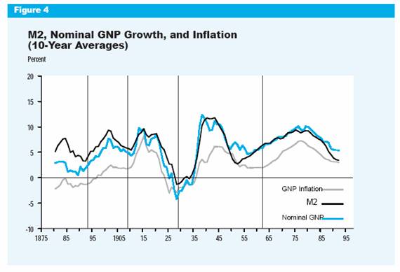
The growth rate of nominal GNP is the sum of inflation plus the growth of real GNP. Thus the above graph suggests that over time, growth of M2 that is higher than the growth of real output shows up as inflation. Moreover, ten-year averages of real growth rates do not exhibit nearly as much fluctuation as these nominal series. It accordingly seems reasonable to attribute the surge in U.S. inflation in the 1970s primarily to the surge in money growth.
The graph below updates Dewald’s analysis with data through 2005. The hundred-year relationship broke down a bit in the 1990s, as the dramatic slowdown in M2 growth in 1994-95 did not reduce the growth of nominal GDP by as great an extent. The instability of the historical correlation led many economists to put less weight on monetary aggregates as a predictor of inflation and economic activity.
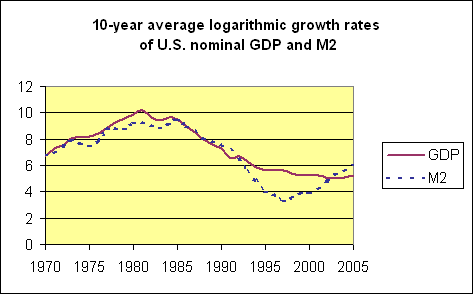
Measuring the money supply is conceptually very difficult, particularly given the many changes in payments technology and financial instruments. For example, consumers may have shifted some of the assets previously held in M2-type accounts into bond and stock mutual funds during the 1990s.
If a new financial innovation causes a shift in the demand for M2, what one would see is a temporary period in which the correlation between M2 growth and GDP growth breaks down. However, unless the fraction of assets held as M2 is continually subject to new shocks, once the shift has occurred, we would thereafter expect to see the correlation between the growth rates resume. Indeed one sees in the above graph that, after the break in the 1990s, the correlation between the growth rates of nominal GDP and M2 appears to be right back on track for the most recent decade.
It is of course more interesting, though also more hazardous, to look at money growth rates more than once a decade. The graph below displays U.S. M2 growth averaged over a 3-year period ending with the indicated date. From 1999-2004, these three-year averages amounted to 6 or 7% annual money growth. Given a 3.5% real growth rate, that would be consistent with a 2.5-3.5% inflation rate, of which there also may be some indication in the most recent PCE deflator and CPI.
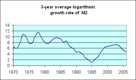
On the other hand, such money growth would not be expected to produce the sort of runaway inflation that some commentators think they detect in commodity prices. Furthermore, the 5% M2 growth rate of the last three years would be the sort of thing to get the economy back on track to a 1.5% inflation rate.
Obviously M2 is a pretty noisy indicator if you have to look to 10-year averages, and even then be careful. Nevertheless, it confirms a picture that I think emerges from any of a number of other indicators: the Fed was a little too aggressively expansionary a few years ago. That may have been responsible for a slight increase we’re seeing now in current inflation. However, the more restrictive measures adopted by the Fed over the last three years should help keep future inflation at acceptable levels.
Technorati Tags: M2,
inflation,
macroeconomics
What about M3? Or does it not matter because it is no longer reported?
Could the “breakdown” in the 90s be due to a shift of M2 money creation to M3-M2? Is this what you were hinting at when you said consumers may have shifted assets into mutual funds?
But on top of any such shift, it is my understanding that in the 90s the Fed eliminated fractional reserve requirements for higher forms of money than M2 (e.g., credit and loans). At the same time, it is common knowledge that interest rates were held very low. This produced an explosion of broad money creation (M3).
One can argue that M3 isn’t “real” money, and therefore can’t end up in broad-based inflation. Fine, but then its progeny–gigantic asset bubbles–are inevitably doomed to collapse, creating widespread financial ruin. This seems like an outcome the Fed, especially with Bernanke at the helm, intends to avoid–most likely through creating lots of good old-fashioned M2.
I wonder if this pattern of M3-M2 growth leading to M2 growth through political means explains charts like this one.
I think you’re ommitting a huge piece of the picture here.
It would also be interesting to look at the relationship between the monetary aggregates and the financial markets. The correction we’re seeing in the markets right now is happening shortly after the growth rate of M2 slowed sharply.
Very interesting post. 3 thoughts/questions:
1. Globally inflated money supplies (esp. by the Japanese, Chinese, & Indian central banks) are contributing to liquidity in the US. And even if they were not, they are undoubtedly a factor in the rise in commodity prices. Is there a decent measure of M2 for the World?
2. Is the purchase of LT Treasuries by Asian Central banks the reason for M3 growing with more celerity than M2? Can M3 be spent without first showing up in M1/2?
3. While I agree that M2 growth is consistent with ~3% avg. inflation, it seems likely to over-shoot that figure for a period because of numerous factors (eg,the way housing is computed, late-cycle pick-up in wages, dispersion of higher energy costs, etc.)
I can’t speak for Japan and China, but it would be hard to come up with an accurate equivalent to M2 for India. There is huge sums of “black money” (money not reported to the tax man for obvious reasons). Typically, anywhere from 50 to 75% of real estate purchases involve black money; the seller gets to pay taxes on only a small portion of the transaction cost and the buyer gets to dispose of his/her black money for real estate. Real estate has been going nuts in Indian cities, partly fueled by incoming dollars and euros and partly fueled by black money. Real estate “bubble” in the US is tiny compared to the real bubble forming in India. Any thoughts on much unreported money is sloshing around in China?
You refer to CPI figures that the government has established. It’s no secret that they are incorret and under report figures. I would be curious to see all of your charts if they were actually correct.
Patrick, none of the charts in this post make any use of the CPI. Furthermore, I do not agree with your view that the CPI necessarily underreports inflation.