How significant is the housing slowdown? Answering requires separating the seasonal from the cyclical factors.
Seasonal adjustment is an effort to distinguish between the changes that are typically expected at a particular time each year from those changes that may have broader economic significance. When one simply wants a quick look at the numbers for an impression of what is going on, the seasonally adjusted numbers are almost always more informative. However, any automatic procedure for removing seasonal factors, such as the X-12-ARIMA algorithm used by the Census Bureau, is inherently problematic, particularly for series that can exhibit large fluctuations or measurement errors. When you can afford the time to develop a detailed understanding of the nature of the seasonal factors for a particular series of interest, it is often preferable to work with the seasonally unadjusted data directly.

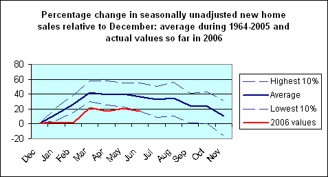
The above graph plots the seasonally unadjusted values for the Census Bureau’s estimates of the number of single-family new houses sold each month in the U.S. In a typical year, this series reaches its lowest point in December and its highest value in March. March months are indicated by vertical lines on the graph. The average logarithmic March-to-March growth rate over 1964-2005 was a bit over 2%.
The revised 2006 new home sales figures released today exhibit this same pattern, with March again setting the year’s peak. Unfortunately, this year’s March sales of 108,000 new homes was down 16% logarithmically from March, 2005. Sales since have followed a typical pattern of falling off a bit from March to June, with the June figure of 103,000 units 11% below June 2005.
Another way to summarize the deviation from the usual seasonal pattern is with a graph like the following. In an average year prior to this one, June sales would be 36% above the December trough, whereas this year they are up only 17% since December. Only 4 years out of the last 41 years (which includes 6 recessions) saw as weak a December-to-June gain.
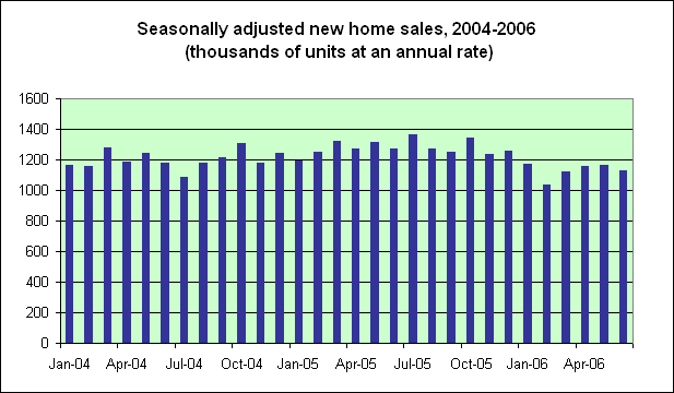
You get the same rough impression, though miss much of this detail, if you just look at the seasonally adjusted sales. Seasonally adjusted new home sales are down 12% for the first 6 months of 2006 compared with their average value during 2005, and seasonally adjusted sales for each of the last 5 months are lower than in any month since July 2004.
More coverage of both the seasonally adjusted and seasonally unadjusted data is provided by the always-excellent Calculated Risk.
Technorati Tags: housing,
new home sales,
seasonal adjustment
JDH said: ” When you can afford the time to develop a detailed understanding of the nature of the seasonal factors for a particular series of interest, it is often preferable to work with the seasonally unadjusted data directly.”
There are other reasons for sometimes wanting to use unadjusted data. For example, you cannot always be sure that the adjustment factors used across the larger data set also apply to a smaller subset. And sometimes it’s interesting to compare results using different models; e.g., comparing X-12 ARIMA to TRAMO-SEATS. And since JDH is something of a worldclass authority on this topic, I hope we can persuade him to discuss seasonality issues more often.
There’s another easy solution: year-over-year figures.
Aaron,
The big problem with y/y changes is that you can’t tell whether the numerator or the denominator has caused a big swing. You still have to go back to the source data for that. A nice healthy current period can be made to look bad by an even stronger period a year ago.
There is also a sub-set of y/y worshipers – conspiracy theorists, math haters and investors of various kinds – who think of seasonal adjustment as some sort of cheat. We don’t want to lend them inadvertent support.
I was wondering about y/y too. Not because I have an opinion on any of this, but out of ignorance. Can’t you learn everything you need to know by stacking 12 graphs, one for each month (i.e. the data points on each graph are a particular month’s data measured every year)? So you’d have a graph depicting every January for the last 41 years … juxtaposed with a graph of every February for the last 41 years … etc. So you can compare relative y/y changes of, say, December with March.
That’s an interesting suggestion, Chris. There’s definitely a lot to be said for year-to-year comparisons and they’re always worth looking at. One drawback is that, if the true peak comes in January, the Feb-to-Feb and March-to-March comparisons may still look pretty strong.
Another drawback with Y/Y looks is that it wastes information. One of the features of seasonal adjustment models such as X-12 ARIMA or TRAMO-SEATS is that they attempt to recover information at the endpoints, which is typically lost in simple Y/Y analyses. Also, there’s a lot to be said for using a single model that FULLY decomposes the time series rather than trying to use separate techniques that separately decompose pieces of the time series, which is what you are essentially doing if you use Y/Y to account for seasonality and then something like H-P to account for trend, etc.
Aula prática de sazonalidade
Aqui. Claudio…
OH GIVE ME A HOME, WHERE THE LOANRATE DON’T ROAM
Q: “If real estate does start to seriously tank can it lower interest rates to get the market moving? ”
the FRAME of this question, and the discussion herein presumes that Monetary Policy is either THE or one of many causes of “Housing Slowdown” apparent.
I would say that it is not the Cost of Capital, nor is it the supply of capital = liquidity, that is affecting New Home Sales; Rather, it is the Cost of New Homes, and supply of New Homes, that is affecting New Homes Sales statistics.
Though we (armchair academics) are correct when we say, “People don’t buy Homes, they buy Loans,” alas, the vast majority of (retail) buyers and sellers do not perceive themselves that way, nor do they act / react with such rational correlation to the ticks and tocks of the Ten-Year Treasury Bond benchmark.
while i am ranting away wit’ and again’ my fellow dismal scientists {grin} i would like to say that the graphics posted here would cause Tufte to toss his cookies, they are THAT bad; and that even without running these data through a simple Time Series de-composition programme, the Visual Displays alone reveal residual SEASONALITY apparent in supposed de-seasonalized data. to wit, this meal has been under-cooked; their sauce conclusions, over-wrought, thus.
Oh, Waiter? Cheque, please. Do you take VISA ?