The latest CPI release provided some much needed relief on the inflation front. What caught my eye was some of the discussion regarding the seasonal adjustment. This inspired me to wonder what seasonal adjustment was doing.
From Reuters, by Emily Kaiser:
WASHINGTON (Reuters) – High gasoline prices got you down? Come to the land of seasonal adjustment, where the sun is always shining and gas prices fell 2 percent last month.
What? You paid more? Well, in the real world, gasoline prices did rise by a sharp 5.6 percent in April from a month earlier, but the way that the Bureau of Labor Statistics adjusts the figures to smooth out seasonal oddities, it appeared to be down in the consumer price index released on Wednesday.
“The drop makes absolutely no sense. Where does the BLS buy their gas?” asked Mark Vitner, senior economist at Wachovia.
No, there is not a magical government gas station where pump prices remain below $3 per gallon while the national average stands at $3.72.
Another branch of the very same U.S. government, the Department of Energy’s Energy Information Administration, said average retail gas prices actually shot up 9.5 percent in April from March.
So who’s right?
It has to do with how the Bureau of Labor Statistics compares current price trends with the norm.
Typically, gasoline prices rise sharply in April as the arrival of warmer weather encourages people to drive more. The government data is adjusted to reflect that pattern so that it can highlight variations from the trend. Because gas prices did not rise as much last month as they typically do in April, the seasonal adjustment showed that prices fell.
So, while it makes sense to do seasonal adjustment in the fashion that it is done, this article makes it clear that sometimes it can be useful to examine both the seasonally adjusted and unadjusted series.

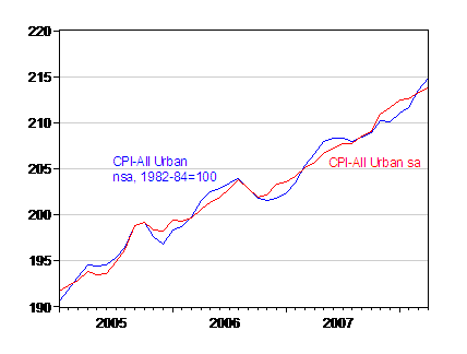
Figure 1: CPI-All Urban, not seasonally adjusted (blue) and seasonally adjusted (red), 1982-84=100. Source: BLS via FREDII, accessed 14 May 2008.

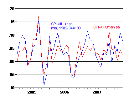
Figure 2: Month on month inflation annualized for CPI-All Urban, not seasonally adjusted (blue) and seasonally adjusted (red), 1982-84=100. Source: BLS via FREDII, accessed 14 May 2008.
Seasonally unadjusted inflation is higher seasonally adjusted last month, exactly for the reasons cited in the article. One interesting aspect, highlighted in this BLS fact sheet, is that the seasonally adjusted series is the weighted sum of the seasonally adjusted component series. This means seasonally adjusting the aggregate not-seasonally-adjusted series using the X-12 seasonal adjustment routine does not yield the official seasonally adjusted series.
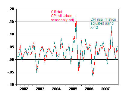
While this approach makes perfect sense, one could argue another plausible approach would be to see if the seasonality in the aggregate series could be modeled. Working on the levels of the aggregate CPI does not allow for much identification of seasonal terms; but modeling the seasonal term in inflation leads to the following picture.

Figure 3: CPI-All Urban, not seasonally adjusted (teal), adjusted using X-12 with arithmetic adjustment factors estimated over the 2002-08M04 period, and CPI All Urban official seasonally adjusted (red), 1982-84=100. Source: BLS via FREDII, accessed 14 May 2008, and author’s calculations.
I am not arguing that this is a better measure of seasonally adjusted inflation. All I want to highlight is the interesting finding that this approach leads to a higher read on CPI-All Urban inflation in 2008M04, that is 4.8% vs. 2.5% month/month, annualized. To the extent that it is harder to identify seasonal patterns in the aggregate series than in individual series, this approach is inferior.
Great post–really interesting and informative.
When you adjust the overall series, you’re assuming that all the components have a similar seasonal signal, no? That doesn’t seem right, though the two series seem pretty close in your plot.
Since BLS “adjustments” lead to systematic understatement of inflation, depress COLA and wage raises benchmarks while favoring capital, the methodological minutiae of alternative modeling are of secondary interest in the grand scheme of things.
On the other hand, someone may want to explain this chart:
http://www.financialsense.com/Market/kirby/2008/0114.html
and regal the audience on its mathematical justification.
Great analysis. Something, perhaps, to look into: is the volatility in month-to-month inflation lower for the U.S. than other developed nations, or lower than the cpi historical volatility? I ask because the absolute volatility of the cpi appears to have stayed low even while the cpi has risen.
This is a test of whether hedonics and other cpi adjustments have the effect of “smoothing” reported inflation. The hypothesis is that spikes in component prices result in a BLS adjustment of either 1) more substitution away from that good; or 2) more attribution of the price rise to quality improvements. So, the bigger the component inflation, the bigger the adjustment. Any support for this thesis?
The price of gasoline is outside the parameters of the historical data set, therefore any seasonal adjustments are guessing and not helpful to anyone except those pointed out by Francois.
Jared Bernstein: You are absolutely right. My procedure implicitly imposes the same seasonal factor into all the component CPI series. The impact relative to the official series does not seem to large when applied to inflation, but is large when applied to the level of the CPI.
Francois: If you look at Figure 3, there are times when the official series indicates higher inflation than my series. That observation is at variance with your view that BLS “rigs” the series.
The graph you link to is an informational nightmare, in the Tufte-ian sense. If I wanted to verify the assertion made in that post, I’d do a regression of sample points against a dummy for significant deviations from a moving average, over a long sample period.
David Pearson: I don’t know — somebody else will have to weigh in. Since the CPI is a Paasche-like index, I don’t think the substitution effect shows up at high frequencies (the basket weights are revised every five years, if I recall correctly). I would expect the substitution effect to be much more pronounced in the PCE deflator, which is a chain weighted index.
me: Seasonal adjustments are always guesses, in the sense that the adjustment factors are estimated. But I will note that since prices of almost all categories in the CPI seem well characterized as I(1) with drift, many series share the characteristic of being outside the range of history.
I think the economy is essentially in deflation but the lagging energy sectors are just now catching up.
The bad thing about CPI is, they will be telling us of “rising inflation” when it is obvious that everything is deflating including energy.
Deflating energy means higher interest rates as the steralization line is cutoff from oil producing countries as their revenues tank. Oil shooting below 100b would do just that.
Does a reverse substitution effect exist? Consumers spending more on items that increase more rapidly and less on items that decrease since some items, like energy, don’t have good substitutes?
I do not understand the reason to discuss aggregate CPI (NSA or SA), which is highly theoretical variable showing general trend in the overall price evolution, in the context of the change in individual prices like food and oil.
Aggregate CPI can not be perceived by consumers at all. Therefore, when one says that inflation realted to NSA CPI was 0.2% in MArch s/he says nothing about individual prices.
The sense of SA is not in hiding something behind seasonal adjustments but in the exclusion of known periodicity from time series. This is pure math which allows a different view on time series.
If you take a look at energy price change from March 2007 to April 2007 you will find that it was much larger than this year. So, this April is not as bad as April 2007. Obviosly, price chaneg from $50 to $70 gives 40% inflation , and from $100 to $120 – only 20%.