Government statistics, particularly the CPI, have been in the news (e.g., [0]). Following up on my previous posts [1], [2], I want to take a stab at the question posed in the title.
This post focuses on issue separate from the mathematics of the index formulation, and has to do with what the typical weights at any given instant in time should pertain to. Should one use the expenditure weights that pertain to all the households aggregated in the economy? Or should one use the expenditure weights that pertain to the “typical” household? Kokoski (2003) [updated link] summarizes the distinction thus:
In the democratic index, the expenditure pattern of each household counts in equal measure in determining the population index; in essence, it is a case of “one household–one vote”. In the plutocratic case, the contribution of each household’s expenditure pattern is positively related to the total expenditure of that household relative to other households–in essence, “one dollar, one vote”.
Clearly, there’s no “right” answer to this question. Just like when asking for the average household income, does one take the income earned in a year, and divide by all the households in the US? Or does one identify all the households in the US, rank them by income from top to bottom, and pick the one in the middle. The former yields the mean, the latter yields the median. Both are measures of central tendency.
Understanding that distinction can be helpful in understanding why any given observer does not feel the CPI represents his or her experiences. Literally, unless the income distribution is concentrated at one level, or all households have the same expenditure patterns regardless of income levels, then almost nobody will feel the CPI is representative of the changing prices facing them. The more unequally income is distributed, or the more expenditure shares vary by income level, the more strongly this perception will held.
The gap between the CPI weighted by expenditures (so that higher income households will naturally get a greater weight) and the CPI weighted by the average over households, irrespective of each household’s total expenditures, is sometimes termed the “plutocratic gap”. From Eduardo Ley in a 2005 Oxford Economic Papers article. From the abstract:
Prais (1958) showed that the standard CPI computed by most statistical agencies can be interpreted as a weighted average of household price indexes, where the weight of each household is determined by its total expenditures. In this paper, we decompose the CPI plutocratic gap — i.e. the difference between the standard CPI and
a democratically-weighted index, where each household has the same weight — as the product of expenditure inequality and the sample covariance between the elementary individual price indexes and a term which is a function of the expenditure elasticity of each good. This decomposition allows us to interpret variations in the size and sign of the plutocratic gap, and to discuss issues pertaining to group indexes.
Note that despite the tendency to associate “democratic” with good, and “plutocratic” with bad (the terminology originates with Prais, I believe), economic theory does not provide a basis for strongly preferring the democratic over the plutocratic, in the absence of some strong conditions. And indeed, it’s not clear that either index can be justified under general conditions.
Now, in the commentary on my two previous government statistics posts, a recurring theme is that the CPI is not representative of the particular writers’ experiences. And it is true that if one’s consumption bundle does not match that of the average consumption bundle, then one will either feel that the CPI understates or overstates the price level.
Another way of tackling this question is to ask what kind of household has a consumption pattern that matches the CPI? The answer is as follows:
It is natural to ask then what is the household better represented by the plutocratic CPI. Muellbauer (1974) searched for the household whose budget shares were closest to the … aggregate weights in the UK CPI, and found it to be at the 71st percentile in the household expenditures distribution. For the US in 1990, Deaton (1998) estimates that this consumer occupies the 75th percentile. Thus, the ‘representative’ consumer embedded … is inclined towards upper-expenditure households.
Ley cites a 1987 study by Kokoski that estimates the plutocratic gap at -0.1 to -0.3 percentage points per year over the 1972-80 period. In words, this means that CPI using democratic weights experienced between 0.1 to 0.3 percentage points greater inflation than the reported CPI inflation rate.
More recently, Kokoski (2003) has updated her analysis (a related version published in Monthly Labor Review in 2000, see here). She summarizes her paper thus:
This paper provides an empirical analysis of the differences between the plutocratic and democratic price indices, using data from the Consumer Expenditure Survey and the CPI for the periods 1987-1997, and for simulated price change scenarios. The results show that there is very little difference between the two types of index, and that one index need not always exceed the other. In the simulated scenarios, even the extreme cases where prices changed only for expenditure-inelastic goods and services, the difference between the democratic and plutocratic indices was only about one point for every ten percent increase in the relative prices of these goods.
Can we extend these results to the present time? It’s not clear. There is the conjecture that, with lower income households having a basket skewed toward food and gasoline, the plutocratic gap would be wide, particularly over the last couple years. While that conjecture makes sense to me, I’d say that answer is actually not clear. The reason I say that is because of a recent paper by Broda and Romalis, who note that because of Chinese imports, lower income households have actually benefitted from globalization to a much greater degree than typically thought exactly because they have consumption patters skewed toward goods that have decreased in price over the past decade. From Broda and Romalis’s paper:
… we find that inflation for households in the lowest tenth percentile of income has been 6 percentage points smaller than inflation for the upper tenth percentile over this period. The lower inflation at low income levels can be explained by three factors: 1) The poor consume a higher share of non-durable goods — whose prices have fallen relative to services over this period; 2) the prices of the set of non-durable goods consumed by the poor has fallen relative to that of the rich; and 3) a higher proportion of the new goods are purchased by the poor. We examine the role played by Chinese exports in explaining the lower inflation of the poor. Since Chinese exports are concentrated in low-quality non-durable products that are heavily purchased by poorer Americans, we find that about one third of the relative price drops faced by the poor are associated with rising Chinese imports.
Still, the Broda-Romalis paper does not directly address what has happened in the very recent past (say the last two and half years), as prices of goods imported from China have started to rise, and oil and food prices have risen relative to other prices. Some ideas can be gleaned from the data provided in Kokoski (2003), who provides 1987 expenditure shares for the various income quintiles. I present for illustration the distributions for the bottom first and top fifth quintiles.
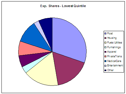
Figure 1: 1987 expenditure shares for bottom income quintile, according to Consumer Expenditure Survey. Source: Kokoski (2003), Table 5.
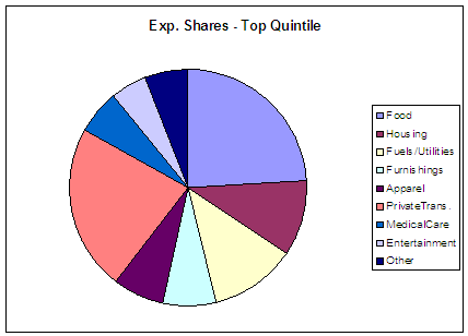
Figure 2: 1987 expenditure shares for top income quintile, according to Consumer Expenditure Survey. Source: Kokoski (2003), Table 5.
With this information, one can make a back of the envelope calculation (and I stress this is only a back of the envelope calculation), based upon these shares and the indices reported for the components. This yields the following figure:
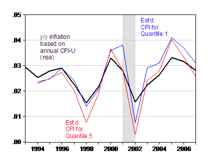
Figure 3: Year-on-year inflation calculated using annual CPI (not seasonally adjusted), (black), and guesstimated CPI for first quantile (blue) and fifth quantile (red). Inflation calculated as first log difference of annual CPI. Guesstimated CPIs calculated as geometric averages of component indices. Source: BLS, and author’s calculations based on weights in Kokoski (2003), Table 5.
Here are several caveats. First, these are calculations that take into account differential expenditures at a very high level of aggregation, so they ignore differential shares at much finer levels of disaggregation. Second, relative prices may have moved even more dramatically in 2008, and the impact of that effect will be missed in this calculation. Third, these are a calculation based upon annual data; calculation of year to year changes will then allow for minimal influence of what has happened to food prices in the last half of 2007.
Those caveats in mind, these guesstimates imply that the differential between the actual CPI inflation and the inflation rate for the first quintile is only about 0.3 ppts in 2007.
A final caveat to keep in mind (from Kokoski (2003)):
…For most a priori definitions of demographic groups, there is generally more variation across households within each group than there is across groups. Since the statistical significance of any differences observed here between quintile indices is unknown, one should not draw quantitative conclusions from these results.
So one’s experience should deviate from that represented by the CPI, even if one were at the 75 th quintile, exactly because of the highly individual nature of consumption bundles. But it is not clear that the income distributional aspects are driving people’s differential experiences.
[Update, 2pm Tue 22 July]: Reader Andrew asks why I used geometric averages. Upon inspecting BLS documentation, I learn that I should aggregate the high level components (as opposed to the elementary prices) using the arithmetic average. I’ve recalculated the indices using the arithmetic averages, and present them in Figure 4. There is little visible difference in the pattern of results.
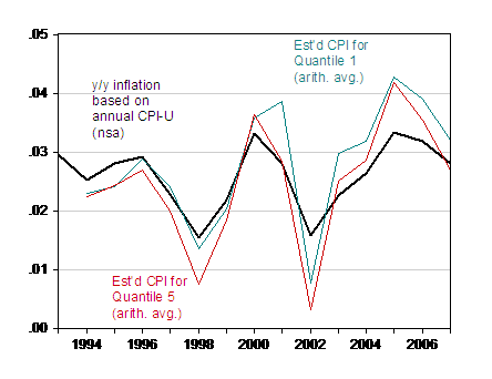
Figure 4: Year-on-year inflation calculated using annual CPI (not seasonally adjusted) , (black), and guesstimated CPI for first quintile (blue) and fifth quintile (red). Inflation calculated as first log difference of annual CPI. Guesstimated CPIs calculated as arithmetic averages of component indices. Source: BLS, and author’s calculations based on weights in Kokoski (2003), Table 5.
Another great post!
It is important to note that the issues considered here are separate from the issues about substitution (Laspeyres vs. Paacshe indexes and so on) discussed in the last post. And they are also separate from the many other issues such as those in the Boskin report (such as quality changes, new goods, price variation among retailers, how to treat housing, etc.)
Before people jump to criticize the CPI, I hope they take time to understand these issues, and how inherently complicated calculating a useful price index can be.
Very nice post. Even though you show that everyone experiences inflation differently, it doesn’t explain widespread beliefs that inflation is understated by 3 percentage points or more. I think the explanation for that perception is more psychological in that people experience inflation in their marginal spending. They really notice paying an extra $30 a week at the gas pump, but don’t consider that amount in the context of their entire spending.
As an interesting side note, what I found surprising from your figures 1 and 2 is that the affluent have so much more discretionary spending available beyond basic food, housing and utilities and they seem to squander it all on cars (private trans.) It seems to imply that in our society, when someone gets more money, the first thing they do is buy more expensive cars.
As an upper middle class parent hoping to buy a home, to pay college tuition, and eventually to retire, the computed CPR is almost completely irrelevant. Housing purchase price (which isn’t even in the CPR), tuition and medical costs together account for over 90% of my take-home income.
Once I have a house purchased and tuition paid for, it will again be irrelevant, but in some other direction.
As mentioned by fg, above, ignoring the issue of the difference between Owner’s Equivalent Rent, and actual housing prices, will mean that numbers for both your high and low quintiles don’t really match actual experience.
If you instead took the “housing” component, and instead replaced it with rents for low income people (rents have increased by 10% per annum for the the last five years where I live), and housing prices (which have tripled in the last five years where I live), I suspect you’ll see a rather different picture.
Garbage in, garbage out, and OER is garbage, in terms of computing real inflation.
Excellent post! Thank you.
Oh, and since I sound so shrill in my last comment, I do want to say how much I appreciate your efforts to explain the difficulties of computing a reliable inflation indicator. You’ve even sold me on the need for some hedonic adjustment. But it’s unlikely that you’ll even get me to accept the madness of OER (but by all means, have at it – I’m all ears).
I wish people criticize CPI actually spend some time to get educated. For example, shelter cost weighs about 29 percent in CPI, which is very close to various consumer spending surveys. Again, for people who don’t like the approach of owners equivalent rent, would you like a user cost approach? Then it will likely show a negative(!) cost for housing in 2003-2006 in places like California, Florida, Arizona, etc. OER has its problems, but it really is one of the better approaches in many imperfect measures.
pat, OER makes no sense. BLS uses price increases/decreases in auto prices to compute CPI. Autos are assets. Why not use the same approach — annual increase/decrease in asset prices — for that really large asset purchase, a home?
Or, should we move to DER (Driver’s Equivalent Rent), too?
If you think asset (home) price does not matter, take a look at the Financial Obligations Ratio over time for homeowners. It has gone to record, painful highs for a reason.
http://www.federalreserve.gov/releases/housedebt/default.htm
Nice. Now what I would like to see is how expenditure shares have changed since 1987, and especially in 2008. I expect these to have a compounding effect due to low substitutability.
Why not use the same approach — annual increase/decrease in asset prices — for that really large asset purchase, a home?
Because cars are not land. My Honda Civic’s value will be essentially zero in thirty years (likely just the value of the metal). This is not the case for land (or even physical houses). As pat pointed out, you get very strange results if you use housing costs (surely you would not use prices per se, since most people use mortgage payments rather than outright purchases) directly.
One surprising aspect of Figure 3 is that both the top quintile and the bottom quintile often appear on the “same side” of the actual CPI–i.e., in 2000 both the richest and poorest households experienced above-average inflation, while the reverse was true in 2002. These seems like an odd result to me.
jg, I think you’re right that OER is highly imperfect.
But if you just used asset prices, you’d get some wild swings that don’t really represent the “cost of living” for a typical person. For example, you’d probably find the “cost of living” going way down over thein Las Vegas and San Diego for the last couple of years, which wouldn’t make a lot of sense with people’s experience who live in those areas.
You’re question about cars is a good one, I think. The difference is that cars have much shorter life and much more stable resale values than homes, so the investment component relative to the consumption component is much, much smaller for cars than for homes.
I think OER makes the most sense, because rent level is what it actually COSTS to live in an area. If you choose to pay more to buy a house, that is a CHOICE that has a lot to do with your prediction about what prices will do in the future. (I admit that OER has a lot of problems, too, since buying and renting are not perfect substitutes in a variety of ways. But the other options seem even worse.)
As a first comment, the medical care costs seem particularly insidious. If we stay healthy until we kick, we really don’t care. But if we suffer an expensive illness we suddenly experience that sector’s inflation.
I mean, does a mean medical cost make sense at all? The healthy don’t care and they ill are beyond it.
I guess my take-away is that we should de-emphasize “the” CPI. As Menzie chronicles, there are many CPIs.
I don’t see the word “core” in this page. There is one particularly poor CPI, beloved by glib politicians.
I think the (glib) claims that “inflation is low because the (glib) CPI is low” should be viewed with real suspicion.
As to what’s better, we probably need to tailor it to our audience. A welfare recipient should have a CPI tailored to real rent. Perhaps retiree CPI should be rent-based as well.
Those of us concerned with retirements decades off might need another CPI to gauge our how well our savings are, or aren’t, pacing buying power in geriatric drugs and fishing cabins.
As one of the people who pointed to this issue in a comment on a previous post, thanks for talking more about the median/mean issue and the expenditure distribution. In particular, the graphs were very interesting.
Now a few questions:
Why did you use a geometric mean of the component indicees? Was it because the CPI-U does it that way (I don’t know if it does or not), and you were comparing with that? Why not the arithmetic average? Geometric average would tend to be slightly lower than the arithmetic. I’ve seen people say this should be used to take substitution into account, but I can’t see how the geometrical average relates to substitution.
Why do both the red and blue line seem to generally be on the same side of the black line at the same times? I would have expected them to more often be on opposite sides than the same side, given that they are the two extremes. Are the middle income lines on the opposite sides?
To people talking about owner’s equivalent rent. If you want to track the prices that people experience you need to track the payments that people typically make. Housing is often paid for via a loan, so you need to use housing loan repayments as a major part of the housing cost rather than the raw cost of the house. The same for cars. This is how it is done in many places. So housing costs are made up of loan repayments, real actual rent, and a smaller portion for direct house prices since some housing is purchased that way.
In the US, tax laws treat a house that you live in as an investment rather than as a consumer item, so owner’s equivalent rent is consistent with that treatment – you buy your house as an investment and rent it to yourself. In other places, your primary residence is treated for tax purposes as a consumer item (no tax deduction, but also no capital gains tax on it). It’s a matter of classification. The house you live in is both an investment and a consumed item. You might try to work out what portion of it is investment and what portion consumed, and weight the loan repayments and owners equivalent rent by those weights.
Anecdotal evidence suggests that people do not generally perceive the official CPI to be characteristic of their own inflation experience. Yale University professor Eduardo Engel reports that a popular newspaper in Chile ran a series of interviews with two dozen celebrities who were asked the same battery of questions, one of which was: “Do you trust the official CPI?” It was the only question to which all the respondents answered in agreement: “No.” Government statistical agencies, therefore, have a difficult task: How best to summarize thousands of price movements in a single index.
(1) Why the CPI may be inappropriate: escalating transfer payments by the usual plutocratic CPI may result in over- or under-compensation relative to a democratic index during different times. Although these deviations may prove unimportant when averaged over time, there is an important perversity, however, that should be emphasized. The plutocratic gap in the CPI often accentuates the change in household welfare rather than smooth it. In effect, lower-income households suffer under-adjustments when inflation is more harmful to them (ie, when they can least afford it). During periods in which the plutocratic gap is negative, when prices behave in an anti-poor way, social programs, which primarily benefit the poor, are revised less than what would be the case with a democratic group index. Similarly, when price movements ar (ie, when the plutocratic gap is positive) indexed social transfers grow faster than proper cost-of-living adjustments would dictate. Thus, plutocratic-CPI adjustments display harmful procyclical features.
(2) On the other hand, plutocratic weights would arise if we were to draw prices at random in
such a way that each dollar of expenditure had an equal chance of being selected (Theil, 1967; Economics and Information Theory p.136). So the standard CPI is quite useful as a macro indicator.
(3) Bottomline: different indexes could be easily computed for different purposes.
Thank you very much for putting together such a picture of a discussion. There are a number of things that come to mind including why governments collect this data (cost of living indexed expenditures and stuff).
I wonder if something could be learned by not worrying too much about the whole, or the individual or the average. Instead, use the IRS data on household income by size and source (a series produced with a delay)to develop a distribution curve for household income by size, using a five-fold division, (too low, under, adequate, comfortable, more than enough)by comparing with the BLS household expenditure data by household income.
This approach would permit one to estimate the different effects of food, energy, transport and debt service on lower income households, the effects of health, energy, transport and education type expenditures on the better off.
It could provide a corrective to “core” CPI which probably eliminates the bottom half of households from the CPI estimates altogether while providing a basis for working towards a representative household defined in terms of the income which would support consumption expenditures which would be a norm to aim for rather than a description of what might appear to be.
The approach would also provide interesting critical insights into the three-key government data series, employment, income and consumption while offering the potential for an implied view of investment.
Thanks for this useful post. Would anyone want to guess how the above might be influenced by changes in household size (and household budgets), or also be influenced by the distinction between transitory versus permanent price changes? Thanks.
Lord, here.
Here and here are some inferences I drew back in 2006.
I think OER makes the most sense, because rent level is what it actually COSTS to live in an area. If you choose to pay more to buy a house, that is a CHOICE that has a lot to do with your prediction about what prices will do in the future.
So, let me get this straight – if a consumer chooses to eat steak instead of chicken, that’s reflected in the index (yeah, yeah, I know, “steak v. chicken is a gross, inaccurate over generalization), but if the consumer chooses to purchase a house, that shouldn’t be reflected in the index? Do I have that right?
If a consumer buys a car (which is an asset that has a lifetime of greater than 20 years, should they decide to maintain it properly), then we should take the cost of that, but if they buy a house, which will become unlivable in 10 years without maintenance, then we shouldn’t count that?
Sorry, but this all seems a bit convenient, if well intentioned.
Why not measure what consumers pay for their housing? Rent, maintenance, insurance, mortgage payment, taxes – all of it… the full monthly nut. Yes, it varies tremendously from person to person, but it’s not arguable that it’s increased for those that have chosen to purchase, just as prices of corn have risen for those who choose to eat that instead of wheat.
Again, for people who don’t like the approach of owners equivalent rent, would you like a user cost approach? Then it will likely show a negative(!) cost for housing in 2003-2006 in places like California, Florida, Arizona, etc.
I’ve seen this said in other parts of this discussion. Anyone have a cite for this? It certainly doesn’t match my experience as a resident of California. Most of the people who purchased a home during the 2003-2006 run-up in prices saw their housing costs go UP, if they were formerly renters – usually by a significant (20% or more) amount. In fact, that increase (75% where I live) is why I’m still renting. Additionally, many people refinanced, and their monthly costs typically went UP as well, since they increased the mortgage balance, since they wanted to “unlock their equity (shudder)” – which was a direct result of rising prices of housing. And as loans reset, they’re certainly seeing costs increase.
Sorry, I’m not sold. But as I said, I’m all ears – please, sell me on this, and I’ll stop.
Another great post? This Menzie fellow is so full of neokeynesian bs. Let me tell you folks, what we are witnessing is not only the implosion of markets, but the implosion of a paradigm that of (k)eynesianism and “money doesn’t matter” idiocy. More and more economists are realizing that they were misled (as undergrads first, and then as grad students), and are starting to read the Austrian Theory of the Business Cycle to understand better what central planning and government mismanagement of the currency has done to the U.S. and the world. Keynes (the homo) never saw the Great Depression coming. But Mises and Hayek did. What does that tell you about soundness of their respective theoretical structures? Have to admit, though, that there is one thing in which this Keynes fellow proved prescient: In the long run, and as a direct result of his policy prescriptions, we will all be dead. Was he right!
1) Why include rarely purchased things in the CPI at all? If home prices double, that doesn’t change my mortgage payments. If iPods can now store twices as much for the same price, that doesn’t do anything for me until I replace mine in two years.
2) Stupid question: do hedonic adjustments ever result in inflation being stated as being *higher* because quality went *down*? If no, that means they should be discarded altogether. Don’t subtract quality improvements unless you’re going to add quality degradations.
3) Why not go by the “insulin index”? Insulin:
-Has a very fixed, inelastic demand.
-Has many inputs, making it unaffected by local supply shocks.
-Can’t be degraded in response to more expensive overall inputs, since it needs to meet a medical standard, thus avoiding substitution effects where they shouldn’t be used.
So any remaining price causes will be have to be the money supply. Thoughts?
I am grateful that Menzie has dedicated three posts to this large and complex subject. As I commented on the previous post, however, I think that the key issue is what the cpi is supposed to represent.
I can see the case for a cost of living measure for pension adjustment etc, but cost of living is a slippery concept. And that concept has been changed in recent years by increasing allowance for quality improvements and substitution which, whether justified or not, have had the effect of shifting the relationship between personal experience and the official measure of inflation.
In my view, the presumption that inflation is about the cost of living, which drives so much of the methodology (eg your use of geometric averaging of price changes, which is motivated by some highly stylised assumptions about consumer preferences) is accepted too readily. I would like to see a welfare-free measure of monetary inflation produced, reflecting as wide a range of transactions prices (including assets) as reasonably possible, using a stochastic methodology (according to Diewert’s categorisation).
Ed- Assuming the average family earns about $40K/year, and takes home $30K/year after tax, an extra $30/week at the gas pump translates to 5.2% yearly inflation (net after tax), solely on the price rise at the gas station. You can add to this, the inflation on everything else (heating, medical, food, clothing…). I hope that you can now appreciate how the BLS CPI-U for the 12 months ending in June 2008 of 5.2% is considered absurd by anyone other than the plutocracy.
Menzi- The Department of Agriculture and BLS food inflation value of 5.2% for the year to June 2008 is simply not credible. Unlike most government economists, and readers of this blog, I do the family grocery shopping every week. My food bill has escalated from about $80 to about $120 per trip in the last year (50% inflation for an essentially invariant basket of items at the cheapest local grocery store). The Economist commodity-price DOLLAR index on food is 56.4% for the year. (The Boston Globe on March 9, 2008) listed average US prices for flour, poultry, milk, and ground beef as 31%, 13%, 26%, and 6% higher respectively in January than the previous year.
When I ran the numbers for your Kokoski pie graphs, using the 12 month June 2008 BLS CPI-U values of 24.7% Fuel, 5.2% Food, 12% Transportation, and 2.4% for everything else, I came up with 7.46% annual inflation for the 1st Quartile, and 7.67% for the 4th Quartile. Please note that these inflation values are 50% higher than the 5.2% CPI claimed by the BLS and are very close to current Consumer Expected Inflation of 7.7%.
However, when I substituted 28% food inflation (50% of the Economist’s Commodity Food-Price Index), for the Dept. of Agriculture’s 5.2% value, the following resulted: 1st Quartile inflation = 14.44% and 4th Quartile inflation = 13.05%… If real consumer food price inflation hasn’t hit 28% yet, its sure to get there soon, as grain, fuel and fertilizer increases are passed through from wholesale to retail prices.
Andrew: I’ve posted an additional graph (Figure 4) with arithmetic averages plotted.
MarkS: Well there are a lot of reasons why you might get different results, including the fact that the weights at the elementary level are not reported, are weighted using geometric averages, and the fact that seasonal adjustment factors may differ. Also, the appropriate weights are probably not the 1987 weights — which is why I said these are “guesstimates”.
Assuming the average family earns about $40K/year, and takes home $30K/year after tax, an extra $30/week at the gas pump translates to 5.2% yearly inflation…
Why stop there? If they spend an extra $300/week on gas, that would be over 50% inflation!
But if you’re the BLS, rather than just assume a hypothetical, you have to do an expensive survey to figure out how much people ACTUALLY DID SPEND on gas, then you use that number instead of the one you made up out of your head.
Ed- My apologies. Joseph not you said: “They really notice paying an extra $30 a week at the gas pump, but don’t consider that amount in the context of their entire spending.”…. I mistakenly made the attribution to the name preceeding rather than following the comment.
Responding to your criticism that my numbers are “made up”: The US median household income was $48,201 in 2006. Using that number, a 25% tax load and the Energy Information Administration’s last survey (1994) stating that the average household drove 21,100 miles per year, and 21 miles/gallon (EPA average car rating in 2004), and $1.106/gallon US average gasoline price increase in the last 12 months … works out to $1111.26/year in gasoline inflation for the median household. The median household’s yearly net after-tax inflation rate solely due to gasoline price increases would then be 3.07%… Additional cost increases for everything else would have to be added to this. I am certain that gasoline price increases constitute considerably less than 61% of total consumer inflation in the last year!
[3.07%-gas/5%-BLS-CPI-U = 61.4% gas/total inflation ?!!!]
References:
http://www.eia.doe.gov/emeu/rtecs/chapter3.html
http://tonto.eia.doe.gov/oog/info/gdu/gasdiesel.asp
An amusing parallel:
The problem of “what will happen with *my* cost of living, given the overall CPI” has similarities with “how much faster will new computer A run *my* workload compared to the one I own now.” Of course, measuring computer performance is generally easier than measuring the economy. 🙂
About 25 years ago, computer vendors used to characterize computer performance by “MIPS – Million Instructions per Second, often called Meaningless Instructions Per Second”. I.e.,. the goal was to give a computer one number to predict performance, and it was measured in a plethora of ways that didn’t really help customers very much. There were *endless* arguments about Arithmetic, Geometric, and harmonic Means, weighted or unweighted, and everyone had their own favorite set of benchmarks, and customers trusted hardly anything.
This was broken, and in 1988 some of us started SPEC to establish better metrics. We created a set of specific benchmarks (think of elements of the market basket) in several groups:
a) We reported one summary number per group, which happened to be Geometric Mean of performance ratios (mathematically correct for this case, not necessarily in general).
b) We always reported all the individual benchmarks and told people that if they knew their own workloads (cost of living) correlated with combinations of specific benchmarks, just use them and ignore the summary numbers.
c) It would be good not just to provide means, but appropriate standard deviations so that people would have some idea of the amount of variability. It turns out that relative computer performance numbers on related benchmarks tend to follow a *lognormal* distribution, whose appropriate mean is a Geometric mean, which is short a shorthand way of computing an average of logarithms and than back-transforming to the original scale.
Anyway, it was interesting to see similar mathematical issues turn up in a different domain.
It would certainly be nice if CPI were split into a few summary numbers, understandable enough that people could map them to their own situations.
====
Note: comment about wealthier people using cars.
That might be true, but if “Private transport” includes air travel (?), I suspect that’s part of the effect.
ed, I don’t know if the BLS does such a survey but this new Bloomberg article says that Fed researchers are doing surveys and also scanning ads for inflation hints:
http://www.bloomberg.com/apps/news?pid=newsarchive&sid=aFCXYdlUlzsY
Thanks to Steven and Ed for helping me out.
Why is “user cost” a bad approach?
The concept of user cost of a house for its owner-occupier is similar to the user cost of a piece of machine for a firm. Ignoring transaction costs, the user cost of a house for a given month for its owner-occupier can be calculated by assuming the homeowner buys the house at the market price at the end of the previous month, uses the house for shelter, and then sells it at the market price at the end of the current month. The user cost for consuming the shelter service for the month is then equal to the lost interest income from the capital tied up in the house, minus the capital gain (or plus the capital loss) on the house for the month, plus other costs related with living in and owning the house for the month (maintenance costs, property taxes, etc).
One can immediately see that in a housing bubble, the capital gain portion can wipe out all other costs and make the “user cost” of shelter negative!
In reality, many homeowners do not own 100 percent of their houses. Therefore, the interest costs term of the user cost should have two components: one represents the opportunity cost of the capital tied up in the house, and the other represents the mortgage interest costs that a homeowner has to pay for the mortgage loan.
The “user cost” approach ignores the investment aspect of owning a house. In addition to the conceptual confusion between investment and consumption, there are many operational difficulties with this approach. For example, as capital gains or losses on the house are part of the user cost, this approach requires the knowledge of house prices every month, which is not directly observable for majority of the houses and can only be estimated. Further, an estimate of house prices based on market transactions will likely to be very volatile as only a tiny portion of overall housing stock is sold each month. Another difficulty of the user cost approach is to gather information on interest rates. While it is relatively easy to collect data on mortgage interest rates, the market interest rates on homeowners’ equity are not directly observable. And conceptually it is controversial as which market interest rate should be appropriate as a proxy for homeowners’ equity in their houses.
Anyone still likes the “user cost” approach?
Thank you for the concise and understandable description of “user cost”, and why it’s a bad measure.
Now, what about using a “monthly payment” metric? Again, that would be rent, insurance, mortgage payment, monthly maintenance, etc.
Yes, it ignores appreciation – but so what? You’re not measuring “pain”, you’re measuring “inflation”, remember? And if that number, for most people, is going *up*, then that’s the “inflation” that you’re supposed to be measuring, irrespective of the increasing asset value.
While it’s an imperfect measure, it’s certainly measuring inflation far more accurately than OER.
I should add – that the OER method missed the greatest inflation in commonly owned asset prices since the early 1800’s (yes, it was greater than the land speculation of the 1920’s), it should be obvious to pretty much everyone that it’s broken. That folks are still arguing that it’s the best of a bad lot, strikes me as the kind of tree-hugging that you often see after a major failure.
Instead of defending it, shouldn’t folks be trying to come up with something that *won’t* miss the next 300% increase in prices? (Or for that matter, the coming 30% decrease in prices?)
Jim D,
A transactions cost measure would not miss house price rises, provided that asset prices are included. While few people buy a house in any particular period, it is a big item of expenditure for those that do, so the weight of housing in the index would be similar. Again, though, the problem is with the definition of the cpi – it is designed to measure the cost of CURRENT consumption, so that asset prices are excluded. It has been argued, most notably by Alchian and Klein, that the inflation measure should include asset prices. I suspect that the reason why asset prices are excluded is that for most people at any particular time, asset prices are the price of what they own rather than buy, so to resist asset price rises would be politically unpopular.
Oil has just fallen by 15% of the peak. Get ready for the next month’s reading of CPI to signal…. DEFLATION.
Reb –
I’m not arguing for inclusion of asset prices.
Apparenly I wasn’t clear… Let me restate what I’m proposing / asking:
Instead of making up the amount that most people pay (OER) by measuring what some people pay (rent), why not instead measure what everyone pays – whether it be rent, mortgage payment, or just property taxes?
This would accurately measure (to use your words) the cost of CURRENT consumption, where the OER badly misses out on an accurate measure – as evidenced by the miss not just on asset prices, but on the rising real cost for anyone who either purchased a home, or refinanced a home, in the last five years.
What’s the problem with doing it this way? There must be one, or we’d be using this already.
Given how very, very badly the OER has done at measuring actual inflation of housing costs, it must be doozy.
Jim D: Using a “monthly payments” metric might make some sense, but it would probably have some problems, too. Would you include interest but exclude principal? Are you including people who buy second houses or investment properties? Why or why not? What about people who have low teaser rates for the first couple of years, does that matter? With the wide variation between houses in these expenses, data collection might be a challenge. (I believe insurance and maintenance should already be reflected in the regular CPI.)
MarkS: That’s much better…I agree that if I look at the numbers you provided I would guess that inflation should have come out somewhat higher (although I’m not sure how much higher—it makes sense that gasoline prices would have been the largest component of inflation over the last 12 months.) I don’t know exactly what accounts for the differences, but perhaps one factor is that urban consumers (the “U” in CPI-U) have higher incomes and drive less than 21K miles/year. Another factor is that you are using MEDIAN income but AVERAGE miles driven. Check out the link in aaron’s comment to look at the BLS measurements of expenditures on “gasoline and motor oil” for different types of households.
In any case, I’m confident the BLS is following a consistent methodology and not just cooking the books.
MarkS: Better yet, look around the BLS website, like here:
http://www.bls.gov/news.release/cpi.t01.htm
According to that link, “motor fuel” prices increased by 33% between June 2007 and June 2008, and had an expenditure-weight in the CPI-U of 5.5% (based on December 2007, if I’m reading the table correctly.) Your figures give a weight of about 8 percent. Are you confident that your weight is more appropriate than the one derived from BLS surveys?
Also, it would appear that food and fuel account for a little over half of the increase in CPI-U over the last year…see here:
http://www.bls.gov/news.release/cpi.nr0.htm
Jim D,
You are most welcome.
As for the “monthly payment” metric, from early 1950s to 1983, homeowners shelter costs in CPI were mainly based on actual out of pocket cash expenses for homeowners. They included home purchases, mortgage interests, property taxes, home insurances, and maintenance costs.
Again, this approach does not separate the possible investment portion of a home purchase. For example, if we both bought identical houses with the same price. You took out a 30 year loan while I took out a 15 year loan. Which of us spent more on our shelter service? On the one hand, my loan has lower interest rate than yours; on the other hand, my monthly payment was higher than yours. Of course, part of my monthly payment is for the principal, but the “monthly payments” approach didn’t separate these things.
This weakness was particularly problematic in the late 1970s. With inflation high at the time, houses were one of the few assets that were both readily accessible to individual investors and a hedge for the inflation risk. As a result, investment demand for residential housing increased, which in turn led to rapid increases in house prices and consequently, higher measured shelter cost inflation for homeowners.
This approach also contributed to the so-called “price puzzle”: when the Fed raise interest rates to combat inflation, mortgage rates go up, thus mortgage payments go up for investors who just got a new mortgage or a rate reset, which lead to higher measured inflation! For these reasons, there were widespread criticisms to this “actual out-of-pocket payment” approach in the late 70s and earlier 89s. OER was adopted around 1985/86 as a response to these criticisms. 🙂
I think the fundamental difficulty in measuring the inflation in homeowners shelter cost is to separate the big investment component in house purchases. OER is a reasonable attempt. It may not do a great job in short term due to different dynamics in the housing market and rental market. But conceptually, it should do a reasonably good job over longer terms.
By the way, I checked the shelter cost inflation in the past 20 years. It averaged about 3.5 percent. And unlike most other components of CPI, shelter cost inflation did not appear to have a downward trend over this period.
John D,
As pat mentions, central banks would not like interest rates in the inflation index, because then the policy action that they take to lower inflation has the immediate effect of increasing it, especially in countries like the UK where most mortgages are floating rate.
Just in case I did not make it clear, I am in favour of including asset prices in the inflation index. It seems to me that inflation is a monetary phenomenon, so measures of inflation should include everything that is purchased with money, especially the largest item that most people ever buy – their house.
I am curious to know why the use of a geometric mean for averaging price increases, as Menzie used at first, is so common. John Mashey says that it is the “appropriate” mean of a lognormal distribution, but I do not get this – the expectation of a lognormal distribution is not the geometric mean. I believe that use of geometric averaging makes the cpi a few tenths of a percent lower, so it ought to have some rigorous justification.
RebelEconomist, this paper explains why the geometric mean inflation rate is preferred:
http://papers.ssrn.com/sol3/papers.cfm?abstract_id=879534
Ed-
You are correct, I did make my arguement relative to the median household (~$48K/yr). I believe that the BLS bases its CPI-U weightings on household expenditures averaged by population. Consequently the CPI-U reflects a mean household income of approximately $61K. Consequently, the proportional gasoline expenditure for the median household are higher than the average household reflected by the BLS CPI-U.
Secondly, the BLS bases its biennial weightings on Consumer Expenditure Surveys three years previous, (2008-09 CPI is based on the 2005-06 survey). Because most of the oil price rise has occurred subsequent to the last survey, the gasoline inflation component will be under-reported by virtue of it’s weighting being being lower than its actual proportion to all expenditures.
Ref: http://www.bls.gov/opub/hom/pdf/homch17.pdf
MarkS:
Thanks for the link. If I understand it right, the weights are *based* on a survey from three years ago, but these weights are then adjusted based on the inflation observed for that category in the intervening years. So the effective weight on fuel is much higher than if you had just used the raw 2005 weights, because fuel inflation has been higher than overall inflation.
Furthermore, doing it this should actually OVERSTATE the gasoline component, not understate it, since it does not account for the fact that people would have been able to substitute away from gasoline towards other goods as gasoline became more expensive between 2005 and now.
Ed-
The BLS weighting for gasoline in 2008 is that calculated for 2005-06. Weights are not adjusted for any inflation that may have occured since the weights were calculated. Since gas prices have risen much faster than CPI since 2005-06, the gasoline weightings currently used by the BLS for 2008 will be LOWER than the actual 2008 gasoline proportion of all expenditures!
In response to your second conjecture: “…people would have been able to substitute away from gasoline towards other goods as gasoline became more expensive…”
For the great majority of Americans, there is no immediate substitute for gasoline. Their cars require it, and their cars are their primary means of transportation. The great majority live where public transportation is either inefficient or non-existant. Only a minority are at the end of their car lease, or have the income for an immediate more efficient vehicle replacement.
From a realistic perspective, gasoline consumption has been relatively inelastic in the USA, primarily because there have been no convenient alternatives. Higher gas prices will directly affect transportation costs… Shifts away from gasoline consumption to something else should still be reflected in the same inflation via hedonics, because the quality of transportation will have deteriorated.
If CPI-U does not reflect gas price inflation as experienced by Americans, but rather reflects (as you suggest), a shell-game of expenditure substitution as dwindling purchasing power is directed to a cheaper (and frequently lower quality) “alternative”. We are no longer measuring inflation, we are tallying consumption.
MarkS: Are you sure the weights aren’t adjusted? I haven’t gone carefully through the document, but it looks to me from the table on page 35 that they are. (2nd to last equation, “Cost weight in pivot month.”) If you are right, I think that would cause a systematic downward bias in the CPI, so it seems unlikely.
“there is no immediate substitute for gasoline.”
Um, you can carpool, you can stay home instead of going out, you can leave the SUV at home and take the Honda, you can cancel the summer road trip…there are all sorts of things people do to save money on gasoline so they can buy other things instead. The elasticity is small, but it isn’t zero, particularly over a three year time period.
Ed-
Page 36 of the BLS “The Consumer Price Index” document, item 3. Aggregation Formula states: “The Laspeyres index uses estimated quantities…to weight each elementry item-area index. These quantity weights remain fixed for a 2-year period, and then are replaced each January in each even year when the aggregation weights are updated.”
Substitutions as you suggest by driving less or using a more efficient vehicle are not reflected in CPI-U releases, until the new consumption surveys are completed and implemented two years later. Besides- Your
“substitutes” for gasoline, are not substitutes at all, they are methods of conservation (economization). The utility of gasoline as a transportation energy source has been been eroded by its price level rise… resulting in reduced transportation utility in the US. I doubt that the BLS will factor in any negative hedonic effects to reflect the losses in transportation utility when the new aggregate weights are applied in 2010.
MarkS, I am inclined to agree with you. Also, total hours traveled in the U.S. on a monthly basis has declined steeply from its long term average since 1984 (which is one of the reasons why the price of oil has been tanking). What effect do you suppose this reduction in travel will have on the CPI or how should the BLS view it?
Note that over long periods of time in the U.S. economy the headline inflation rate tends to converge to the core inflation rate, and that the CPI is rarely a true Laspeyres index:
http://en.wikipedia.org/wiki/Cpi
Disclosure: short the price of oil since 145.2 but will reevaluate my short position once and if the price hits the low 120s.
MarkS: Ah, I see the problem…yes, the quantities are fixed based on the previous survey, but the cost weights are updated, as shown in the formulas on page 35.
You are not understanding what I mean by substitution. This is just basic econ 101…if good A gets more expensive relative to good B, people tend to buy more of B and less of A even if they could have afforded to buy the same as before.
Again, this approach does not separate the possible investment portion of a home purchase. For example, if we both bought identical houses with the same price. You took out a 30 year loan while I took out a 15 year loan. Which of us spent more on our shelter service? On the one hand, my loan has lower interest rate than yours; on the other hand, my monthly payment was higher than yours. Of course, part of my monthly payment is for the principal, but the “monthly payments” approach didn’t separate these things.
OK, I get that, but why is that a bad thing? After all, we’re trying to measure inflation, right? And that’s what people pay…
I suppose what you’re getting at here is that there’s a “savings” component to the payment, but since that will decrease payments for those who eventually pay off their loans (50% or so of homeowners, I’ve read), then it should average out in a way that pretty much reflects reality for a the widest swath of people – which is what I thought the point of the exercise was…
Later you say:
This approach also contributed to the so-called “price puzzle”: when the Fed raise interest rates to combat inflation, mortgage rates go up, thus mortgage payments go up for investors who just got a new mortgage or a rate reset, which lead to higher measured inflation!
Which, of course, is an accurate measure of the inflationary effects of rising interest prices – they do have inflationary, as well as disinflationary effects, after all.
And then another commenter notes:
As pat mentions, central banks would not like interest rates in the inflation index, because then the policy action that they take to lower inflation has the immediate effect of increasing it
I’m reminded of the engineering parable of the Chinese dam – perhaps you’ve heard of it?
An American engineer goes to China to observe the building of a dam. He notes that it’s mostly being built by workers with shovels. When he suggests using more modern equipment, the overseer recoils in horror: “Oh”, he says, “we can’t do that, all those workers would be out of a job!”. “Ah”, say the engineer, “I was mistaken. I thought you were building a dam. I see now that what you’ve got here is a jobs project. In that case, why not just give them spoons?”
So, to reform my question: Why is ignoring the increase in the underlying asset price a bad thing? Why not use a monthly payment metric that measures what people pay, regardless of the investment aspect? Yes, a person with a 15 year mortgage pays a different amount than a person with a 30 year mortgage. And someone with a teaser rate pays even less. So? If the objective is to measure inflation in housing costs, that fact is irrelevant, isn’t it? After all, that 15 year mortgage will get paid off more quickly, and the price will effectively go to zero at that time – less insurance, maintenance, and taxes, of course – so that lower price will eventually be reflected in the measured price. If the objection is that it makes the numbers look bad if interest rates rise, then you’re pretty much saying that the agenda isn’t actually to measure inflation of prices, right? Or is my layman’s understanding flawed on this?
I appreciate your taking the time to educate me. I know from personal experience how painful it can be to explain a complicated topic to an amateur. But I’m afraid that I’m still unconvinced.
I think the fundamental difficulty in measuring the inflation in homeowners shelter cost is to separate the big investment component in house purchases. OER is a reasonable attempt. It may not do a great job in short term due to different dynamics in the housing market and rental market. But conceptually, it should do a reasonably good job over longer terms.
I agree, of course, that over very long terms, it should work – but it’s failed consistently for 10 years now, as SFR prices have outstripped rents, often by spectacular amounts in coastal and desert areas… And it’s likely to fail for another 10 years, as prices revert to their more traditional levels. So if you’ve got a 25 year time horizon, then it’s a good metric, but I suspect that the CPI is gunning for something with a little less of a lead time. It would be nice if we found one.
This is a serious matter – if we’d included ballooning housing prices in calculations to determine the GDP deflator, what would the last decade have looked like in the statistics? Would it have better explained a flat median wage with spiraling debt? Would it have caused a different government response? (Yes, this is a bit of a non-sequitur for the existing discussion… Feel free to moderate it out if you think necessary. 🙂
(See my previous comment for a question on why it’s necessary to separate out the investment component.)
Charlie Stromeyer,
Many thanks for the reference to the IMF paper above which was most useful. With that and a bit of reading around, I now understand the statistical (as opposed to the microeconomic) reason for using the geometric mean, and I am convinced that it is appropriate. Apparently, the geometric mean is the maximum likelihood estimator of the expectation of a lognormal distribution.
For anyone who wants a basic intro to how the geometric mean is related to the log normal distribution see:
http://en.wikipedia.org/wiki/Geometric_mean
Jim D, I am also quite skeptical about the efficacy of OER. Perhaps Professors Hamilton or Chinn would like to do a post about OER so that we might discuss it more?