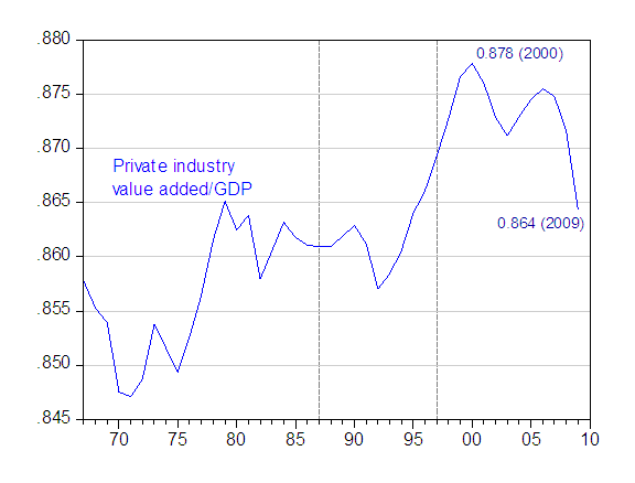
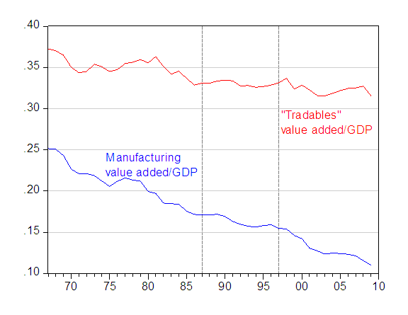
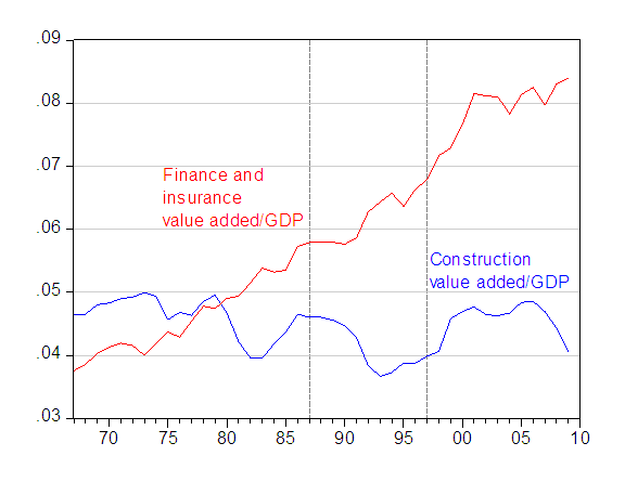
The BEA today released value added and output series by industry through 2009. A few highlights: (1) the share of the private sector value added in total GDP has declined by 1.34 percentage points since 2000; (2) manufacturing’s share of GDP continues to decline in nominal terms; and (3) the share of finance and insurance barely rose in 2009.
The data highlight a number of trends that are relevant to issues currently debated in policy circles. One is the extent to which the government has encroached upon the private sectors, in terms of production. Figure 1 plots the value added of all private industries, divided by GDP.

Figure 1: Value added of all private industries expressed as a share of GDP. Dashed lines denote breaks in the data series. Source: BEA, GDP by industry data, release of 25 May 2010, and previous releases, and author’s calculations.
Notice that the recent decrease has only brought down the ratio to something more akin to the historical norm prevailing from 1965-95 (actually a bit above).
Next, what has happened to the economy in terms of reorienting output toward tradable goods, necessary as a prerequisite for increasing exports and decreasing imports? [1]

Figure 2: Value added of manufacturing (blue) and “tradables” (red) expressed as a share of GDP. “Tradables” defined as sum of manufacturing, mining, agriculture, and 70% of professional and business services. Dashed lines denote breaks in the data series. Source: BEA, GDP by industry data, release of 25 May 2010, and previous releases, and author’s calculations.
Clearly, manufacturing continues its decline as a share of GDP. There are a number of caveats to keep in mind. First, manufacturing is highly procyclical, and moves much more with GDP than other components of GDP. Hence, it would not be surprising to see a bounceback once data for a full year incorporating a period of recovery is included in the plot. Second, real output in manufacturing has almost assuredly not shown as much a decline. This is a drawback of using the value added share data; we cannot control for relative price effects.
Finally, we know that the set of tradables is broader than merely manufactured goods (see this post). I also plot a proxy measure for tradables which includes manufacturing, mining, agriculture and 70% of professional and business services. I would say that this series simultaneously overstates the level of tradables, and overstates the downward trend in the series. Clearly, less a much smaller share of professional and business services are exportable at the beginning of the sample shown than at the end, for instance.
Finally, there has been a lot of talk about job-mismatches and a potential increase in structural unemployment (or NAIRU). Here, I don’t have any specific information on the issue, but the data do provide a perspective on how the shares of two key sectors in the boom/bust cycle we’ve just suffered through have evolved.

Figure 3: Value added of construction (blue) and finance and insurance (red) expressed as a share of GDP. Dashed lines denote breaks in the data series. Source: BEA, GDP by industry data, release of 25 May 2010, and previous releases, and author’s calculations.
Construction’s share of value added certainly seems to have substantially decreased, back to 1998 levels. Finance and real estate have not shown a corresponding decrease. Of course, the denominator in all these ratios was GDP, so the trends are going to be obscured by the very large downturn in those years. However, presumably if financial reform proceeds, and incorporates more regulation (including higher capital requirements) and even taxes on assets or liabilities, then one should expect a change in the trend in the finance and insurance share of GDP. On this point, only time will tell.
You have a false conclusion… “the government has encroached upon the private sectors, in terms of production.”
You give no insight into this conclusion anywhere in the article…
With capacity utilization still down to 73%, where is the govt encroaching upon production?
Edward Lambert: That’s the point. The government isn’t encroaching on the private sector in terms of production, according to the statistics.
Yet the share of government expenditures is increasing
Real Federal Consumption Expenditures & Gross Investment
http://research.stlouisfed.org/fred2/series/FGCECA
And yes the gross fixed capital formation in USA is less than the ones recorded in the consolidated euro area,and Japan (P8)
http://www.ecb.int/pub/pdf/stapobo/spb201005en.pdf
As an aside gift, an interesting chart of the boom and bust cycles in the USA (Fraser s attic)
http://fraser.stlouisfed.org/publications/bb/issue/5069/download/85250/1943chart_busibooms.pdf
Ahhhh…. ok… I see… “isnt encroaching”… I read it wrong
But I would like to comment on something that Menzie Chinn said… “Yet the share of government expenditures is increasing…”
Its ok to increase govt expenditures as long as they are imperfect substitutes for what is offered in the private sector… these are things like infrastructure… These will raise aggregate demand without crowding out private demand which is low now as you know… youll find this concept in the following paper…
http://www.ny.frb.org/research/staff_reports/sr402.pdf
I would be interesting to see bar graphs totaling to 100% with each component, much like Professor Hamilton’s graph of the FED balance sheet numbers. That would allow us to see trends much better.
One of econbrowser post, when reviewing the achievements of government expenditures and their impacts on states incomes was showing that the multiplier effect was less than 1.(to be seen here?)
Further comments were comparing the difference between money spent and money received as a cash burning ratio.If withholding tax is a proxy to the multiplier effect, then it may be worth to look at it through this threads:
http://www.dailyjobsupdate.com/
http://www.dailyjobsupdate.com/public/second-derivative
I posted a link to this elsewhere and was told that the material was leftist drivel. I had to laugh but the level of ignorance is striking; people actually reacted in that way to actual, official government statistics from the Dept of Commerce. I was then told that the information was cherry-picked because it didn’t go back – the BEA series start at 1947 – and a few minutes of checking showed me that the post-war percentage has hovered in a 3-4% range in which private value added has been 85% to 88% inclusive. (1948 seems to be the outlier.) I was then told that we should look back to 1900, which seems completely ignorant of the history of the income tax and the modern world. So much for rationality. This is what you actually deal with in the world at large.
BTW, it would have helped if you’d mentioned that the series starts when the Great Society programs began and thus if there has been a tremendous shift one might expect it to show. Instead, we’ve seen the private share of GDP grow slightly.
Does anyone have any ideas as to how government value added calculated? It strikes me as a very different animal to private production, as I assume prices are lacking for government-produced goods and services.