From Reuters:
U.S. employment recorded a second straight month of solid gains in March and the jobless rate fell to a two-year low of 8.8 percent, underscoring a decisive shift in the labor market that should help to underpin the economic recovery.
Nonfarm payrolls rose 216,000 last month, the largest increase since May, the Labor Department said on Friday. The gain built on the 194,000 new positions added in February.
BLS report here.
As noted elsewhere, even with these solid gains, the pace of net job creation is far below that necessary to rapidly reduce the unemployment rate.
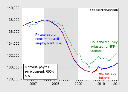
Figure 1 depicts the trend in the standard nonfarm payroll employment series, the same series excluding temporary census workers, and the household series adjusted to conform to the nonfarm payroll concept.

Figure 1: Nonfarm payroll employment series (blue), ex.-temporary census workers (red), and household survey series adjusted to nonfarm payroll employment series (green), in 000’s, all seasonally adjusted. NBER defined recession dates shaded gray. Source: BLS, employment situation, via FRED, BLS, and NBER.
It does seem to be the case that an actual trend is in place. I find it interesting that the adjusted household (research) series — which was developed (in my understanding) partly at the instigation of conservative economist criticisms of the standard establishment based series — has received so little attention. That series has been both consistently higher than the establishment series (by a nontrivial 1.7 million!), and growing faster. That being said, the household series does have a higher degree of variability [0], so I understand in part the downweighting (although not to zero).
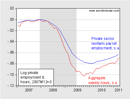
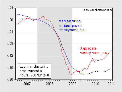
Disaggregating slightly, it’s apparent that private sector employment is rising, as are aggregate hours. The manufacturing sector, in particular, is growing rapidly in terms of numbers (ex-supervisory), and especially in terms of aggregate hours. Both of these observations are highlighted in Figures 2 and 3. In addition, average hours per week manufacturing is now above pre-recession levels, and in fact higher than at any time during the Bush Administration.

Figure 2: Log private nonfarm payroll employment series (blue), and aggregate weekly hours index (red), all seasonally adjusted, normalized to 2007M12=0. NBER defined recession dates shaded gray. Source: BLS, employment situation, via FRED, NBER, and author’s calculations.

Figure 3: Log manufacturing employment series (blue), and aggregate weekly hours index (red), all seasonally adjusted, ex.-supervisory workers, normalized to 2007M12=0. NBER defined recession dates shaded gray. Source: BLS, employment situation, via FRED, NBER, and author’s calculations.
The rise in manufacturing sector employment and hours (and orders [1]) is consistent with the view that rebalancing the US economy towards exports (see here) will entail the production of more tradable goods (and services). (Aside from construction, the broad-based nature of the growth of employment suggests to me a somewhat less-than-dominant role for the structural unemployment/skills-mismatch approach to explaining unemployment). [2] [3]
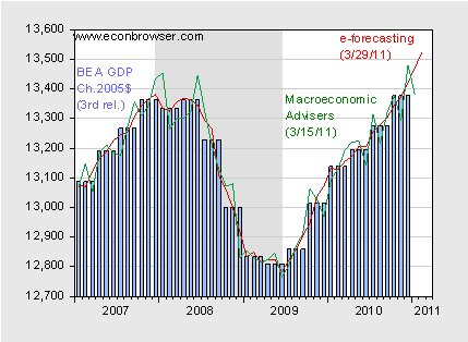
Finally, on a related note, backwards-looking high frequency indicators for overall economic activity still seem to be rising. Figure 4 depicts the official GDP series, as well as two estimates of monthly GDP.

Figure 4: Real GDP (blue bars), e-forecasting estimate of GDP (red line), and Macroeconomic Advisers estimate of GDP (green line), all in bn Ch.2005, SAAR. NBER defined recession dates shaded gray. Source: BEA, 2010Q4 3rd GDP release, e-forecasting, Macroeconomic Advisers, NBER.
Growth in real activity seems to be in place. Why that hasn’t manifested itself in a proportionate fashion for employment remains to be explained.
Returning to the employment situation release, it’s of interest to note what is contracting in employment. In addition to construction, government had a net reduction of 14,000. More than 100% of that change was accounted for by the reduction in local government employment, which fell 15,000 (seasonally adjusted).
More from [CR1] [CR2] [Economists View] [RA/Free Exchange] [Ip/Free Exchange] [Izzo/WSJ RTE] [Murray/WSJ RTE] DeLong.
As a student of economics, I was wondering if the entire US population was included when calculating employment-population ratios and/or the labor force participation rate? Specifically: are the baby-boomer retirees going to cause permanent changes in these metrics?
Well duh, I predicted this last summer. Of course when quarter 3 comes, things starting getting interesting on a series of global fronts.
Econ yes, with the Boomer bailing from the labor force, the overall lfp will fall down.
It seems this Feb 13 prediction of oil price patterns and DJIA I have been posting from time to time holds pretty well.
http://saposjoint.net/Forum/download/file.php?id=2609
We could expect Brent higher then in previous peak, by 5-10 USD ( 125-130 USD).
Than it goes down in mid April just to shoot to new highs in approaching May (135-140 USD).
That should stop QE3 in its tracks-which will cause another temporary downturn in oil price.
All things are let loose in July 2011. Must be some supply disruption, serious this time.
Which would lead to serious downturn in stocks, and following double dip in the USA-recession in q1 2012.
http://saposjoint.net/Forum/download/file.php?id=2608
Quess who will not be the USA next president?
“Growth in real activity seems to be in place. Why that hasn’t manifested itself in a proportionate fashion for employment remains to be explained.”
Once you factor in that GDP grows about 2% per year without any increase in employment, I don’t see the mystery here. Looking at trends from 2001-2011 also reveals that both employment and output are about 8% below peak.
Am I missing something here?
Very good post.
Are we energy-constrained on re-remployment? By rights we should be.
And I’d don’t like those oil prices either. Technically, they’re $20 over the 4% threshold ($30 for Brent). The US has never seen an extended period at crude oil consumption in excess 4% of GDP without a recession.
The Steve Levitt in me just couldn’t resist this story in the NY Times today.
Happy Motoring: Traffic Deaths at 61-Year Low
http://www.nytimes.com/2011/04/01/us/01driving.html?_r=1&ref=todayspaper
It appears motoring deaths have plummetted since the start of the recession–as they did after ’73, ’79 and ’87. What causes the decrease? Is it recession, or oil shocks? Less congestion on the roads? Fewer people going to bars and drinking? Or does the recession tend to make more dangerous drivers stay off the road? Are they more likely to lose their jobs?
It’s a bit of a mystery, but no doubt the answers are there is the statistics somewhere.
Jim hasn’t been posting frequently enough to break through the union noise.
I like Jim’s posts because I learn things.
Don’t get me wrong Menzie, I like your posts too. Your technical work is great, and your conclusions/implications make me feel like a genius.
Menzie, I owe you an apology. My comment implies that there’s something wrong with this post. This post is excellent.
My comment was a more general perception over the past couple weeks, the impulse to comment on it just happened to strike me now.
Steven,
It’s not less congestion. Congestion actually decreases road fatalities. The reduction is likely due to improved vehicle design, improved road design, decreased driving during times there is more free-flow, and more driving during traditional commute times (people driving less for recreation, but driving more during during work hours to try so sustain a living standard).
Congestion constrains the behavior that results in serious accidents. Fatalities are usually higher during uncongested times (per mile traveled). A few factors are: higher speeds during free-flow, lower visibility during non-congested hours, and more opportunity for reckless behavior during free-flow hours.
Having passengers or talking on a cell phone impairs driving the most, but drinking often combines all the above factors. Inhibition is reduced when there is the most opportunity for reckless behavior and motor skills and perception are impaired.
EconStudent: The changes will have an impact on the participation rate, etc. More discussion on CR and DeLong.
Cameron: I think the mystery is not that components should add up, but the composition of the overall growth, in particular why productivity growth is so high at this stage of recovery.
Steve Kopits: I defer to James Hamilton on this question.
aaron: Thank you for your comments. Let me provide some metrics, to place your perception into perspective. As I noted in another thread, my Wisconsin-oriented posts are in addition to my regular posts. Specifically, in March, I posted 18 posts, 6 of which pertained to Wisconsin (and most included an economics/fiscal component), leaving a net 12 economics/fiscal posts. In January (before the “budget repair bill” was proposed by Governor Walker), I had 12 posts total.
Furthermore, of the six Wisconsin-focused posts, only 2 contained the word “union”. Let me submit that for some reason, you have a skewed perception of the “union” noise; I will not conjecture on the source of this skew.
Thanks Menzie.
I have generally not been reading the dispatches, thus the assumed union references.
My complaint is not about a lack of substantive content from you or Jim, but that the posts distract from the more substantive posts and discussions.
This is a personal gripe of mine. Seeing the large amount of comments the posts attract, more people feel the opposite.
Hope things are good for you in WI.
During the last 20 years, and much more deeply in the last 10 years, the US economy has changed from a manufacturing base to a service debt-based economy, and as BLS shows that the jobs with higher growth in the last 10 years are:
1) Home health aides = 461.000 new jobs (150% increase), mean wage = 22.000 $
2) Personal and home care aides = 376.000 new jobs (46% increase), mean wages= 20.000$
3) Registered nurses = 582.000 new jobs (22% increase), mean wages = 66.000 $
4) Customer service representatives = 400.000 new jobs (17% increase), mean wages = 32.000$
5) Combined food preparation and serving workers= 394.000 new jobs (15% increase), mean wages = 18.000$
In the same period 2000-2009 US has lost 5,5 millions manufacturing jobs with average wages twice the value of the low-income services jobs I have incuded before
The very successful partnership between the US 1% richer and the chinese polit-bureau has mobilised the “unemployment army” in this country as a way to recycle the earnings from the US middle class to the wealthy people in US through our reatil and chinese good production value added chain, that was the driven force to open access to China in the WTO, and the free trade in general
We will assist to a deflationary process where the wages will go down more and more at the same time the price of goods remains more or less at the same level, but the income of the richer will increase dramatically (see the figures of Picketty and Saez, now the 1% richer have the 40% of the wealth, as in 1927 before the New Deal)
All the welfare state will colapse because there is not enough wealth generation in developed countries to sustain it, because we need to forget the “money” itself (as concept), what really means in the long term as “wealth” is the capacity to make “things” = food, machines, cars, planes, PC’s, TV’s, etc…
Once the debt umbrella (that hide the real economy problem) has fall-down, there is not way-out if we continue supporting the free trade than only benefits the richer
Joe Stiglitz say some interesting things about “our” 1% richer here:
http://www.vanityfair.com/society/features/2011/05/top-one-percent-201105
The biggest concern is the inflation will kill employment at the end. Now uncontrollable inflation from first rising oil&food price to the broad based goods prices will cause negative effects on the real income. Surely, Federal Reserve is pumping money at untrollable level and even if Fed decide to end QE or raise the interest rate, we cannot see the decline in the inflation within one or two years.
I think we may face stagflation in second half of this year and all employment gain will disappear but all money will go into inflation. Surely oil may pass al-time high by end of QE2 soon.
I think we have temporary imcrease in employment but suataining inflation and Stagflation will be the biggest problem in US.
O.K., I must be an idiot, but Menzie, where in Figure 3 do you see, “average hours per week manufacturing is now above pre-recession levels?”
“The number of employed women rose by 247,000 vs. 4,000 for men. Thus, improvement in Friday’s jobs numbers came entirely from women, at least according to the household survey.”
http://globaleconomicanalysis.blogspot.com/2011/04/men-vs-women-digging-into-bls-jobs-data.html?utm_source=feedburner&utm_medium=email&utm_campaign=Feed%3A+MishsGlobalEconomicTrendAnalysis+%28Mish%27s+Global+Economic+Trend+Analysis%29
Mark Kuperberg: Sorry for being unclear; it’s not plotted in Figure 3. See this series (FREDII).
“Are we energy-constrained on re-remployment? By rights we should be.
And I’d don’t like those oil prices either. Technically, they’re $20 over the 4% threshold ($30 for Brent). The US has never seen an extended period at crude oil consumption in excess 4% of GDP without a recession.”
Mr. Kopits, my good sir, you are correct yet again. I congratulate you, although one can imagine a great many better reasons to enjoy such accolades, consider that our being correct means hardship for countless of our fellow human apes.
But I must add that the situation is rather worse than you imply. The “energy constraint” you correctly identify is “permanent”, although we are not supposed to say, or know, this.
The implied negative net energy return means we are likely to be seeing Peak Everything, including at some later encounter with grim destiny, population peak.
By my accounting, real US private final sales are on course to fall below 1%, if not near 0%, this qtr., and perhaps 0% to contraction by early summer, including an “unexpected” deceleration of China-Asia (particularly real consumer spending and exports) any day now.
The pass-through effects to US business input and consumer prices are already well underway, promising to squeeze margins and discretionary consumer spending hereafter.
The US “scam” (a.k.a stock) market has priced in 3-4% real GDP growth and 15%+ S&P 500 earnings growth. Oops!!! Deja vu. It looks like late ’07 to spring ’08 and late ’79 to early ’80 all over again, Yogi. “The future ain’t what it used to be.”
Menzie wrote:
I am not a big fan of Larry Kudlow, but in his CNBC article he is spot on. The household series weighs more heavily toward mom and pop businesses that more often file as self-employed.
So what changed in the month of December to improve employment? Hmmmmm! Was there an announcement or an increase in quantitative easing? Was there an increase in government spending? Did Keynes roll over in his grave?
Let’s see, the major event in December – now correct me if I am wrong – was that the White House and the Republicans agreed to an extension of the Bush tax cuts so that uncertainty came off of the table, and there was a reduction in the withhold of the payroll tax. Oh, there were tax reductions?
Why, when QEI and QEII fail and the projection of unemployment under 8% gets blown out of the water with over 10% unemployment then sustained unemployment over 9% do we keep trying it over, and over, and over? But we have very small positive movements in taxes and suddenly things improve.
You would think that economists would all recommend continuing with what works, but we have to remember that government employs economists and give grants to academics and so economics has to support government largess and abuse of the purse. How are these politicians going to buy votes is they can’t raise taxes and increase spending? How are the executives in Fannie and Freddie going to pull down their multi-million dollar commissions if you reverse the nationalization of the home mortgage business?
So recovery and prosperity are killed on the alter of personal gain and politics, and economic theories that bring nothing but pain and suffering.
Not to harp on this subject, because it isn’t that big a deal, but it is interesting that there is such a disconnect between the red line in Figure 3 and the Fred series. What explains that?
Mark Kuperberg: The red line in Figure 3 is an aggregate hourly series. The indicated FRED series is average weekly hours.