Professor Scott Sumner says “No more jobs mystery. Period. End of story.”. I’m not so certain.
From the post:
If I hear one more discussion of the mysterious lack of jobs I’ll explode. The new GDP numbers are the final nail in the coffin. For years I’ve been saying there is no jobs mystery. That any deviation from Okun’s Law was minor compared to the scale of the output collapse. With the new RGDP figures we now know I was right, there isn’t and never was any mystery as to why there are so few jobs. RGDP is very low. Period. End of story.
Professor Sumner couches his discussion in terms of real GDP growth and changes in the unemployment rate in this post. It may be that he is right that there is no mystery once one uses post-revision data in that context *, but I prefer to focus on employment growth, rather than changes in the unemployment rate which is a function of both employment growth and labor force participation rates.
Turning to the idea that lower GDP estimates would then make the lackluster employment growth understandable, I’ll say that this story has a lot of intuitive appeal. But it isn’t so simple once one looks at the data. The relationship between contemporaneous growth rates, using the pre-revision and post-revision data, was illustrated in as in this post. In order to make the strongest case for a shift in the relationship in favor of the Sumner thesis, I ran regressions of the first difference of log employment growth on the lagged first difference of GDP growth, over the recovery period. First, the pre-revision, and second the post-revision GDP data, over the 2009Q3-2011Q2 sample (HAC SE, bold face indicates significance at 5% level).
Δnt = -0.0032 + 0.6741 × Δyt-1 + ut
Adj R2 = 0.21, n=8
Δnt = -0.0023 + 0.5527 × Δyt-1 + ut
Adj R2 = 0.09, n=9
I plot the data (blue circles post-revision, red + pre-revision) for this sample.
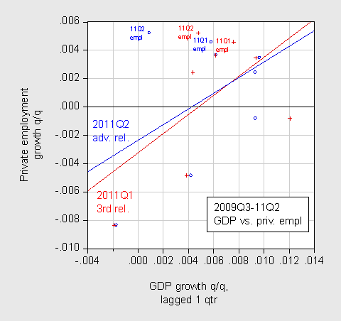
Figure 1: Scatterplot of lagged private employment q/q growth (blue, post-revision; red pre-revision) against GDP growth q/q growth (not annualized). Growth rates calculated as log differences. OLS regression lines over 2009Q3-11Q2 sample. Source: BEA, BLS, author’s calculations.
What the regressions and the graph indicate is that with the post-revision data, employment growth is less — not more — positively related to GDP growth than was the case with pre-revision data. This point is illustrated by the flatter slope of the blue line relative to the red line. (It is true that the threshold for positive private employment growth is a little lower, but I’m not sure that saves the story).
By the way, with such a small sample, changing the sample alters the slope coefficient considerably. If I drop the employment growth observation for 2009Q3 (which is plotted against the 2009Q2 GDP growth rate), the slope coefficient becomes negative (albeit not statistically significant). In addition, if I look at contemporaneous changes, the slope coefficient is negative for both pre- and post-revision data(!).
Hence, it’s not clear to me exactly how the data revisions make the job creation puzzle disappear. In fact, once drops linearity, and let the data speak with respect to the relationship between lagged GDP growth and employment growth, the mystery only deepens. I use a nonlinear regression technique, which fits a smooth line to the scatterplot.
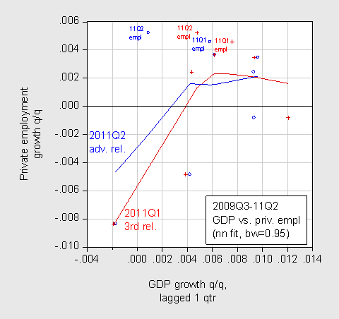
Figure 2: Scatterplot of lagged private employment q/q growth (blue, post-revision; red pre-revision) against GDP growth q/q growth (not annualized). Growth rates calculated as log differences. Nearest neighbor/Loess regressions, or local linear regression, using a bandwidth of 95% of the sample. The estimates use Tricube weighting, and Cleveland subsampling of the data. Source: BEA, BLS, author’s calculations.
I guess to the extent that a portion of the curve is less negatively sloped, perhaps the mystery is partly resolved. But I think that what Professor Sumner has in mind is that the level of employment should be higher given what we thought GDP was, or GDP was actually lower than what we thought. To answer that sort of question, one has to include levels. I do that by estimating an error correction models over the 2000Q1-09Q2 period, then using those regressions to forecast dynamically out-of-sample. If the Sumner thesis is correct, then the degree of overprediction of employment should disappear with the revised data.
The estimating regressions are (for pre-revision and for post-revision data, respectively):
Δnt = 0.264 + 0.212 × Δ y t + 0.245 × Δ y t-1 + 0.686 × Δ n t-1 – 0.035 × nt-1 + 0.015 × y t-1 + e t
Adj-R2 = 0.93, n = 38, bold face denotes statistically significant at the 10% msl, using HAC robust standard errors.
Δnt = 0.311 + 0.188 × Δ y t + 0.216 × Δ y t-1 + 0.681 × Δ n t-1 – 0.041 × nt-1 + 0.017 × y t-1 + e t
Adj-R2 = 0.93, n = 38, bold face denotes statistically significant at the 10% msl, using HAC robust standard errors.
Both regressions fail to reject Q-statistic (4, 8 lags) tests for serial correlation, and fail to reject tests for no-structural breaks according to 1-step ahead recursive residual, CUSUM and CUSUM-sq tests, at the 5% msl.
The regression results appear plausible. The long run elasticity of private employment with respect to GDP is about 0.424 using pre-revision data. It’s about 0.416 using post-revision data; both a little bit higher than the 0.37 elasticity of total nonfarm payroll I obtained in this post.
Using these equations, I generate dynamic forecasts of (log) private employment.
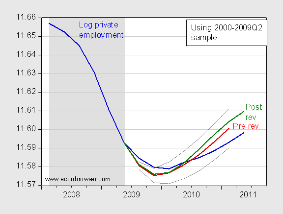
Figure 3: Log private employment (blue line), conditional forecast using pre-revision GDP data (red line) and +/- 1 standard errors (gray lines), conditional forecast using post-revision data (green line). NBER defined recession dates shaded gray. Source: BLS, BEA, NBER and author’s calculations.
The results in the figure highlight that taking into account the levels of GDP as well as the growth rates, the model indicates an overprediction of 0.7% (log terms) in 2011Q1, using pre-revision data. If one uses the post revision data, the overprediction is 1.1%. Whlie this seems like a counter-intuitive result, it’s important to recognize that all of these are within the +/- one standard error band for the pre-revision data-based forecast. That is, the relationships are badly enough estimated that this overprediction could happen just by chance, and might not necessarily indicate a structural change. (Note: The forecasts are conditional on GDP; hence what I have conducted is sometimes called an historical ex post simulation).
One could argue that one should only use expansions. If I use the 2001Q4-05Q4 sample (the expansion after the 2001 recession), then I overpredict by large margins (around 7 percent) and the difference between the forecasts based on pre- and post-revision data is trivial by comparison (around half a percent).
Hence, I think it safe to say we still have something of a mystery why employment growth has been so slow, given the growth rate of GDP. One way to identify where the puzzle originates from, in an almost tautological sense, is to include productivity (Z) in the regression.
Δnt = 1.715 + 0.441 × Δ y t + 0.103 × Δ y t-1 – 0.246 × Δ z t +
0.681 × Δ n t-1 – 0.041 × nt-1 + 0.017 × y t-1 – 0.224 × z t-1 + e t
Adj-R2 = 0.94, n = 38, bold face denotes statistically significant at the 10% msl, using HAC robust standard errors.
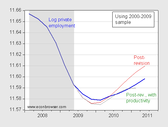
Figure 4: Log private employment (blue line), conditional forecast using post-revision GDP data (dark red line), and conditional forecast using post-revision data and productivity (green line). Productivity is output per hour in nonfarm business sector. NBER defined recession dates shaded gray. Source: BLS, BEA, NBER and author’s calculations.
The forecast conditioning on output per hour in the differences and level terms results in a much better fit. I don’t want to interpret this in causal terms, but rather in a kind of accounting sense: assuming a constant level of productivity is particularly problematic in the post-2000 sample. Including a productivity variable accounts for some of the misprediction.
Why the apportionment of total output toward output per hour, instead of toward number of workers, has risen is deeper question.
The July Employment Release
Aside from the relief that greeted the news, against the backdrop of other indicators of slowing activity, what else can we glean from the July release? One point is that employment growth remains lackluster, and is decelerating from rates earlier in the year. There were upward revisions in the May and June numbers, but not enough to make a discernable impact in the graph below.
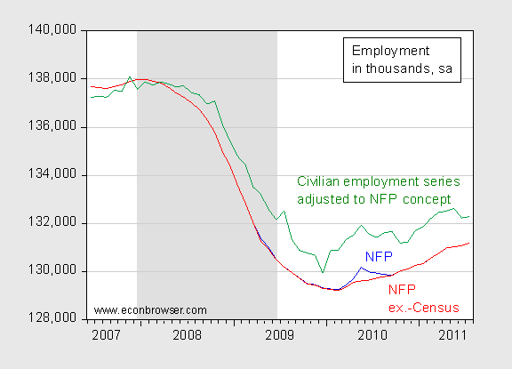
Figure 5: Nonfarm payroll employment (blue), ex-temporary Census workers (red), and civilian employment series adjusted to nonfarm payroll concept (green), in thousands, all seasonally adjusted. NBER defined recession dates shaded gray. Source: BLS via FREDII, BLS, NBER, and author’s calculations.
Interestingly, the research series which adjusts civilian employment from the household survey to conform to the nonfarm payroll concept remains substantially higher than the official nonfarm payroll series.
Aggregate weekly hours is growing faster than private employment, at least on a year-on-year basis.
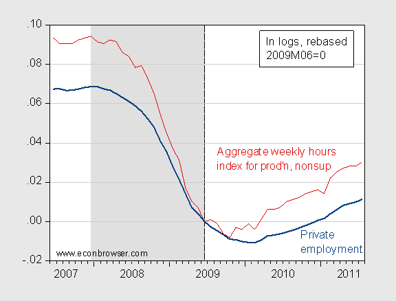
Figure 6: Log private nonfarm payroll employment (dark blue), and log aggregate weekly hours for production and nonsupervisory workers (dark red), all seasonally adjusted, rescaled to 2009M06=0. NBER defined recession dates shaded gray. Source: BLS via FREDII, NBER, and author’s calculations.
Finally, I think it worthwhile to remember that fiscal policy (both at the Federal and the state and local level) is moving toward contraction. That is, while the level of GDP and employment is higher than it otherwise would be, the direction of policy is adding a negative factor to growth (I have to say these things because lots of people have evidenced an inability to differentiate between level and gradient).
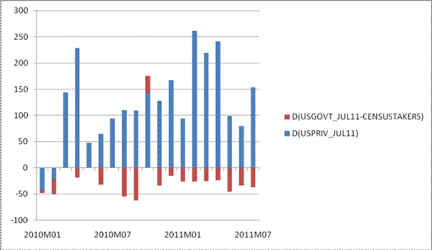
Figure 7: Change in private nonfarm payroll employment (blue bars), and government employment ex.-Census workers (red bars), all seasonally adjusted, rescaled. Source: BLS via FREDII, and author’s calculations.
That point is highlighted by the fact that in recent months, government employment has deducted from overall employment growth, as state and local governments retrench. Given the nature of the debt ceiling agreement, there is no reason to believe the decrease in government employment will diminish any time soon.
More on the release at [WSJ RTE], [Thoma], [CRE1], [CRE2], [CRE3], [Stone/CBPP], [Rampell/NYT], [Norris/NYT], [Ip/Free Exchange], and [Spencer/Angry Bear].
* The relationship appears to be change in unemployment rate as a function of real growth rate. If I run a regression on q/q data over the 1986-2009Q2 sample, and then forecast out of sample, it makes little difference whether I use pre- or post-revision data. In both cases, I overpredict the unemployment rate.
n=8 or 9 isn’t all that convincing, though I suppose your overall point still stands.
Perhaps an alternate method might be to gather MA’s monthly real GDP data (assuming it accounts for the revised data) and regress log changes against the monthly employment data. At least that way you’ll be able to get better estimates.
Semi-tangential, but due to the S&P downgrade of US debt, what happens to the stock market on Monday?
Do we get an Oct ’87-style super-plunge? Or less? Or nothing at all?
There is no mystery.
It’s the Rise of the Machines.
Menzie According to BLS productivity data, capital services were rising up until 2011, and now they have flatlined. Sounds like businesses have decided to consume existing capital and use higher labor inputs but from the same sized labor force. This relates to your previous post about top income groups. To the extent that GDP is growing, the benefits are going to those who were already doing okay. For those who weren’t doing okay, not so much. A rising tide only lifts yachts.
Methodological question. Would it be more appropriate to use net product rather than gross product? Gross product comparisons assume some stable relationship between capital inputs and labor inputs. But if capital is being depreciated more intensively, then this might imply something a bit different in terms of the labor market’s response to GDP.
I don’t know what to think. Perhaps the RGDP->employment relationship is not stable. That is, the “right” lag length moves around a lot or is in some other way more complex. Also, although I am a big believer in Sumner’s story over 2008-2010, I find myself wondering more and more about how low (N)GDP growth these days is causal in the *continued* weak recovery. Aren’t we approaching the long run now? I am thinking especially of the growing GDP deflator.
The trendlines in the first two graphs are simply ridiculous. Although Excel or whatever will cheerfully produce one, you cannot draw any meaningful trendline on a “starry sky” plot like that. It’s a statistical sin.
John Hall: I think this is an issue of span, rather than observations. Using noisier monthly data probably won’t help.
Anonymous coward: No need to be bashful. I actually agree — one can’t tell much from 8 or 9 data points, and my point was that people should stop making strong assertions on the basis of 8 or 9 data points (or revisions thereof). By the way, that’s why most of the inference is based on the regressions using 38 observations…
2slugbaits: I’m using GDP because that is what people look at. I’d guess you’re right conceptually, but NDP looks much like GDP, so all the results follow pretty much through.
Menzie Yes, measured NDP does tend to follow GDP quite closely. In my view too closely to be believeable. I’ve never quite trusted the way the NIPA tables compute NDP. Capital is assumed to depreciate at pretty much the same rate regardless of where we are in the business cycle.
This is fascinating work, Menzie! How many actual jobs would need to be created to eliminate the overprediction of 1.1%?
Also, it doesn’t seem surprising that the inclusion of output per hour results in a better prediction of the employment given GDP. If I understand your regressions correctly, the only thing that would prevent a perfect fit would be changes in hours per worker. Is that right?
Erik Brynjolfsson: Thanks. For 2011Q2, an extra 1.25 million jobs would have to be created.
You are right that the last regression is almost tautological. If employment was measured in hours, instead of workers, and if private sector value added (not GDP) was the activity variable, then the regression would be tautological.
@Menzie: it’s not a matter of the number of points in this case. 8-9 points should be adequate if they more or less follow a theoretically plausible relationship. Although it is susceptible to various problems, the R-value gives you a quantitative hint for linear relationships — if it’s less than 0.5-0.6 there is basically no trendline to talk about.
Why am I even writing about this, you should know this stuff better than I do.
Anonymous coward: I agree I should have highlighted the general non-significance of the first two regressions. I thought I was being clear that one couldn’t really make any inferences from those scatterplots — but I guess I was not sufficiently clear. Apologies.
@Menzie: I understand I’m being obnoxious in comments, and anonymous comments at that, but I consider the issue important. With data like this, it is a mistake to present a trendline. You might draw one privately while analyzing the data (if you don’t believe the evidence of your eyes that the data is a “starry sky” and there is no distinguishable relationship), but you publish the plot with the trendline and continue with
while the plot indicates that all this discussion about slopes is devoid of meaning, statistically speaking. That first scatterplot (minus the trendline) should have been followed by
Which is quite post-worthy in itself, in my opinion!
Then suppose you wish to look for a nonlinear relationship. With this little “starry sky”-looking data, it is a non-starter unless you have a plausible hypothesis for the shape of the relationship. Supposing that I had good reasons to think that q/q private employment growth (p) and q/q GDP growth (g) are related as p~sinkg/g with k unknown, then I might fit for the two coefficients and see how good the fit is.
Anonymous coward: No, these are good comments. I am happy to debate philosophy regarding reporting of regression coefficients. First, the slope coefficient in the first regression is borderline significant using HAC standard errors (which one could debate over use, given the small sample). But if I report the first line, it makes sense for consistency to report the second line, even if the adjusted-R-squared is much lower (and of course then no statistically significant coefficients).
So I think there is a philosphical difference in terms of how and what to report, colored by my education (my first publication involved the application of smoothers to exchange rate data, called alternating conditional expectations (ACE) developed by Breiman and Friedman), and my experience in policy is that even if you don’t put the regression lines in, people will run “ocular regressions”, so might as well put ’em in and warn ’em of nonsignificance. That after all shows up in lots of international finance applications, including the rat-x/UIP formulation.
Of course, your view puts you at odds with the purists who say never run a regression, regardless of coefficient of variation, unless you have a theoretical model in mind, the most basic of which is the measurement error model. I will say that, for better or worse, very few of us achieve such high standards of “purity”.
> you publish the plot with the trendline
Anonymous coward: this is a blog, not a “publication”
@Menzie: I suppose it’s rather more difficult to construct a plausible measurement error model for data like GDP than for physical measurements, to put it mildly. Purists might object, but life is not pure and I’m fine with that — to a degree. I am no expert statistician and I don’t know what HAC is, but I did six semester courses of physics and chemistry lab work and my ocular regression gauge reads “starry sky”. Frankly, I find it difficult to conceive of someone deducing a relationship from that plot, although that might indicate nothing but dearth of imagination on my part. I am also tempted to say that it is a defect of modern education, however, that would take me too far from the topic at hand, so I won’t. And your remark about international finance applications makes me jittery. Do they at least display big flashing red “NO RELATIONSHIP HERE” warning signs?
PS: just read about heteroskedasticity. I kind of see now where you are coming from in that first plot, with variance “obviously” being smaller on the right side of the plot. But as you mention yourself, with so few points the validity of this metric is questionable (read “it’s crystal-ball gazing”, or should that rather be “starry-sky gazing”?)
My modest experience in the business world is that in addition to the written explanation you include the trend-line on the chart. It is an acceptable assumption that the executives are smart enough to both spot the stars and understand the written description.